Local Software & SaaS Comparison Website Template
Query is a dark-mode database management landing page template built for developer tools and software products. It combines a glowing code-editor hero, a twelve-row competitor comparison table, and an OS-aware download call to action. The layout follows a tight Problem-to-Solution arc designed to move technical buyers from frustration to conviction before they reach the download button.
by Rocket studio
Quick summary
Query is a single-page, dark-mode template for database management tools. It opens with a cinematic code-editor hero, walks visitors through a clear problem-and-solution narrative, and anchors the argument in a detailed comparison table. By the time a visitor reaches the download call to action, the page has already done the selling.
Who this template is for
This template is built for technical product teams who need a landing page that speaks directly to developers. It works equally well for solo builders and funded startups shipping a database or developer tool.
- Backend engineers and DevOps leads who want a page that matches the tone of their product
- Startup founders and CTOs marketing a database GUI, query tool, or developer utility
- Design and marketing teams looking for a ready-made, dark-mode framework they can brand quickly
What problem this template solves
Developer tool marketing often fails because the page looks like every other SaaS site. Generic hero images and vague benefit copy do not convince technical buyers. This template fixes that by centering real code, a structured comparison, and a narrative that earns the download click before it asks for it.
- Visitors bounce when they cannot quickly see how a tool compares to what they already use
- Generic landing pages feel mismatched to products that live in a terminal or dark workspace
- Unclear call-to-action paths leave motivated visitors without an obvious next step
What you get with this template
The template delivers a complete, single-page layout structured around a Problem-to-Solution arc. Every section is sequenced to build conviction progressively, so the download button lands at peak persuasion.
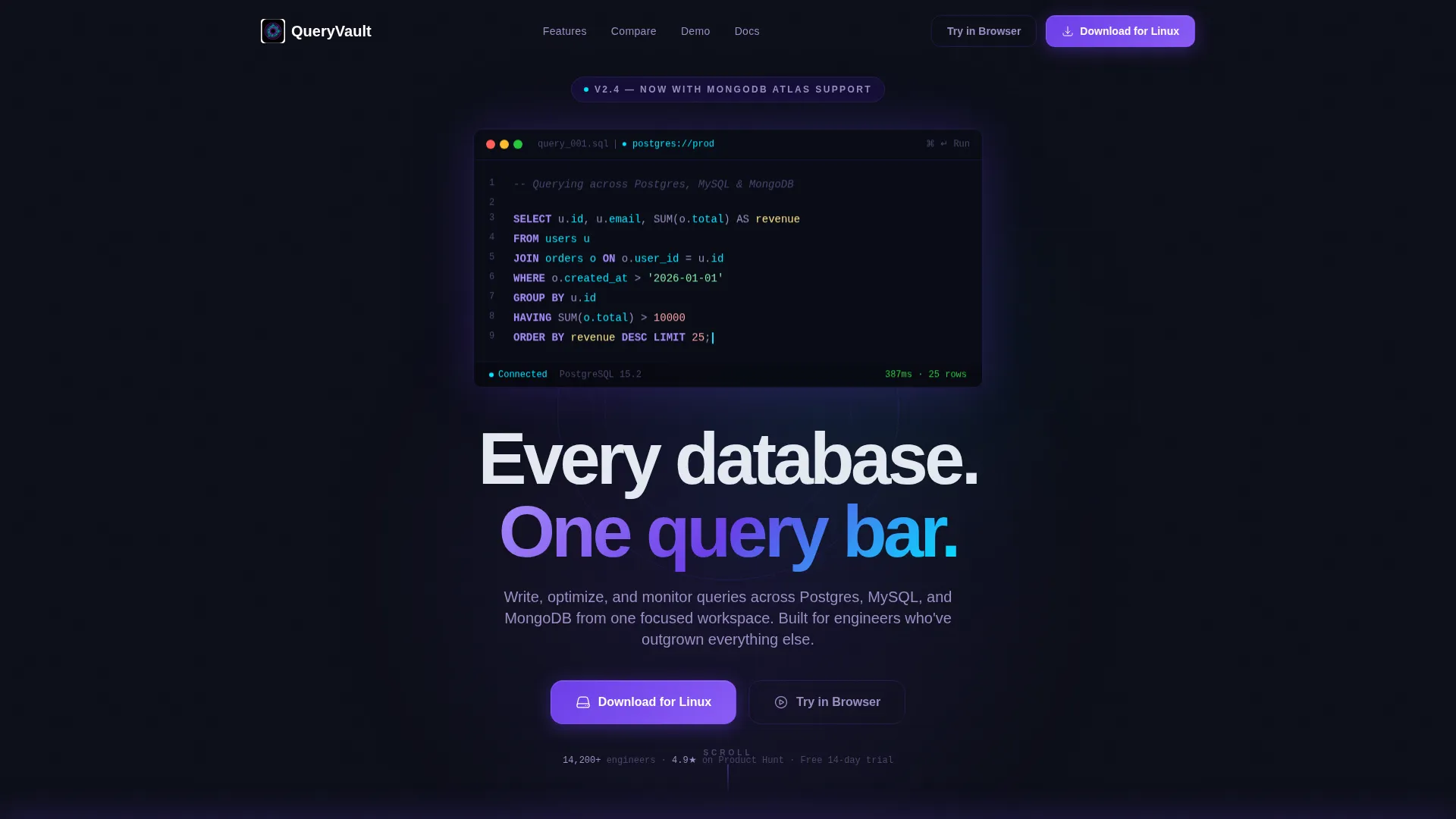
- A full-bleed dark hero section with a glowing inline query editor and animated background rings
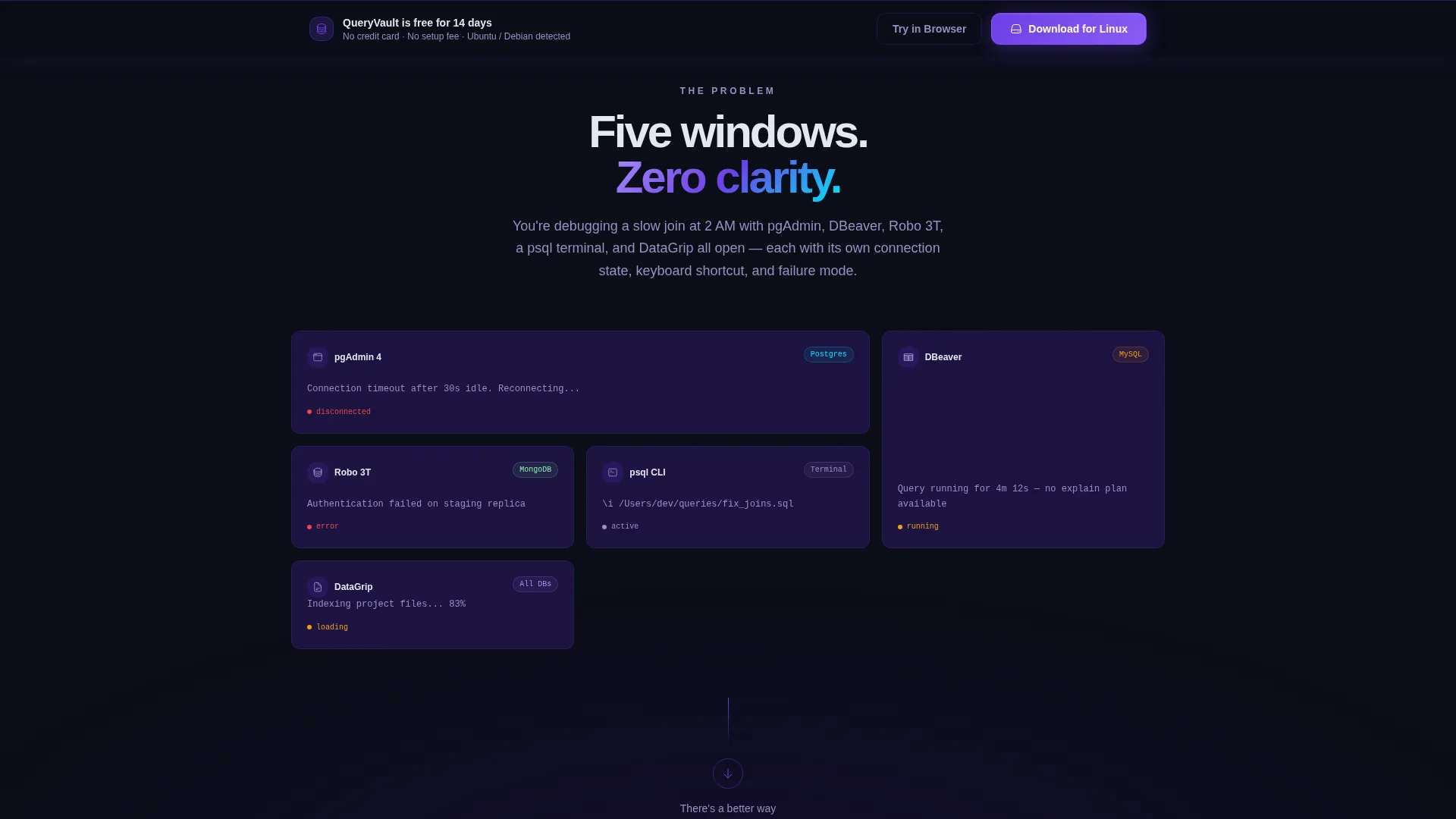
- A chaos-versus-clarity problem section followed by a twelve-row comparison table and a live-demo GIF block
- A sticky bottom download bar with OS-aware primary and secondary call-to-action options
Feature list
This template is built around a small set of high-impact components that work together as a complete persuasion flow.
Glowing Code-Editor Hero
The header fills the entire viewport with a void-black background. A single SQL statement sits center-frame, keywords lit in electric violet and table names in cyan. A blinking cursor and pulsing indigo rings behind the editor create the impression that something is actively running.
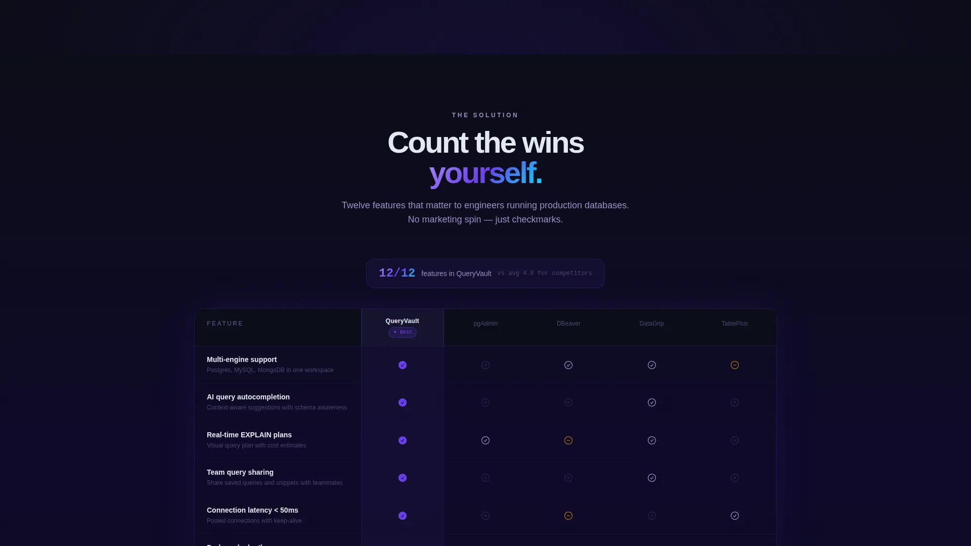
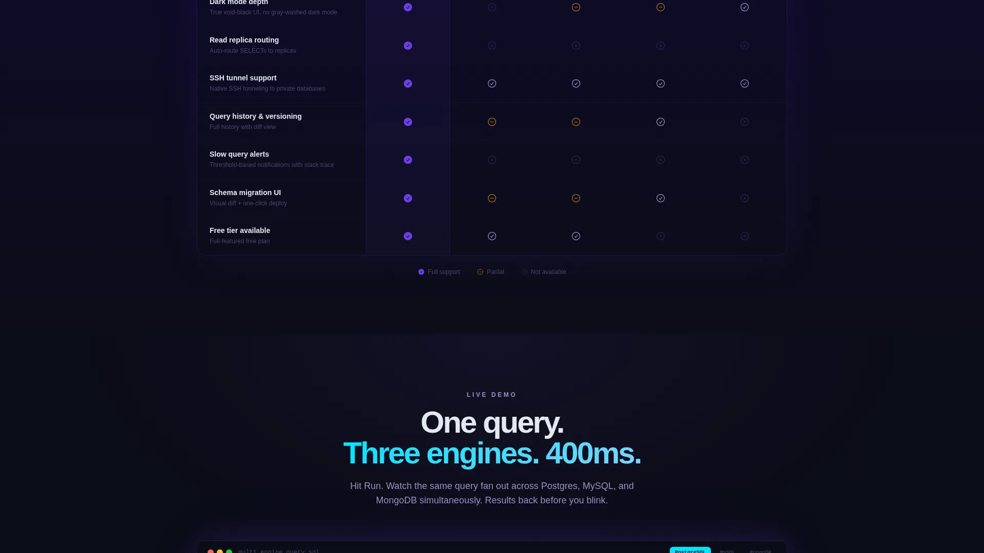
Twelve-Row Comparison Table
The comparison table stacks the product against multiple competing tools across twelve evaluation rows. Checkmarks glow in electric violet for present features; absent features sit in muted gray. The visual contrast makes the product's strengths immediately readable.
Problem Section with Chaos Narrative
Before the table, a dedicated section illustrates the pain of managing multiple database GUIs at once. Mismatched tabs and lost connections are shown as a visual pattern, making the frustration tangible before the solution is introduced.
Live-Demo GIF Block
Below the comparison table, an animated GIF shows a single query executing across three database engines simultaneously. Results appear in under 400 milliseconds, giving the visitor a concrete performance impression without requiring them to install anything.
OS-Aware Download Call to Action
The primary call-to-action button reads "Download for Mac" by default and switches label text to match Windows or Linux. A secondary "Try in Browser" option gives hesitant visitors a lower-commitment path. Both options appear in the header navigation and in the sticky bottom bar.
Sticky Bottom Conversion Bar
After the comparison table scrolls into view, a sticky bar locks to the bottom of the viewport and persists through the rest of the page. It keeps the download action visible without interrupting the reading flow.
Page sections overview
| Section | Purpose |
|---|---|
| Header Navigation | Anchors logo, nav links, and primary download button |
| Hero Code Editor | Introduces the product concept with live-feeling code display |
| Problem Chaos Section | Visualizes the pain of juggling multiple database GUIs |
| Comparison Table | Benchmarks the product across twelve feature rows against competitors |
| Live Demo GIF | Shows a real query fanning across three engines with fast results |
| Download Call to Action | Delivers OS-aware primary download and browser-based fallback |
| Sticky Bottom Bar | Keeps the download action persistently visible after the table |
Design & branding system
The visual identity is built on an Electric Indigo color system rooted in a Startup Velocity theme. Every color choice reinforces focus, speed, and technical credibility.
- Backgrounds use void-black (#0B0D17) for the primary canvas and deep indigo (#1A1040) for card surfaces and section breaks
- Interactive elements and syntax-highlighted keywords use electric violet (#6C3FE8); data visualization accents and success states use sharp cyan (#00E5FF)
- Body text sits in cool white (#E2E8F0) with muted lavender (#9B8EC4) reserved for secondary labels and supporting copy
Mobile & speed optimization
The template is structured for clean rendering across screen sizes. Its lean component set and dark-first design reduce visual noise on smaller viewports.
- The full-bleed hero and comparison table are designed to reflow cleanly on mobile screen widths
- The sticky bottom bar is positioned to remain usable on touch devices without blocking primary content
- No stock photography or heavy image assets are used; the visual weight comes from color and code
How this template helps you convert
The page is sequenced so that every section increases the visitor's confidence before the call to action appears.
- The hero establishes immediate product context through real code, so technical visitors recognize the tool's category within seconds of landing.
- The comparison table presents a structured, twelve-row argument that lets visitors reach their own conclusion rather than reading marketing claims.
- The sticky download bar and OS-aware button remove friction at the moment of decision, reducing the steps between conviction and action.
Other information about this template
This template fits naturally into a product-led growth strategy where the tool's own behavior is the primary marketing message. It is especially well-suited to developer tools that compete directly with established options in the database GUI space.
- The comparison table layout can be adapted to highlight different feature rows depending on which competing tools are most relevant to a specific audience
- The "Try in Browser" secondary call to action supports product-led acquisition flows where a no-install trial is part of the conversion funnel
- The template's dark-mode-first aesthetic aligns with the visual expectations of backend engineers and DevOps professionals who spend most of their working hours in low-light environments
- Tools such as pgAdmin, DBeaver, DataGrip, and TablePlus represent the competitive landscape this comparison table is designed to address
Theme
Startup Velocity
Creative direction
Problem→Solution Arc
Color system
Electric Indigo
Style
Comparison Table
Direction
App Download
Page Sections
Glowing Code-editor Hero Section
Twelve-row Comparison Table
Problem Narrative Section
Live-demo GIF Block
Os-aware Download Call to Action
Sticky Bottom Conversion Bar
Related questions
What type of product is this template designed for?
Can I adapt the comparison table to show different competitors?
Does the template include the live-demo GIF or just the section layout?
Is the OS-aware download button logic included?
Who is the sticky bottom bar designed for?



