Micro-SaaS & Developer Tools Comparison Website Template
Queryglass is a hub-and-spoke landing page template built for a database GUI client. It uses a Tech Glass visual identity with a Carbon Fiber color system, an interactive query-editor hero, and a comparison-driven scroll structure. The template is designed to turn technical visitors into confident downloaders by letting the product's own benchmarks do the persuading.
by Rocket studio
Quick summary
Queryglass is a single-page, anchor-nav landing page template purpose-built for a desktop database GUI client. It opens with a live-style query editor preview, then guides visitors through five research-style spoke sections. Each section builds a side-by-side case for switching, closing with a direct download call to action that requires no form on first click.
Who this template is for
This template is made for developer tool founders, indie hackers, and product marketers who need to convert technically skeptical buyers. If your audience reads documentation before clicking anything, this layout speaks their language directly.
- Backend engineers and database administrators who evaluate tools on hard evidence
- Startup founders and technical product teams launching a database GUI client
- Developer tool marketers who want comparison-led copy to do the heavy lifting
What problem this template solves
Most landing pages for developer tools bury their proof. They lead with marketing headlines while the technical buyer has already opened five tabs to find benchmarks. This template flips that sequence entirely.
- Visitors see the actual product interface before they read a single claim
- Every spoke section pairs a bold benchmark stat with a structured comparison matrix
- The conversion path stays within reach at all times, removing friction at the moment of decision
What you get with this template
You get a fully structured, single-page layout with five anchor-navigated spoke sections and a sticky top nav. The design system, section logic, and call-to-action placement are all pre-built and ready to customize.
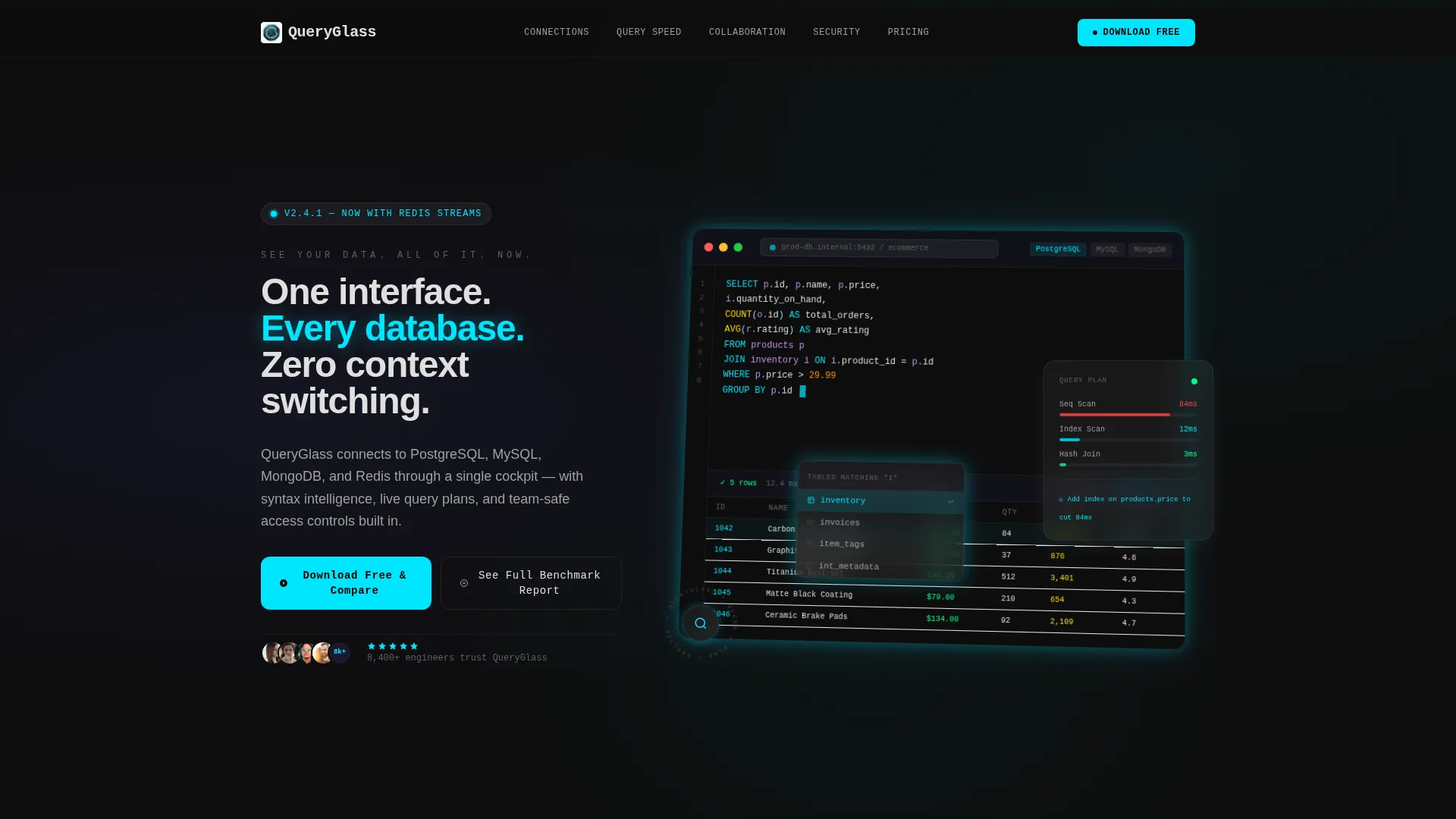
- An interactive-style hero section showing a syntax-highlighted query editor with a blinking cursor and results pane
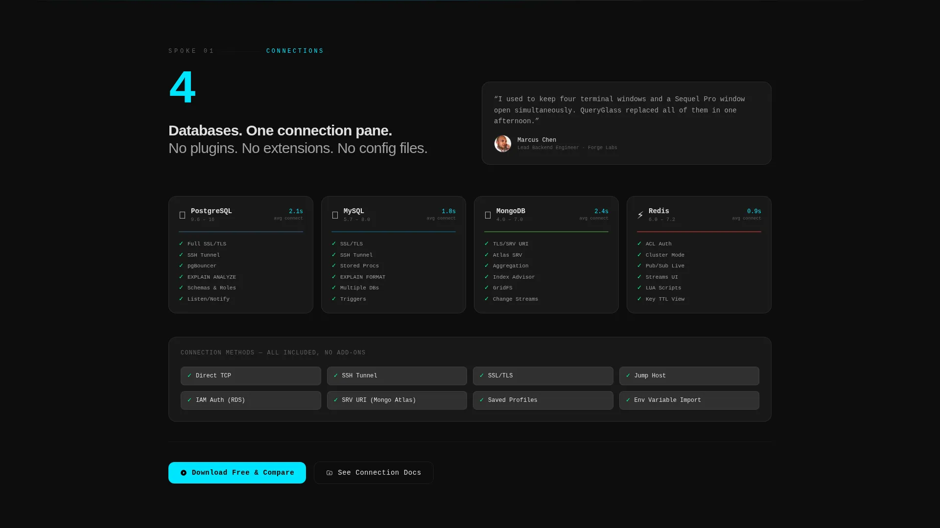
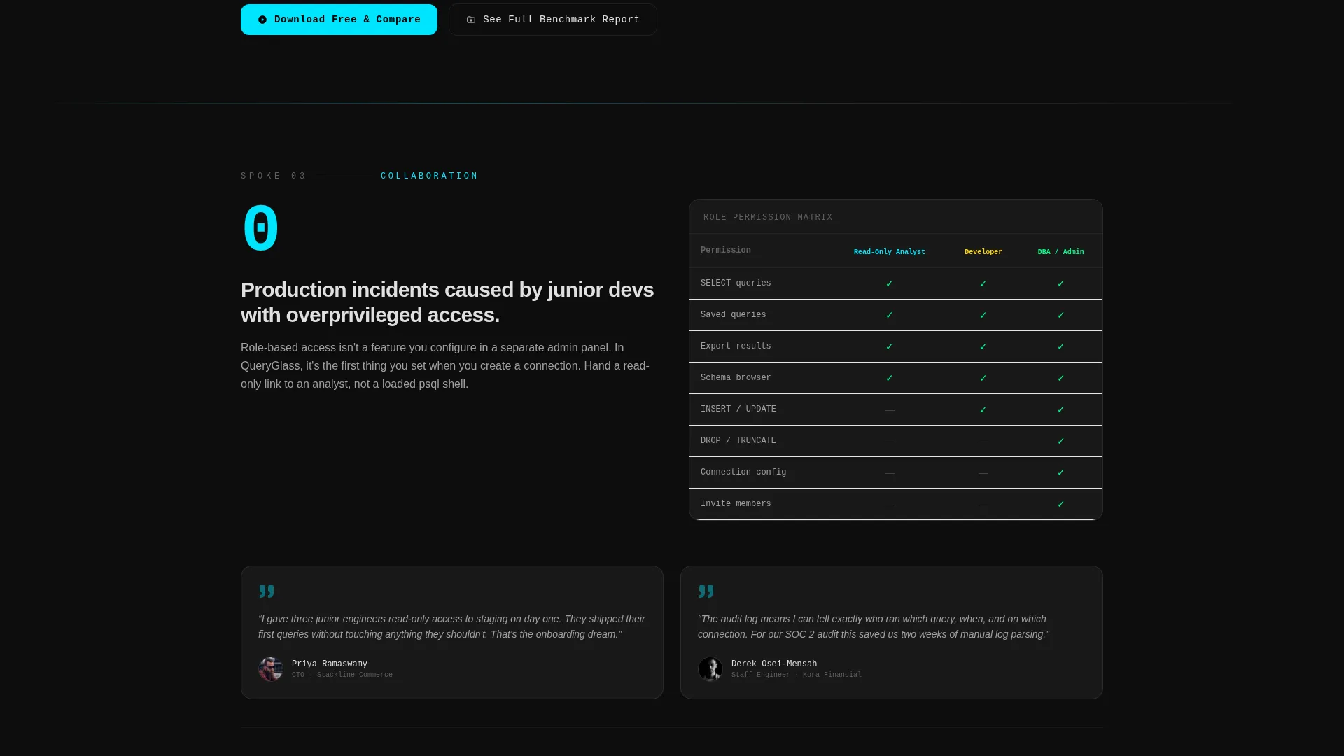
- Five comparison spoke sections covering Connections, Query Speed, Collaboration, Security, and Pricing
- A dual conversion path: a no-form direct download button and a secondary email-gated benchmark report option
Feature list
This template delivers a specific set of pre-built design and structural components grounded in the source brief.
Interactive Query Editor Hero
The header section renders a realistic screenshot-style query editor frame. It includes a blinking cursor, mid-statement syntax-highlighted SQL, a half-open autocomplete dropdown suggesting table names, and a twelve-row results pane below. The frame sits at a subtle Z-axis rotation with a cyan glow bleeding from behind the window chrome.
Sticky Anchor Navigation
A five-spoke anchor nav pins to the top of the viewport on scroll. It links directly to the Connections, Query Speed, Collaboration, Security, and Pricing sections. Visitors can jump to any spoke without losing their place, and the nav stays visible throughout the entire page.
Comparison Matrix Sections
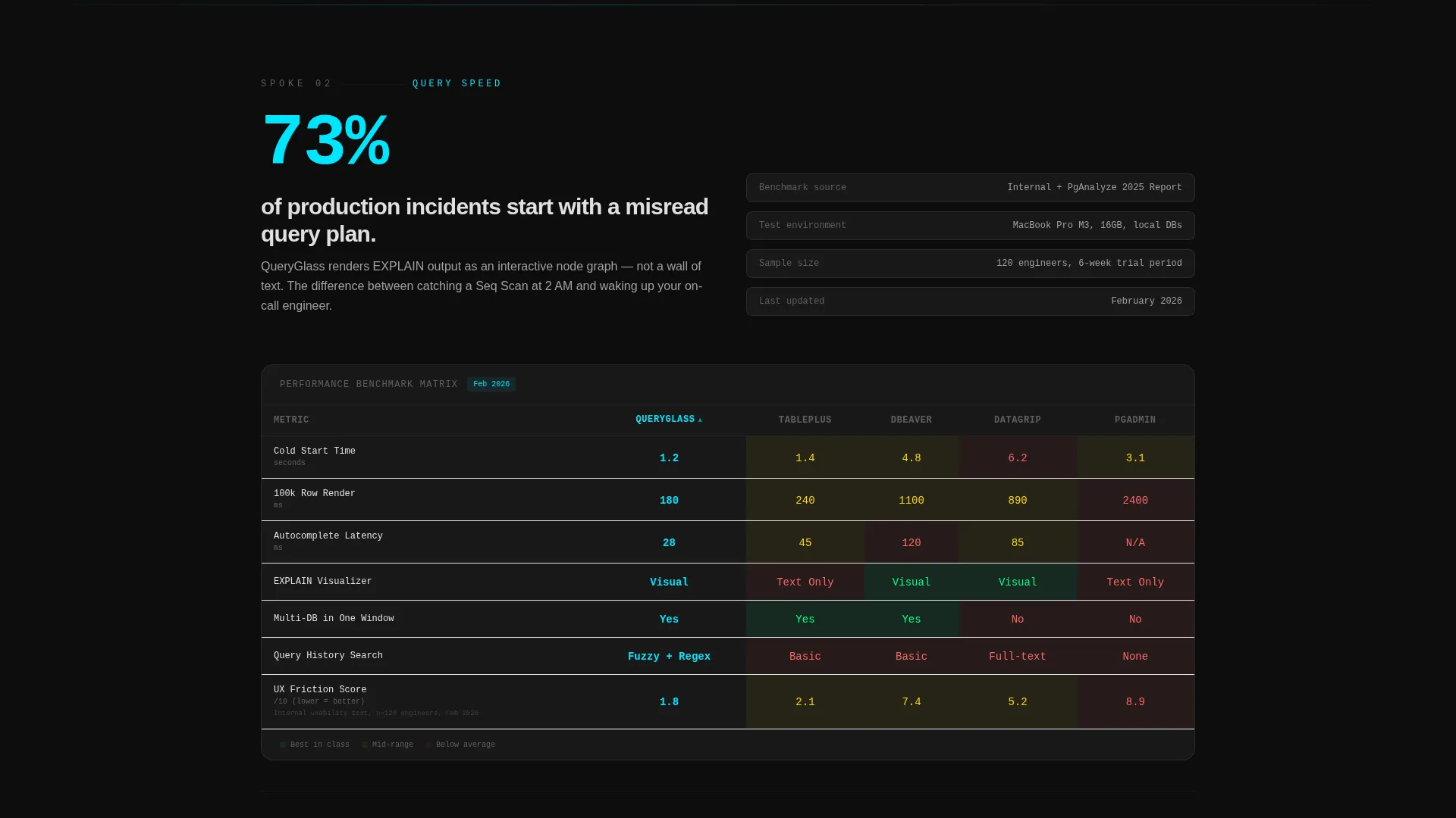
Each spoke section opens with a bold stat or real-world benchmark, then unfolds a structured comparison matrix. The layout places the featured product in the left column with competitor columns across the top, covering feature presence, latency benchmarks, and user experience friction scores side by side.
Dual Conversion Call to Action
The primary call-to-action button, labeled "Download Free & Compare," appears in the sticky nav and at the close of every spoke section. No form fields appear on the first click. A secondary path labeled "See Full Benchmark Report" sits behind an email gate for visitors who want the detailed data in PDF form.
Tech Glass Carbon Fiber Design System
The visual identity uses a layered background system: a pure carbon black base, frosted glass cards with backdrop blur floating above it, silver-white body text, and electric cyan reserved for interactive and glowing states. Every section transition is styled to feel like a panel sliding open on a brushed-metal rail.
Benchmark-Backed Copy Structure
Each section is structured as a research finding rather than a marketing claim. Bold statistics lead each spoke, followed by numbered comparison cells the visitor has already read. By the final call to action, the click feels like confirming a decision already made rather than taking a leap of faith.
Page sections overview
| Section | Purpose |
|---|---|
| Interactive Hero Preview | Show the query editor in action before any headline competes |
| Sticky Anchor Nav | Let visitors jump directly to any of the five spoke sections |
| Connections Spoke | Compare multi-database support across competing clients |
| Query Speed Spoke | Present latency benchmarks with a side-by-side matrix |
| Collaboration Spoke | Highlight team workflow features against alternatives |
| Security Spoke | Compare security controls and access management options |
| Pricing Spoke | Break down cost structures against competing tools |
| Spoke-Level call to action | Close each section with a direct download conversion prompt |
| Benchmark Report Gate | Capture emails from data-motivated buyers wanting the full PDF |
Design & branding system
The template uses a Tech Glass theme layered over a Carbon Fiber color system. The result is a dark, precise interface that feels authoritative to a technical audience without looking cold or generic.
- Color palette: deep carbon black (#0D0D0D) as the base, woven graphite (#1A1A2E) for card backgrounds, frosted glass panels (#FFFFFF12 over blur), silver-white (#E0E0E0) for body text, and electric cyan (#00E5FF) strictly for interactive states and data highlights
- Typography uses tight uppercase monospace for the hero tagline, with readable proportional text for all body sections
- Visual transitions between sections are styled as brushed-metal panel slides, reinforcing the cockpit-instrument feel throughout the scroll
Mobile & speed optimization
The layout is structured to remain usable and readable on smaller screens while preserving the visual weight of the Carbon Fiber design system.
- Frosted glass cards and the comparison matrices are designed to reflow cleanly on narrower viewports
- The sticky anchor nav collapses gracefully so it does not crowd the viewport on mobile devices
- The hero editor frame scales with the viewport, keeping the syntax-highlighted preview legible without horizontal scrolling
How this template helps you convert
The conversion logic is built directly into the scroll flow. Visitors are never more than one viewport away from a clear action, and every call to action is backed by a comparison cell they just finished reading.
- The hero section shows the product interface immediately, establishing credibility before any claim is made, so skeptical technical visitors stay rather than bounce.
- Each spoke section closes with the "Download Free & Compare" button directly below fresh benchmark evidence, so the action follows naturally from the proof rather than interrupting it.
- The secondary email-gate path captures high-intent buyers who want more data before deciding, giving the template two distinct conversion channels from a single scroll.
Other information about this template
This template is designed specifically for the database GUI client market, where technical buyers compare tools carefully before committing. The hub-and-spoke structure with an Industry Report creative direction suits products that compete on measurable performance and feature depth.
- The comparison matrix layout is well-suited for positioning against established clients in the database management space
- The dual call to action approach supports both immediate converters and research-driven buyers in a single page flow
- The template style is classified as Hub and Spoke with Anchor Navigation, making it easy to extend or reorder spoke sections without redesigning the full layout
- The Carbon Fiber color system and Tech Glass theme are cohesive enough to work for any dark-mode developer tool, not just database clients
Theme
Tech Glass
Creative direction
Industry Report
Color system
Carbon Fiber
Style
Hub & Spoke (Anchor Nav)
Direction
Comparison/Versus
Page Sections
Interactive Query Editor Hero
Sticky Five-spoke Anchor Nav
Benchmark-led Comparison Matrices
Dual Conversion Call to Action
Tech Glass Carbon Fiber Design System
Related questions
Can I add or remove spoke sections from the anchor nav?
Does the primary download button require a form to be filled out?
Can I replace the comparison matrix data with my own benchmarks?
Is this template suitable for a SaaS web app rather than a desktop client?
How do I customize the hero query editor preview?



