Bakery Vertical SaaS Booking Website Template
Queue is a hub-and-spoke bakery booking landing page template built for independent bakery owners who lose revenue to missed calls and untracked orders. The dark Carbon Fiber visual system and interactive header dashboard make the product feel real before visitors ever sign up. A single clear call to action drives free-trial conversions without a form on the page.
by Rocket studio
Quick summary
Queue is a single-page bakery booking system template designed around a click-through conversion flow. It uses a dark Carbon Fiber color palette, an interactive mock dashboard header, and a hub-and-spoke anchor navigation structure. Every spoke section follows a data-point, explanation, proof rhythm to move independent bakery owners toward a free-trial signup.
Who this template is for
This template is built for independent bakery owners who manage complex, time-sensitive order types with little or no scheduling infrastructure. If your day starts with sticky notes and ends with an unreturned voicemail, Queue speaks directly to that pain.
- Independent bakery owners handling wedding-cake consultations and custom-order timelines
- Bakers running wholesale morning delivery routes alongside retail pre-order windows
- Small bakery teams ready to replace phone-tag and paper logs with a structured booking pipeline
What problem this template solves
Most bakery booking problems are not about volume; they are about visibility. Orders get lost not because owners are careless but because no single system shows everything at once. Queue addresses that gap directly.
- Missed custom-cake deadlines caused by scattered notes and unreturned voicemails
- Revenue lost when Saturday pre-order windows close before demand is fully captured
- No clear way to show prospective customers that booking is easy and reliable
What you get with this template
Queue delivers a fully structured landing page that markets a bakery booking system through interactive visual proof, anchor-driven navigation, and a trust-building conversion flow. Everything on the page earns the click before asking for it.
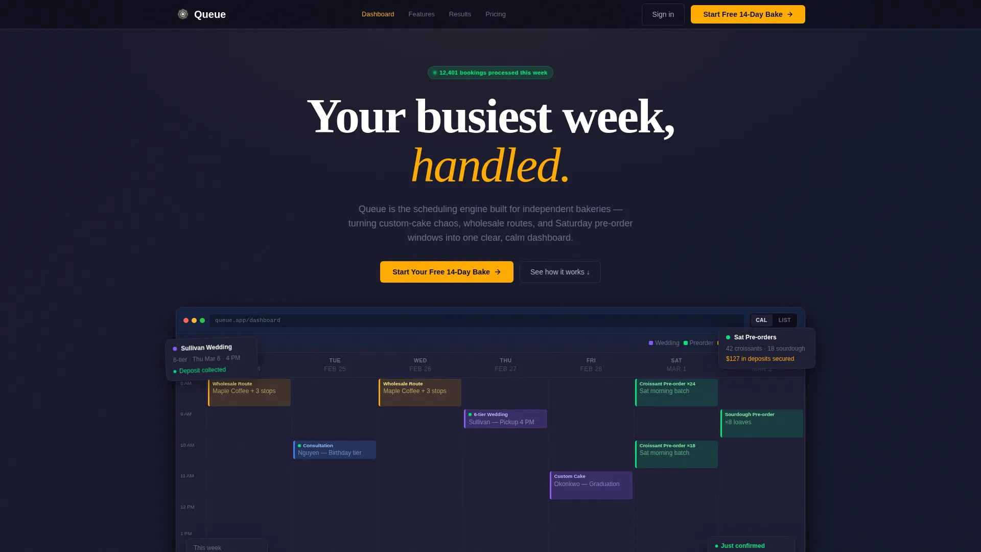
- A clickable interactive browser-frame dashboard in the header showing a real bakery week
- Five capability spoke sections, each opening with an oversized metric and a micro-interaction
- Live metric counters, a rotating bakery-owner quote strip, and a pinned anchor nav call to action
Feature list
Queue is built around a deliberate sequence of design and interaction decisions. Each feature below is drawn directly from the template brief.
Interactive Header Dashboard
The header places a fully clickable mock dashboard inside a browser frame. Visitors see color-coded calendar blocks for a wedding cake order, a cluster of Saturday croissant pre-orders, and a blinking green confirmation dot. They can drag a time slot, watch a confirmation toast animate, and toggle between calendar and list view, all before reading a single line of body copy.
Hub-and-Spoke Anchor Navigation
A sticky anchor nav sits at the top of the page and links directly to each capability spoke section. The primary call-to-action button, "Start Your Free 14-Day Bake," is pinned inside this nav so it is never more than a glance away. Visitors can jump to any feature without losing context.
Spec Sheet Spoke Sections
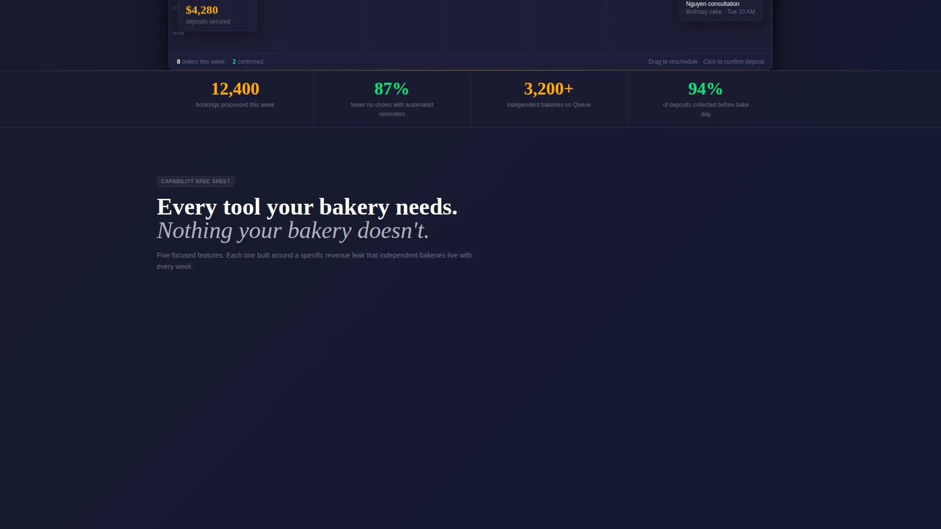
Five discrete capability cards cover Online Booking Widget, Automated Reminders, Deposit Collection, Order-Form Builder, and Wholesale Route Scheduler. Each card opens with a single oversized metric, follows with a tight explanatory paragraph, and closes with an embedded micro-interaction. The rhythm repeats across every section, building cumulative confidence.
Live Social Proof Elements
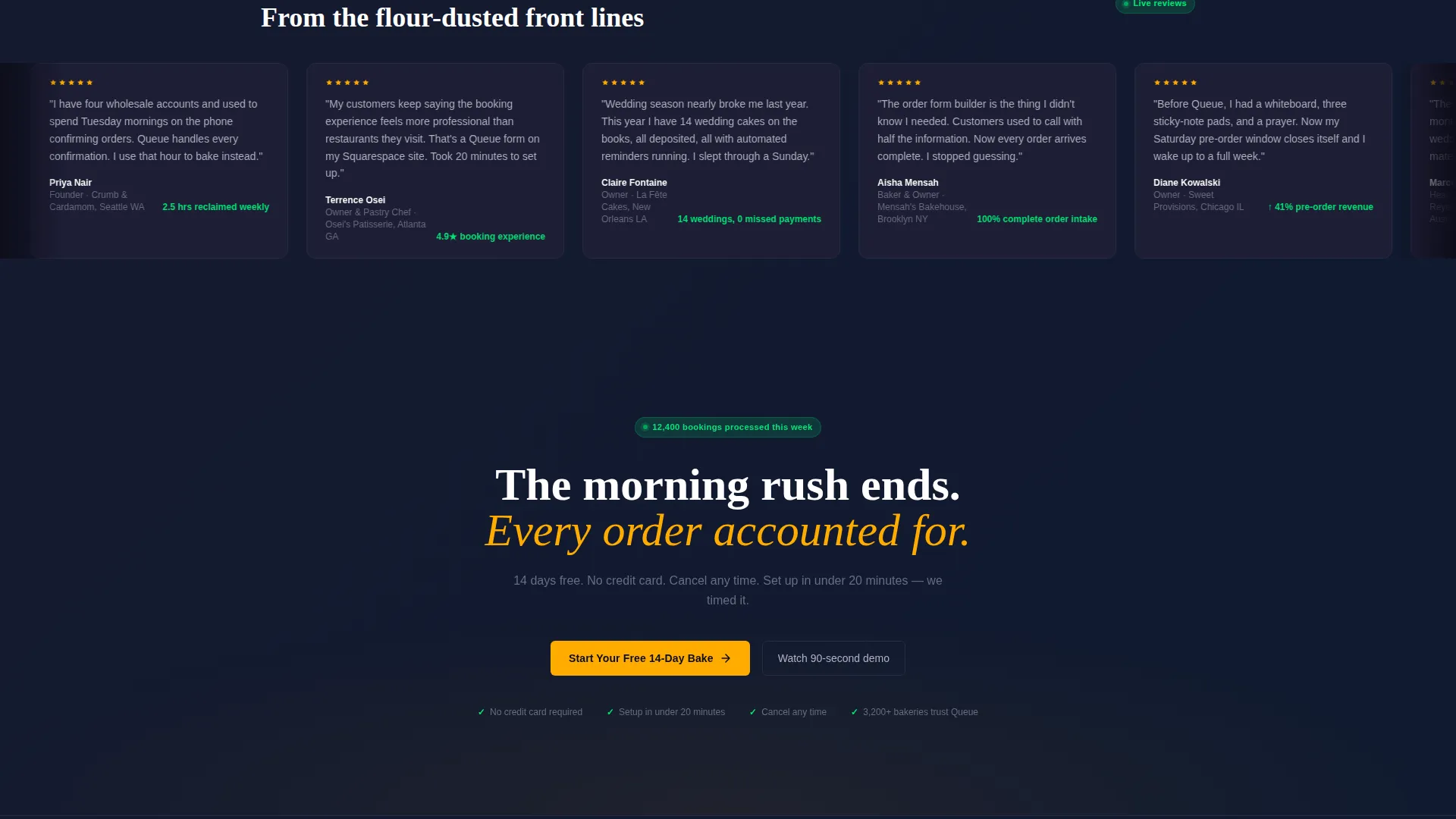
A live metric counter displays a rolling count of bookings processed that week. A rotating quote strip cycles through bakery-owner testimonials. Together, these elements establish trust without requiring visitors to read a long case study.
Click-Through Conversion Flow
No form appears on the landing page itself. Every call-to-action button carries visitors to a separate single-field email signup page. This keeps the landing page uncluttered and removes friction from the moment of intent.
Carbon Fiber Visual Identity
The dark graphite background, aluminum body text, status-green confirmation states, and hot-ticket amber call-to-action accents form a cohesive, high-contrast design system. The palette signals speed and professionalism without sacrificing readability.
Page sections overview
| Section | Purpose |
|---|---|
| Interactive Header Dashboard | Show a real bakery week through a clickable mock calendar and hook visitors immediately |
| Anchor Navigation Bar | Keep the primary call to action and section links pinned and accessible throughout the scroll |
| Online Booking Widget | Demonstrate frictionless customer-facing scheduling with an oversized proof metric |
| Automated Reminders Spoke | Show how the system reduces no-shows with a data point and embedded micro-interaction |
| Deposit Collection Spoke | Explain upfront payment capture with a single metric and contextual visual proof |
| Order-Form Builder Spoke | Highlight custom-order form flexibility for wedding cakes and specialty requests |
| Wholesale Route Scheduler | Show how recurring morning delivery routes are structured and tracked |
| Live Metric Counter | Build real-time trust with a rolling count of weekly bookings processed |
| Bakery Owner Quote Strip | Reinforce credibility through rotating peer testimonials |
| Closing call to action Section | Repeat the free-trial call to action and move visitors to the email signup page |
Design & branding system
The Carbon Fiber color system gives Queue a fast, focused visual identity that feels more like a modern point-of-sale terminal than a typical food-business website. Every color choice has a specific role and none of them overlap.
- Deep graphite (#1A1A2E) dominates all backgrounds, creating a dark and focused reading environment
- Machined aluminum (#B0B0C0) carries body text and divider lines for high legibility against graphite
- Status-green (#00E676) pulses on confirmation states to signal successful actions clearly
- Hot-ticket amber (#FFAB00) is reserved for every call-to-action button and live-data accent point
Mobile & speed optimization
The template is structured to remain scannable and actionable on smaller screens. The hub-and-spoke layout naturally adapts because each spoke section is self-contained and vertically stacked.
- The sticky anchor nav collapses cleanly so the pinned call to action stays reachable on mobile viewports
- Each spoke card is designed as a discrete unit, making vertical reflow straightforward without losing the data-point, explanation, proof sequence
How this template helps you convert
Queue is engineered as a click-through landing page, meaning every design and copy decision points toward one outcome: the free-trial signup click.
- The interactive header dashboard lets visitors experience the product before reading any sales copy, which builds intent through action rather than persuasion alone.
- The repeating call to action placement in the pinned nav and at the close of every spoke section means a visitor who becomes ready at any point in the scroll can act immediately without searching for a button.
Other information about this template
Queue fits within the broader Bakery Vertical SaaS category, a growing segment of tools built specifically for food-production businesses that have outgrown generic calendar apps. The template is tagged under the Technology category and is designed to market software products in that niche.
- The Startup Velocity theme keeps the visual language modern and product-forward rather than rustic or craft-focused
- The hub-and-spoke template style is well suited for SaaS landing pages where multiple features need individual attention without separate pages
- The click-through landing page direction means the page itself carries no form fields, keeping the experience clean and the signup step isolated
- This template can support any bakery scheduling or appointment software product that shares a similar feature set and audience profile

Theme
Startup Velocity
Creative direction
Spec Sheet
Color system
Carbon Fiber
Style
Hub & Spoke (Anchor Nav)
Direction
Click-Through
Page Sections
Interactive Browser-frame Header Dashboard
Hub-and-spoke Anchor Navigation
Spec Sheet Spoke Sections
Live Metric Counter and Quote Strip
Click-through Conversion Flow
Carbon Fiber Visual Identity System
Related questions
Does this template include a working booking form?
Can I update the color palette to match a different brand?
Is the Wholesale Route Scheduler section included by default?
What makes the header different from a standard hero section?
How many sections does this landing page template include?



