Micro-SaaS & Developer Tools Booking Website Template
Queue is a social media scheduler landing page template built for creators, agencies, and brand managers who need to move fast. It features a glassmorphic dashboard preview, a live competitor comparison table, animated post counters, and three OS-detecting download calls to action. The design runs on a dark void and electric cyan palette that feels sharp, modern, and ready to convert.
by Rocket studio
Quick summary
Queue is a single-page app download landing page for a social media scheduling tool. It opens with an animated glass dashboard preview, drives urgency through a competitor comparison table, and closes with a full-width frosted call-to-action strip. Every section is designed to build confidence fast and send visitors straight to the app store.
Who this template is for
This template is built for founders, product marketers, and developers who are launching or repositioning a social media scheduling app. It speaks directly to the people who will use the product, so your landing page connects with them immediately.
- Solo creators who manage multiple social platforms from a single device
- Agency coordinators handling large volumes of client accounts on tight deadlines
- Direct-to-consumer brand managers who need precise timing for product launches
What problem this template solves
Most app landing pages either undersell the product or overwhelm visitors with features before earning their trust. Queue solves this by letting the comparison table do the persuading before the first call-to-action even appears.
- Visitors see exactly which features competitors are missing before they reach any call to action
- The page removes friction by skipping forms entirely and going straight to an app store tap
- Social proof counters and a live post ticker replace static testimonials with real-time credibility
What you get with this template
You get a complete, single-page layout that covers every stage of the download decision. The structure moves from curiosity to conviction without a single wasted section.
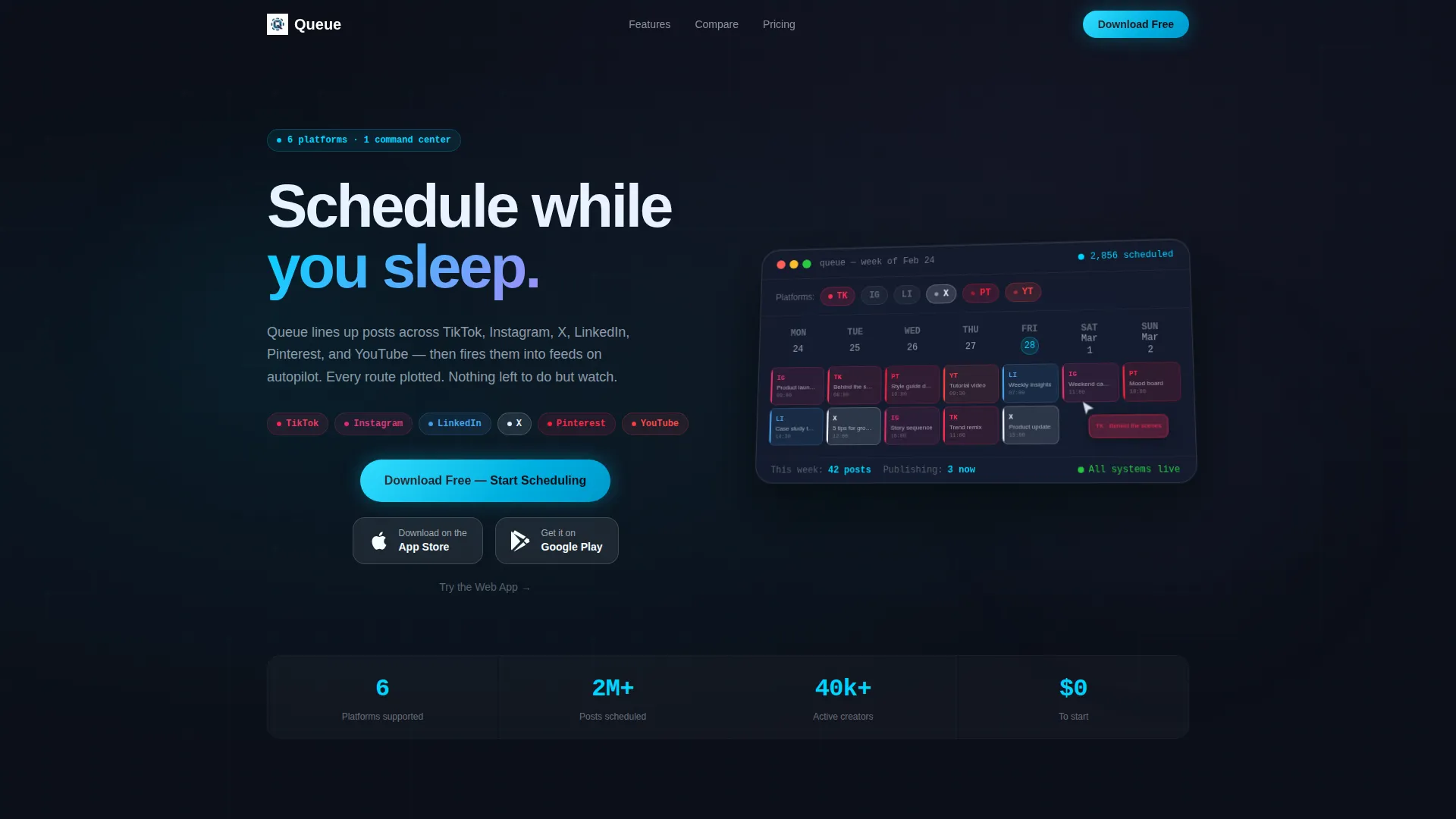
- An animated glassmorphic dashboard header with a draggable post preview and a live scheduled-posts counter
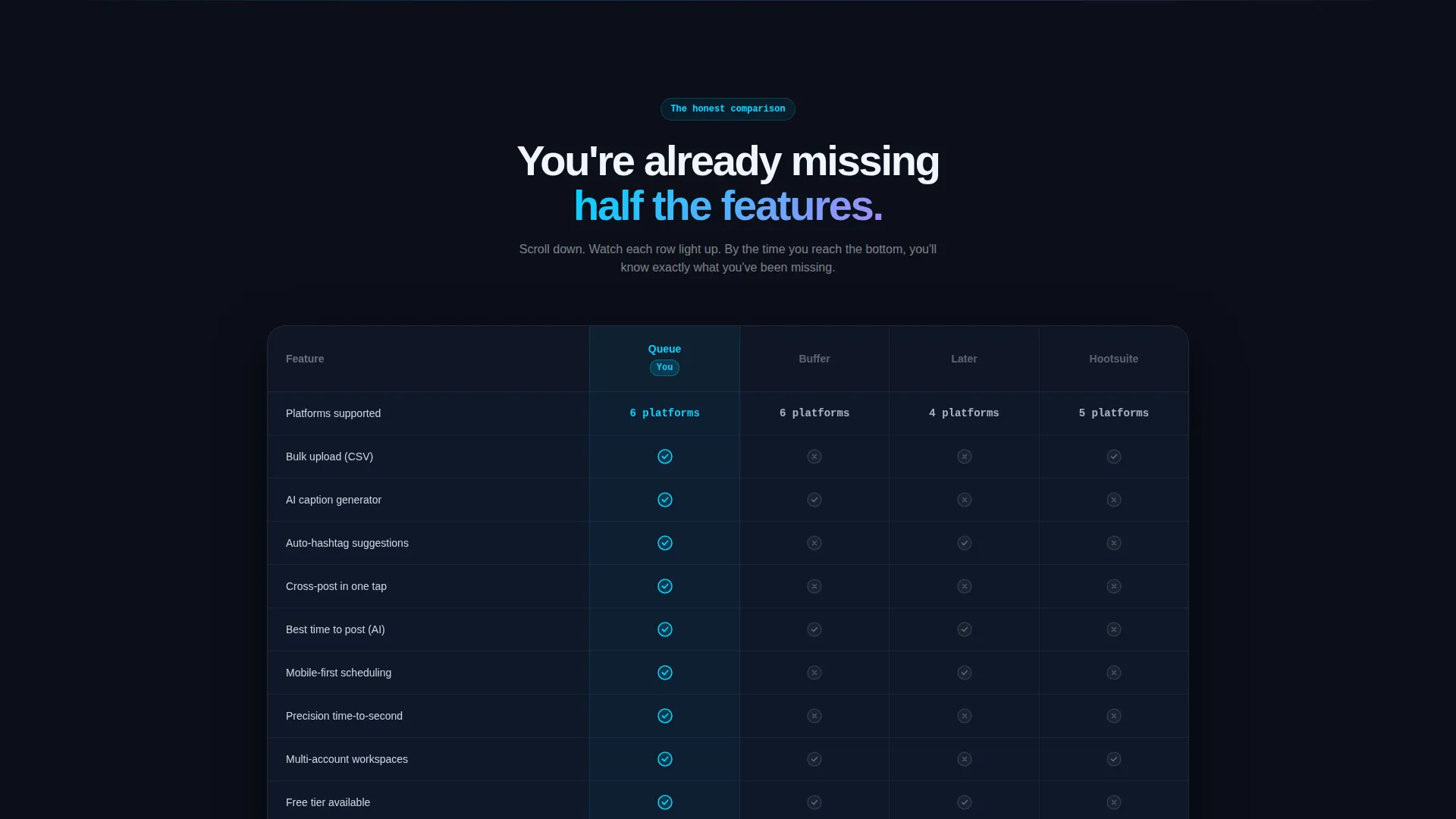
- A scrollable competitor comparison table with glowing cyan win columns and grayed competitor cells
- Three strategically placed OS-detecting calls to action with App Store and Google Play badge support
- A live tweet-style ticker showing posts published by users in the last hour
- A "Posts Scheduled Today" rolling counter and a phone mockup handoff section at the bottom
- A secondary "Try the Web App" text link path for desktop visitors who prefer a browser signup
Feature list
This section covers the core built-in components and design behaviors included in the Queue template.
Glassmorphic Dashboard Header
The header renders as a floating glass panel set against a deep void black background. It shows a color-coded weekly calendar with platform icons pulsing beside each scheduled slot. A cursor ghost-drags a post from one day to another, and the grid ripples to confirm the move. The three-quarter overhead camera angle gives the frosted layers visible depth.
Competitor Comparison Table
A structured feature table compares your app against three named competitors. Rows cover capabilities such as bulk upload, AI caption generation, auto-hashtag, and cross-posting. Columns glow electric cyan where your app wins and go gray where competitors fall short. Each row animates into view as the visitor scrolls, building a growing sense of advantage.
OS-Detecting Download calls to action
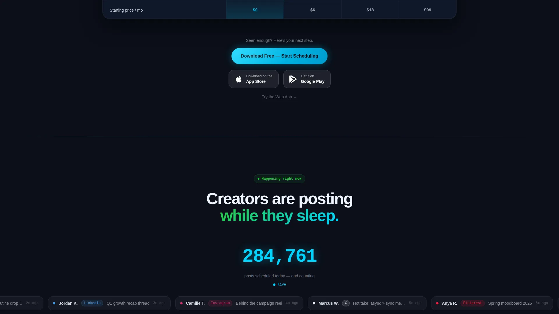
The primary call-to-action reads "Download Free - Start Scheduling" and appears in three locations: the sticky top bar, mid-page after the comparison table, and the final full-width frosted glass strip. Each instance detects the visitor's operating system and displays the matching App Store or Google Play badge. No form fields are required.
Live Activity Social Proof
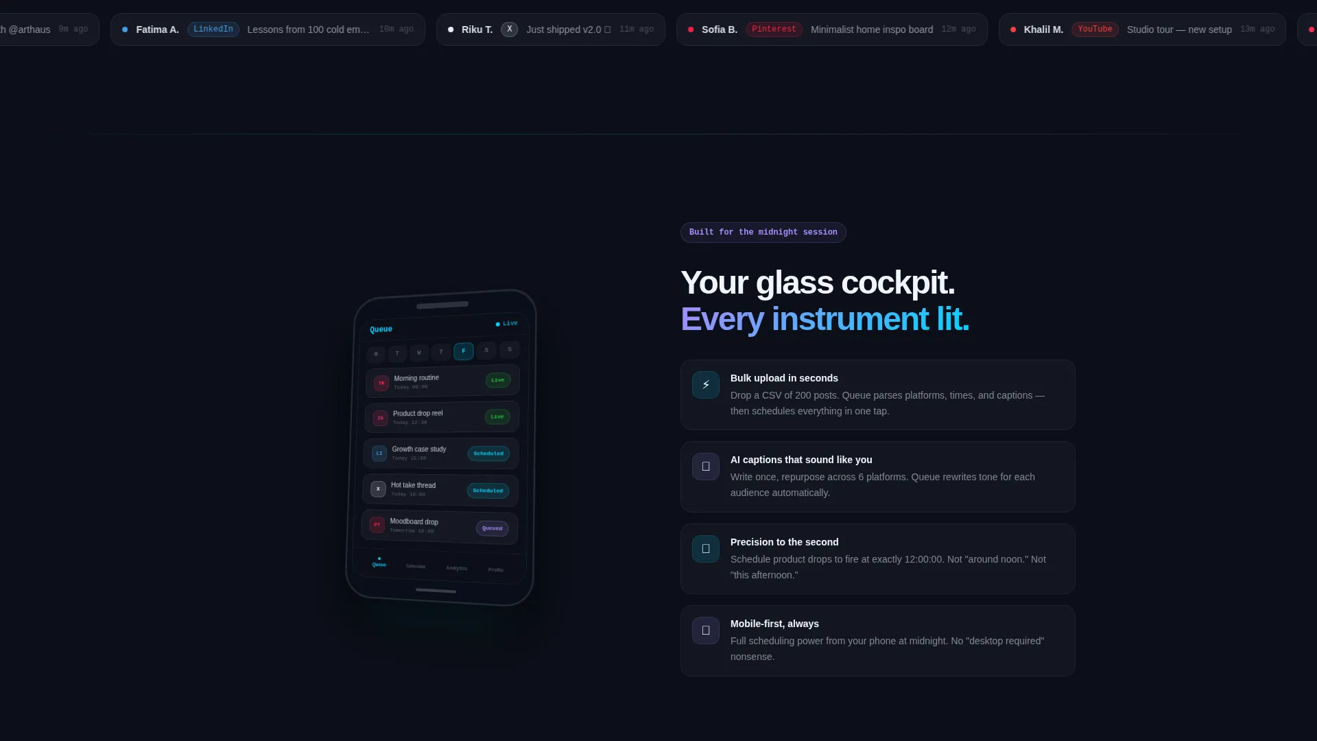
A tweet-style ticker scrolls recent posts published by real users in the last hour. Below it, a "Posts Scheduled Today" counter rolls upward with comma-separated formatting. These two elements replace static testimonials with motion-based credibility that feels immediate and authentic.
Phone Mockup Handoff Section
Near the bottom of the page, a phone screen tilted toward the viewer shows the app interface up close. The angle mimics someone physically handing the device to the visitor. This moment bridges the visual promise of the landing page with the tangible reality of using the app.
Secondary Web App Path
Below each primary call to action, a "Try the Web App" text link gives desktop visitors an alternative entry point. This path leads to a minimal signup requiring only an email address and password. The option exists without disrupting the primary app download flow.
Page sections overview
| Section | Purpose |
|---|---|
| Sticky Top Bar | Persistent OS-detecting download call to action |
| Dashboard Header Panel | Animated glass cockpit with live scheduling preview |
| Competitor Comparison Table | Feature-by-feature win visualization |
| Mid-Page call to action Strip | Second download prompt after table persuasion |
| Live Post Ticker | Real-time social proof feed |
| Scheduled Today Counter | Rolling number showing platform activity |
| Phone Mockup Handoff | Tactile app preview near page close |
| Full-Width Bottom call to action | Final frosted glass download strip |
Design & branding system
The visual identity is built around a Tech Glass theme using a glassmorphic color system. The palette creates contrast between deep darkness and sharp neon detail, which suits a product that promises precision and control.
- Deep void black (#0B0F19) as the base background, giving every glass panel a sense of depth
- Frosted translucent white (solid white at 8% opacity with a 12-pixel blur) for all card and panel surfaces
- Electric cyan (#00D4FF) for live-state indicators, glowing win columns, and all primary call to action elements
- Soft lavender (#A78BFA) as a secondary glow applied to hover states and toggle switches
Mobile & speed optimization
The template is built with app download as the primary goal, so the mobile experience is treated as the primary viewport. A visitor arriving from a social media ad on their phone should reach the download tap in two scrolls or fewer.
- The sticky top bar keeps the primary call to action visible at all times without blocking content
- The comparison table is structured to scroll horizontally on smaller screens without breaking layout
- The OS-detecting call to action logic works on both mobile and desktop without requiring visitor input
How this template helps you convert
Queue is designed around one outcome: getting a visitor to tap the download button. Every section is sequenced to reduce hesitation before that moment arrives.
- The animated dashboard header establishes product credibility in the first three seconds of the visit, before the visitor reads a single word of copy.
- The comparison table removes the need for the visitor to research competitors by presenting the advantage clearly and visually, with no form standing between them and the call to action that follows.
- The live ticker and rolling counter add momentum at the exact point where a visitor might otherwise bounce, replacing doubt with a sense of an active, growing user base.
Other information about this template
This template is categorized under Technology, specifically within the Micro-SaaS and Developer Tools subcategory, with a niche focus on social media scheduling. It is built as a single-page comparison table landing page and follows the Launch Energy creative direction, which means every scroll triggers a reason to act rather than simply delivering information.
- The template style is Comparison Table, making it well-suited for products competing in a crowded social media scheduler market
- The Tech Glass theme and glassmorphic design system align with the visual language common in modern productivity and scheduling app marketing
- The header concept is a Dashboard Preview, which is a proven approach for software products because it shows the product in motion before the visitor commits
- The landing page direction is App Download, so all call to action logic, badge placement, and secondary paths are optimized for that single outcome
Theme
Tech Glass
Creative direction
Launch Energy
Color system
Glassmorphic
Style
Comparison Table
Direction
App Download
Page Sections
Glassmorphic Dashboard Header
Competitor Comparison Table
Os-detecting Download Ctas
Live Activity Social Proof
Phone Mockup Handoff Section
Secondary Web App Entry Path
Related questions
Can I customize the competitor names in the comparison table?
Does the template include the live post ticker logic?
Is there a version without the app store badges for web-only products?
How many platforms does the scheduling preview show in the header?
Can this template be used for a product that is not yet launched?



