Industry Mobile Apps Professional Website Template
The Aisle smart AI grocery shopping app landing page template is a hub-and-spoke single-page layout built for AI-powered grocery apps. It combines an interactive app mockup, a problem-to-solution scroll arc, animated comparison tables, and a filterable integrations grid. The design runs on a dark iridescent palette with mint-driven calls to action, making every section feel sharp, modern, and conversion-ready.
by Rocket studio
Quick summary
This template gives you a complete, high-energy landing page for an AI grocery shopping app. It opens with an interactive phone mockup, walks visitors through a problem-to-solution story across five anchored spokes, and closes with a sticky call-to-action bar. The result is a page that earns the download before it asks for it.
Who this template is for
This template is built for founders, product teams, and developers launching or promoting an AI-powered grocery app. If your app helps people plan meals, build a grocery list faster, or save money on weekly groceries, this layout communicates that value immediately.
- App teams launching a grocery shopping app to a mobile-first audience
- Indie developers who want a polished, conversion-focused landing page fast
- Marketing leads who need to present AI tools clearly and persuasively to everyday shoppers
What problem this template solves
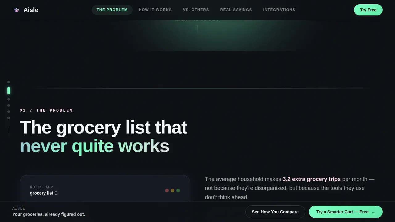
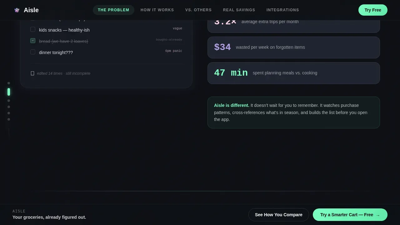
Most app landing pages bury the value proposition. Visitors bounce before they understand what the app actually does. This template leads with the problem your users already feel: a chaotic shopping list, forgotten produce, last-minute trips back to the grocery store, and a notes app that never keeps the family on the same page.
- Generic layouts fail to show the contrast between the old way and the new way
- Static pages cannot demonstrate AI-powered features the way an interactive mockup can
- Conversion suffers when there is no structured path from "I recognise this problem" to "I want this app"
What you get with this template
You get a fully structured, single-page layout with six content spokes, a fixed anchor navigation rail, a sticky conversion bar, and a secondary quiz-based conversion path. Every section is built to move a visitor from awareness to action without friction.
- A hero section with an interactive app mockup, typewriter headline, and anchor nav
- Five problem-to-solution spokes covering chaos, the AI engine, comparison tables, real savings, and an integrations directory
- A sticky bottom bar and post-comparison call-to-action placement for maximum conversion coverage
Feature list
This template includes every structural and interactive element listed in the source brief.
Interactive Hero Mockup
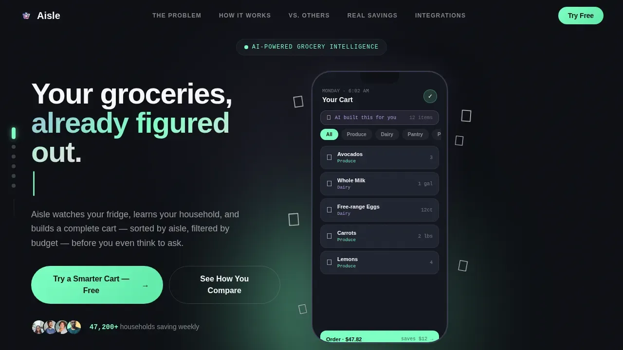
The header drops visitors into a phone-scale app preview. Floating grocery items drift and reorganise in real time as an invisible AI sorts them by store aisle, dietary preference, and budget. Visitors can tap categories and watch the cart rearrange itself, making the AI feel tangible before a single word of copy is read.
Anchor Navigation Rail
A fixed vertical spoke rail sits on the left side of the page. Glowing mint dots mark each anchor point. Visitors can jump between the chaos section, the AI engine diagram, the comparison tables, the real savings showcase, and the integrations grid without losing context.
Self-Building AI Engine Diagram
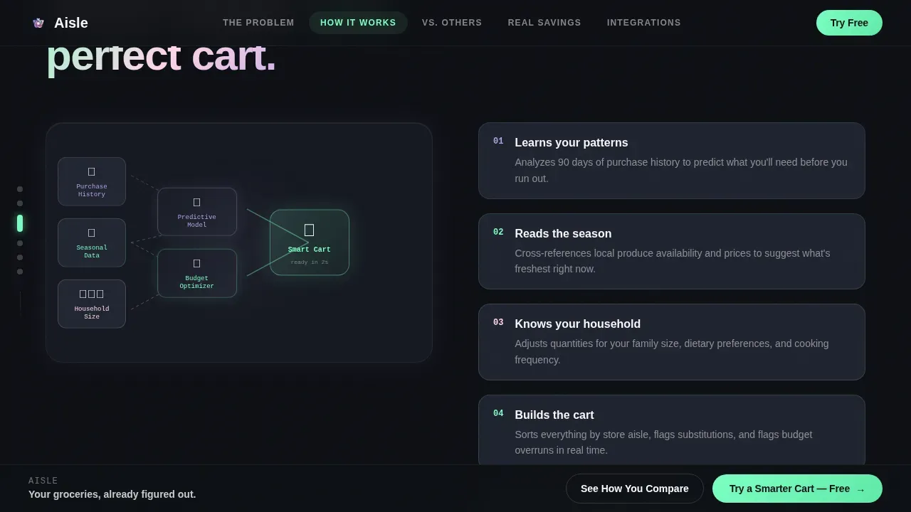
The second content spoke reveals how the app works through a visual diagram that builds itself as the visitor scrolls. It maps how purchase history, seasonal data, and household size feed into predictions, turning an abstract AI concept into something a tired parent can understand at 6 AM.
Animated Comparison Tables
Three side-by-side tables compare the app against traditional grocery apps, handwritten paper lists, and meal kit subscriptions. Animated checkmarks land with satisfying weight as the visitor scrolls into view. This is where the competitive advantage becomes undeniable.
Savings Quiz Conversion Path
A secondary conversion flow asks three quick questions: household size, weekly grocery spending, and biggest frustration. The app generates a personalised savings estimate before prompting the download. This path earns the click by showing the visitor their own inefficiency first.
Filterable Integrations Directory
The final spoke lays out store logos, payment methods, and smart-home connections in a discovery grid the visitor can filter. It signals depth, ecosystem trust, and the breadth of the app's real-world utility.
Page sections overview
| Section | Purpose |
|---|---|
| Hero Interactive Mockup | Demonstrate the AI cart in action and capture immediate attention |
| The Chaos Spoke | Surface the pain of a disorganised grocery shopping list |
| AI Engine Diagram | Explain how artificial intelligence builds the grocery list automatically |
| Comparison Tables | Show the app's advantage over paper lists and rival apps |
| Real Savings Showcase | Display user cart screenshots with weekly savings highlighted |
| Integrations Directory | Build trust through a filterable grid of store and payment partners |
| Sticky Conversion Bar | Keep the primary call to action visible throughout the scroll |
Design & branding system
The visual identity follows a Directory and Discovery theme using an AI Iridescent colour system. Deep app-shell black dominates the background, letting iridescent gradients shift across cards and section dividers like a living interface. The overall effect is futuristic but organic, algorithmic but warm. Consistent branding through the colour palette and icon system builds professional credibility at every scroll depth.
- Background: deep app-shell black (#0D0F14) with holographic lavender (#B4A0E5) for feature highlights
- Active states and calls to action use shimmer mint (#7DFFC3); micro-interactions use soft opal pink (#FFD6E8)
- Typography pairs DM Sans for body readability with JetBrains Mono for data, numbers, and savings figures
Mobile & speed optimization
The template is built mobile-first because the target users are on their phones at 6 AM before the school run. Every section reflows cleanly at phone scale. The interactive mockup is rendered at phone-scale centre-screen to feel native in a mobile browser.
- Client-side animations use Intersection Observer and CSS transforms for smooth scroll-triggered effects
- Typewriter headline, floating grocery item animations, and self-building diagram are all designed to perform on mobile without heavy dependencies
- The anchor nav rail and sticky conversion bar remain usable on small screens without obscuring content
How this template helps you convert
A high-conversion landing page for an AI-powered grocery app emphasises speed, personalisation, and convenience. This template is engineered around that principle. It does not ask for the download until it has proven the value.
- The problem-to-solution arc walks visitors through the chaos of their current shopping routine before introducing the app as the logical, stress free answer, making the call to action feel earned rather than forced.
- The animated comparison tables create a clear, visual moment of competitive clarity right before the post-comparison call to action appears, converting visitors when their confidence is highest.
- The savings quiz generates a personalised result for each visitor, turning an abstract benefit into a specific number tied to their own grocery spending, which is the fastest way to build trust and prompt action.
Other information about this template
This is the Aisle smart AI grocery shopping app landing page template, designed for the grocery and food-tech niche within the broader Technology and Industry Mobile Apps category. It is a complete game changer for teams who need to communicate advanced features without overwhelming a non-technical audience.
- The template supports the full problem-to-solution arc without requiring a master chef brief or deep technical knowledge to customise
- The integrations directory grid makes it easy to show connections across different stores, payment platforms, and smart-home tools in one app
- The comparison tables are ready to demonstrate why the app is a game changer versus a handwritten list or a basic notes app
- The secondary quiz path acts like a personal assistant for the visitor, producing a savings estimate that makes the value of meal planning and smarter grocery shopping tangible
- Real-time updates on item availability, inventory tracking across pantry stock, and cereal aisle routing are all narrative-ready in the AI engine section
- The layout helps teams shop smarter as a concept by letting the page itself demonstrate convenience rather than just claiming it
Theme
Directory & Discovery
Creative direction
Problem→Solution Arc
Color system
AI Iridescent
Style
Hub & Spoke (Anchor Nav)
Direction
Comparison/Versus
Page Sections
Interactive AI Cart Mockup Hero
Five-spoke Anchor Navigation
Self-building AI Engine Diagram
Animated Comparison Tables
Personalised Savings Quiz
Filterable Integrations Discovery Grid
Related questions
What type of app is this template designed for?
Can I use this template without a development team?
How does the comparison section work in this template?
Does the template support a shared grocery list for multiple users?
Is this template suitable for a mobile app launch campaign?



