Quiet - Premium Luxury Landing Page Template
Quiet is a full-width immersive landing page template built for a quiet luxury subscription box. It opens on a scroll-jacked cinematic header, moves through a desaturating marketplace grid, and closes with a frictionless waitlist form. The Ruby & Chrome color system and suede-drawer pacing make every section feel considered, unhurried, and unmistakably premium.
by Rocket studio
Quick summary
Quiet is a single-page landing page template designed for a quarterly luxury subscription box. It pairs a scroll-jacked opening sequence with a material-rich marketplace grid and a minimal waitlist conversion form. The result is a page that earns the sign-up through atmosphere alone, before a single word of persuasion is needed.
Who this template is for
This template is built for founders and creative leads launching a high-end subscription product aimed at an audience that values discretion over spectacle. It suits brands whose product sells through restraint, provenance, and tactile storytelling rather than discount urgency.
- Founders launching a quiet luxury subscription box for affluent, taste-led audiences
- Creative directors who need a cinematic landing page that communicates brand world at first scroll
- Brand teams building waitlist momentum for a curated quarterly gift or personal indulgence product
What problem this template solves
Most subscription box landing pages rely on loud grids, countdown timers, and stacked benefit bullets. That approach alienates audiences who read those signals as noise. Quiet solves the mismatch between a premium product and the generic pages used to sell it.
- Replaces aggressive conversion tactics with atmosphere-first design that builds genuine desire
- Removes the visual clutter that signals mass-market and replaces it with weighted, intentional pacing
- Captures waitlist sign-ups through a frictionless single-field form, without cheapening the brand experience
What you get with this template
The template delivers a complete, single-page conversion experience from opening frame to waitlist submission. Every section is pre-built and carries the same dark-lacquer visual language throughout.
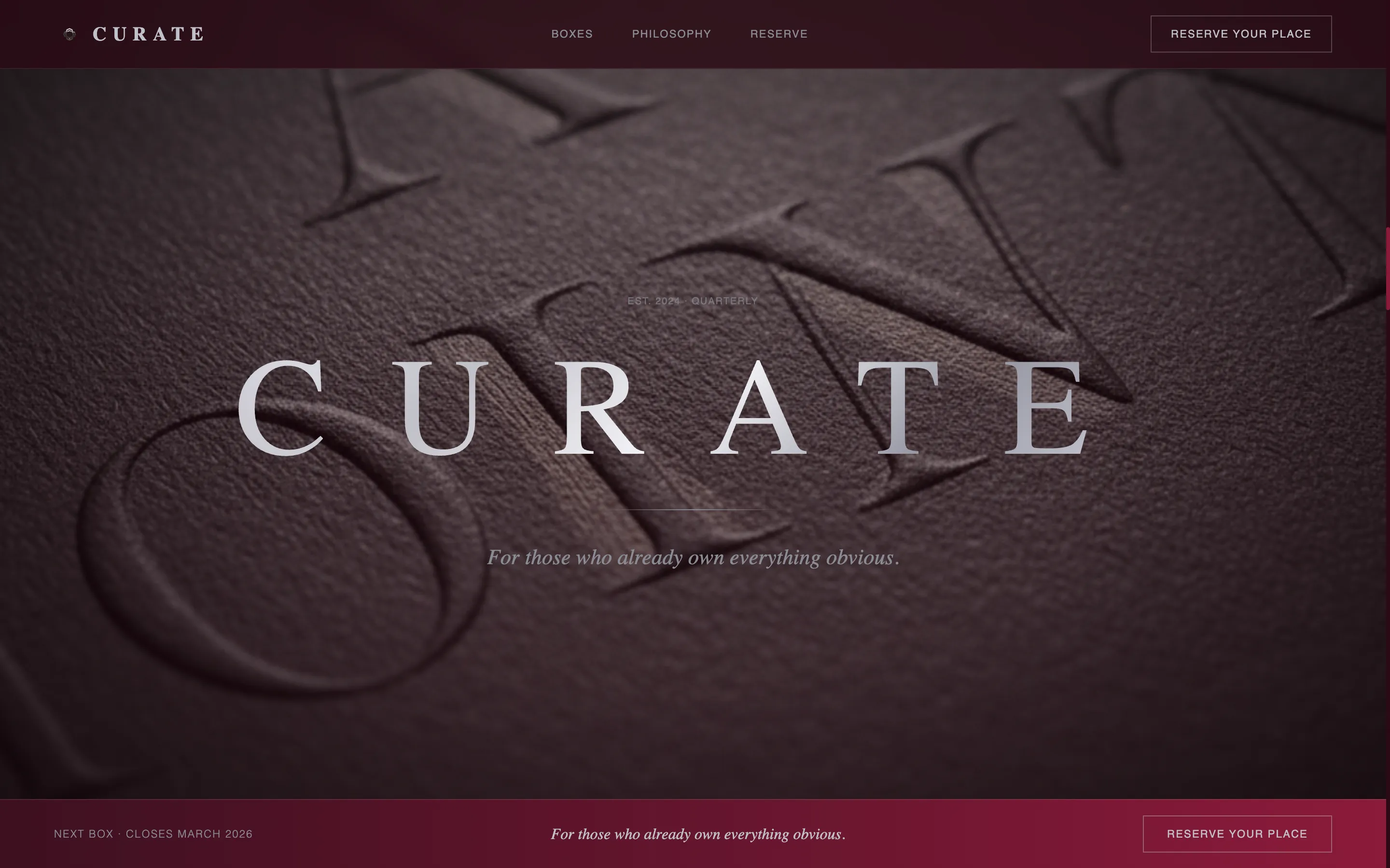
- A scroll-jacked hero sequence that opens on absolute black and reveals cashmere fiber textures through parallax motion
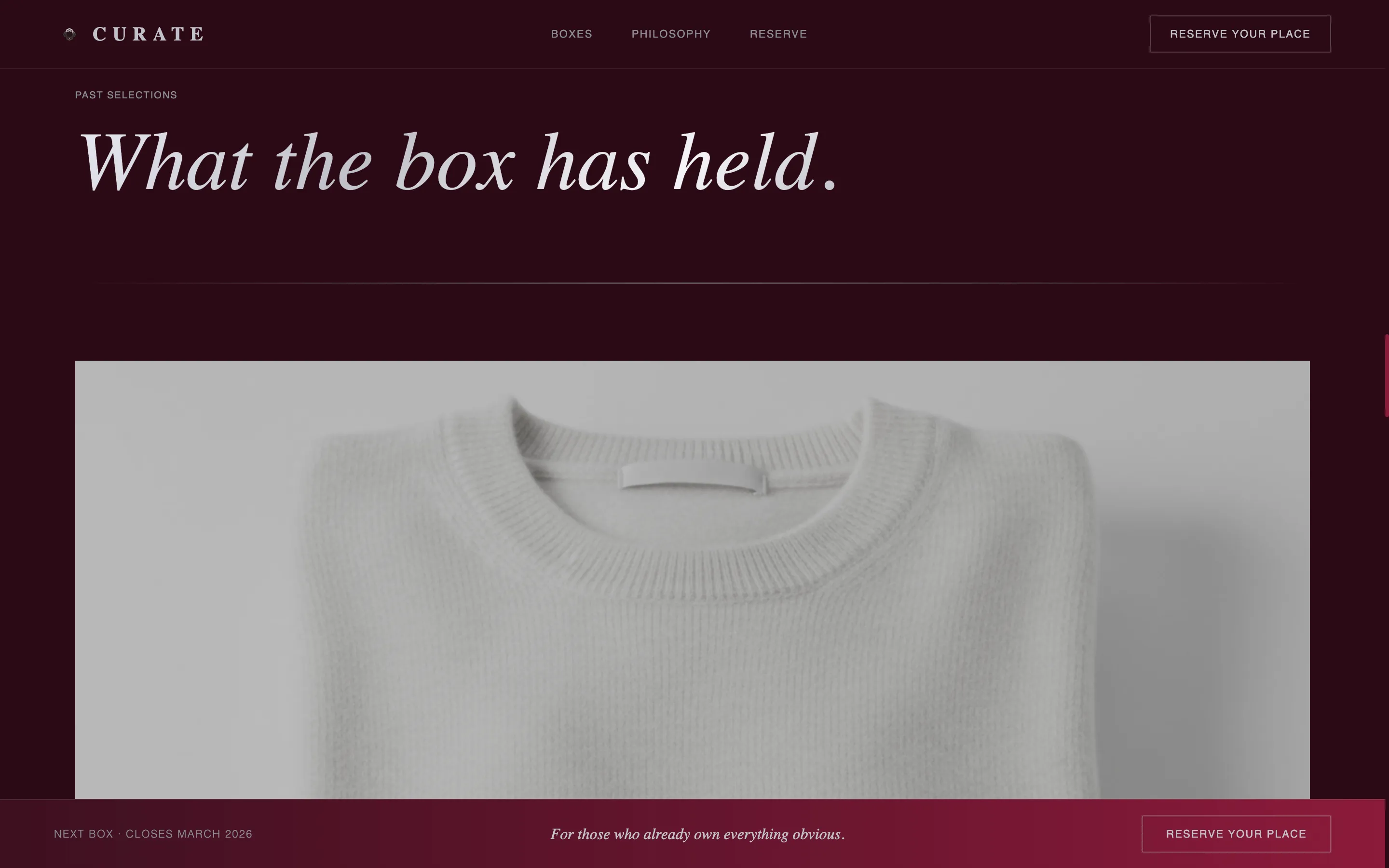
- A three-column past-box marketplace grid with hover states that desaturate on rest and bloom into ruby tones on interaction
- A fixed-bottom waitlist call to action with a single email field, a Gift or Personal toggle, and a secondary "Request a Preview" modal path
Feature list
This template is built around a set of purposeful design and interaction features. Each one serves the same goal: letting the product speak before the pitch does.
Scroll-Jacked Cinematic Header
The viewport opens on absolute black. As the visitor scrolls, a parallax sequence slowly pulls back through macro material textures, including cashmere fiber, grained leather, molten wax, and embossed paper. The single-word logotype then lands in chrome silver, wide letter-spaced, and holds for a breath before the rest of the page continues.
Desaturating Marketplace Grid
Three past-box stories fill the viewport as full-bleed photographs. Each image rests in a near-desaturated state and blooms into deep ruby tones on hover, expanding to reveal a short provenance narrative for one featured item. The grid alternates between density and single-image stillness to create an editorial cadence.
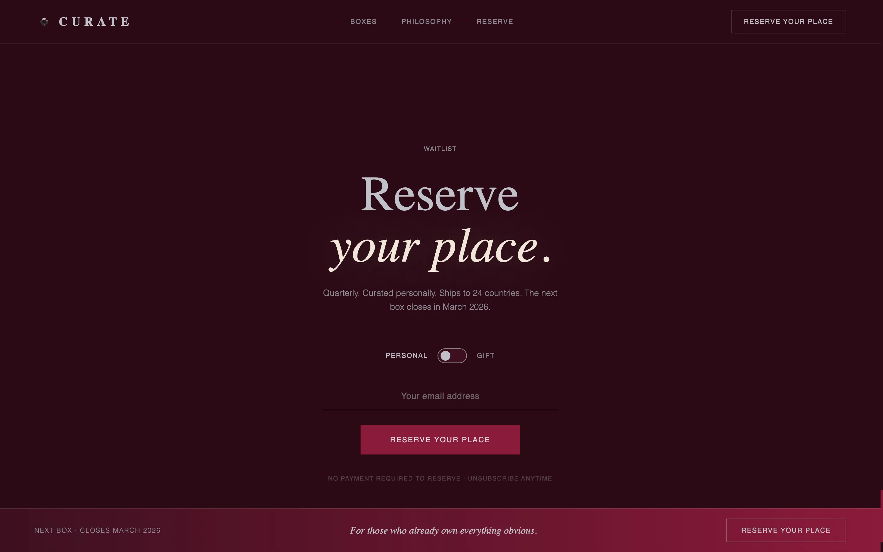
Fixed Waitlist Conversion Bar
After the scroll-jack resolves, a slim call to action bar fixes to the bottom of the viewport. It shows a single email input, a Gift or Personal toggle, and the "Reserve Your Place" call to action rendered in chrome silver on ruby. The form stays present but never intrusive.
Preview Modal with Founder's Note
A secondary call to action invites colder visitors to "Request a Preview." The modal displays three past-box detail photographs and a short founder's note. After viewing, the visitor is returned to the same single-field waitlist form, warming them without removing the conversion path.
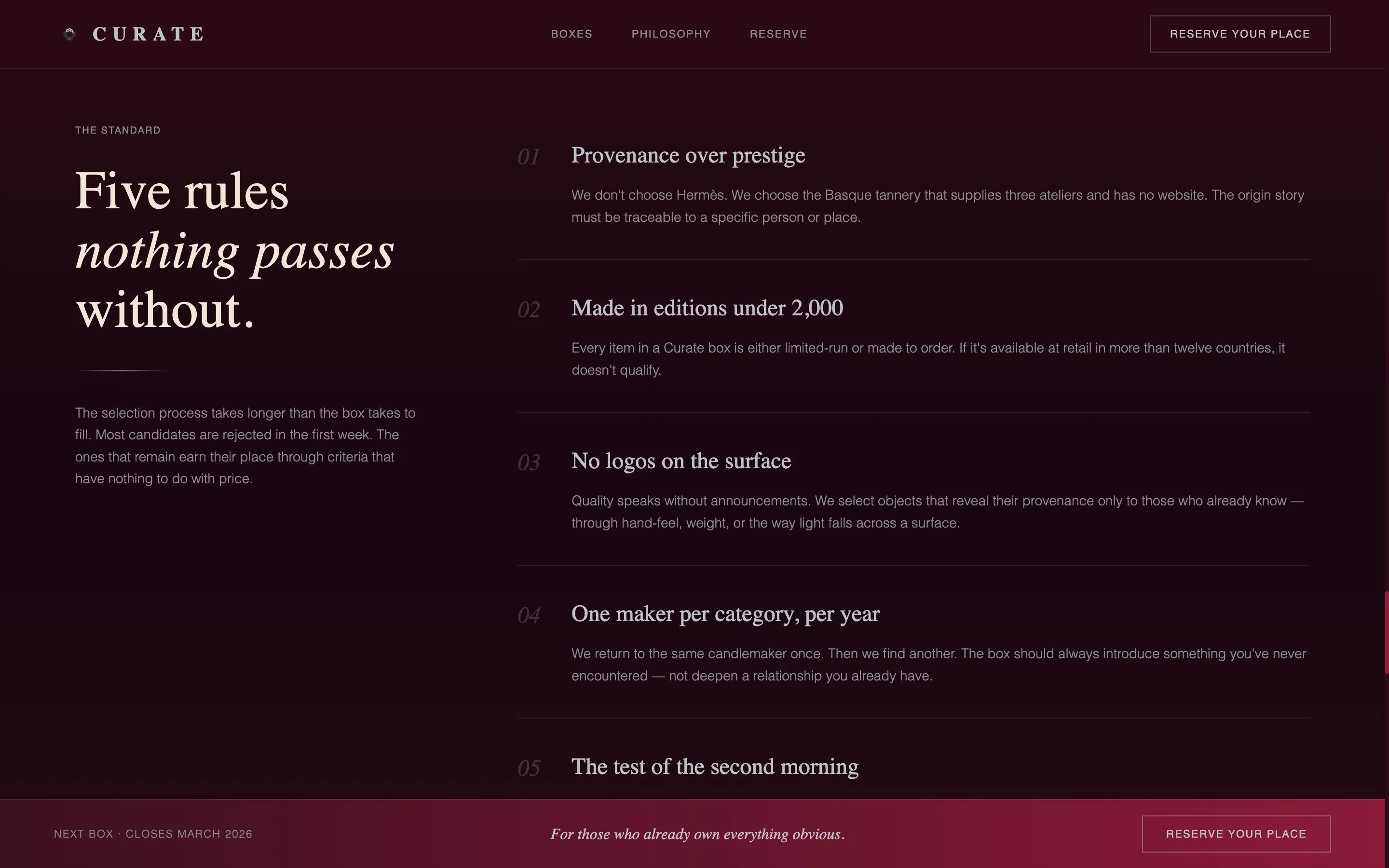
Ruby & Chrome Color System
The palette is built around near-black burgundy as the dominant background, liquid chrome silver for type and divider lines, deep ruby for hover states and accent pulls, and warm parchment reserved for a single mid-page text-highlight moment. The result reads like the interior of a dark, lacquered space with one warm light catching the detail.
Immersive Full-Width Layout
Every section runs edge to edge. There are no sidebar gutters or card containers to interrupt the sense of depth. The layout enforces a single visual flow from cinematic header to conversion form, keeping the visitor inside the brand world for the full scroll.
Page sections overview
| Section | Purpose |
|---|---|
| Scroll-jacked hero | Opens on black, reveals material textures through parallax |
| Logotype reveal | Lands chrome silver wordmark after cinematic sequence |
| Past-box grid | Three full-bleed stories with hover-activated ruby bloom |
| Provenance narrative | Expands on hover to show item origin detail |
| Preview request modal | Warms cold visitors with detail shots and founder's note |
| Fixed waitlist bar | Captures email with Gift or Personal toggle |
Design & branding system
The visual identity is built for restraint. Every color decision, typographic choice, and spacing rule serves the same purpose: communicating that this product is for people who notice what is missing rather than what is present.
- Near-black burgundy (#2B0A14) dominates all backgrounds, creating a sense of depth and enclosure
- Liquid chrome silver (#C0C0C8) carries all primary typography and divider lines, reading cool and precise against the dark ground
- Deep ruby (#8B1A3A) activates only on hover states and accent pulls, making every interaction feel like a reveal rather than a decoration
- Warm parchment (#F0E6DA) appears once at a mid-page text-highlight moment, functioning as a single sliver of warmth in an otherwise composed palette
Mobile & speed optimization
The full-width immersive layout and scroll-jacked sequences are designed to translate cleanly to smaller viewports without losing the sense of weight and pacing that defines the desktop experience.
- Parallax and scroll-jacked motion sequences are scoped to maintain visual coherence on mobile screen sizes
- Full-bleed photography sections reflow to preserve edge-to-edge impact on narrower displays
- The fixed waitlist bar and modal path remain accessible and functional across device sizes
How this template helps you convert
The page earns the conversion before the form appears. By the time the waitlist bar fixes to the bottom of the viewport, the visitor has already experienced the product through texture, material, and editorial pacing.
- The scroll-jacked header creates an immediate sense of discovery, holding attention through motion and material before any copy asks for anything
- The desaturating grid builds desire through restraint, making each ruby bloom feel like a reward earned by the visitor rather than a feature pushed by the page
- The frictionless form, asking only for an email and a single toggle, removes the last point of resistance at the moment conversion intent is highest
Other information about this template
Quiet is categorized under Fashion and Lifestyle, with a specific focus on the quiet luxury fashion segment and the luxury subscription box niche. It is designed as a full-width immersive template with a marketplace grid theme and an immersive visual creative direction. The waitlist or coming-soon landing page direction makes it well suited for pre-launch campaigns, limited-availability drops, and invitation-style product reveals. The template's intersection match across color system, header concept, template style, and conversion direction means every design layer reinforces the same brand signal.
- Template style: Full-Width Immersive
- Theme: Marketplace Grid
- Creative direction: Immersive Visual
- Header concept: Scroll-Jacked Experience
- Landing page direction: Waitlist and Coming Soon
- Category fit: Fashion and Lifestyle, Quiet Luxury Fashion, Quiet Luxury Subscription Box
Theme
Marketplace Grid
Creative direction
Immersive Visual
Color system
Ruby & Chrome
Style
Full-Width Immersive
Direction
Waitlist/Coming Soon
Page Sections
Scroll-jacked Cinematic Header
Desaturating Marketplace Grid
Fixed Waitlist Conversion Bar
Preview Modal with Founder's Note
Ruby & Chrome Color System
Immersive Full-width Layout
Related questions
What kind of product is this landing page template designed for?
Does the template include the waitlist form and the preview modal?
Can I adapt the color palette and photography to match my own brand?
Is this template suitable for a pre-launch or coming-soon campaign?
How does the scroll-jacked header work within the template?



