Micro-SaaS & Developer Tools Professional Website Template
Quizify is a dynamic split-screen landing page template built for quiz and assessment builders. It pairs a live product screenshot with kinetic stat typography, animated data visuals, and a no-form click-through flow. The template is designed to turn curious visitors into active users by leading them straight into a free interactive demo with one tap.
by Rocket studio
Quick summary
Quizify is a single-page template for quiz and assessment builder platforms. It uses a 50/50 split-screen layout, stats-first motion design, and a direct click-through structure to move visitors toward a free demo. Every scroll beat opens with a number, then proves it visually, creating a forward momentum that makes the product feel impossible to ignore.
Who this template is for
This template is built for teams and creators who need to show, not just tell, what their quiz platform can do. The design does the heavy lifting across multiple buyer types.
- Course creators who bundle knowledge checks and scored assessments into their sales funnels
- Human resources teams screening large applicant pools using automated assessments
- Marketing directors running personality quiz campaigns as high-converting lead magnets
What problem this template solves
Most software landing pages describe features in paragraphs. Visitors skim, disengage, and leave before they understand the value. Quizify solves this by leading every section with a hard number and then proving it with motion.
- Static pages fail to communicate live, data-driven products with energy and immediacy
- Form-gated demos add friction that kills curiosity before it becomes commitment
- Generic layouts do not reflect the branching, interactive nature of a quiz builder product
What you get with this template
You get a fully structured, visually animated single-page layout ready to represent a quiz and assessment platform. Every section is pre-wired to a specific conversion purpose.
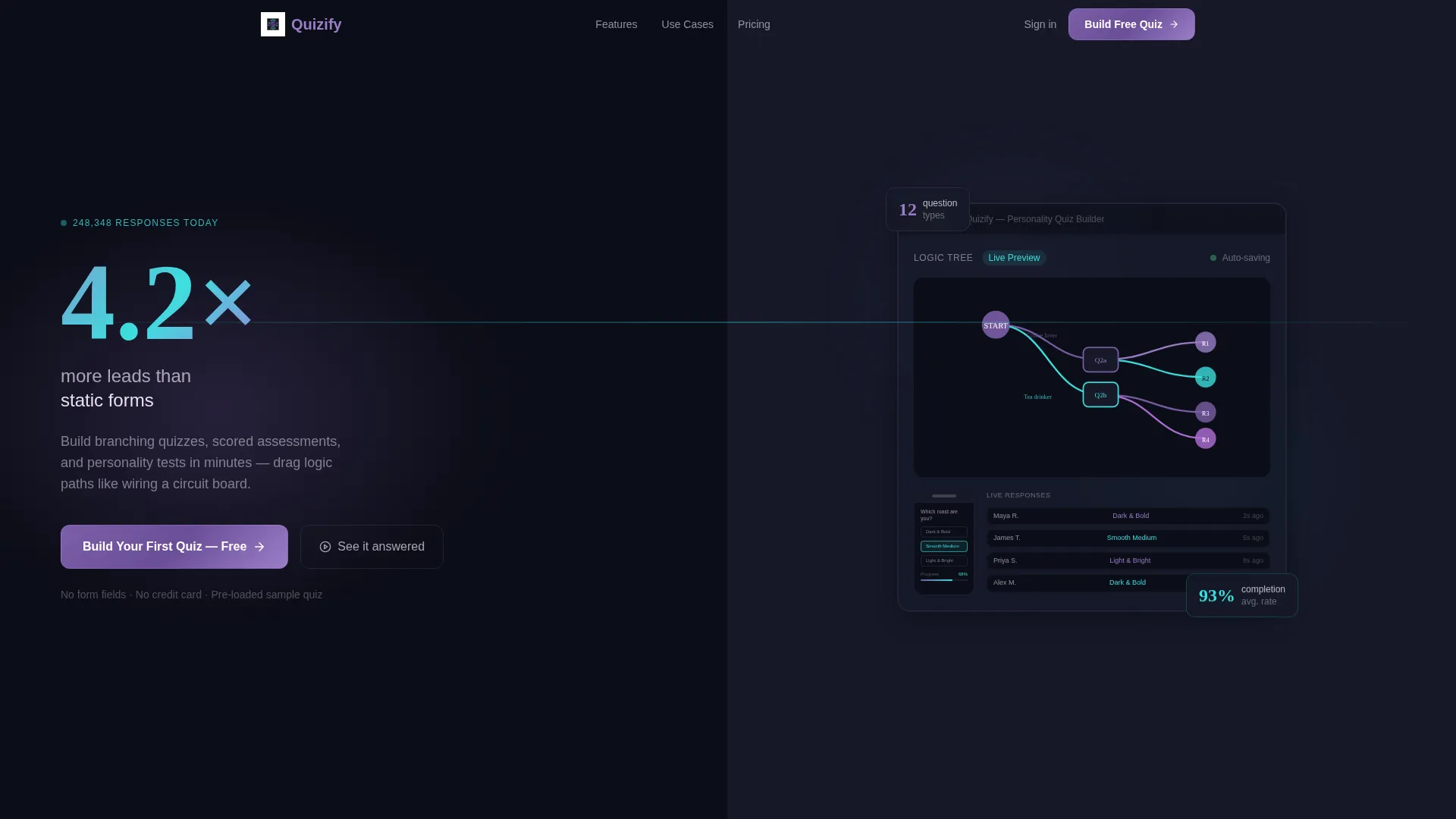
- A split-screen header with a product screenshot on the right and an oversized kinetic stat on the left
- An animated question-type showcase, a live-updating completion rate graphic, and a racing bar chart section
- Two strategically placed call-to-action buttons and a secondary demo link, all requiring zero form fields
Feature list
This template ships with purpose-built layout components matched to the specific energy of a real-time quiz platform.
Split-Screen Header with Kinetic Stat
The header divides the viewport evenly. The right half displays a product screenshot of the quiz builder mid-edit, showing a branching logic tree with violet and cyan node connectors. Nested inside is a phone mockup of a half-answered personality quiz with a 68% completion bar. The left half features oversized kinetic typography displaying "4.2x more leads than static forms" with a subtle counter animation that makes it feel live.
Stats-First Section Rhythm
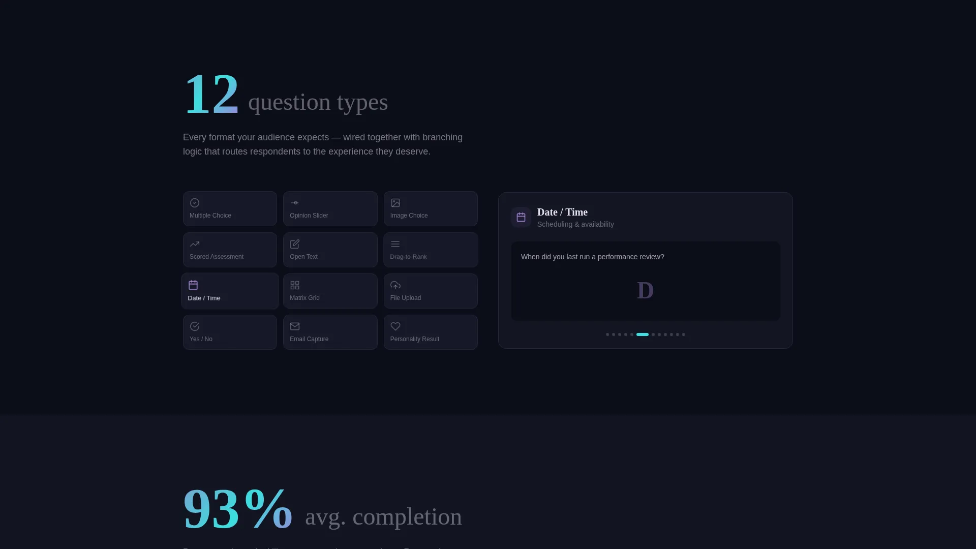
Every content section opens with a bold statistic before any explanatory copy appears. "12 question types" detonates first, then the right panel animates each type into view. "93% average completion rate" follows, paired with a live-updating bell curve graphic. This rhythm keeps the eye moving downward and builds compounding credibility.
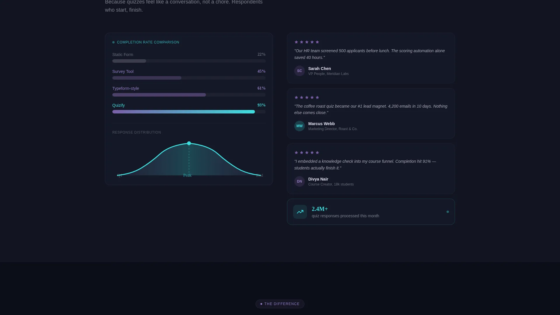
Animated Data Visuals
The template includes multiple motion components: sliding cards, filling percentage bars, and racing bar charts. These visuals are not decorative. Each one maps directly to a product claim, making abstract platform performance feel tangible and real-time.
No-Form Click-Through Flow
There are no input fields anywhere on the page. The primary call to action, "Build Your First Quiz, Free," routes visitors directly into the builder with a sample quiz pre-loaded. A secondary text link, "See it answered," lets visitors experience the end-user quiz side first before committing to building.
Dual Call-to-Action Placement
The primary call-to-action button appears twice: once beneath the header stat and once floating after the final comparison section. This placement catches both early-decision visitors and those who needed the full scroll to commit.
AI Iridescent Color System
The palette uses void black (#0B0D17) as the base, holographic violet (#7B5EA7) for primary actions and graph lines, shifting cyan (#3CDFDF) on hover states and progress indicators, and iridescent pearl (#E8E0F0) for card surfaces and text fields. The result feels like light refracting through a prism on a dark desk.
Page sections overview
| Section | Purpose |
|---|---|
| Split-screen header | Anchor attention with a live product visual and a bold lead-gen stat |
| Counter animation block | Reinforce credibility with a live-ticking response count |
| Question types showcase | Animate all 12 question types into view after the stat lands |
| Completion rate graphic | Pair the 93% stat with a live-updating bell curve visual |
| Bar chart race section | Show platform performance data through animated racing charts |
| Primary call to action block | Push visitors to start building with a zero-friction free demo link |
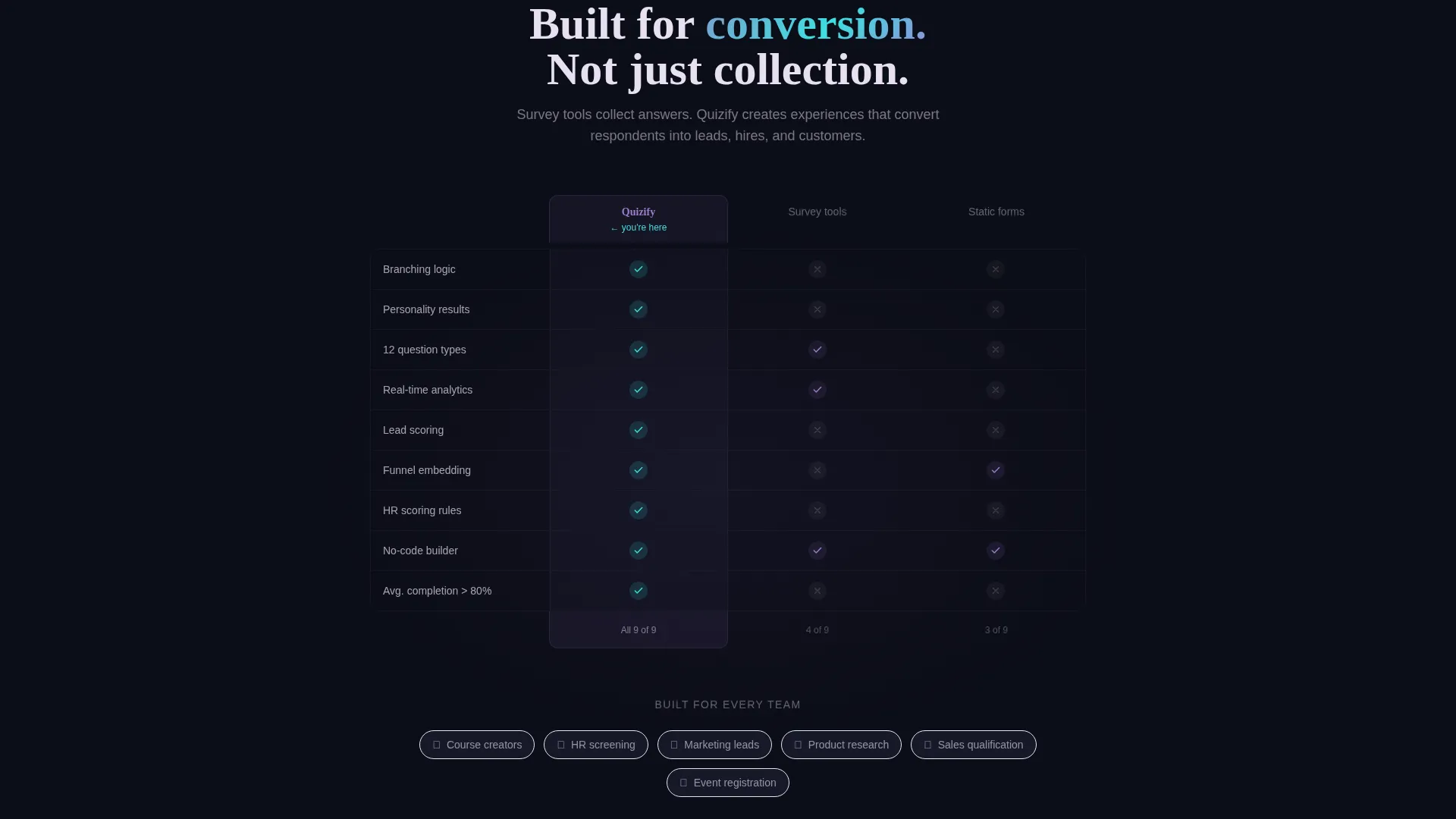
| Comparison section | Position the platform against static forms using visual contrast |
| Floating call to action button | Catch late-scroll visitors with a second "Build Your First Quiz" placement |
| Secondary demo link | Let hesitant visitors experience the end-user quiz side first |
Design & branding system
The template follows a Dynamic Motion theme built on an AI Iridescent color system. Every color choice is intentional, pulling the eye toward action while keeping dark backgrounds from feeling heavy.
- Void black (#0B0D17) anchors all backgrounds, giving luminous elements room to breathe
- Holographic violet (#7B5EA7) drives primary actions, graph lines, and node connectors throughout the layout
- Shifting cyan (#3CDFDF) activates on hover states and progress indicators, and iridescent pearl (#E8E0F0) surfaces cards and text fields
Mobile & speed optimization
The split-screen layout is structured to adapt cleanly across screen sizes without losing the motion-driven impact that defines the template.
- The 50/50 split collapses gracefully so stat typography and product screenshots stack legibly on smaller screens
- Animated components are scoped to their sections so they do not block content loading or disrupt scroll flow
- The no-form click-through structure removes layout weight from the conversion path on every device
How this template helps you convert
The entire page is engineered as a click-through landing page. Every design decision removes hesitation and shortens the path from first impression to first action.
- Stats-first section rhythm builds compounding trust before any feature explanation appears, so visitors arrive at the call to action already convinced
- Dual call-to-action placement means both quick deciders and careful researchers hit a conversion point at the natural end of their scroll journey
- The "See it answered" secondary link captures visitors who need to feel the product before they build with it, turning curiosity into a first meaningful interaction
Other information about this template
Quizify is built specifically for the quiz and assessment builder niche inside the broader Micro-SaaS and developer tools category. A few practical details worth knowing before you use it.
- The template is a single landing page, not a multi-page site structure
- The header product screenshot is designed to be swapped with your own quiz builder interface
- The kinetic stat typography and counter animation are layout components, and their displayed numbers can be updated to match your platform's real data
- The color system is fully documented with hex values, making it straightforward to apply or adapt to an existing brand
- This template fits naturally into technology product launches, platform rebrand campaigns, and conversion rate improvement projects for existing quiz tool landing pages
Theme
Dynamic Motion
Creative direction
Stats-First Impact
Color system
AI Iridescent
Style
Split Screen (50/50)
Direction
Click-Through
Page Sections
Split-screen Header with Live Product Visual
Stats-first Scroll Rhythm
Animated Data Visuals
No-form Click-through Conversion
Dual Call-to-action Placement
AI Iridescent Color System
Related questions
Who is the Quizify template designed for?
Does this template require visitors to fill out a form?
Can I update the stats and product screenshots in the template?
What makes this layout different from a standard software landing page?
Is this a one-page layout or a multi-page site?


