Privacy-First Enterprise Software Pricing Website Template
The Quote CPQ landing page template is built for privacy-first revenue teams who need to configure, price, and deliver complex proposals without exposing deal data to outside servers. Every calculation runs client-side, every document encrypts at rest, and every audit trail stays on infrastructure you own. The design pairs a mission-control aesthetic with a feature comparison matrix and interactive sandbox that lets buyers explore the product before signing up.
by Rocket studio
Quick summary
Quote is a configure-price-quote (CPQ) landing page template designed for enterprise teams that cannot afford a data breach at renewal season. It pairs a dark, mission-control visual identity with a structured feature matrix and a live sandbox. Visitors compare capabilities, toggle encryption modes, and start quoting free without leaving the page.
Who this template is for
This template speaks directly to revenue and operations professionals who handle sensitive commercial data. It is not a generic sales tool. It targets people who have already been burned by insecure vendor stacks and need evidence before they commit.
- Heads of revenue operations at mid-market software-as-a-service companies who need compliant quoting workflows
- Solutions engineers at defense contractors managing export-controlled quotes requiring regulatory compliance
- Chief financial officers at healthcare firms who have lived through vendor breaches during contract renewal cycles
What problem this template solves
Legacy configure-price-quote platforms send pricing logic, client names, and deal structures to third-party servers. That creates audit exposure, regulatory risk, and a quiet trust problem that compounds every quarter. This template addresses that gap head-on, in the page structure, the copy, and the product demonstrations.
- Deal data leaks to third-party infrastructure during standard quoting workflows on most platforms
- Approval chains and audit logs sit in vendor-controlled environments, outside the buyer's governance scope
- Buyers cannot evaluate privacy claims without seeing the product behave, so they default to the familiar risky choice
What you get with this template
You get a single-page layout that functions as both a marketing surface and a product preview. Every visual element reinforces the privacy-first positioning, and every interactive element asks the visitor to do something rather than just read.
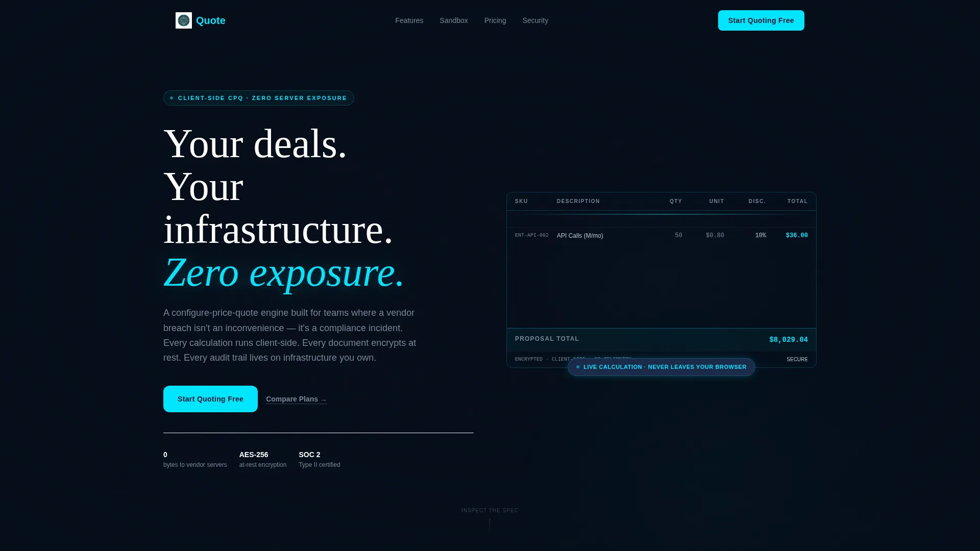
- A dark full-bleed header with a live-data grid rendered in phosphor cyan, showing SKUs, tiered pricing columns, and discount branching logic
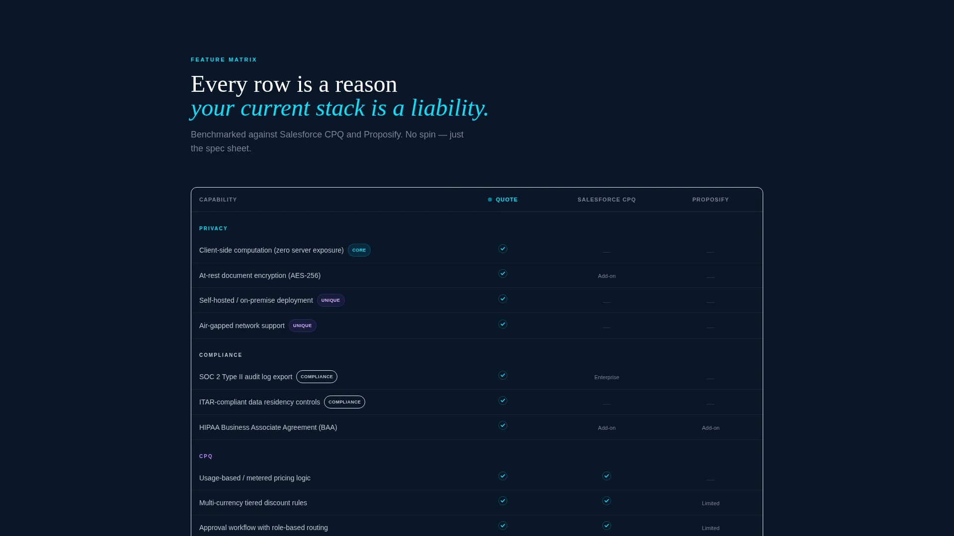
- A scrolling feature comparison matrix that benchmarks CPQ and privacy capabilities row by row against legacy vendors and generic proposal tools
- A freemium conversion flow with a single-step signup form, a qualifying toggle, and a secondary pricing grid styled identically to the product interface
Feature list
This section details the core components built into the template. Each one is drawn directly from the creative and structural brief.
Live-Data Header Grid
The header renders a working data grid at center frame. Rows display SKUs, tiered pricing columns, and branching discount logic in phosphor cyan lines and silver type. A radial glow pulses behind the grid, creating a reactor-core effect that makes the product feel operational from the first scroll position.
Scrolling Feature Comparison Matrix
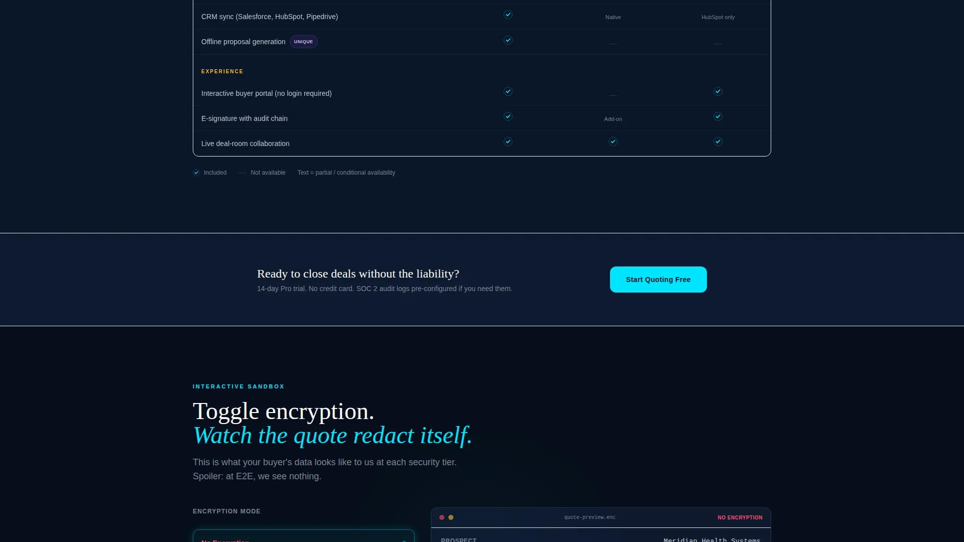
Past the header, visitors enter a structured comparison grid. Every row represents a privacy or CPQ capability, such as end-to-end encryption, approval workflows, usage-based pricing logic, or customer relationship management (CRM) sync. Columns benchmark Quote against legacy CPQ vendors and generic proposal tools. Checkmarks glow cyan; absent features stay dark and empty.
Interactive Encryption Sandbox
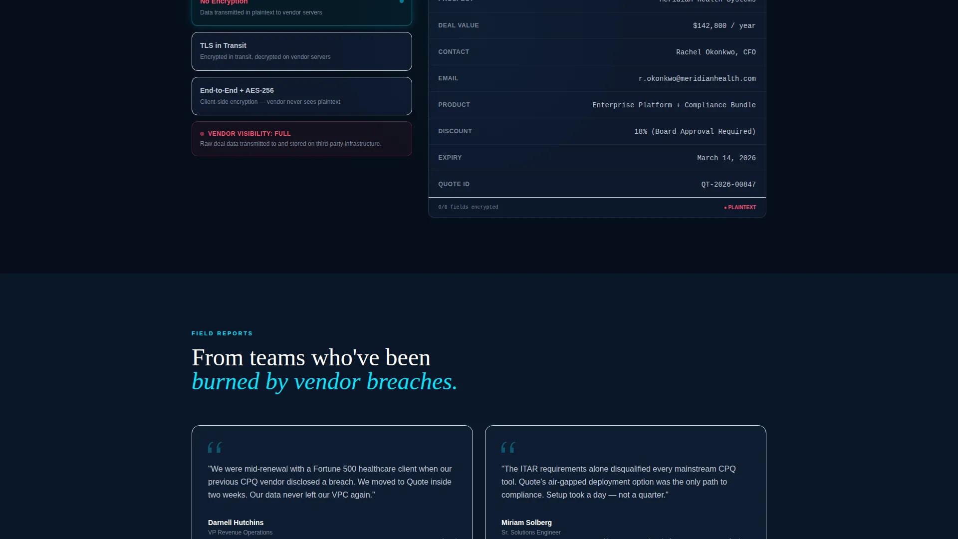
Midway through the scroll, the matrix dissolves into a sandbox section. Visitors can toggle encryption modes and watch a sample quote redact itself in real time. The sandbox is the core pitch mechanism. It lets prospects touch the product before any commitment is required.
Single-Step Freemium Signup
The primary conversion path is a lean, single-step form asking for work email, company name, and one qualifying toggle. The toggle asks whether the user needs SOC 2 audit logs, which doubles as a feature preference signal and a qualifying question for the sales team.
Pricing Data Grid Section
The secondary conversion path is a "Compare Plans" link that scrolls to a pricing grid styled identically to the product interface. The visual continuity between the marketing page and the product preview reinforces that the page itself is a demonstration of what Quote looks like in daily use.
Pinned Conversion call to action
A cyan-glow "Start Quoting Free" button is pinned to the navigation bar and repeated after the feature matrix and sandbox sections. The repetition ensures the primary call to action is always within reach regardless of scroll depth.
Page sections overview
| Section | Purpose |
|---|---|
| Full-bleed header | Introduce product with live pricing grid and headline |
| Feature matrix grid | Compare CPQ and privacy capabilities against competitors |
| Encryption sandbox | Let visitors interact with real-time quote redaction |
| Freemium signup form | Convert visitors with a single-step qualifying form |
| Pricing data grid | Show plan comparison in product-native visual style |
| Pinned nav call to action | Keep primary action accessible at every scroll depth |
Design & branding system
The visual identity follows a Directory and Discovery theme built on a Midnight Blue color system. The palette was designed to feel like a mission-control room operating at full capacity in low light. Every color choice reinforces the idea of precision, security, and controlled power.
- Abyssal navy (#0A1628) as the primary background, tactical slate (#1B2A4A) for card surfaces and data rows, phosphor cyan (#00E5FF) for interactive glows and hover states, and muted silver (#C0C7D3) for body text
- No stock imagery and no human faces anywhere in the layout; all visual interest comes from the live data grid, the glowing comparison matrix, and the ambient radial light effect behind the header
- The overall aesthetic is cold steel giving way to an elegant cockpit interior, designed to signal that security and usability can coexist in the same product
Mobile & speed optimization
The dashboard and data grid layout is structured to remain readable and navigable across screen sizes. The comparison matrix and sandbox sections are the most complex visual elements, so they are designed to scale without losing the core information hierarchy.
- Data grid rows and comparison matrix columns are structured for horizontal legibility, with visual hierarchy maintained at narrower viewport widths
- The pinned navigation call to action stays accessible at all scroll positions across device sizes, so the conversion path is never buried
- The single-step signup form is compact by design, reducing friction on smaller screens where long forms create drop-off
How this template helps you convert
The conversion strategy is built around evidence and interaction rather than persuasion through narrative text alone. Visitors arrive skeptical and leave with hands-on experience.
- The feature comparison matrix builds the case row by row, letting visitors arrive at the conclusion themselves rather than being told what to think about their current stack.
- The interactive sandbox turns a privacy claim into a live demonstration, removing the trust gap that abstract copy cannot close on its own.
- The freemium signup flow asks only three inputs and uses a qualifying toggle to reduce friction while gathering the information the sales team needs to follow up effectively.
Other information about this template
This template is part of a broader ecosystem of privacy-first enterprise software layouts designed for technology companies operating in regulated or high-sensitivity commercial environments.
- The template style is classified as Dashboard and Data Grid, making it suited for software products where the interface itself is the proof of value
- The creative direction is Feature Matrix, a format that performs well when the product's advantages are most visible in direct comparison rather than standalone description
- The theme is Directory and Discovery, which supports structured browsing and evaluation behavior common among enterprise buyers conducting vendor due diligence
- The landing page direction is Freemium and Trial, aligning the conversion model with software-as-a-service products that rely on product-led growth
Theme
Directory & Discovery
Creative direction
Feature Matrix
Color system
Midnight Blue
Style
Dashboard/Data Grid
Direction
Freemium/Trial
Page Sections
Live-data Header Grid
Scrolling Feature Comparison Matrix
Interactive Encryption Sandbox
Single-step Freemium Signup
Pricing Data Grid Section
Pinned Navigation Call to Action
Related questions
Who is this template designed for?
Does the template include the interactive sandbox component?
Can I customize the feature comparison matrix rows?
What conversion model does this template support?
Is this template suitable for regulated-industry use cases?



