Quotehub - Powerful Headless CPQ Landing Page Template
Quotehub is a modular card-grid landing page template built for headless Configure, Price, Quote (CPQ) platforms. It guides revenue operations and sales teams through a visual problem-to-solution arc, showcasing API-first quoting, nested pricing rules, and multi-channel quote delivery. The Tech Glass design and teal color system give it a polished, developer-credible look that earns trust before asking for an install.
by Rocket studio
Quick summary
Quotehub is a single-page, card-grid landing page template designed for headless CPQ platforms. It opens with a product screenshot header, walks visitors through a problem-to-solution arc across modular card rows, and closes with a clear app-download call to action. The Tech Glass visual style makes complex quoting infrastructure feel approachable and precise.
Who this template is for
This template is built for teams selling or positioning an API-first configure, price, quote platform to a technical and commercial audience. It speaks directly to the operators and decision-makers who own the quoting stack.
- Revenue operations leaders at mid-market SaaS and manufacturing companies
- Sales engineers and technical evaluators who want to inspect real API output before committing
- Founders or product marketers launching a headless CPQ tool to an integration-savvy buyer
What problem this template solves
Quoting tools that live inside a monolithic system create handoff problems. Deals stall between configure and checkout because pricing logic cannot travel cleanly to other systems. This template gives your platform a page that names those pain points directly and resolves them visually.
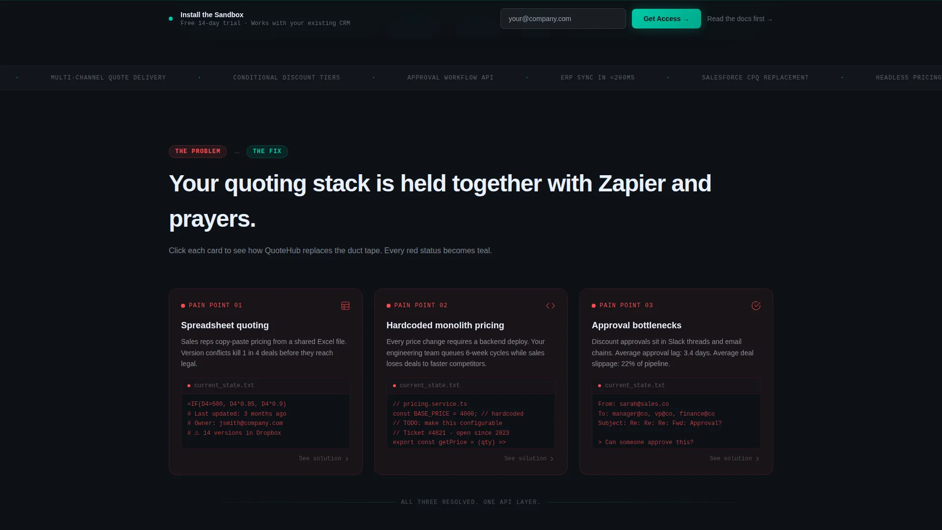
- Manual spreadsheet quoting, hardcoded pricing in legacy monoliths, and approval queue bottlenecks are shown as real, named problems
- Visitors see the broken workflow before they see the fix, making the solution feel earned rather than marketed
- The arc moves from individual pain to a full integration diagram, addressing both individual users and team-wide buyers
What you get with this template
The template delivers a complete, structured landing page ready to adapt for a headless CPQ product. Every section has a defined role in the buyer journey, and the visual system is consistent throughout.
- A frosted-glass card grid with animated problem-to-solution card transitions and red-to-teal status dot changes
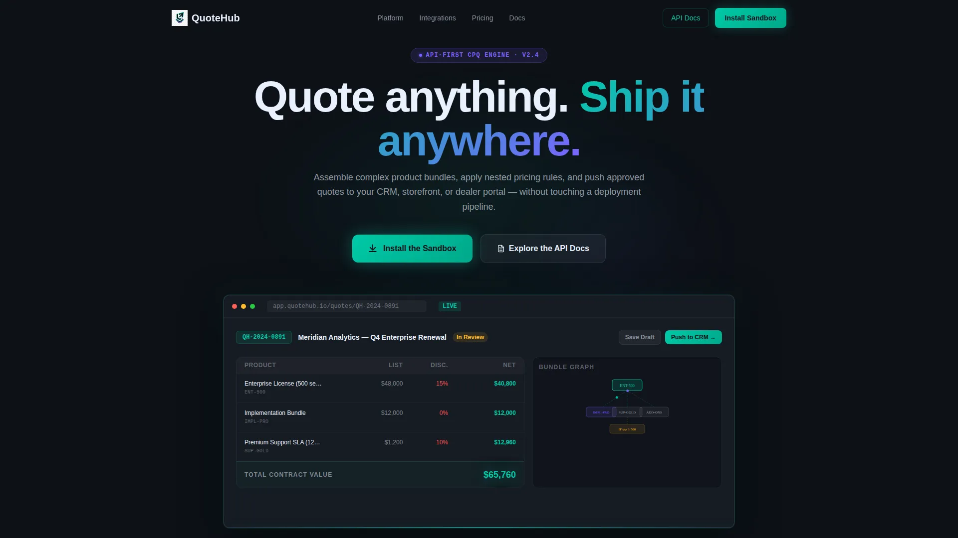
- A product screenshot header showing a live quote in progress with line items, a bundle dependency graph, and a live price total
- Two primary call-to-action placements: one beneath the header and one as a sticky bottom bar that activates after the third card row
Feature list
This template includes a set of purpose-built design and layout features grounded in the source brief. Each one supports a specific moment in the buyer journey.
Problem-to-Solution Card Arc
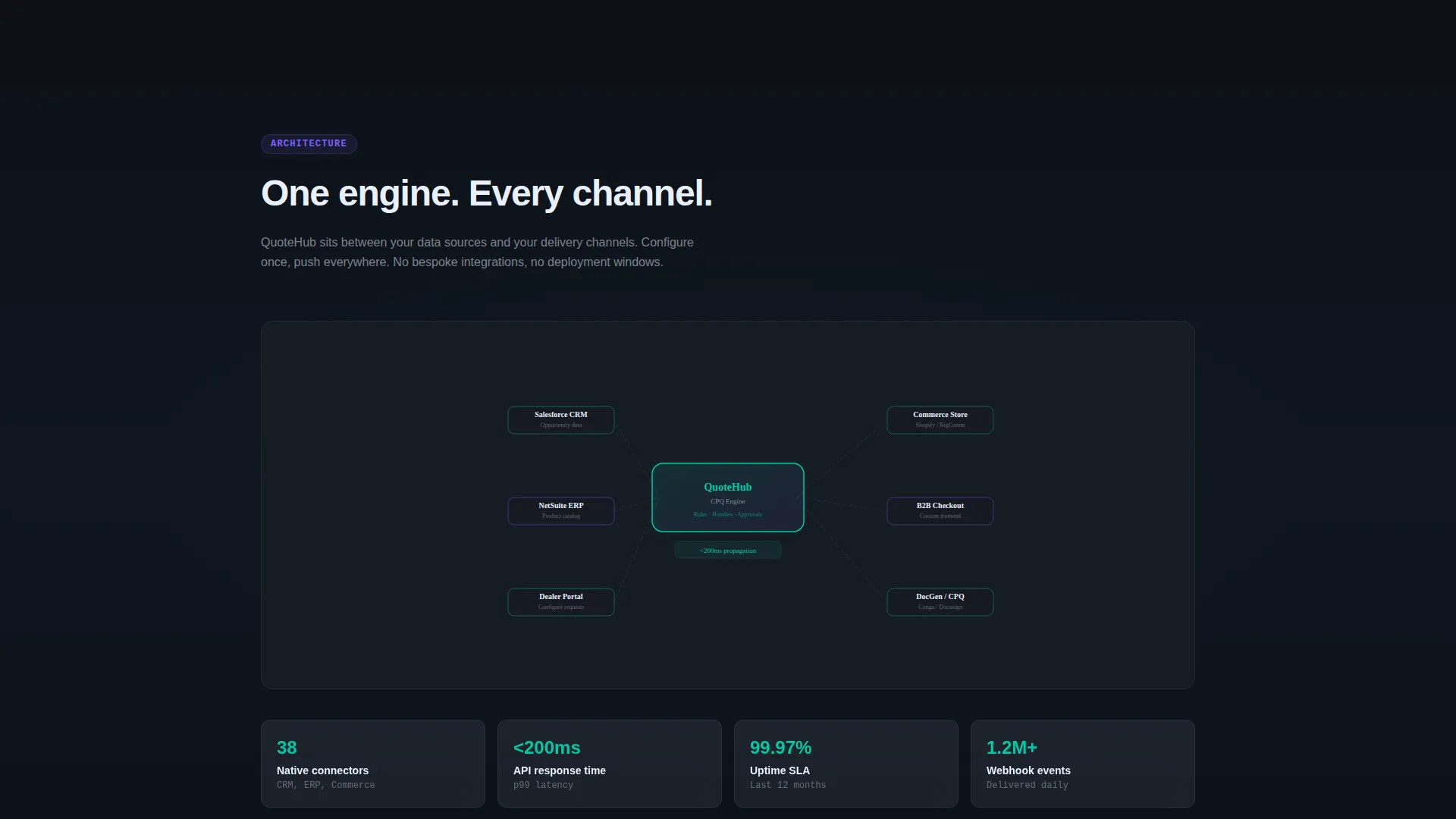
Each card row opens with a broken workflow state, marked by a red status dot. As the visitor scrolls, the card transitions into its solution counterpart with an API snippet or rule preview, and the accent color shifts from red to teal. The arc ends with a full headless CPQ integration diagram connecting configure, price, quote logic to a CRM, commerce storefront, and dealer portal.
Product Screenshot Header
The header features a pixel-perfect CPQ interface screenshot floating on a subtle isometric plane. It shows three product line items with conditional discount tiers, a bundle dependency graph, and a live price total. The screenshot sits inside a frosted-glass browser chrome with a faint teal glow along the bottom edge.
Dual Call-to-Action Flow
The primary call to action, "Install the Sandbox," appears first below the header, then again in a sticky bottom bar. A secondary path labeled "Explore the API Docs" serves technical evaluators who prefer to read the documentation before downloading. Both paths are built into the layout without requiring additional configuration.
Real Configuration Output Display
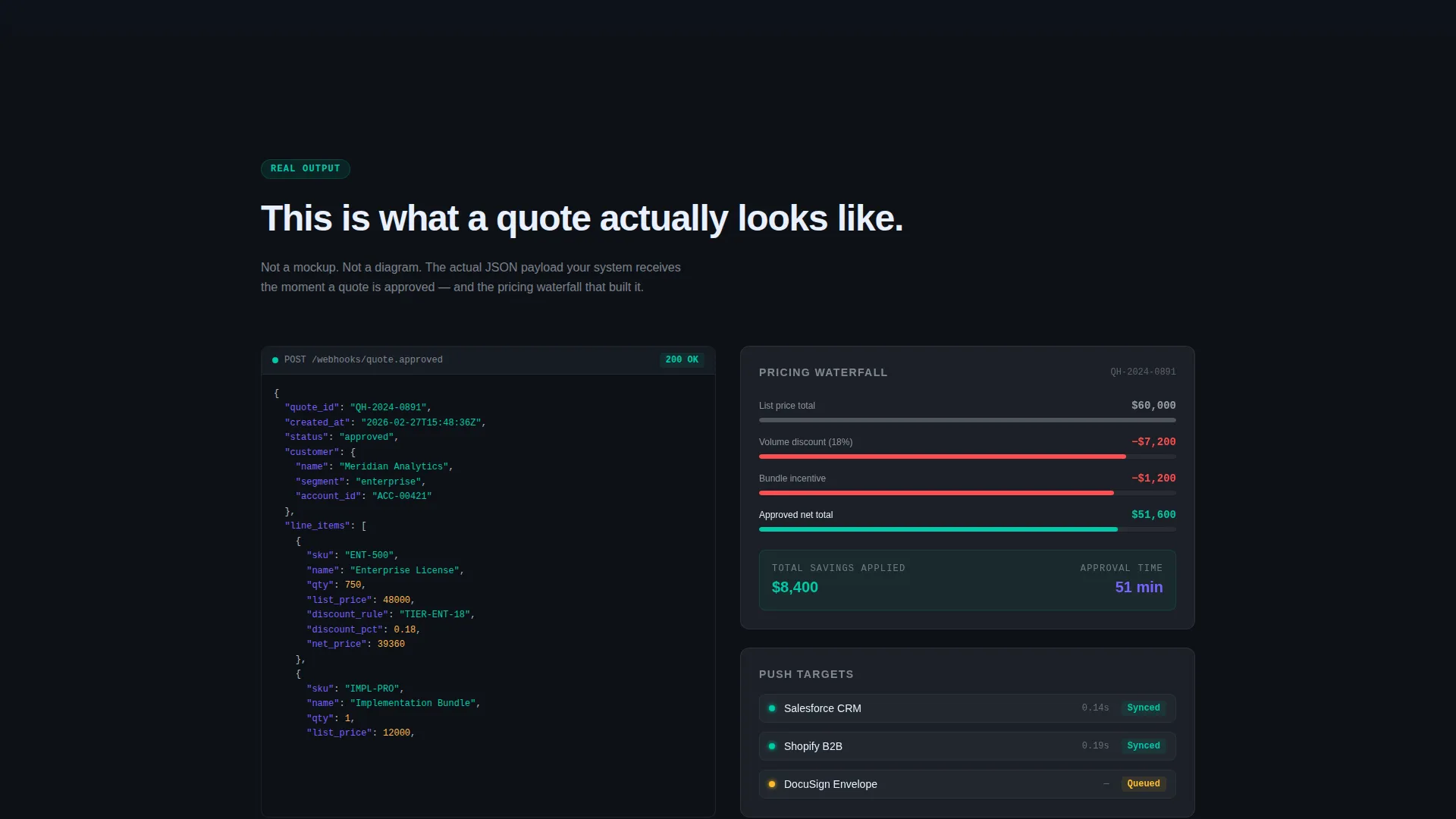
The template includes layout sections designed to show actual JSON payloads and pricing waterfall displays. This proves the product works before asking any visitor to commit to a download or sign-up, which is critical for a developer and operations audience.
Modular Card Grid Layout
The page is built on a card grid system where each card is a translucent tile styled against a dark workspace background. Cards are modular and independent, making it straightforward to reorder, remove, or replace individual sections without breaking the overall layout.
Tech Glass Visual System
The color palette uses deep terminal black for the background, catalyst teal for interactive states and data accents, frosted panel white on card surfaces, and signal violet for badges and status indicators. The combined effect resembles a glass control panel backlit from beneath, giving the page a distinctive developer-tool aesthetic.
Page sections overview
| Section | Purpose |
|---|---|
| Header screenshot | Anchors the page with a real quote-in-progress visual |
| Primary call to action block | Drives immediate sandbox install conversions |
| Broken workflow cards | Names the three core pain points with red status dots |
| Solution transition cards | Flips each problem into its API-powered resolution |
| Integration diagram | Shows headless CPQ connected to CRM, ERP, and storefront |
| JSON payload display | Proves product output before asking for commitment |
| Pricing waterfall section | Shows real conditional discount logic in action |
| Sticky call to action bar | Reinforces the install prompt after three card rows |
| API Docs secondary path | Offers a low-friction entry point for technical readers |
Design & branding system
The Tech Glass theme uses a tightly controlled four-color palette that communicates precision and reliability. Every visual decision reinforces the idea of systems connecting cleanly and data moving without friction.
- Background is deep terminal black (#0D1117); interactive states and data accents use catalyst teal (#00C9A7); card surfaces use frosted panel white (#E8F0FE); badges and status indicators use signal violet (#7B61FF)
- Card surfaces are styled as translucent tiles floating over the dark background, with edges catching teal light for a layered, glass-panel depth effect
- Status dots shift from red to teal as the problem-to-solution arc progresses, giving the color system a functional narrative role beyond decoration
Mobile & speed optimization
The modular card grid is structured to adapt cleanly across screen sizes. The layout priorities are set to keep the most critical conversion elements visible and functional on smaller viewports.
- The sticky bottom call-to-action bar remains visible on mobile scroll, keeping the primary conversion action accessible throughout the page
- Card grid columns reflow to a single-column stack on narrow screens, preserving the problem-to-solution reading order
- The isometric product screenshot and integration diagram are framed to scale without losing the visual detail that makes them credible
How this template helps you convert
The page is designed to earn the install rather than just ask for it. Every layout decision serves the conversion sequence described in the brief.
- The header screenshot and headline establish credibility immediately. Visitors see a real interface with real data before reading a single feature claim, reducing skepticism at the top of the page.
- The problem-to-solution card arc builds momentum by surfacing a specific objection and resolving it before moving to the next one. By the time visitors reach the integration diagram, they have already seen their own workflow reflected and resolved three times.
- Showing actual JSON payloads and pricing waterfalls before the call to action removes the final barrier to the sandbox install. The page proves the product works; the call to action simply confirms what the visitor already believes.
Other information about this template
This template is categorized under Technology, within the Headless Enterprise Software subcategory, and targets the headless CPQ niche. It is designed for teams building or marketing API-first quoting infrastructure to a commercially and technically literate audience.
- The template style is a Card Grid (Modular) layout, meaning individual sections can be adapted for different product messaging without rebuilding the page structure
- The landing page direction is App Download, with the install flow collecting a work email first and then detecting the user's platform to serve the correct desktop client or CLI installer
- The creative direction follows a Problem-to-Solution Arc, a proven structure for enterprise software pages where buyers need to see their own pain acknowledged before they trust a solution
Theme
Tech Glass
Creative direction
Problem→Solution Arc
Color system
Teal Catalyst
Style
Card Grid (Modular)
Direction
App Download
Page Sections
Problem-to-solution Card Arc
Product Screenshot Header
Dual Call-to-action Layout
Real Configuration Output Sections
Modular Card Grid Structure
Tech Glass Visual System
Related questions
What type of product is this template designed for?
Can I adapt the card grid sections for a different product message?
What does the Install the Sandbox call to action flow look like?
Does the template include actual JSON payloads or just placeholder content?
Who is the intended audience for this landing page template?



