Expert Radiology School Landing Page Template
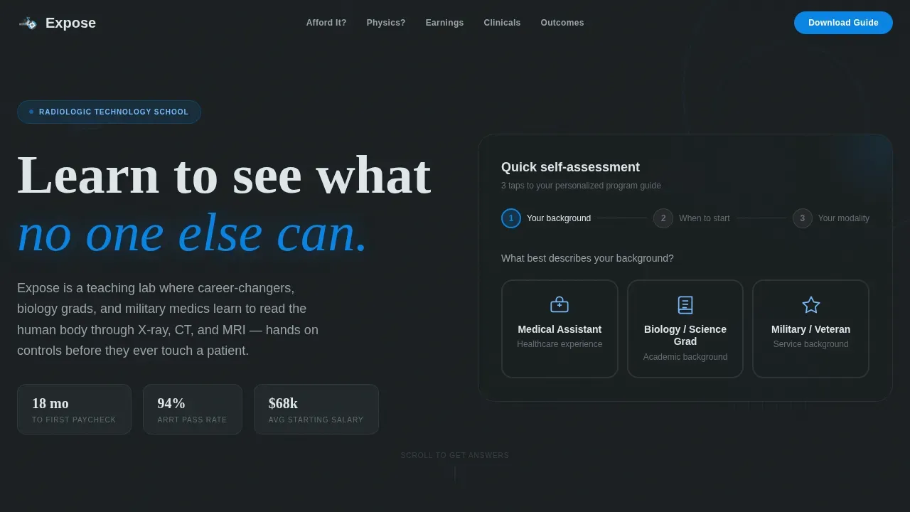
Expose is a hub and spoke landing page template built for radiologic technology schools. It opens with a three-step quiz that feels like a career self-assessment, then walks prospective students through honest, question-led sections covering tuition, academics, career outcomes, and clinicals. The goal is to earn trust before asking for anything in return.
by Rocket studio
Quick summary
Expose is a single-page, anchor-nav landing page template designed for radiologic technology schools. It leads with a playful multi-step quiz, answers the questions prospective students actually worry about, and closes with a low-friction Program Guide download. Every section is built to feel like an honest advisor conversation, not a sales pitch.
Who this template is for
This template is a strong fit for schools and programs that want to attract career-changers and non-traditional applicants. It speaks directly to people who are already working in healthcare but want to move forward.
- Night-shift medical assistants ready to level up their credentials
- Biology graduates drawn to anatomy and hands-on clinical work
- Military medics transitioning into civilian allied health careers
What problem this template solves
Most radiologic technology school pages look the same. They lead with tuition tables, dense program grids, and generic calls to action. That approach pushes away the exact audience you want to reach. This landing page template flips the script.
- Prospective students arrive with real fears about cost, physics prerequisites, and clinical intensity
- Competing pages offer brochure copy instead of honest, direct answers
- Visitors bounce before they ever find the information that would change their mind
What you get with this template
You get a fully structured landing page that centers on conversation before conversion. Each spoke section on the anchor nav answers one specific fear, then presents a data visualization and a graduate pull-quote to back it up.
- A three-step hero quiz covering background, start date, and modality interest
- Four frequently asked question-driven spoke sections: tuition and aid, academics, career outcomes, and clinicals
- A persistent cerulean-on-charcoal download call to action and a secondary virtual class link
Feature list
This template includes the following core features built from the source brief.
Three-Step Hero Quiz
The header runs a multi-step self-assessment disguised as a quiz. Visitors tap through background icons, semester tiles, and animated modality icons. Each step triggers a micro-animation, keeping the page easy and approachable rather than institutional.
frequently asked question-Driven Spoke Sections
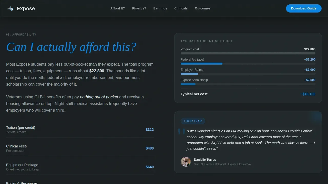
Each anchor-nav section opens with a bold cerulean question, such as "Can I afford this?" or "Will I pass physics?" A short narrative answer follows, paired with a geometric data visualization and a real graduate pull-quote. The design makes it easy to find the answer you need without scrolling past walls of text.
Geometric Data Visualizations
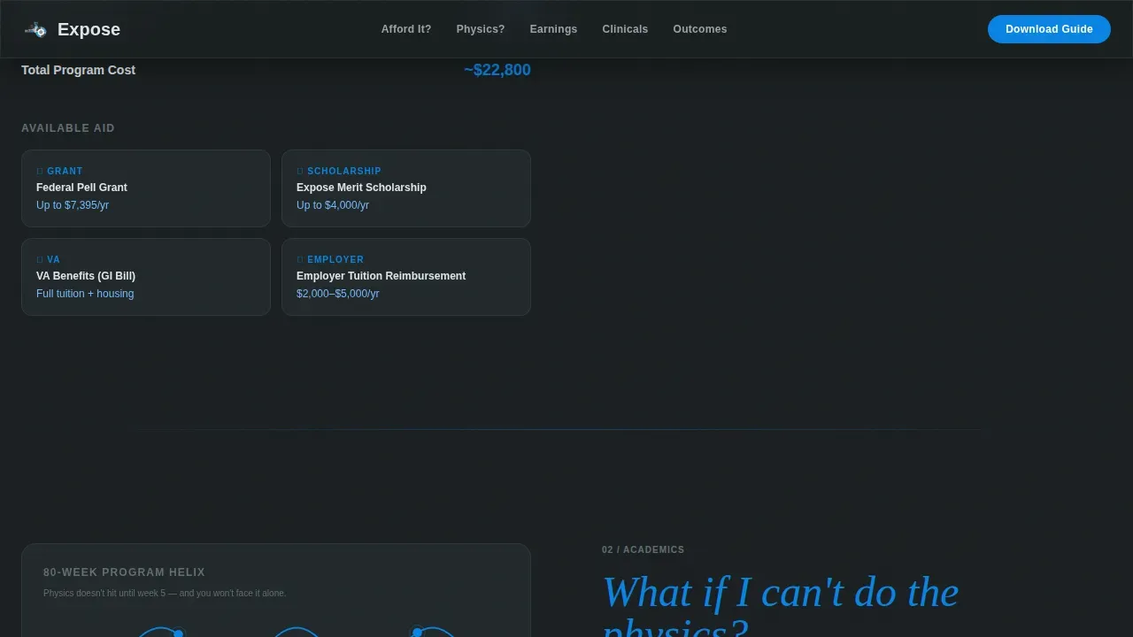
Salary ranges look like stacked-square bar charts. The program timeline is rendered as a horizontal helix. These custom-built visuals center quantitative information in a format that is easy to scan and immediately readable on a phone screen.
Persistent Download Call to Action
The primary call to action, "Download the Program Guide," stays visible in the anchor nav throughout the page. It opens a minimal form that asks only for first name, email, and modality interest already captured in the quiz. The simplified inquiry form is easy to complete in under a minute.
Graduate Pull-Quote Social Proof
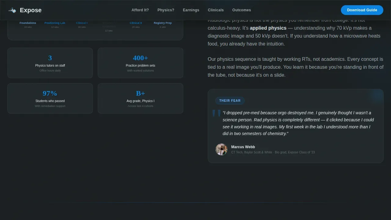
Every spoke section includes a pull-quote from a graduate who shared that exact fear. This gives prospective students a clear view into the real student experience and makes the supportive atmosphere of the program tangible and credible.
Mobile-First Layout
The page is built with a mobile-first structure. Tap targets are large, the quiz steps are easy to complete on a small screen, and the anchor nav keeps every section one tap away. The layout loads cleanly for users who view the page during a break or a night shift.
Page sections overview
| Section | Purpose |
|---|---|
| Hero Quiz | Qualify and engage visitors with a three-step background, start date, and modality self-assessment |
| Tuition & Aid | Answer "Can I afford this?" with a stacked-square bar chart and aid overview |
| Academics Overview | Answer "Will I pass physics?" with a program timeline helix and pull-quote |
| Career Outcomes | Answer "How fast can I start earning?" with a salary bar chart |
| Clinicals Detail | Answer "What's clinicals actually like?" with a graduate pull-quote |
| Footer | Linear single-row footer with essential links and contact spot |
Design & branding system
The Slate and Sky color system pairs deep charcoal with open cerulean and card white, creating contrast that guides the eye naturally from section to section. Geometric shapes tile across backgrounds at low opacity, adding energy without competing with the content.
- Colors: deep charcoal (#2D3436), imaging-suite slate (#636E72), cerulean (#0984E3), and card white (#DFE6E9)
- Fonts: Plus Jakarta Sans for body text and Fraunces as a display serif for section questions
- Background shapes: circles echoing cross-sectional anatomy and angular grids referencing detector arrays
Mobile & speed optimization
The page is built mobile-first because the target audience often views content from a phone during off-hours. Every interactive element is optimized for tap-based navigation.
- Quiz steps, semester tiles, and modality icons are all easy to tap on small screens
- GSAP scroll reveals and staggered animations load progressively so the page feels fast and fluid
- Anchor nav keeps every section open and reachable without excessive scrolling
How this template helps you convert
The page earns the download before it asks for it, which is what makes the conversion path feel natural rather than pushy.
- The quiz collects modality interest upfront, so the Program Guide download form asks for only two additional fields, making it easy to complete and submit
- Each answered fear reduces hesitation, and by the time a visitor reaches the persistent download button, they have already received more honest information than any competitor page offers
Other information about this template
This template is a strong example of how medical landing page templates can enhance the online presence of a school or company in the allied health space. It is also a clear demonstration of how the right landing page design can make or break a website's ability to attract potential students.
- Accreditation logos, such as those from JRCERT (the Joint Review Committee on Education in Radiologic Technology), can be placed in a visible spot to build credibility
- The design uses vibrant, inviting colors rather than standard medical colors, replacing dull stock photos with high-resolution visuals of students using real equipment
- No-code and AI-powered tools make it easy to customize and deploy templates like this one without extensive coding knowledge
- The Expose playful radiologic technology school landing page template is suited for programs that want to stand out with clear headlines and honest content
Theme
Playful Geometric
Creative direction
FAQ-Driven
Color system
Slate & Sky
Style
Hub & Spoke (Anchor Nav)
Direction
Content/Resource
Page Sections
Three-step Hero Quiz
Faq-driven Spoke Sections
Geometric Data Visualizations
Persistent Download Call to Action
Graduate Pull-quote Social Proof
Mobile-first Anchor Navigation
Related questions
Can I customize the quiz steps and section questions?
Does the template include the data visualizations, or do I build them separately?
How does the Program Guide download form work?
Can I use this template if I am not a developer?
Where should I display accreditation information on this template?



