Radio Station Vertical SaaS Cost Calculator Website Template
Frequency is a bold brutalist landing page template built for radio station analytics platforms. It combines a live interactive estimator, real-time data visualizations, and a brutalist dark-void design into a single high-impact page. Program directors, media buyers, and indie station managers get an immediate feel for the product before they ever tap the download button.
by Rocket studio
Quick summary
Frequency is a single-page dashboard landing page template for a radio station analytics platform. It opens with a full-bleed dark header and a live quarter-hour listener curve, then drops visitors into an interactive estimator before revealing a full brutalist data grid. The page is built to earn app downloads by letting users experience the product first.
Who this template is for
This template is designed for teams building or marketing a radio station analytics platform. It speaks directly to the people who live inside ratings data every day.
- Program directors who need to defend lineup decisions to group management using real metrics
- Media buyers evaluating cost-per-thousand efficiency across terrestrial and streaming simulcast channels
- Independent station managers in mid-market towns who need drive-time data strong enough to support a rate card increase
What problem this template solves
Radio professionals struggle to communicate the value of analytics software before a prospect ever opens the app. A static feature list does not move a program director who has spent years reading diary-method reports. This template solves that by making the product experience the first thing a visitor encounters.
- Visitors interact with a live estimator that renders projected cume, time-spent-listening, and share benchmarks before any sales copy appears
- The scroll journey mirrors channel-surfing through real data, replacing abstract feature claims with visible, functional proof
- The floating download bar appears only after tool interaction, so the call to action arrives at the moment of highest intent
What you get with this template
The template delivers a complete, ready-to-customize single-page layout built around a data-first creative direction. Every section serves either the product demonstration or the conversion path.
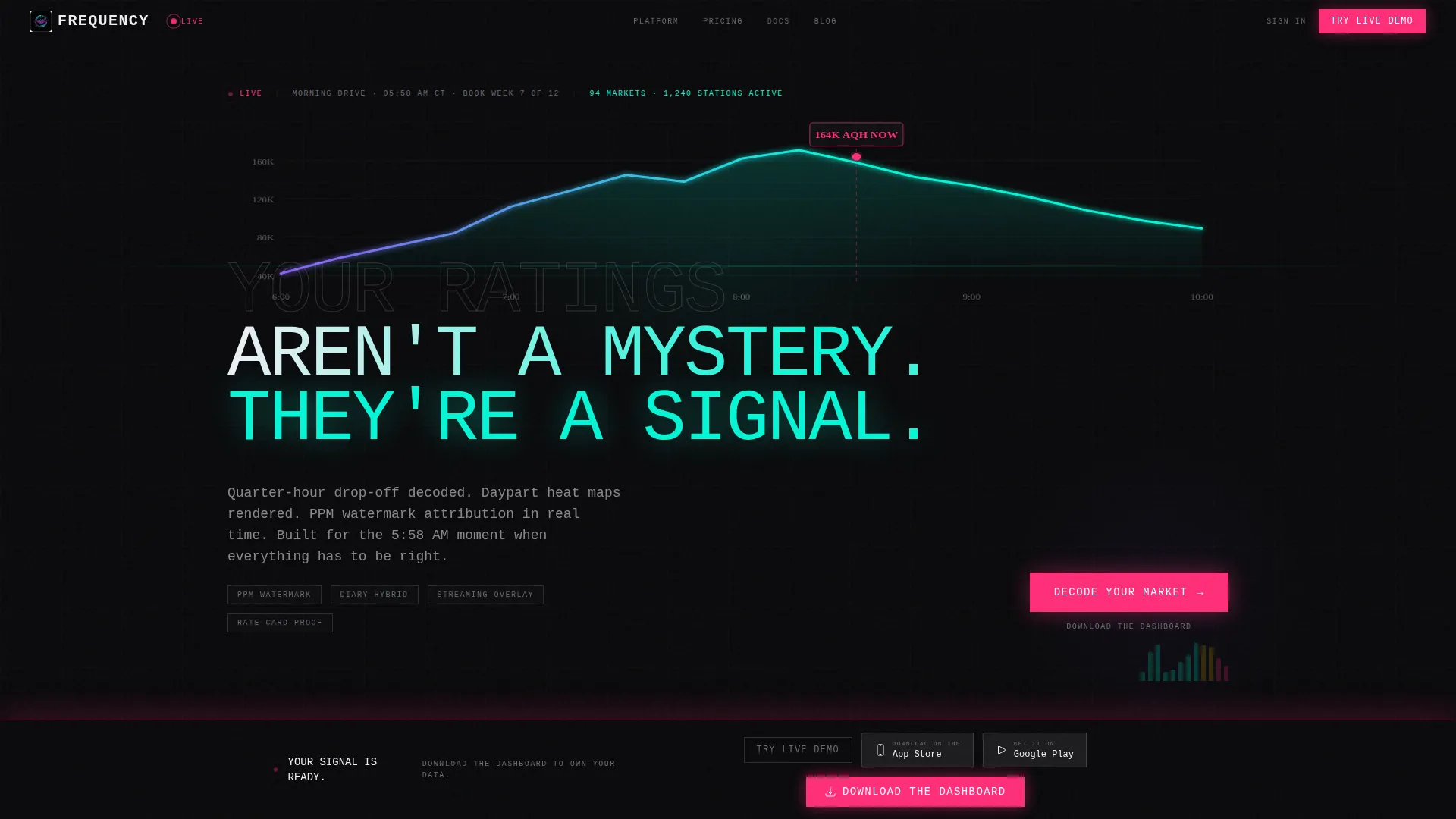
- A full-bleed dark header with a glowing live listener curve, a condensed 120-pixel uppercase headline, and a pulsing current-time marker
- An interactive market estimator positioned immediately below the header, where visitors input market rank, format, and daypart to see simulated analytics output
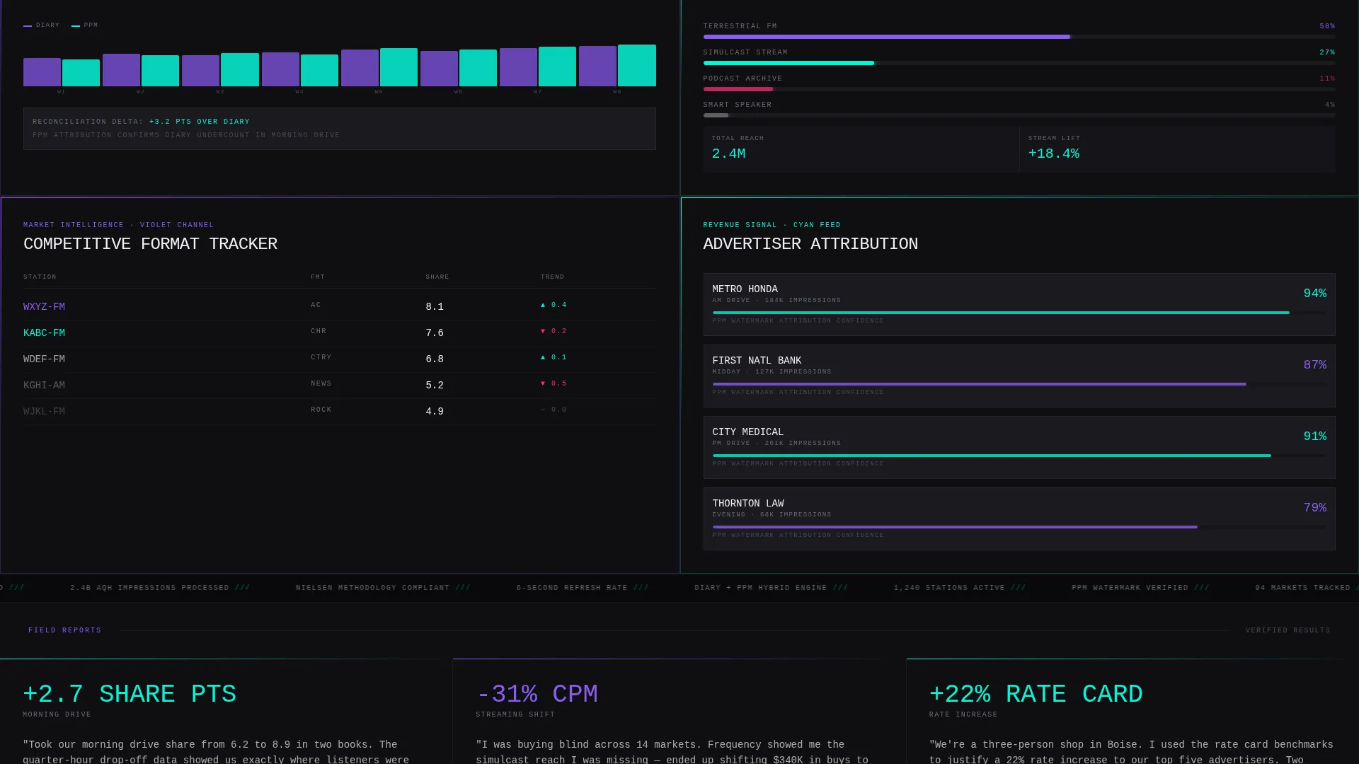
- A brutalist data grid of feature modules covering diary reconciliation, streaming overlay, competitive format tracking, and advertiser attribution, stacked edge-to-edge with no margins
Feature list
This template is built around specific, prompt-defined components. Each one plays a defined role in the page experience.
Live Quarter-Hour Listener Curve
A holographic cyan line chart renders in the header, showing listener drop-off by the quarter-hour. A pulsing pink dot marks the current time position. The chart is the visual hero, replacing photography entirely.
Interactive Market Estimator
Visitors enter their market rank, format, and daypart into a live calculator tool. The tool instantly renders a simulated analytics view with projected cume, time-spent-listening, and share benchmarks against format averages. This is the centrepiece of the Calculator/Tool First creative direction.
Brutalist Feature Data Grid
Feature modules stack edge-to-edge with no margins below the estimator. Each block uses a distinct iridescent accent color and covers a specific capability: diary reconciliation, streaming overlay, competitive format tracking, and advertiser attribution. The scroll feels like flipping through live data panels.
Daypart Heat Map Display
The template includes a dedicated module for daypart heat map visualization. This gives program directors and media buyers a spatial view of when listener engagement peaks and drops across the broadcast day.
Floating App Download Bar
A signal-pink download bar appears pinned to the bottom of the viewport after the visitor interacts with the estimator tool. It carries paired app store badges and a secondary "Try the Live Demo" link for visitors who want more time with the calculator before committing.
PPM Attribution and Streaming Overlay Modules
Dedicated data grid blocks surface PPM watermark attribution and streaming simulcast data side by side. These modules address the specific dual-channel measurement needs of media buyers working across terrestrial and digital formats.
Page sections overview
| Section | Purpose |
|---|---|
| Full-Bleed Header | Establishes dark void aesthetic and introduces the live listener curve as the visual anchor |
| Headline Overlay | Slams a 120px condensed uppercase headline across the chart in brutalist fashion |
| Interactive Estimator | Lets visitors input market data and receive a simulated analytics output immediately |
| Feature Data Grid | Stacks brutalist module blocks covering core platform capabilities edge-to-edge |
| Diary Reconciliation Block | Highlights the platform's ability to reconcile traditional diary-method data |
| Streaming Overlay Block | Shows simulcast and streaming listener data alongside terrestrial metrics |
| Competitive Format Tracker | Surfaces format-switching patterns and competitive daypart comparisons |
| Advertiser Attribution Module | Displays PPM watermark attribution and CPM efficiency data for media buyers |
| Floating Download Bar | Pins the primary call to action after tool interaction with app store badges and demo link |
Design & branding system
The visual identity follows a Bold Brutalist theme built on an AI Iridescent color system. Every color in the palette carries a specific functional meaning, not just a decorative role.
- Void black (#09090B) forms the near-black base surface; phosphor violet (#8B5CF6) signals historical data; holographic cyan (#06F5D6) signals live data; signal pink (#FF2D78) is reserved for alerts and calls to action
- Typography uses oversized monospace type slammed to grid edges, with the primary headline set at 120 pixels in condensed uppercase, creating deliberate brutalist tension with the chart it overlaps
- No stock photography or human faces appear anywhere; the data visualizations and user interface components are the entire visual language of the page
Mobile & speed optimization
The template is structured to carry its dense data grid layout across viewport sizes without losing the visual hierarchy that makes the brutalist design work.
- The floating download bar and interactive estimator are both designed for touch interaction, keeping the conversion path accessible on smaller screens
- The iridescent color coding remains legible across the dark surface at mobile scale, where cyan for live data and pink for calls to action retain their distinct signaling roles
- Module blocks in the data grid reflow cleanly so the edge-to-edge stacking translates to a vertical scroll experience on mobile devices
How this template helps you convert
The conversion strategy is built into the page architecture itself. Visitors do not read their way to the download button; they earn it through product interaction.
- The interactive estimator creates a personalized data moment early in the visit, making the app feel immediately relevant to the visitor's specific market and format
- The floating pink download bar surfaces only after estimator interaction, tying the call to action to demonstrated product value rather than to scroll depth alone
- The secondary "Try the Live Demo" link gives hesitant visitors a low-friction re-entry point, keeping them in the product experience instead of bouncing
Other information about this template
This template is part of a broader collection of vertical software-as-a-service landing page templates in the Technology category. A few additional details are worth noting before you build with it.
- The template sits within the Radio Station Vertical SaaS subcategory, making it a strong starting point for any analytics tool targeting broadcast or streaming radio operators
- The Bold Brutalist theme and AI Iridescent color system are consistent across the full template family, so the design language scales to related marketing pages without visual conflict
- The Intersection Match Score for this template is 13, reflecting a high degree of alignment between the template style, theme, color system, creative direction, and landing-page goal
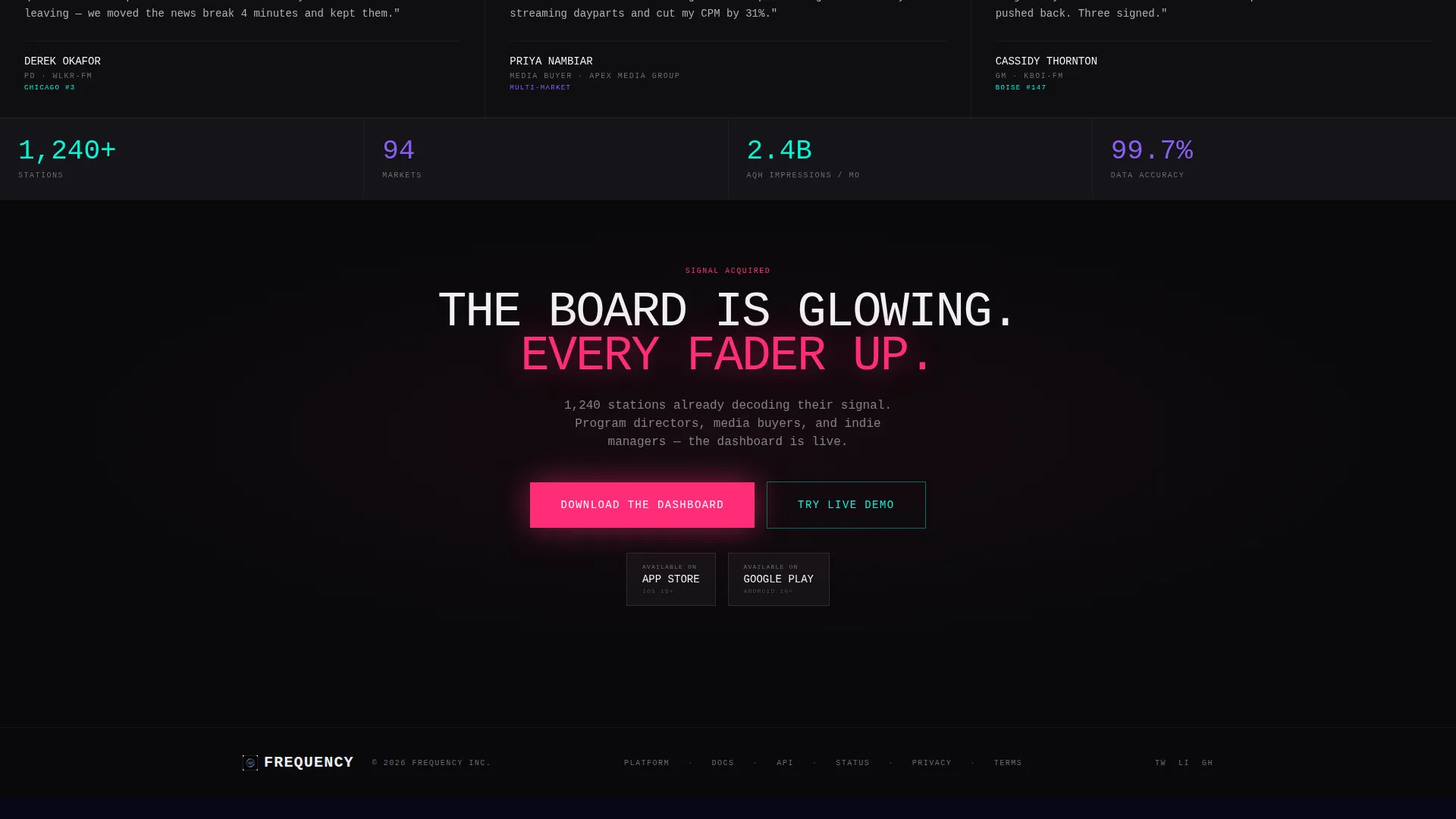
- The primary call-to-action direction is App Download, supported by both Apple App Store and Google Play Store badge placements within the floating bottom bar

Theme
Bold Brutalist
Creative direction
Calculator/Tool First
Color system
AI Iridescent
Style
Dashboard/Data Grid
Direction
App Download
Page Sections
Live Quarter-hour Listener Curve
Interactive Market Estimator Tool
Brutalist Feature Data Grid
Daypart Heat Map Module
PPM Attribution and Streaming Overlay
Floating App Download Bar
Related questions
Who is this template built for?
What does the interactive estimator show visitors?
Can I customize the colors and typography?
Does the template support both major app store download paths?
Is this a single-page layout or a multi-page template?



