Railroad Vertical SaaS Professional Website Template
Railhead is a Data Command landing page template built for railroad analytics dashboards. It opens with a live KPI metrics wall, flows into side-by-side feature comparison tables, and closes with a clear app download call to action. The AI Iridescent color system, void black, phosphor teal, and neural violet, gives every section the feel of an active operations center.
by Rocket studio
Quick summary
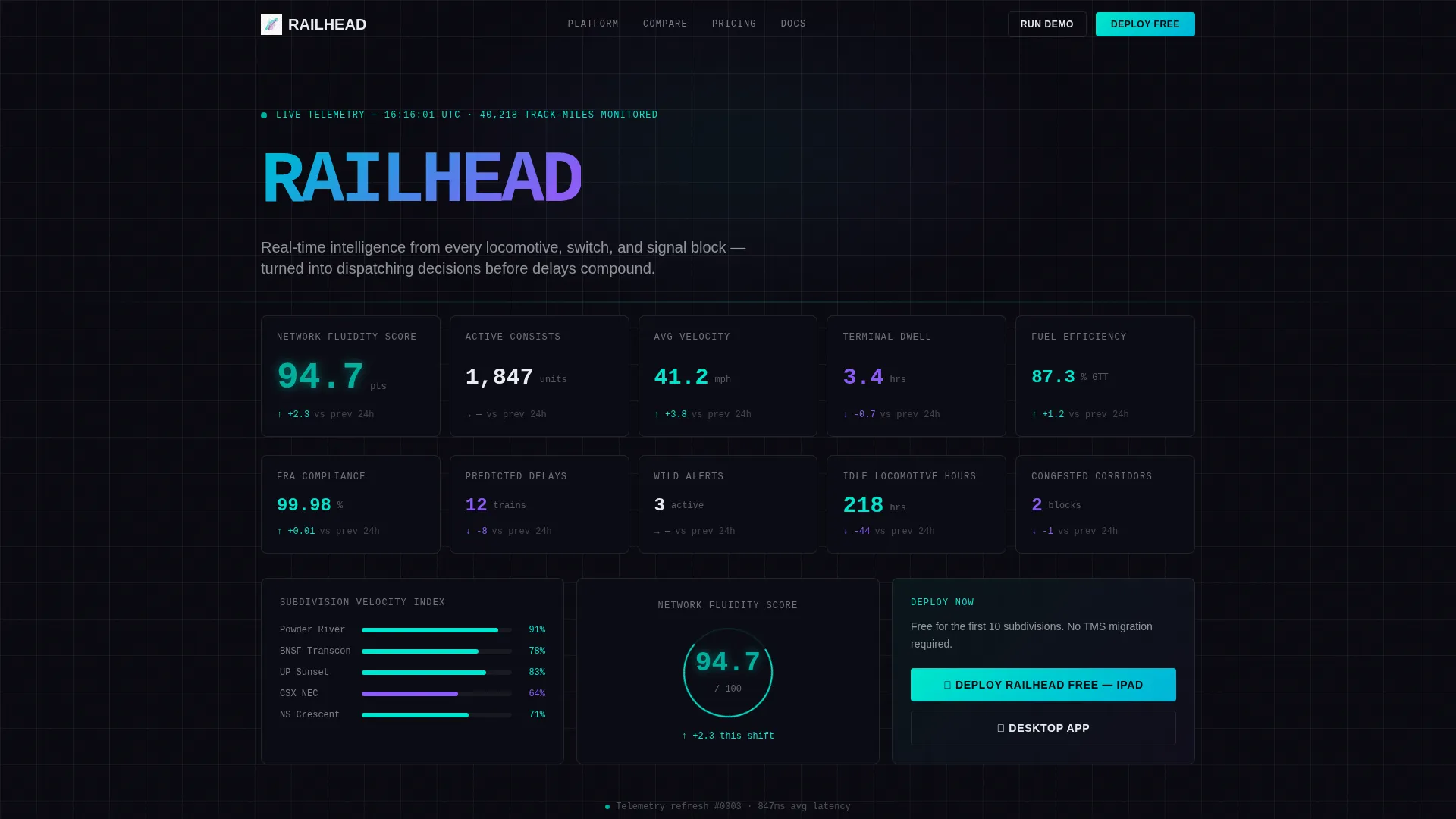
Railhead is a single-page template designed for railroad intelligence platforms. It leads with a full-viewport KPI metrics wall, works through structured feature comparison tables, and drives toward app download. The design uses a void-black background with phosphor teal and neural violet accents, making data feel like a live nerve center rather than a static product page.
Who this template is for
This template is built for teams that operate at the intersection of heavy infrastructure and real-time data. If your product makes railroad operations smarter, this layout gives it a credible, visually commanding home.
- Operations chiefs who need to communicate fleet-wide intelligence to stakeholders
- Network planners and product teams positioning a vertical SaaS platform against legacy systems
- Mechanical officers or product marketers showcasing analytics depth to Class I decision-makers
What problem this template solves
Most SaaS landing pages feel generic. A railroad analytics platform is not a generic product, and its landing page should not look like one. Buyers in this space are technical, skeptical, and short on time. They need to see capability proof before they trust a claim.
- Generic templates hide differentiators behind vague headline copy instead of showing data
- Legacy TMS platforms dominate by default, so new entrants need a clear comparison structure
- Decision-makers at 3 AM need to absorb complexity fast, not scroll through marketing fluff
What you get with this template
You get a fully structured, single-page layout built around the Feature Matrix creative direction. Every section has a defined role, from the opening metrics wall to the sticky download bar that appears after the first comparison table.
- A full-viewport live Stats and Metrics header with monospace KPI typography and trend indicators
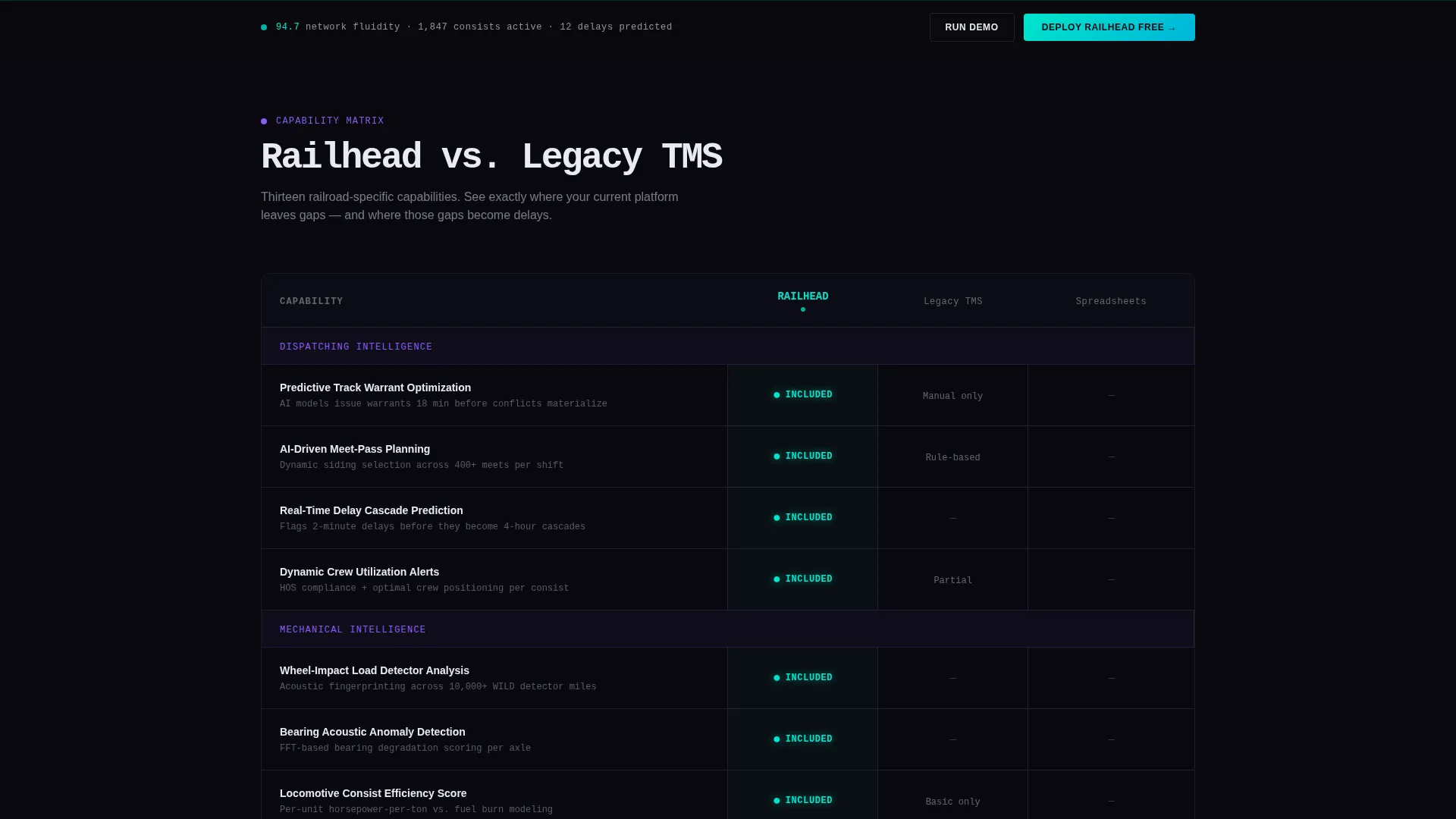
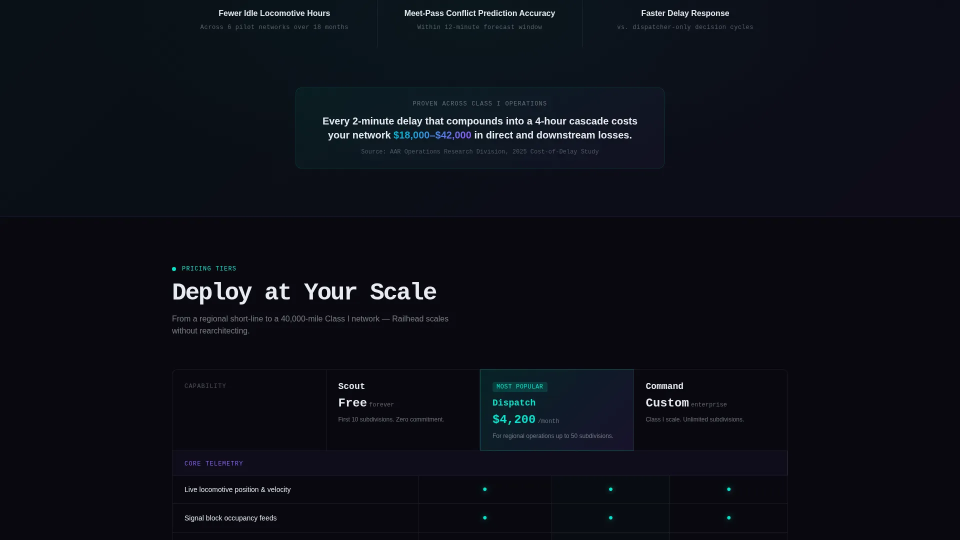
- Two structured comparison table blocks: one against legacy TMS platforms, one across tier plans
- Sticky app download bar, dual call to action buttons for iOS and desktop, and a secondary demo request form
Feature list
This template is built around six purpose-driven design and layout components drawn directly from the source brief.
Full-Viewport KPI Metrics Header
The header is a dense grid of railroad-specific KPIs rendered at full viewport width on a void-black background. Train velocity heatmaps, dwell time distributions, locomotive consist efficiency percentages, and a real-time network fluidity score are all typeset in large monospace numerals. Each metric carries its unit label and a trend arrow. There is no hero image because the data serves that role entirely.
Feature Comparison Tables
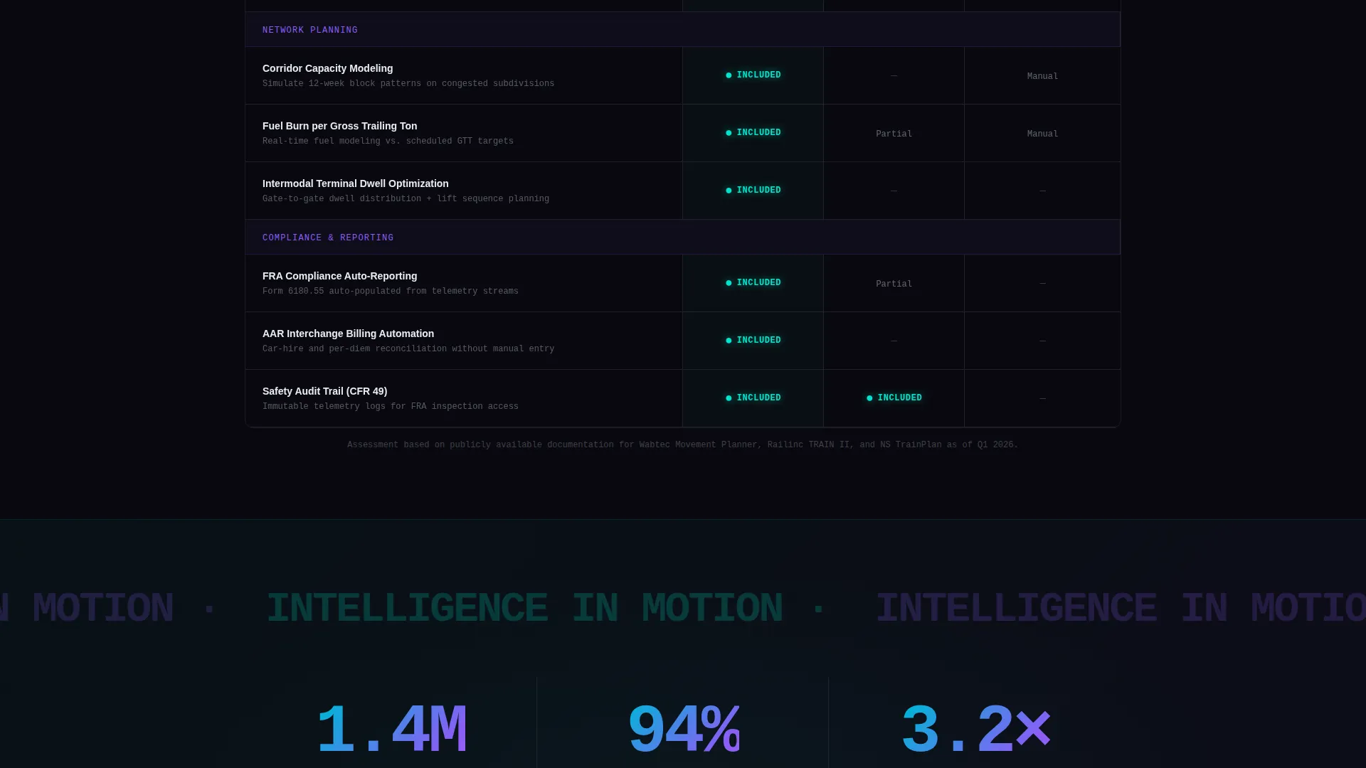
Two structured comparison blocks anchor the page's middle section. The first compares Railhead against legacy Transportation Management System platforms. The second compares across Railhead's own tier plans. Each row maps to a railroad-specific capability: predictive track warrant optimization, artificial intelligence-driven meet-pass planning, wheel bearing acoustic analysis, fuel burn modeling per gross trailing ton, and Federal Railroad Administration compliance auto-reporting. Included features glow in phosphor teal; absent ones dim to gray.
Single-Stat Proof Callouts
Between comparison blocks, single-stat callout sections interrupt the scroll with proof points. Numbers are rendered enormous in the iridescent gradient, paired with a concise label. An example from the brief: "1.4 million fewer idle hours across pilot networks." These sections break the table rhythm and reinforce trust without adding noise.
Sticky App Download Bar
After the visitor scrolls past the first comparison table, a sticky download bar activates. It carries the primary call to action, "Deploy Railhead Free", with paired buttons for iOS (optimized for iPad field use) and desktop. The bar stays visible through the rest of the page scroll, reducing friction at every decision point.
Secondary Demo Request Form
A secondary conversion path offers visitors a way to run a demo on their own network. The short form requests three fields: railroad name, subdivision count, and current TMS provider. This captures qualified leads who are not yet ready to download but are actively evaluating.
AI Iridescent Hover States
Accent gradients shift between phosphor teal and neural violet on hover states. The visual effect is described in the brief as a shimmer like oil on wet rail, synthetic, alive, and slightly alien. This motion layer keeps the interface feeling active without relying on external data feeds or animation libraries.
Page sections overview
| Section | Purpose |
|---|---|
| KPI Metrics Header | Display live railroad KPIs at full viewport width |
| Network Fluidity Score | Surface the central real-time performance pulse |
| Railhead versus. TMS Table | Compare capabilities against legacy platform competitors |
| Single-Stat Callout | Interrupt scroll with a high-impact proof number |
| Tier Plan Comparison | Compare features across Railhead's own plan tiers |
| Second Stat Callout | Reinforce proof before the closing call to action |
| App Download call to action | Drive primary conversion with dual platform buttons |
| Demo Request Form | Capture qualified leads via a short three-field form |
| Sticky Download Bar | Keep the primary call to action accessible throughout the scroll |
Design & branding system
The template follows a Data Command theme executed through the AI Iridescent color system. Every color choice is functional, not decorative. The palette signals authority to a technically literate audience.
- Void black (#09090F) dominates the background, phosphor teal (#00E5CC) marks live data and active states, neural violet (#8B5CF6) marks predictive analytics overlays, and signal white (#E8ECF1) handles typography and table borders
- Monospace typefaces render all KPI numerals large and readable, with unit labels and trend arrows in signal white at smaller weights
- Hover gradients shift between teal and violet, creating a shimmer effect across comparison table cells and call-to-action buttons
Mobile & speed optimization
The template is designed with iPad-optimized field use as a stated requirement, given that operations staff access dashboards from field devices. Layout choices reflect this priority.
- The comparison tables are structured to remain readable and scrollable on tablet viewports, where field personnel are most likely to review the page
- Typography scales from the large monospace display sizes in the header down to readable body weights without losing hierarchy
- The sticky download bar is sized and positioned for thumb-reach interaction on mobile and tablet screens
How this template helps you convert
The Railhead template is built around a deliberate persuasion sequence. By the time a visitor reaches the bottom, the comparison tables have already shown them exactly which capabilities they are missing from their current system.
- The KPI metrics header establishes immediate credibility by leading with data, not marketing language, so technically skeptical buyers stay on the page
- The feature comparison tables do the selling systematically, letting visitors self-identify the gaps in their current platform before the download call to action appears
- The sticky bar and dual-path conversion structure (download plus demo form) capture both ready buyers and qualified leads who need one more touchpoint
Other information about this template
This template is categorized under Technology and the Railroad Vertical SaaS subcategory, targeting the Railroad Analytics Dashboard niche. It was built to serve a specific buyer profile, not a broad software audience.
- The template style is Comparison Table, which is particularly effective for vertical SaaS products where differentiators are specific and technically meaningful
- The landing page direction is App Download, making it suitable for platforms that offer a free deployment tier alongside a demo or evaluation path
- The Data Command theme and AI Iridescent color system are designed to communicate computational authority rather than consumer-grade polish
Theme
Data Command
Creative direction
Feature Matrix
Color system
AI Iridescent
Style
Comparison Table
Direction
App Download
Page Sections
Live KPI Metrics Header Wall
Dual Feature Comparison Tables
Single-stat Proof Callouts
Sticky App Download Bar
Secondary Demo Request Form
AI Iridescent Hover System
Related questions
What type of product is this template built for?
Can I adapt the comparison table rows to my own feature set?
Does the template include the demo request form?
Is the sticky download bar included by default?
Who is the intended audience for this landing page template?



