Automotive Software Booking Website Template
Rally is a Bold Brutalist landing page template built for automotive event organizers who manage volunteers across car shows, track days, and charity rallies. The modular card grid layout walks visitors through a Spec Sheet experience, phases their platform through RECRUIT, SCHEDULE, DEPLOY, and DEBRIEF, and closes with a blunt comparison table and a fast signup form.
by Rocket studio
Quick summary
Rally is a single-page landing page template for an automotive volunteer dispatch platform. It uses a Bold Brutalist design with a Midnight Blue color system, modular spec-sheet card rows, and a head-on comparison table. The layout is built for desktop-first use but scales to mobile. Every section is engineered to move car-event organizers toward signup.
Who this template is for
This template is built for people running real automotive events, not corporate HR teams. If you manage crews of marshals, flaggers, and gate staff across a single chaotic event weekend, this is your starting point.
- Car-club event chairs coordinating 20 to 200 volunteers across recurring events
- Concours committees and track-day organizers who need shift-sorted gate staff
- Grassroots rally coordinators tired of chasing corner workers through group chats
What problem this template solves
Automotive event staffing runs on WhatsApp threads and hand-edited spreadsheets. That combination breaks down fast when volunteers no-show, shifts overlap, and nobody knows who is credentialed for which gate. This template presents a platform that cuts through that chaos with hard data and blunt language.
- Shift swaps, credential tracking, and day-of check-in managed without group chat noise
- No-show rates reduced with visible, accountable shift assignments per volunteer
- Post-event hours logging handled in one place instead of scattered notes
What you get with this template
You get a complete, ready-to-customize landing page built around six clearly defined sections. The page moves visitors through a logical, mechanical sequence from social proof to signup without wasted space or soft language.
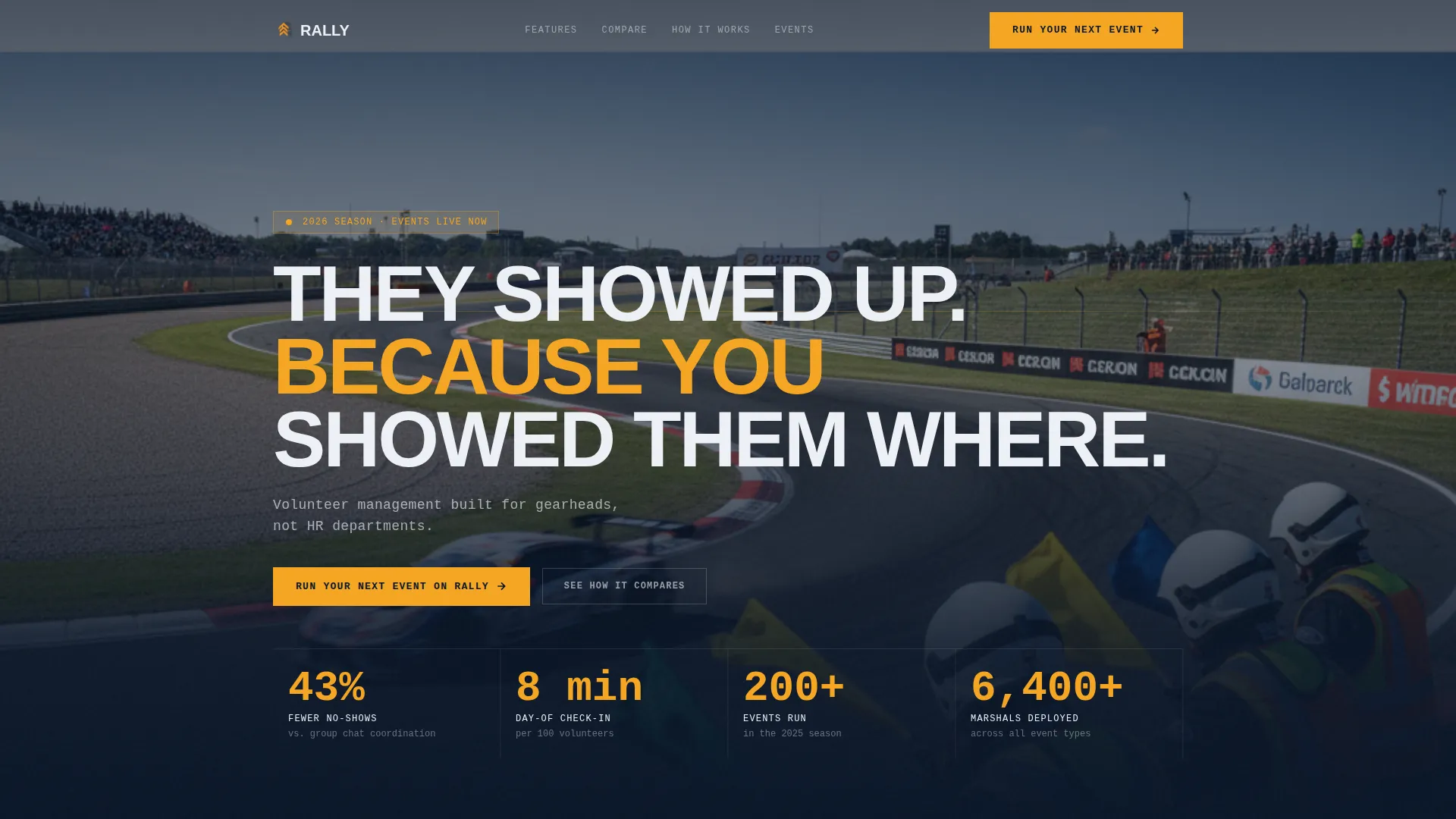
- A hero section with massive uppercase type, a grain texture, and an amber status badge
- A scrolling logo bar, a four-phase spec sheet card grid, and a data-driven comparison table
- A signup form asking only for event name, volunteer count, and email, plus a linked case study card
Feature list
This template is built around specific, prompt-defined capabilities. Each one is visible in the layout and backed by the creative brief.
Four-Phase Modular Card Grid
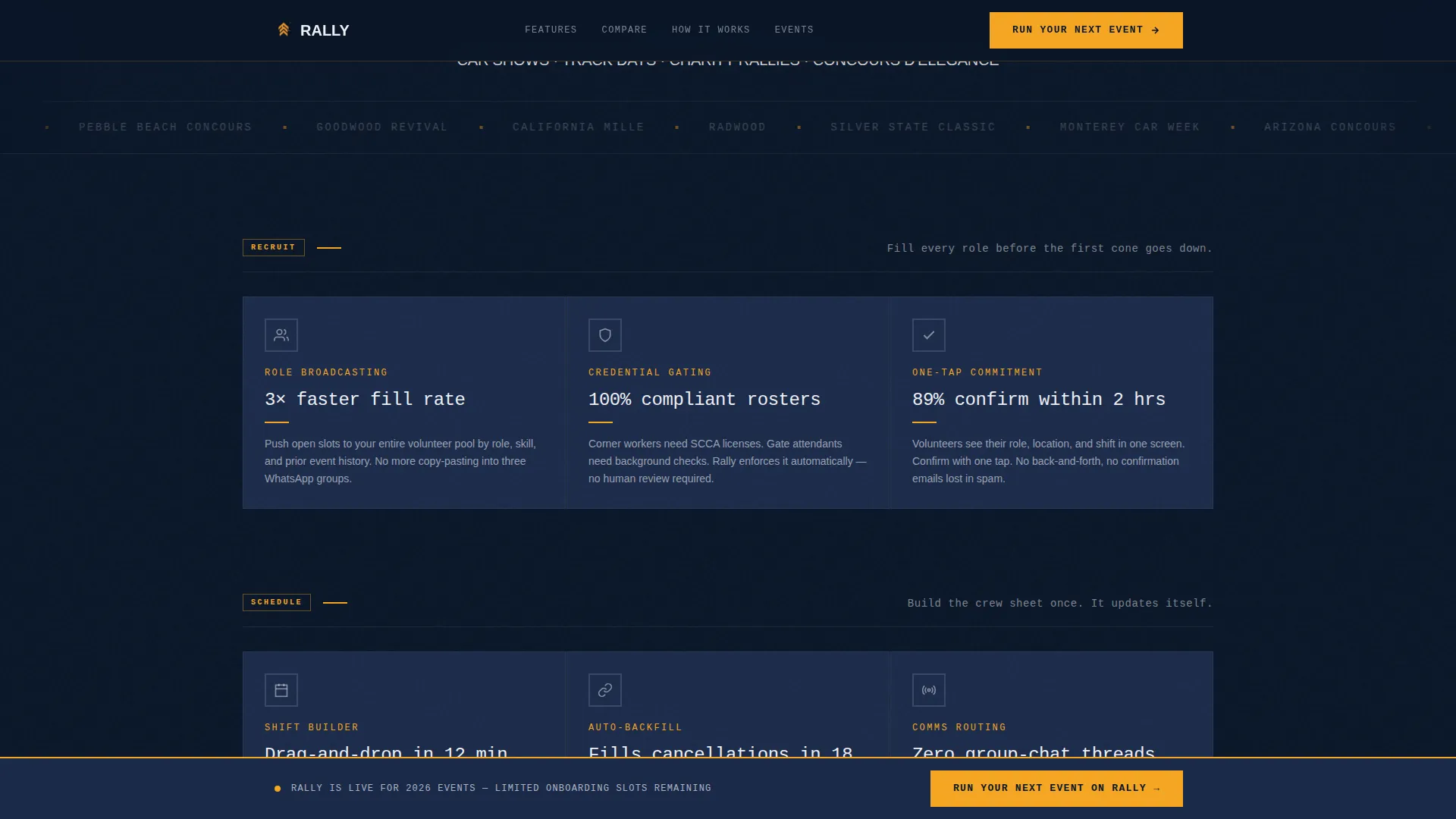
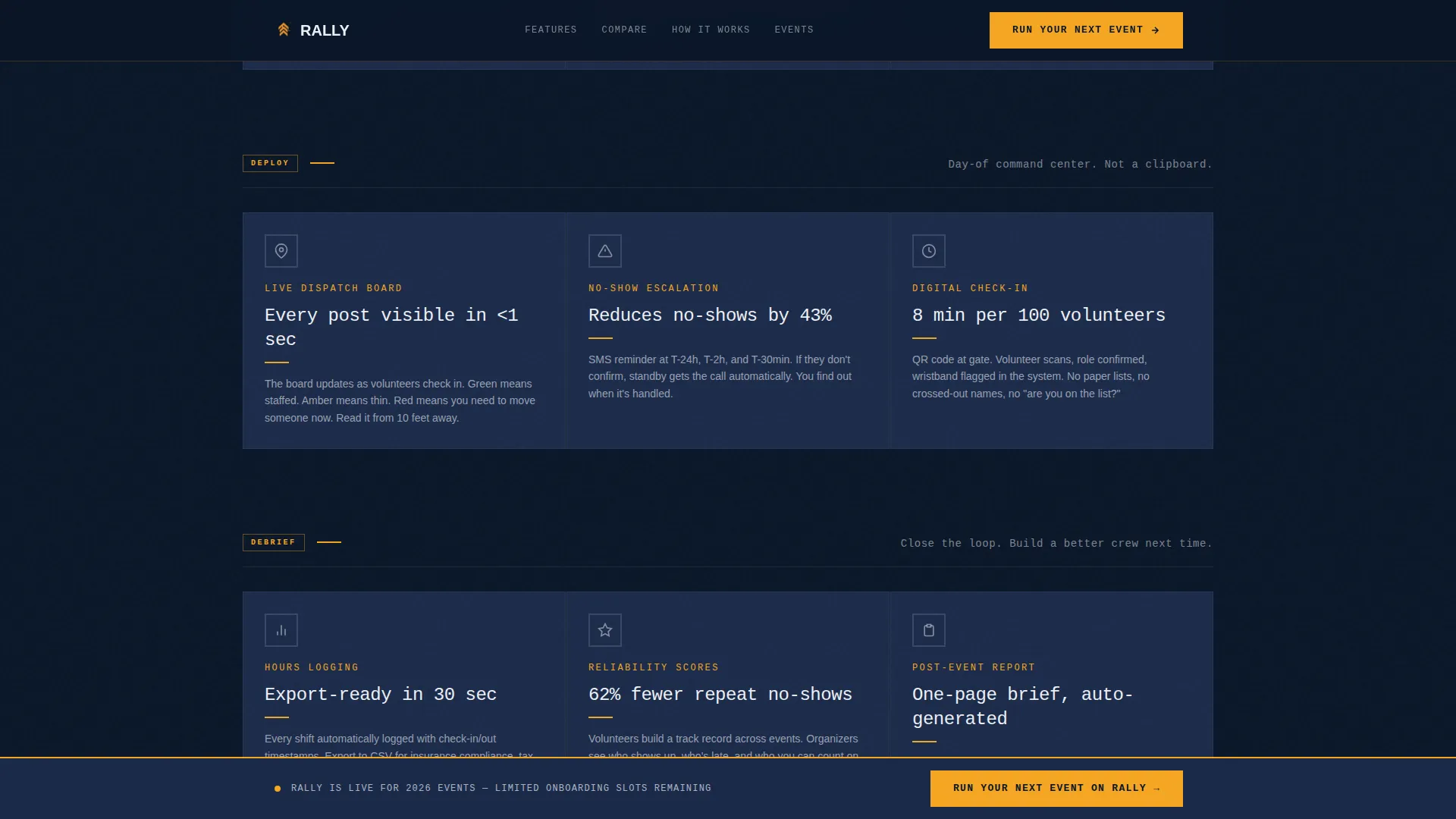
Cards are organized into four grouped rows labeled RECRUIT, SCHEDULE, DEPLOY, and DEBRIEF. Each card presents a single platform capability with a bold monospaced feature name, one hard metric, a two-line explanation, and a stamped-style icon. The rhythm is mechanical and additive, building platform credibility as the visitor scrolls.
Spec Sheet Creative Direction
Every card reads like an entry in a car brochure spec sheet. Feature names are set in bold monospaced type, metrics are hard and specific, and icons look stamped rather than illustrated. This keeps the page feeling like a technical document rather than a marketing pitch.
Head-On Comparison Table
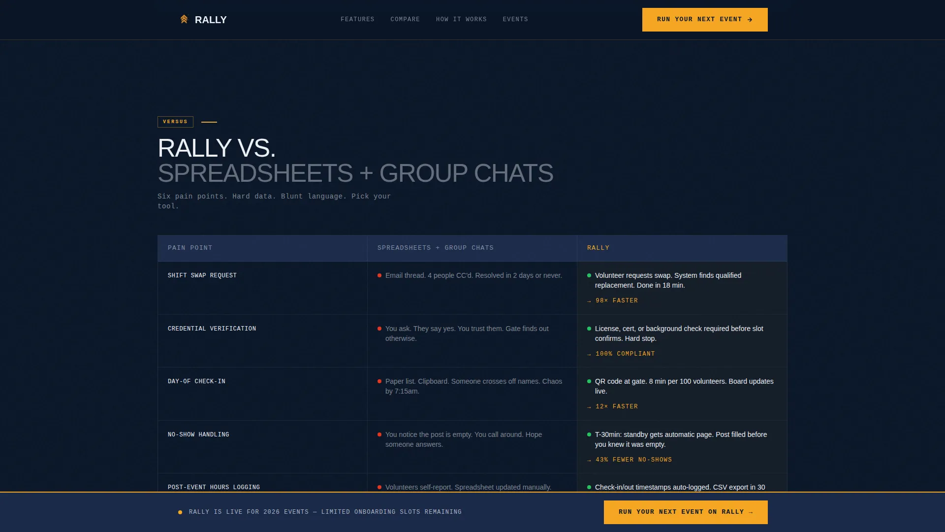
A persistent two-column section pits the platform directly against spreadsheets and group chats. Each row targets a specific pain point: shift swaps, credential tracking, day-of check-in, and post-event hours logging. Hard data and blunt language are used throughout, with no softening qualifiers.
Scrolling Automotive Logo Bar
The header features a slow-scrolling horizontal marquee of automotive event organization logos. Each logo is rendered in desaturated white against the deep navy background, giving the appearance of sponsor decals on a race car's quarter panel and delivering social proof at a glance.
Sticky Call-to-Action Bar
A persistent sticky bar runs along the bottom of the page repeating the primary call to action: "Run Your Next Event on Rally." This keeps the conversion path visible at every scroll position without interrupting the reading flow above it.
Fast Frictionless Signup Form
The signup form collects only three fields: event name, expected volunteer count, and email. That order is deliberate, keeping the first question event-focused rather than personal. A case study card sits alongside the form as a secondary conversion path.
Page sections overview
| Section | Purpose |
|---|---|
| Hero Section | Opens with oversized uppercase headline, grain texture, amber status badge, and primary call to action |
| Logo Bar Marquee | Scrolling strip of automotive event org logos for immediate social proof |
| RECRUIT Card Row | First spec-sheet card group presenting volunteer recruitment capabilities |
| SCHEDULE Card Row | Second card group covering shift assignment and scheduling features |
| DEPLOY Card Row | Third card group showing day-of dispatch and check-in capabilities |
| DEBRIEF Card Row | Fourth card group covering post-event hours logging and review |
| Comparison Table | Two-column Rally versus spreadsheets section with hard data per pain point |
| Signup Call to Action | Three-field form plus case study card for primary and secondary conversion |
| Footer | Linear single-row footer pattern |
Design & branding system
The visual identity is Bold Brutalist, built to feel like a pit-lane gantry at dusk. Every design decision prioritizes speed of reading and operational clarity over decorative detail.
- Color system: deep cockpit navy (#0A1628) as the dominant background, instrument-cluster blue (#1B2A4A) on card surfaces, high-beam white (#EDF0F5) for all typography, and caution-stripe amber (#F5A623) reserved exclusively for calls to action and live-status indicators
- Typography: JetBrains Mono for all data labels and feature names, DM Sans for body copy, and massive uppercase headlines tracked tight for section openers
- Cards use no border-radius and sit on the navy field with hard 2px amber rules appearing on hover, making interaction feedback feel mechanical and deliberate
Mobile & speed optimization
The template is designed desktop-first, matching the reality that event chairs are at a desk the morning of an event. It is built to scale responsively to mobile without losing the brutalist visual clarity.
- Native CSS scroll behavior is used throughout, with no third-party scroll libraries, keeping the build lightweight
- Scroll-reveal animations use the Intersection Observer application programming interface (API), triggering card and section entrances without JavaScript overhead
- The marquee, sticky call-to-action bar, and hover states all rely on CSS-first implementations for consistent cross-device performance
How this template helps you convert
The page is structured as a funnel, not a brochure. Every section adds evidence and reduces friction before the visitor reaches the form.
- The spec sheet card grid builds platform credibility row by row, so by the time the visitor reaches the comparison table they already understand the value proposition
- The comparison table delivers the final push by naming specific pain points and showing hard data, removing the last objection before the call to action
- The three-field signup form and adjacent case study card give the visitor two paths forward without requiring any enterprise demo commitment
Other information about this template
This template is part of a broader ecosystem of automotive software landing page designs built for the community-run events market. It is specifically suited to B2B software-as-a-service (SaaS) products targeting small and mid-sized event organizations rather than large enterprise clients.
- The template style is Card Grid (Modular), making it easy to reorder or expand card rows as the platform's feature set grows
- The header concept is a Logo Bar, a proven social proof pattern in automotive and motorsport sponsorship contexts
- The creative direction is Spec Sheet, borrowed directly from car brochure design language, which resonates strongly with gear-focused audiences
- The landing page direction is Comparison/Versus, a high-intent conversion pattern well suited to buyers already aware they have a problem and actively evaluating solutions
Theme
Bold Brutalist
Creative direction
Spec Sheet
Color system
Midnight Blue
Style
Card Grid (Modular)
Direction
Comparison/Versus
Page Sections
Four-phase Spec Sheet Card Grid
Head-on Comparison Table
Scrolling Automotive Logo Bar
Sticky Call-to-action Bar
Fast Three-field Signup Form
Bold Brutalist Visual System
Related questions
Who is this landing page template built for?
What sections are included in the template?
Can I update the card content and metrics?
What does the signup form collect?
Is this template optimized for desktop or mobile use?



