Nonprofit Software Professional Website Template
Dispatch is a dashboard-style nonprofit landing page template built for operations teams managing physical goods logistics. It opens with a cinematic API code snippet, walks visitors through a chaos-to-clarity problem arc, and drives them toward a free sandbox demo. The dark Carbon Fiber visual system and real-time data aesthetic make the platform feel alive and trustworthy from the first scroll.
by Rocket studio
Quick summary
Dispatch is a single-page, click-through landing page template designed for nonprofit order management platforms. It uses a Problem to Solution Arc structure to show operations directors exactly how scattered spreadsheet logistics become a clean, routed, trackable system. The dark dashboard aesthetic and code-first header make the value clear before a visitor reads a single headline.
Who this template is for
This template is built for software founders and product teams selling logistics or order management tools to the nonprofit sector. It speaks directly to the people running warehouse operations, not the fundraising side of the house.
- Operations directors at mid-size nonprofits managing donated inventory across multiple warehouse partners
- Software-as-a-service teams building platforms for physical goods logistics in the humanitarian or relief space
- Founders who want a high-trust, demo-first landing page that converts without asking for a form fill
What problem this template solves
Nonprofit operations teams often manage complex shipment routing through color-coded spreadsheets and manual workarounds. When a pallet goes to the wrong staging area, families go without supplies. This template helps a platform product page communicate urgency, specificity, and real capability fast.
- Visitors arrive skeptical; the code-snippet header and simulated chaos grid make the pain point undeniable within seconds
- Generic SaaS landing pages fail to show nonprofit operators that a tool understands their world; this template speaks their language from the first line
- Most demo-driven products bury the call to action; this template places it at three strategic points so no motivated visitor ever has to hunt for next steps
What you get with this template
The template delivers a fully structured, single-page layout built around a linear narrative flow. Every section is designed to reduce doubt and increase the impulse to try the sandbox demo.
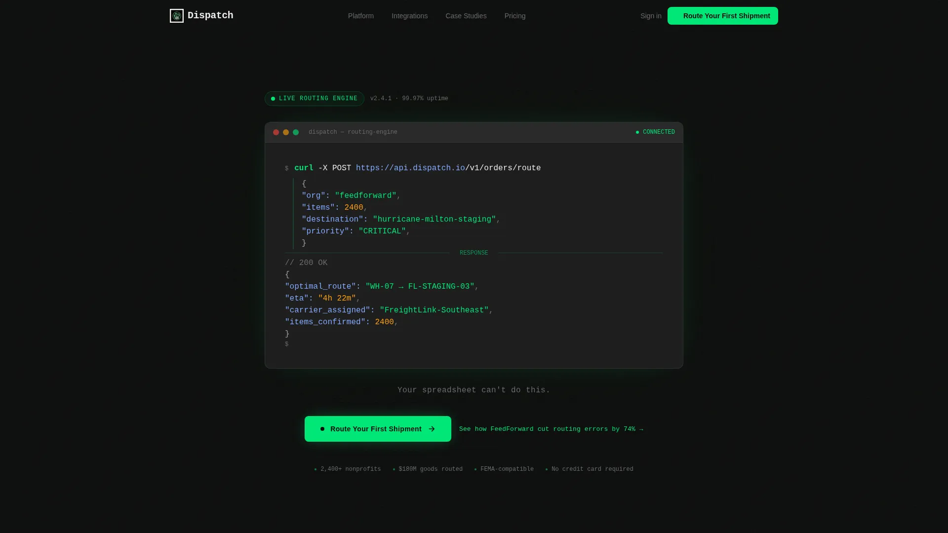
- A cinematic code-snippet header showing a live POST request to a routing endpoint, complete with green syntax highlighting and a blinking cursor on a carbon-black field
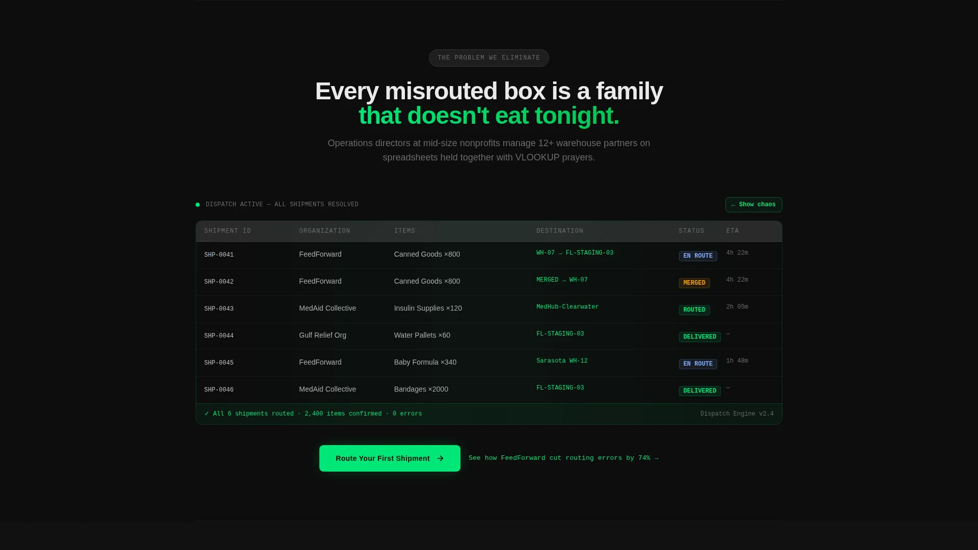
- A two-act Problem to Solution Arc with a simulated broken spreadsheet transitioning to a resolved, green-coded dashboard with carrier tracking on a dark-mode map
- Three strategically placed primary call-to-action buttons reading "Route Your First Shipment," plus a secondary case study text link beneath each one
Feature list
This section covers the core built-in components and design behaviors included in the Dispatch template.
Cinematic Code-Snippet Header
The header displays a syntax-highlighted POST request to /v1/orders/route at large scale. The payload shows real nonprofit context: organization name, item count, disaster destination, and a 200 response returning route, estimated arrival, and carrier. A single line of copy fades in below the block.
Problem to Solution Arc Sections
Section one renders a simulated spreadsheet grid with red cells, duplicate entries, and an upward-ticking counter of unaccounted shipments. Section two snaps to a resolved dashboard view. Each subsequent section peels back one platform layer, showing the broken state first before the solution slides into place.
Three-Point Call-to-Action Placement
The primary call-to-action button appears after the header, after the dashboard reveal, and as a fixed bottom bar on mobile. No form is required. Each button click leads directly to a pre-loaded demo environment with sample nonprofit data already populated.
Secondary Case Study Link
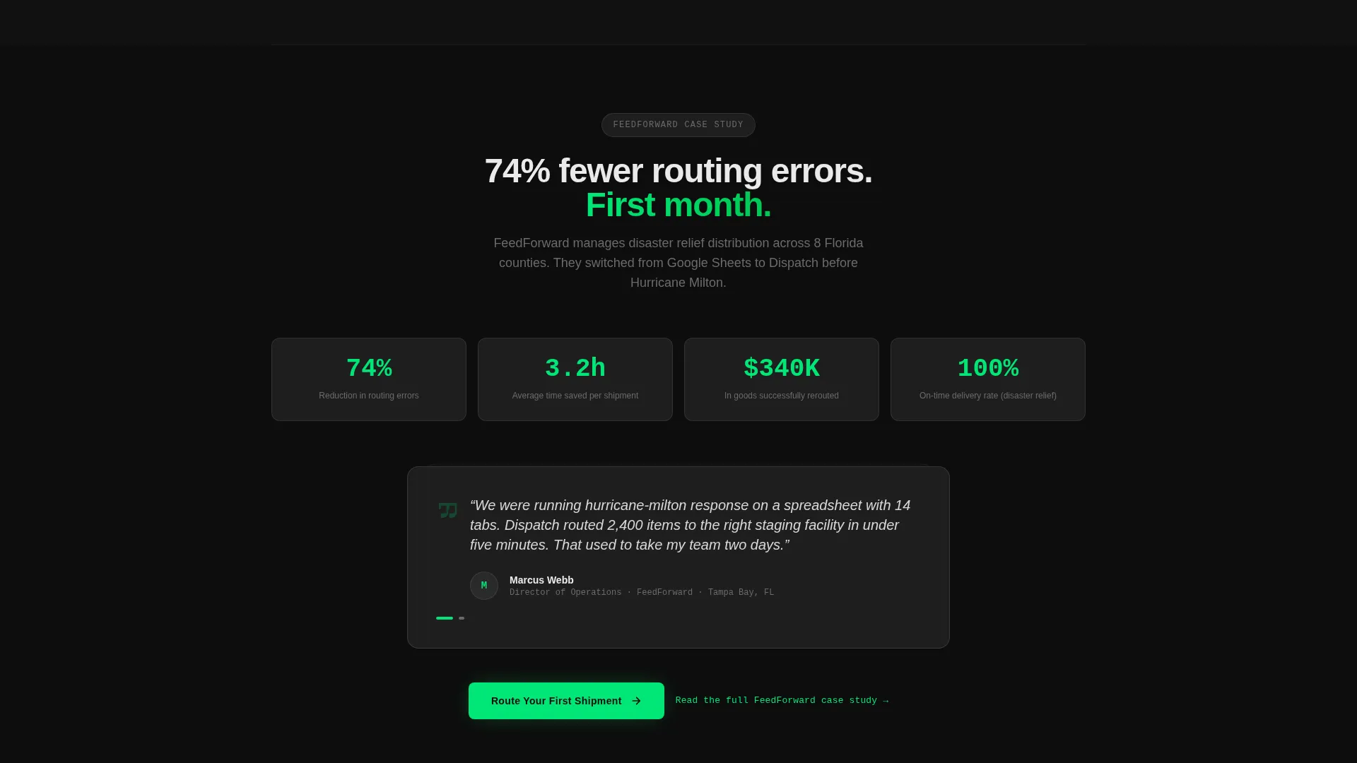
A text link reading "See how FeedForward cut routing errors by 74%" threads beneath every primary call-to-action. It gives hesitant visitors a social-proof path without disrupting the main conversion flow.
Dark-Mode Dashboard Reveal
The dashboard section uses a dark-mode map with real-time carrier tracking pins and color-coded routing status. The visual shift from chaos to clarity is the emotional core of the page and is designed to be the moment a visitor decides to try the demo.
Platform Layer Walkthrough
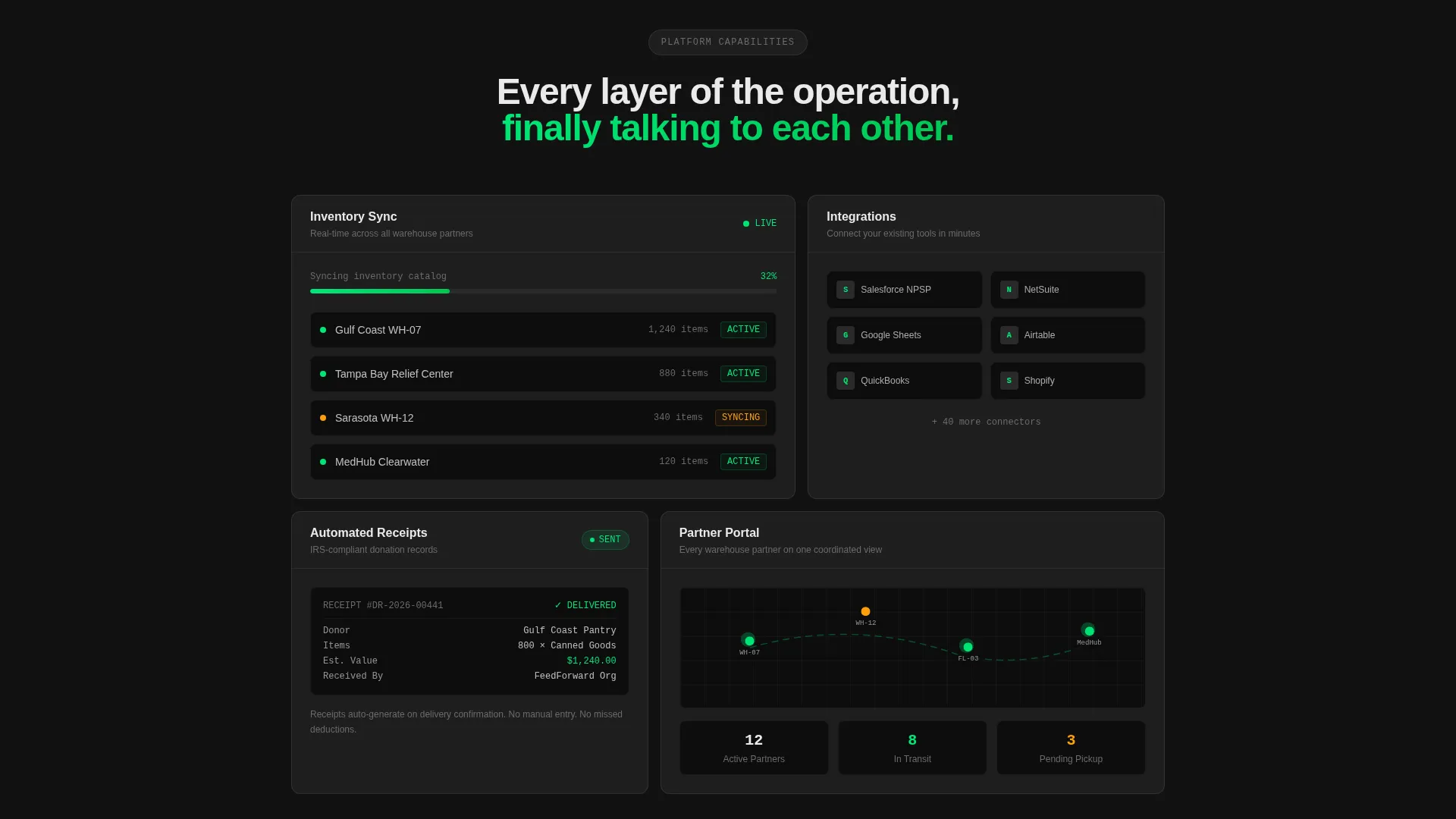
After the main dashboard reveal, individual sections cover inventory sync, partner portal access, and automated receipts. Each section is structured to show the broken workflow first and the platform solution second, reinforcing the core message with each scroll step.
Page sections overview
| Section | Purpose |
|---|---|
| Code Snippet Header | Open with live API context and a sharp one-liner |
| Hero Copy Line | Fade-in copy lands the contrast after the code |
| Chaos Spreadsheet View | Visualize the problem with a ticking error counter |
| Dashboard Reveal | Show the resolved, routed, green-coded solution |
| Inventory Sync Section | Demonstrate real-time inventory management capability |
| Partner Portal Section | Show multi-warehouse partner access in context |
| Automated Receipts Section | Cover the receipt and confirmation workflow |
| First call to action Block | Drive to demo after the header section |
| Second call to action Block | Re-engage after the dashboard reveal |
| Mobile Fixed call to action Bar | Persistent bottom bar for mobile visitors |
| Case Study Text Links | Provide a social-proof path below each call to action |
Design & branding system
The visual identity is built on the Carbon Fiber color system. Every design decision reinforces the feeling of a high-precision cockpit: matte surfaces, glowing data readouts, and zero decorative noise.
- Color palette: deep carbon black (#0D0D0D) and machined graphite (#1E1E1E) for all backgrounds; telemetry green (#00E676) reserved strictly for live data points, status indicators, syntax highlights, and hover states; signal white (#EAEAEA) for all primary typography
- Green is used as a functional signal, not a decorative accent, so every time it appears it carries meaning
- The overall visual tone is dark, fast, and purposeful, built to feel like operational software rather than a marketing brochure
Mobile & speed optimization
The Dispatch template is structured with mobile nonprofit operators in mind. The fixed bottom call-to-action bar ensures the demo entry point is always reachable on smaller screens without scrolling back up.
- The fixed mobile call to action bar keeps "Route Your First Shipment" visible throughout the entire scroll journey on small screens
- The page uses no forms, which reduces friction on mobile devices where typing is slow and drop-off is high
- Section transitions and the chaos-to-clarity animation flow are designed to work within a linear single-column mobile layout
How this template helps you convert
Dispatch is built around a click-through model where the goal is one action: get the visitor into the sandbox. Every structural decision removes a reason to hesitate.
- The code-snippet header establishes technical credibility in under three seconds, filtering for the right audience and signaling that this is a real platform, not a concept
- The Problem to Solution Arc creates emotional momentum by showing the pain first and the relief second, so the visitor arrives at each call-to-action already wanting the resolution
- The no-form, demo-first model lowers commitment to nearly zero; clicking "Route Your First Shipment" costs nothing, which means conversion pressure stays low and click-through rates stay high
Other information about this template
Dispatch is categorized under Technology and Nonprofit Software, making it a focused tool for a specific intersection of operator need and platform product marketing. A few additional details worth noting before you decide.
- The template style is Dashboard and Data Grid, which means the visual language is rooted in operational interfaces rather than editorial or storytelling layouts
- The creative direction follows the Problem to Solution Arc pattern, a structure well suited for tools that replace a painful manual process
- The header concept is a Code Snippet, which positions the product as developer-built and API-capable from the very first impression
- The landing page direction is Click-Through, meaning no lead capture happens on this page; all conversion flows to the demo environment
- The Startup Velocity theme drives the pacing, keeping the scroll experience tight and forward-moving rather than leisurely or content-heavy
- This template is part of the Carbon Fiber color system family, designed for dark-mode-first interfaces where data clarity is the primary visual goal
Theme
Startup Velocity
Creative direction
Problem→Solution Arc
Color system
Carbon Fiber
Style
Dashboard/Data Grid
Direction
Click-Through
Page Sections
Cinematic Code-snippet Header
Problem to Solution Arc Layout
Three-point Call to Action Placement
Secondary Social Proof Link
Platform Layer Walkthrough Sections
Fixed Mobile Call-to-action Bar
Related questions
Does this template include a contact form or lead capture?
Can I change the color scheme to match my own brand?
Who is the intended visitor for this landing page?
Is this template suitable for a for-profit logistics company?
What sections are included in the Dispatch template?



