InfoSec Platform Landing Page Template
Shield is a bento grid cybersecurity landing page template built for enterprise security teams and vendors. It combines a Dark Glass Panels header, a Feature Matrix comparison grid, and a Comparison/Versus conversion flow. The Monochrome Steel palette and Data Command theme give it the cold, focused visual authority that serious security buyers expect.
by Rocket studio
Quick summary
Shield is a single-page cybersecurity landing page template built on a bento grid layout. It uses a Data Command theme and Monochrome Steel color system to establish immediate visual authority. The page guides enterprise security buyers from a high-impact header through a granular feature comparison, then moves them toward a free threat assessment. Every section is designed to earn trust before asking for a click.
Who this template is for
This template is built for cybersecurity vendors and security platform teams who need to speak directly to a technical, skeptical buyer. It is also the right fit for any team positioning a product against established competitors in the enterprise security space.
- Security platform companies targeting CTOs, compliance officers, and security engineers
- Vendors replacing or displacing legacy SIEM tools, standalone endpoint detection and response solutions, or cloud-native application protection platforms
- Teams running a comparison-led or versus-style go-to-market strategy
What problem this template solves
Most cybersecurity landing pages fail technical buyers. They lead with vague claims, bury the data, and ask for a meeting before proving any value. The result is a high-exit page that never earns the trust of the engineer who actually makes the shortlist.
- Visitors with deep technical knowledge leave when they cannot find granular proof behind a claim
- Generic hero sections do not reflect the operational weight of enterprise security decisions
- Comparison pages that lack interactive specificity fail to move buyers who already know their current stack
What you get with this template
You get a complete, conversion-focused cybersecurity landing page with a structured bento grid layout, a defined visual identity, and a clear conversion architecture. Every section has a specific job, and the design reinforces the message at every scroll depth.
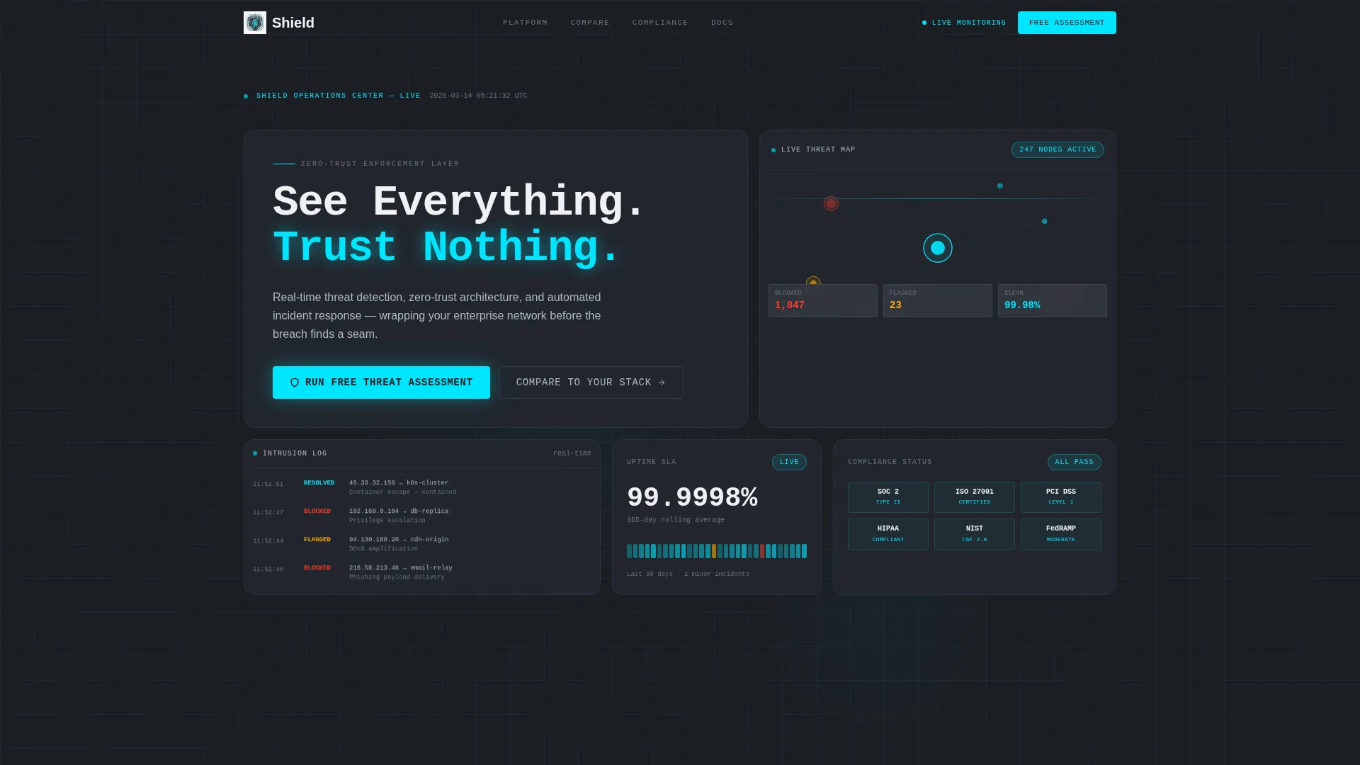
- A Dark Glass Panels bento header displaying a live threat map, a scrolling blocked-intrusion log, an uptime counter, and a compliance badge grid
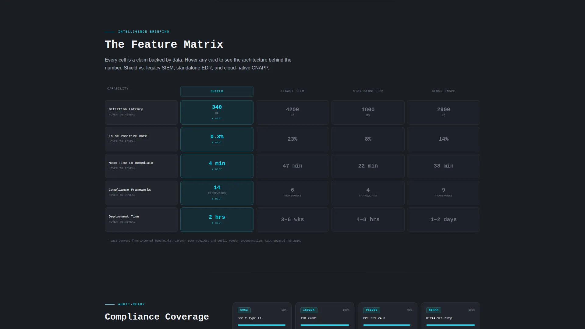
- A Feature Matrix comparison section that pits your platform against legacy SIEM, standalone endpoint detection and response, and cloud-native application protection platform archetypes across detection latency, false positive rate, mean time to remediate, compliance framework coverage, and deployment hours
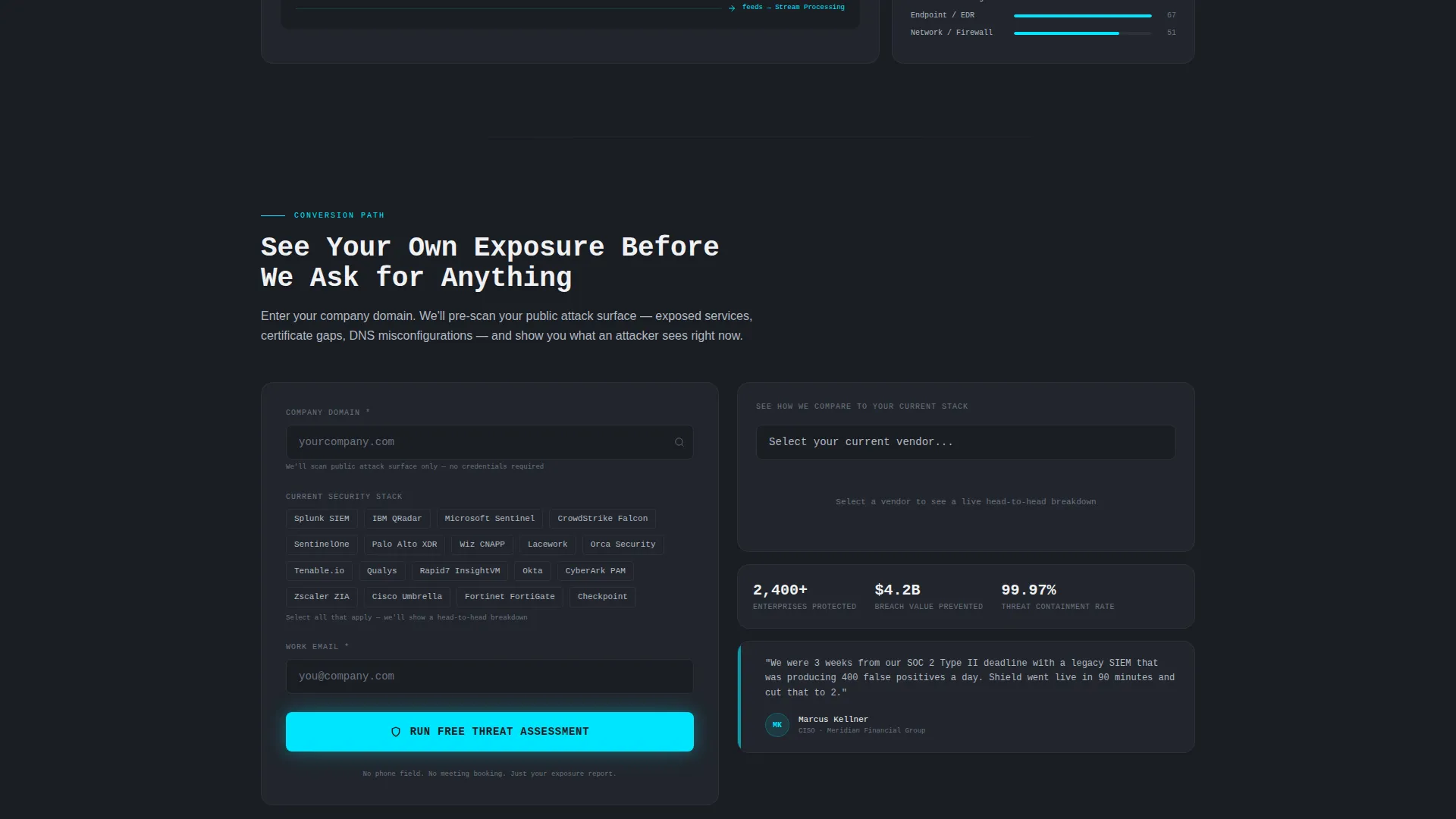
- A Comparison/Versus conversion path with a persistent primary call-to-action pill, an interactive vendor comparison tool, and a pre-qualification form collecting company domain, current security stack, and work email
Feature list
This landing page template delivers six tightly scoped, brief-backed capabilities that work together to move enterprise security buyers from first impression to qualified action.
Dark Glass Panels Bento Header
The header is a wall of frosted, translucent bento cards floating against a near-black void with a faint grid overlay. Each panel surfaces a different live data feed: a threat map with pulsing nodes, a scrolling intrusion log, an uptime counter, and a compliance badge grid. The headline "See Everything. Trust Nothing." appears in oversized mono type across the top-left panel without a glassmorphic layer, giving it immediate visual dominance.
Feature Matrix Comparison Grid
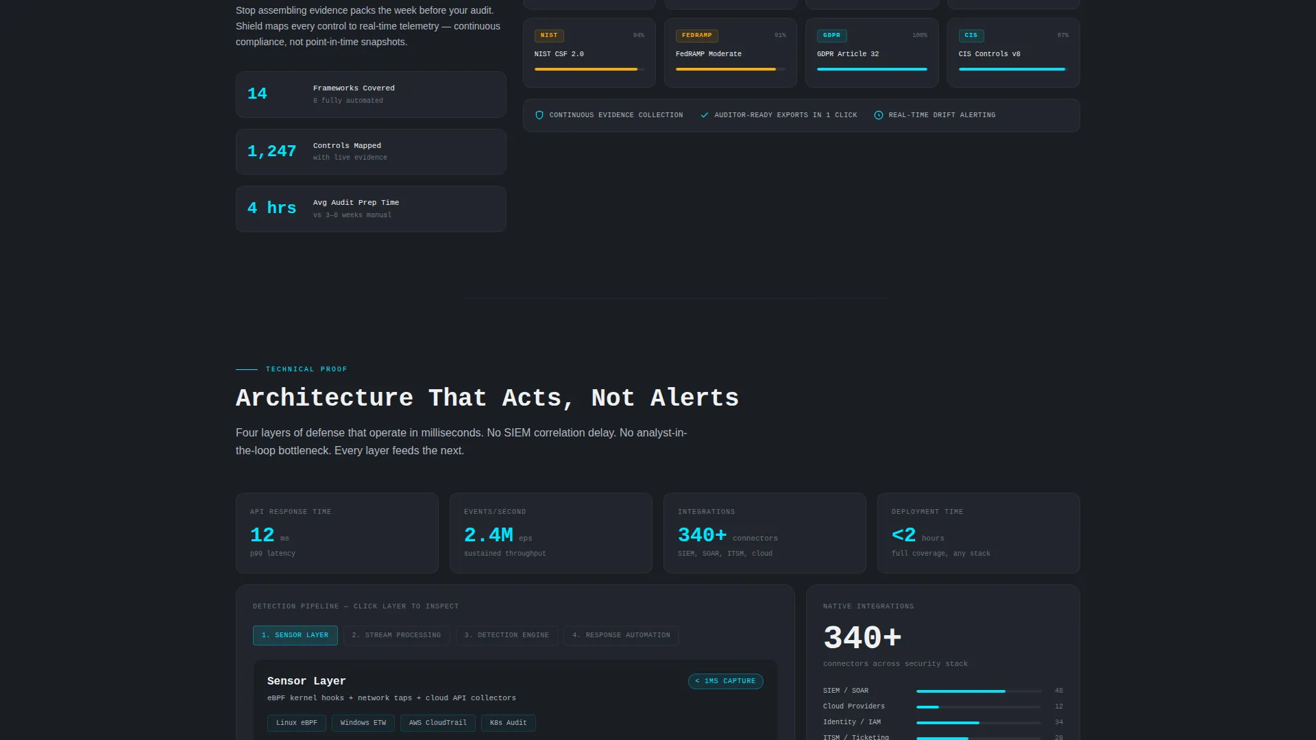
Below the header, the bento grid reorganizes into comparison clusters. Each row benchmarks the platform against a named competitor archetype across five capability columns: detection latency, false positive rate, mean time to remediate, compliance framework coverage, and deployment hours. Cards flip or expand on hover to surface the data behind each claim, and the grid tightens as the visitor scrolls from broad capability overview to granular technical proof.
Interactive Vendor Comparison Tool
A secondary conversion path labeled "See How We Compare to Your Current Stack" opens an interactive tool. Visitors select their existing vendor from a dropdown, and the bento grid dynamically reconfigures to show a head-to-head breakdown. This path keeps buyers engaged by making the comparison personal and specific to their current environment.
Persistent Primary Call-to-Action
The primary call-to-action "Run a Free Threat Assessment" appears as a persistent electric cyan pill in the bottom-right corner after the first scroll. It stays visible throughout the page without interrupting the reading experience, ensuring the conversion path is always one click away regardless of scroll depth.
Pre-Qualification Lead Form
The lead form collects company domain for public attack surface pre-scanning, a multi-select chip field for current security stack, and a work email address. There is no phone field and no meeting booking step. The form earns the submission by showing the visitor their own exposure before requesting any commitment.
Monochrome Steel Visual System
The entire template runs on a disciplined four-color system. Gunmetal black (#1A1D23) is the primary background. Brushed steel (#3A3F47) surfaces the bento cards. Cold silver (#B0B8C1) handles body text and secondary elements. Electric cyan (#00E5FF) is reserved exclusively for active states, live data pulses, and primary calls-to-action. White (#F0F1F3) appears only in headlines.
Page sections overview
| Section | Purpose |
|---|---|
| Dark Glass Header | Establish visual authority with live data panels and the primary headline |
| Threat Map Panel | Show real-time node activity to signal operational depth |
| Intrusion Log Panel | Surface a scrolling feed of blocked attempts to build immediate credibility |
| Uptime and Compliance | Display uptime counter and compliance badge grid in bento cells |
| Feature Matrix Grid | Compare platform capabilities against competitor archetypes row by row |
| Hover Detail Cards | Reveal granular technical proof when a visitor interacts with a comparison cell |
| Vendor Comparison Tool | Let visitors select their current stack and see a dynamic head-to-head view |
| Lead Capture Form | Collect domain, security stack, and work email to pre-qualify interest |
| Persistent call to action Pill | Keep the primary action visible at all scroll depths after the first section |
Design & branding system
The visual identity follows a Data Command theme built entirely on the Monochrome Steel color system. Every color choice has a single, defined role so the palette never competes with the content it frames.
- Background, surface, text, and action colors are strictly separated: gunmetal black for the void, brushed steel for cards, cold silver for body copy, electric cyan for all active and primary elements, and white reserved for headlines only
- Typography uses oversized, tracked-out mono type for the primary headline, reinforcing the operational command center aesthetic without decorative distraction
- The glassmorphic card treatment adds frosted depth and refracted light edges to bento panels, creating visual layering that suggests real interface density without visual clutter
Mobile & speed optimization
The bento grid layout is structured to adapt across screen sizes while preserving the visual hierarchy that makes the template effective. The dark, minimal palette also supports efficient rendering by avoiding heavy gradients or complex background imagery.
- Bento grid cells are designed to restack and reflow for smaller viewports without losing the comparison clarity of the Feature Matrix section
- The persistent call-to-action pill is positioned and sized to remain accessible and non-intrusive on mobile screens
- The interactive vendor comparison tool and hover card behaviors are scoped to work within a touch-first interaction model
How this template helps you convert
The conversion architecture in this template is built around a single principle: show the buyer their own risk before asking them to act. Every section earns the next click by increasing specificity and reducing perceived sales friction.
- The header establishes operational credibility immediately through live data panels, so technical buyers recognize the environment and stay engaged long enough to scroll
- The Feature Matrix builds the argument progressively, moving from broad capability proof to granular technical evidence at each scroll depth, so the visitor arrives at the call-to-action already pre-convinced
- The lead form pre-scans the visitor's own company domain for public attack surface exposure, making the first value exchange concrete and personal before any sales conversation begins
Other information about this template
This template is designed specifically for the cybersecurity landing page category and is a strong fit for vendors positioning against established platforms in the enterprise security market.
- The template style is Bento Grid, and the layout direction is Comparison/Versus, making it suited for product-led security companies that compete on measurable, verifiable capability differences
- The Data Command theme and Dark Glass Panels header concept are visually consistent with the aesthetic expectations of security operations center environments, which reinforces trust with a technically literate audience
- Teams building pages for incident response automation, zero-trust architecture, or real-time threat detection products will find the section structure and conversion flow directly aligned with their messaging needs
Theme
Data Command
Creative direction
Feature Matrix
Color system
Monochrome Steel
Style
Bento Grid
Direction
Comparison/Versus
Page Sections
Dark Glass Panels Bento Header
Feature Matrix Comparison Grid
Interactive Vendor Comparison Tool
Persistent Cyan Call-to-action Pill
Pre-qualification Lead Form
Monochrome Steel Color System
Related questions
Who is the primary audience for this landing page template?
Can I customize the competitor archetypes in the Feature Matrix section?
What does the lead form collect and why?
Does the interactive vendor comparison tool require a backend integration?
Is this template suitable for a compliance-focused security product?



