Powerful Poultry Management Landing Page Template
Flock is a bold brutalist poultry analytics landing page built for production managers, veterinary nutritionists, and contract growers who need real-time flock performance data at a glance. The template opens on a live-simulated data grid and drives conversions through a head-to-head comparison grid, a settlement sheet section, and a sticky "Run Your Numbers Free" call to action.
by Rocket studio
Quick summary
Flock is a single-page, dashboard-style landing page template built for a poultry analytics platform. It opens at full intensity with a live-simulated data grid and never lets up. Every section is designed to convert production agriculture professionals who already know their numbers and need to see the platform earn its place in the control room.
Who this template is for
This template is built for AgTech and poultry vertical SaaS teams selling to production agriculture professionals. It speaks directly to buyers who live inside the numbers every day and have no patience for vague software promises.
- Integrator production managers tracking growout performance across forty or more houses
- Veterinary nutritionists diagnosing feed conversion ratio (FCR) drops before they become profit bleeds
- Contract growers reviewing settlement sheets and looking for every recoverable dollar
What problem this template solves
Poultry analytics platforms face a specific sales challenge: their buyers are skeptical, data-literate, and already burned by legacy tools. A generic SaaS landing page with stock photography and bullet-pointed features will not move them. This template solves that problem by putting real data on the screen before the visitor reads a single headline.
- Buyers cannot feel the value of a dashboard from a screenshot, so the template simulates the live interface on load
- Legacy software comparisons are abstract until they are shown side by side with stark, unambiguous bars
- Settlement sheet impact is invisible until a before-and-after visualization makes it concrete and dollar-denominated
What you get with this template
You get a fully structured, single-page landing page ready to be customized and launched. Every section is built from the source brief and serves a specific conversion role in the buyer journey.
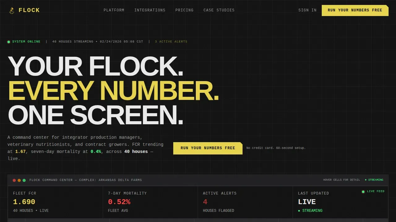
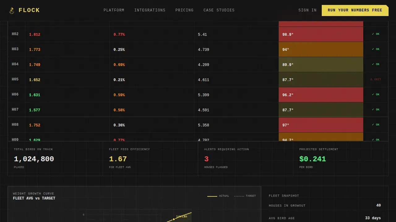
- A live-simulated data grid header with hoverable cells, tooltips, and pulsing flock metrics including FCR, mortality rate, bird weight, and house temperature heatmaps
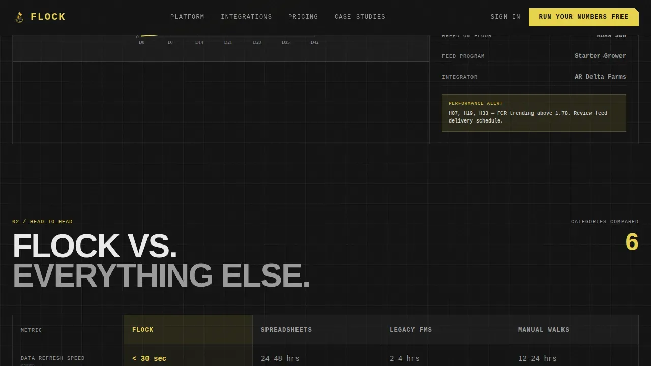
- A head-to-head comparison grid pitting the platform against spreadsheets, legacy farm management software, and manual house walks
- A settlement sheet before-and-after section, an integration ticker marquee, and a sticky "Run Your Numbers Free" call-to-action bar with a two-field form modal
Feature list
This template is built with a specific set of interactive and structural components. Each one comes directly from the source brief.
Live-Simulated Flock Data Grid
The header section renders a functioning data grid showing simulated live flock metrics. FCR trends at 1.67, seven-day mortality holds at 0.4%, average bird weight plots a growth curve, and house temperature heatmaps pulse across a forty-house complex. Visitors interact with the grid before they ever scroll down.
Hoverable Cells with Tooltips
Every cell in the data grid responds to hover. Tooltips fire on interaction, showing the visitor exactly how the interface behaves. This gives the platform a tangible, credible feel without requiring an account or a demo call.
Head-to-Head Comparison Grid
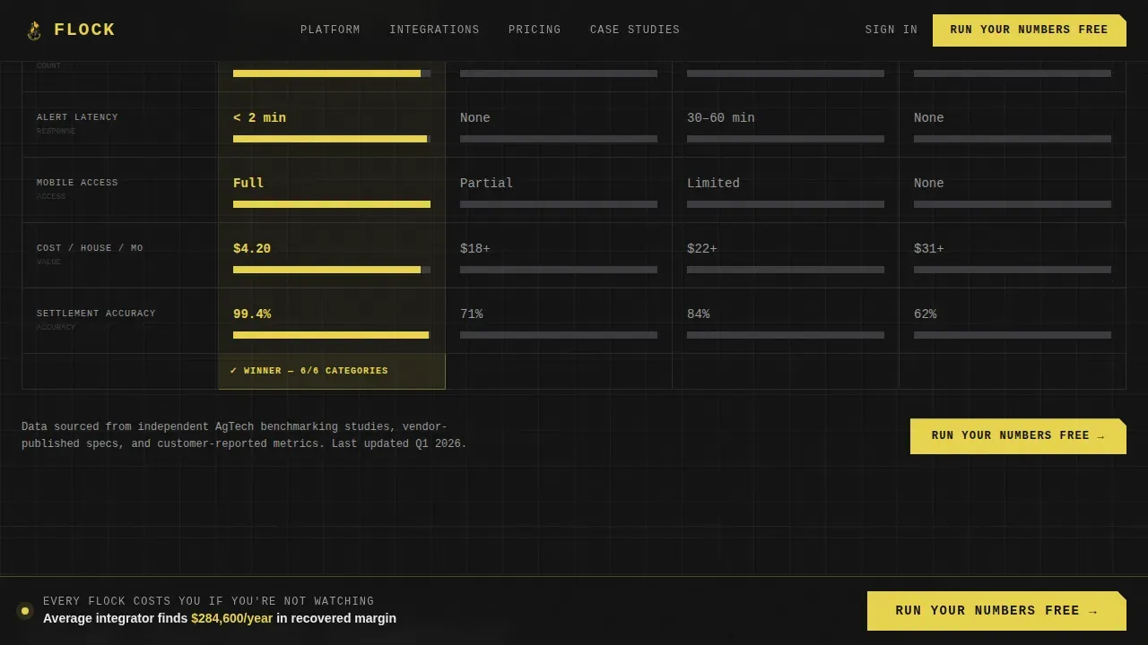
Section two is a structured comparison table measuring Flock against spreadsheets, legacy farm management software (FMS), and manual house walks. Columns cover data refresh speed, integration count, alert latency, mobile access, and cost per house. Flock's column renders in high-vis yellow; competitors render in muted graphite.
Settlement Sheet Visualization
Section three shows a real settlement sheet before and after using the platform. The visualization makes the dollar impact visible and specific. This section anchors the secondary call to action: "See Your Payback in 60 Seconds," which links to a return on investment (ROI) calculator.
Integration Ticker Marquee
Section four displays a fast-moving monochrome logo marquee. The ticker communicates ecosystem depth at a glance and keeps the scroll momentum going without slowing down the page narrative.
Sticky Call-to-Action Bar
A sticky bottom bar appears after the comparison grid and stays visible through the rest of the page. Clicking "Run Your Numbers Free" opens a two-field modal asking for number of houses and current software. The dropdown includes "spreadsheets" and "nothing" as options, meeting buyers exactly where they are.
Page sections overview
| Section | Purpose |
|---|---|
| Live Data Grid | Simulate flock metrics on load and let visitors feel the interface immediately |
| Comparison Grid | Show Flock versus spreadsheets, legacy FMS, and manual walks side by side |
| Settlement Sheet | Visualize before-and-after dollar impact from a real settlement scenario |
| Integration Ticker | Display equipment and genetics partner logos in a fast monochrome marquee |
| Sticky call to action Bar | Keep "Run Your Numbers Free" visible after the comparison grid with a two-field form |
Design & branding system
The visual identity follows a Bold Brutalist theme built on the Carbon Fiber color system. The palette reads like the instrument panel of a machine engineered for dust, heat, and ammonia. Nothing is decorative. Every element is load-bearing.
- Colors: deep carbon black (#121212) for backgrounds, woven graphite (#2A2A2E) for panels, high-vis alert yellow (#E8D44D) for critical data and calls to action, and clinical data white (#EAEAEA) for typography and chart lines
- Typography: JetBrains Mono for data and numbers, Manrope for headlines, DM Sans for body copy
- The brutalist headline "YOUR FLOCK. EVERY NUMBER. ONE SCREEN." is stamped across the top of the data grid in raw, uncompromising type
Mobile & speed optimization
The template is designed desktop-first, reflecting the reality that production managers work on command center screens. It is also built to be responsive so contract growers can pull it up on a mobile device in the field.
- Animation uses optimized intervals for data simulation and requestAnimationFrame for smooth, non-blocking updates
- Scroll reveals, pulsing alerts, and the marquee ticker are all performance-tuned to avoid jank on production hardware
- The desktop layout prioritizes the data grid and comparison table at full width, while the mobile layout reflows content for smaller screens without breaking the visual identity
How this template helps you convert
The comparison grid does the selling. The calls to action just open the gate. Every section is sequenced to build conviction before asking for anything.
- The live data grid creates immediate credibility by letting visitors interact with simulated flock metrics before reading a single claim, removing skepticism at the top of the page.
- The comparison grid makes the platform's advantage concrete and measurable across five specific dimensions, so buyers can justify the decision internally without needing a sales call.
- The sticky call to action bar with a minimal two-field form lowers the friction of starting, and the secondary ROI calculator link gives number-focused buyers a reason to take the next step on their own terms.
Other information about this template
This template is categorized under Technology and sits in the Poultry Vertical SaaS subcategory with a niche focus on poultry analytics dashboards. It is built in English with United States dollar pricing and Imperial units (pounds and degrees Fahrenheit) throughout.
- The template style is Dashboard and Data Grid, matched to the AgTech and production agriculture B2B context
- The creative direction is Launch Energy: the page opens at full intensity and every scroll feels like acceleration
- The header concept is Interactive Preview, meaning visitors experience the product interface before any sign-up prompt appears
- The landing page direction is Comparison and Versus, meaning the comparison grid is the structural and persuasive core of the page
Theme
Bold Brutalist
Creative direction
Launch Energy
Color system
Carbon Fiber
Style
Dashboard/Data Grid
Direction
Comparison/Versus
Page Sections
Live-simulated Flock Data Grid
Hoverable Cells with Tooltips
Head-to-head Comparison Grid
Settlement Sheet Before and After
Integration Ticker Marquee
Sticky Call to Action Bar with Form Modal
Related questions
Who is this template designed for?
Does the data grid show real flock data?
Can I customize the comparison grid columns?
What does the sticky call to action bar include?
Is this template desktop-only?



