Home Services Landing Page Template
Dispatch is a single-page, card grid landing page template built for home services email platforms. It showcases post-booking confirmation emails with technician details, service scope, and upsell pathways. Designed for HVAC franchises, plumbing networks, and multi-trade operators, the template uses a Data Command visual theme to present performance metrics that make the value case instantly clear.
by Rocket studio
Quick summary
Dispatch is a modular card grid landing page template for home services email platforms. It is built around a Stats-First Impact creative direction, opening with a scrolling logo bar and a single oversized metric. Every section stacks evidence through bold KPI cards, comparison rows, and two conversion-focused calls to action that let visitors benchmark their current email against the platform.
Who this template is for
This template is designed for teams who send high-volume post-booking confirmation emails and want to show prospective clients exactly what they are leaving on the table. It speaks directly to operators who measure revenue per dispatch, not just delivery rates.
- HVAC franchises and plumbing networks that send thousands of confirmation emails daily
- Multi-trade home service companies looking to turn low-value confirmations into upsell opportunities
- Platform founders and sales teams pitching home services email tools to franchise decision-makers
What problem this template solves
Most home service businesses send a plain confirmation email and move on. They never measure open rates, tap-through rates, or rebooking conversions, so they have no way of knowing how much revenue each send leaves unclaimed. This template gives platforms a landing page that surfaces that gap immediately and makes the cost of inaction visible.
- Dispatchers sending thousands of emails daily with no performance visibility
- Businesses relying on generic confirmation messages instead of dynamic, data-rich sends
- Sales teams lacking a compelling comparison tool to close franchise-level prospects
What you get with this template
You get a fully structured, single-page card grid layout built around evidence and conversion. Every visual element is designed to move a skeptical franchise buyer from curiosity to commitment without a single lifestyle image.
- A scrolling logo bar header followed by a dominant stat in oversized electric cyan typography
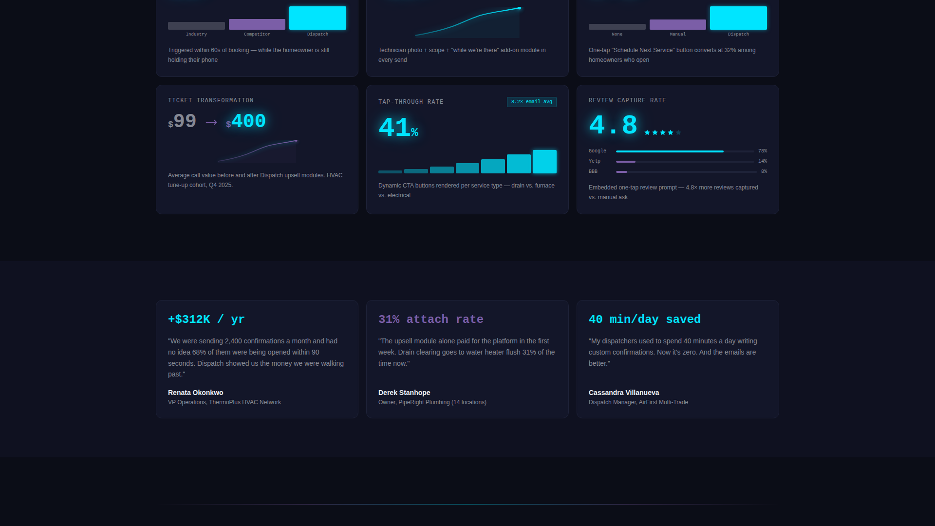
- A modular grid of KPI cards, each leading with a bold metric and a supporting mini chart or comparison delta
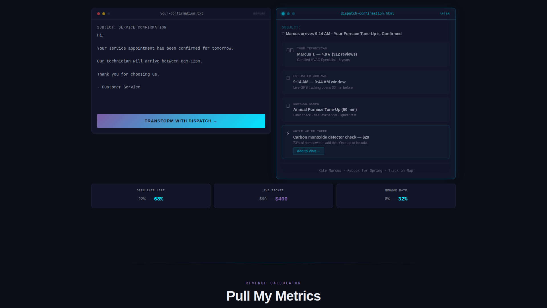
- Two primary conversion modules: a side-by-side email simulator and a revenue projection calculator
Feature list
This template packages every layout component a home services email platform needs to make its performance case fast and credibly.
Stats-First Card Grid
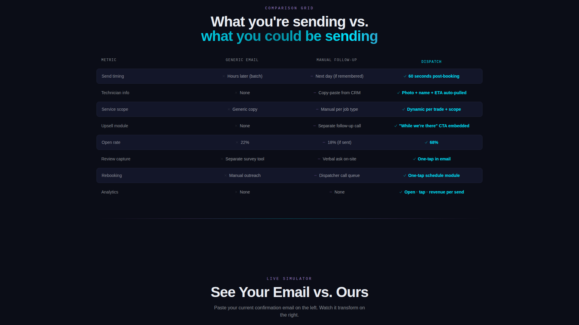
Each card in the modular grid leads with a bold performance metric before revealing its context. Cards display figures such as open rates and average upsell values alongside mini bar charts and revenue curves. The layout makes every row a piece of evidence rather than a marketing claim.
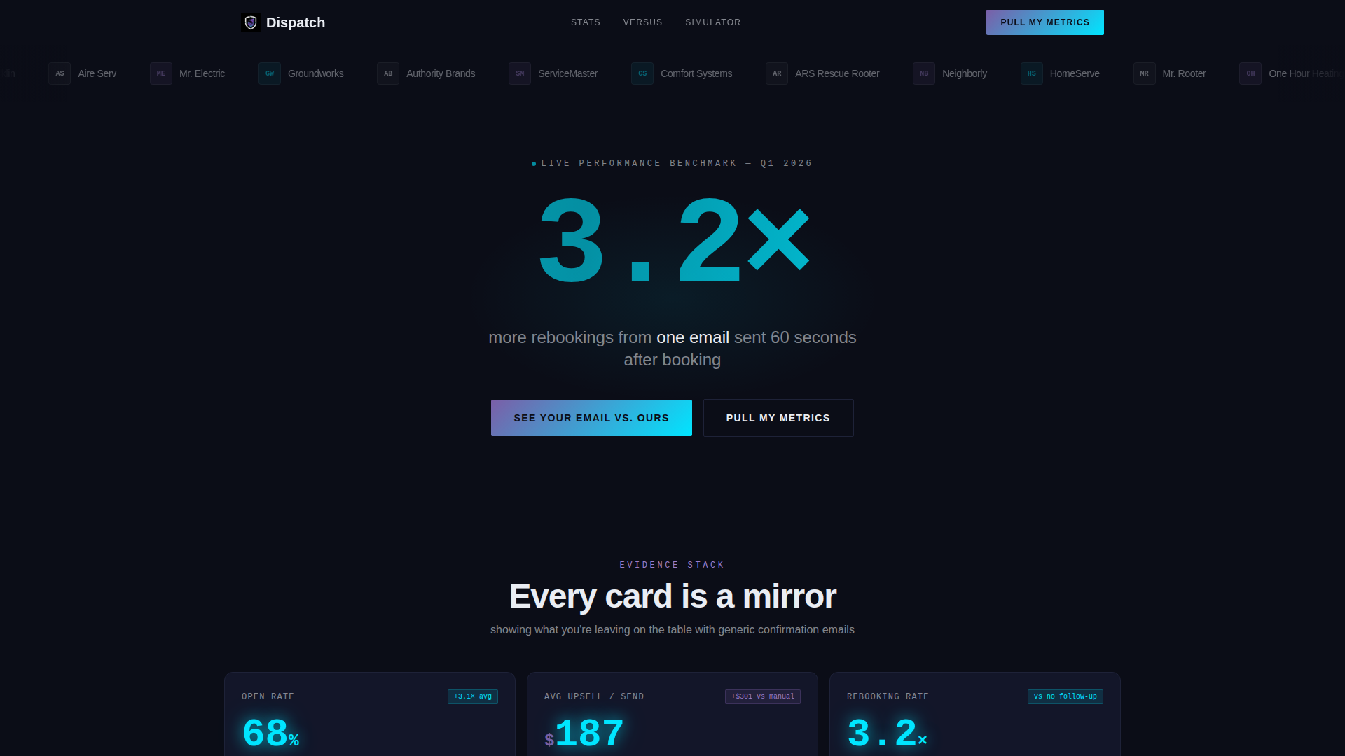
Scrolling Logo Bar Header
The header opens with a horizontal ribbon of home service franchise logos scrolling slowly against a void-black background. Each logo is tinted to the iridescent palette. Below the ribbon, a single oversized stat printed in electric cyan anchors the page's credibility in under two seconds.
Side-by-Side Email Simulator
The primary call to action, "See Your Email versus. Ours," opens a comparison module where visitors can paste their current thank-you email. The simulator rebuilds it with dynamic service data, a technician photo, a review prompt, and a rebooking module, making the gap between old and new instantly visual.
Revenue Projection Module
The secondary call to action, "Pull My Metrics," collects only monthly service volume and current email platform from the visitor. It then generates a projected revenue lift, giving prospects a personalized reason to act without requiring a long sign-up form.
Comparison Row Layout
Each row of cards in the grid positions the platform's results directly against generic confirmation emails, manual follow-ups, and competitor tools. Visitors absorb a clear verdict before they consciously decide to evaluate, which reduces friction in the consideration phase.
Iridescent KPI Pulse Styling
Every key performance indicator number is styled in electric cyan and pulses on the card surface. Comparison deltas glow in holographic violet. Card backgrounds use near-black with subtle gradient borders that shimmer iridescent on hover, keeping the data feel consistent and visually alive throughout the scroll.
Page sections overview
| Section | Purpose |
|---|---|
| Logo Bar Header | Builds franchise credibility and delivers a single dominant stat in electric cyan |
| Primary Stat Banner | Anchors attention with "3.2x more rebookings" in oversized typography |
| KPI Card Grid | Stacks evidence rows of bold metrics, mini charts, and comparison deltas |
| Comparison Row Cards | Positions platform results against generic emails and competitor tools |
| Email Simulator call to action | Lets visitors paste their current email and see it rebuilt side by side |
| Revenue Projection call to action | Collects service volume and email platform to return a projected revenue lift |
Design & branding system
The visual identity follows a Data Command theme using the AI Iridescent color system. The palette feels like a GPU rendering a neural network in real time, shifting between deep purple and hot cyan depending on where the eye lands.
- Core palette: void black (#0B0D17) for backgrounds, holographic violet (#7B5EA7) for comparison deltas, electric cyan (#00E5FF) for KPI numbers, and signal white (#EAEDF3) for card surfaces and body text
- Card backgrounds sit at near-black with subtle gradient borders that shimmer iridescent on hover
- Typography runs in signal white at body level with electric cyan reserved for oversized stat callouts and KPI pulse numbers
Mobile & speed optimization
The card grid layout is structured to reflow cleanly across screen sizes so that franchise buyers reviewing the page on a phone or tablet still experience the full evidence stack in the intended order.
- Modular card rows collapse to single-column stacks on smaller viewports without losing metric visibility
- The scrolling logo bar and oversized stat banner maintain visual hierarchy at every screen width
- Both call to action modules, the email simulator and the revenue projector, are positioned for thumb-friendly interaction on mobile displays
How this template helps you convert
The entire page is engineered around a Comparison/Versus direction where every element makes the visitor feel the cost of their current approach before asking for anything in return.
- The Stats-First card grid front-loads proof, so visitors absorb a performance verdict within the first scroll, reducing the time needed to build trust with a skeptical franchise buyer.
- The "See Your Email versus. Ours" simulator makes the gap between a plain confirmation and a dynamic, upsell-loaded send personal and immediate, which turns abstract claims into a concrete demonstration the visitor controls.
- The "Pull My Metrics" revenue projection module closes the loop by attaching a specific dollar figure to the visitor's own operation, making the decision to sign up feel like math rather than a leap of faith.
Other information about this template
This template is part of a Technology category collection focused on home services email tools. It is suited for teams pitching post-booking confirmation improvements to franchise operators at the scale of companies like Neighborly or HomeServe, where dispatchers handle thousands of sends per day.
- The template style is Card Grid (Modular), making it straightforward to rearrange, add, or remove metric cards as the platform's proof points evolve
- The Data Command theme and AI Iridescent color system distinguish the page visually from typical SaaS landing pages built on light backgrounds and lifestyle photography
- The niche focus is the home services thank you email, a category where the gap between a generic send and a revenue-optimized confirmation is large enough to serve as the entire conversion argument
Theme
Data Command
Creative direction
Stats-First Impact
Color system
AI Iridescent
Style
Card Grid (Modular)
Direction
Comparison/Versus
Page Sections
Stats-first Modular Card Grid
Scrolling Franchise Logo Bar
Side-by-side Email Simulator
Revenue Projection Module
Comparison Row Architecture
Iridescent KPI Pulse Styling
Related questions
What type of business is this template designed for?
Can I update the metric cards with my own platform's numbers?
Does the template include working simulator functionality?
How many calls to action does this template include?
Is Dispatch a single landing page or a multi-page template?