Space & Advanced Aerospace Professional Website Template
Ration is a single-column flow landing page template built for the space food and nutrition niche. It combines a Data Command visual theme with a Monochrome Steel color system to create a resource hub that feels like a live mission display. The layout guides aerospace professionals through research content and toward a gated archive download, earning trust before asking for credentials.
by Rocket studio
Quick summary
Ration is a precision-built landing page template for space food and nutrition professionals. It uses a Data Command theme and Monochrome Steel palette to deliver a credible, content-led resource hub. The single-column flow moves visitors through research sections and toward a gated archive download, balancing visual authority with a clear conversion path.
Who this template is for
This template is designed for organizations working at the intersection of aerospace science and human nutrition. It communicates depth and technical authority from the first scroll, making it a natural fit for high-trust professional audiences.
- Aerospace contractors provisioning crewed missions and managing payload nutrition requirements
- Space agency dietitians and flight surgeons balancing macro ratios against payload mass limits
- Biotech researchers studying gut microbiome behavior and crew health in microgravity environments
What problem this template solves
Space food and nutrition resources are often buried in dense academic portals or scattered across agency websites. There is no polished, conversion-ready hub that speaks the language of aerospace professionals while also earning trust before asking for contact information.
- Credibility gap: visitors need to see real research depth before they share professional credentials
- Fragmented content: white papers, diet protocols, and caloric planning tools have no unified, navigable home
- Weak conversion paths: generic lead forms do not segment aerospace engineers from flight surgeons or researchers
What you get with this template
You get a fully structured, single-column landing page designed around a space laboratory environment. Every section serves a distinct content function, and the layout moves visitors from discovery to conversion in a deliberate sequence.
- A panoramic spacecraft galley header with live-style telemetry data overlays and mission elapsed time counters
- Four scroll compartments covering the galley, nutrition lab, research bay, and cargo manifest resource library
- Two conversion paths: a gated archive download form and a persistent bottom-docked email subscription bar
Feature list
This template is built around six purposeful components drawn directly from the source brief. Each one is described below.
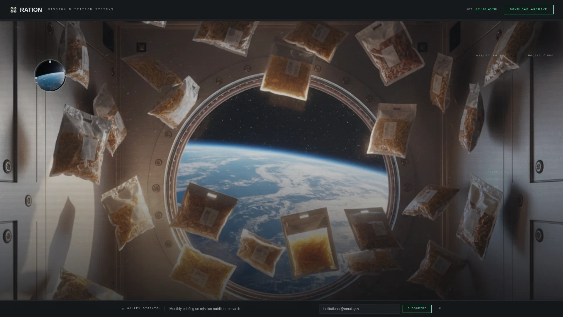
Panoramic Galley Header
The header spans the full viewport width and simulates a seated eye-level view inside a spacecraft galley module. Magnetic trays, mission-coded pouches, and a barely visible Earth curve through a porthole frame the scene. A data line fades in across the bottom third, displaying mission elapsed time, crew caloric deficit, and a slow-counting macro tracker. No traditional headline appears, just telemetry that draws the visitor in.
Compartment Scroll Architecture
Each scroll section is designed as a distinct compartment within the same vessel. Visitors move from the galley into a nutrition lab, then into a research bay, then into a cargo manifest. Horizontal pressure-door line transitions slide open between sections as the visitor scrolls, reinforcing the sensation of moving deeper into a space station.
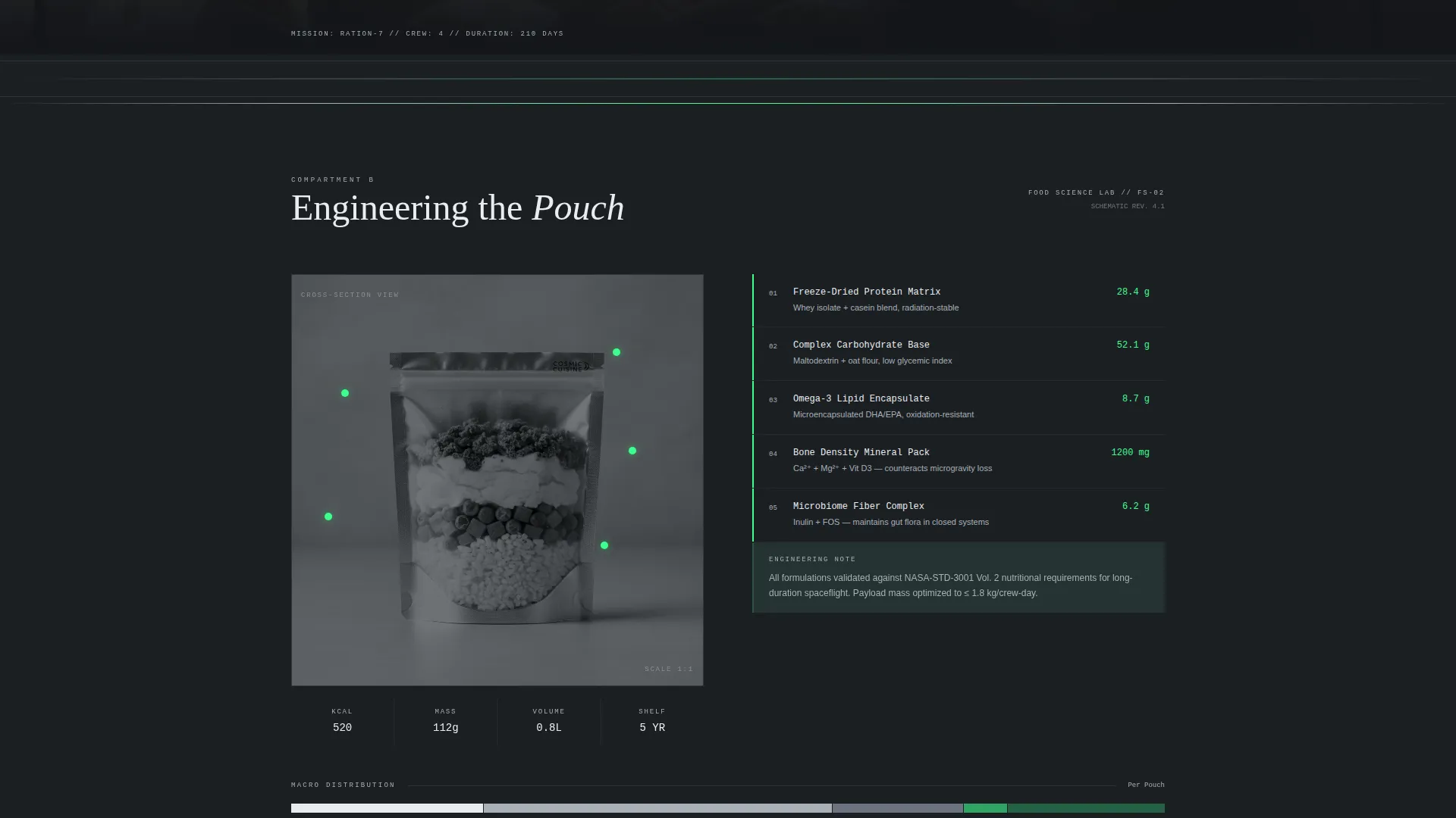
Engineering Schematic Food Diagrams
The nutrition lab compartment presents cross-section diagrams of food pouches with ingredient callouts floating beside them. These callouts are styled as engineering schematics, giving technical audiences an immediate visual vocabulary they recognize and trust.
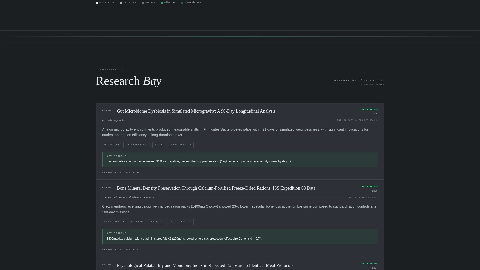
Research Data Cards
The research bay renders peer-reviewed study summaries as individual data cards. Each card shows abstract numbers and citation counts, with expandable methodology panels. This format lets professional visitors scan findings quickly and dig deeper on demand.
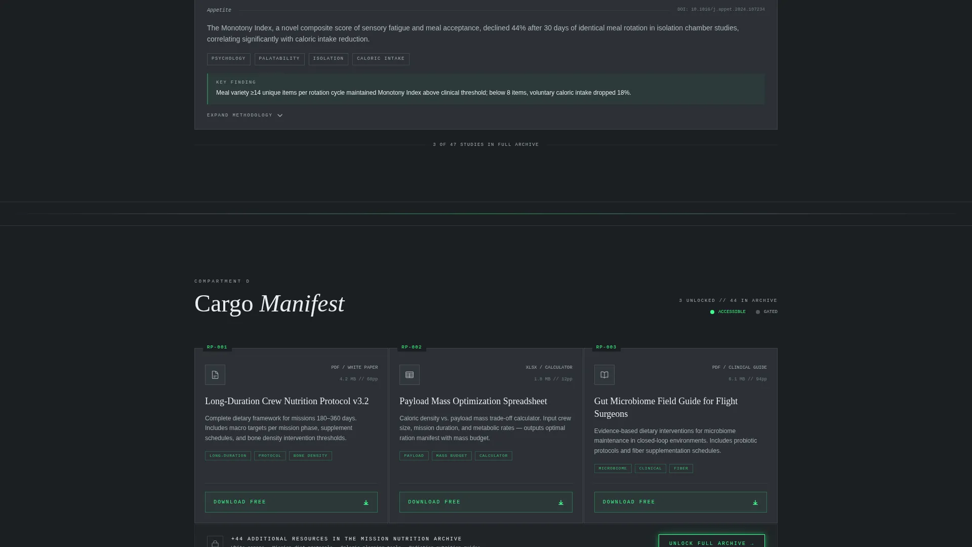
Cargo Manifest Resource Library
The resource library displays white papers, mission diet protocols, and caloric planning spreadsheets as labeled payload containers arranged on a grid. The visual metaphor of a cargo manifest makes the content feel organized, mission-critical, and worth downloading.
Gated Archive Download Form
The primary call to action appears after the third content compartment, once the visitor has consumed three unlocked resources. The form collects professional role, institutional email, and specific interest area via checkbox, segmenting aerospace engineers, flight surgeons, researchers, and students before granting archive access.
Page sections overview
| Section | Purpose |
|---|---|
| Galley Header | Establish mission atmosphere and surface live telemetry data |
| Telemetry Data Line | Display caloric deficit, macro tracker, and mission elapsed time |
| Nutrition Lab | Show food pouch schematics with floating ingredient callouts |
| Research Bay | Present study summaries as expandable data cards with citations |
| Cargo Manifest | Grid of labeled downloadable resources styled as payload containers |
| Archive Download Form | Gate the full resource archive after three unlocked content pieces |
| Galley Dispatch Bar | Persistent bottom-docked email subscription bar for monthly briefing |
Design & branding system
The visual identity follows a Data Command theme built entirely from the Monochrome Steel color system. Every color choice prioritizes information clarity over decoration, making the page feel like a live nutrition manifest displayed on an internal station monitor.
- Deep bulkhead charcoal (#1B1F23) for the primary background, machined aluminum (#A8B0B8) for secondary surfaces and dividers, and clinical module white (#EAEDF0) for text and data overlays
- Caution phosphor green (#3DFF8F) used exclusively for interactive elements, live data points, and call-to-action states to create sharp visual focus without warmth
- Overhead fluorescent lighting simulation with a cool cast on all photographic surfaces, keeping every element reflective and utilitarian
Mobile & speed optimization
The single-column flow layout is well suited to responsive rendering across screen sizes. The template's architectural structure keeps content load predictable and scroll behavior clean.
- Single-column layout eliminates complex grid reflow across viewport breakpoints
- Section-by-section compartment structure means content loads in a clear, linear sequence without layout collisions
- The persistent bottom-docked Galley Dispatch bar is designed to stay visible and functional across all screen heights
How this template helps you convert
The conversion strategy is built into the content sequence itself. Visitors earn access to the archive rather than being asked for credentials upfront.
- Three unlocked resources are presented in full before the gated download form appears, proving content depth and building trust before any form is shown
- The archive download form segments visitors by professional role and interest area, making the lead data more useful for aerospace and nutrition organizations
- The persistent Galley Dispatch subscription bar provides a low-commitment secondary path, capturing emails from visitors who are not yet ready to complete the full form
Other information about this template
This template is categorized under Aerospace and Defense, with a specific focus on the Space and Advanced Aerospace subcategory and the Space Food and Nutrition niche. It was designed for a content and resource hub landing page direction, meaning the primary goal is information delivery before conversion.
- The template style is Single Column Flow, which keeps the visitor on a single uninterrupted reading path from header to conversion
- The Spatial and Architectural creative direction treats the page as a physical environment, not a flat document, giving each section a distinct spatial identity
- The header concept is Panoramic and Wide, designed to span the full viewport and establish environmental authority immediately on load
- The Data Command theme is consistent throughout, meaning every visual element functions as information rather than decoration
- This template is suited to organizations building authority in long-duration mission nutrition, food preservation technology, crew psychology of eating, and payload mass optimization
Theme
Data Command
Creative direction
Spatial & Architectural
Color system
Monochrome Steel
Style
Single Column Flow
Direction
Content/Resource
Page Sections
Panoramic Spacecraft Galley Header
Compartment-to-compartment Scroll Flow
Engineering Schematic Food Diagrams
Research Bay Data Cards
Cargo Manifest Resource Grid
Dual Conversion Path System
Related questions
Who is the primary audience for this template?
How does the conversion flow work?
Can I customize the color palette or section content?
What types of resources does the cargo manifest section support?
Is this template suited for ongoing use or a single campaign?


