Transparent Nonprofit Landing Page Template
Reach is a scroll-reveal nonprofit landing page template built around radical transparency. A live impact calculator greets visitors first, letting them see exactly what their donation or volunteer hours accomplish. Progressive comparison panels then reveal overhead ratios, program breakdowns, and time-to-impact metrics, giving donors, volunteers, and corporate partners the proof they need before they ever fill out a form.
by Rocket studio
Quick summary
Reach is a single-page nonprofit contact template designed for organizations that lead with proof, not promises. Visitors interact with a real-time impact calculator before any ask is made. Scroll-triggered glassmorphic panels then surface overhead comparisons, program-level cost breakdowns, and volunteer metrics, building a transparent, data-backed case that converts skeptical donors, busy volunteers, and corporate giving managers alike.
Who this template is for
This template is built for nonprofits that have nothing to hide and want that fact to be the centerpiece of their outreach. It works especially well for community-focused organizations handling food access, tutoring, or housing programs.
- Church group coordinators comparing how far each dollar actually travels across multiple organizations
- Corporate social responsibility managers who need verifiable data before committing to an annual giving partnership
- Retired professionals ready to volunteer but frustrated by charities that offer no visible record of impact
What problem this template solves
Most nonprofit pages ask for trust before earning it. They lead with emotional imagery and a donate button, leaving analytical visitors with no way to verify claims. Reach flips that sequence entirely.
- Visitors calculate their personal impact before a single form field appears, removing the cold-ask problem
- Overhead ratio comparisons and program-by-program cost data address the "where does my money go" question directly
- The branching contact form sends donors, volunteers, and organizational partners to a relevant next step instead of a generic submission page
What you get with this template
Reach delivers a fully designed, interaction-rich landing page where every major section serves a specific persuasion role. The layout is not decorative; it is argumentative by design.
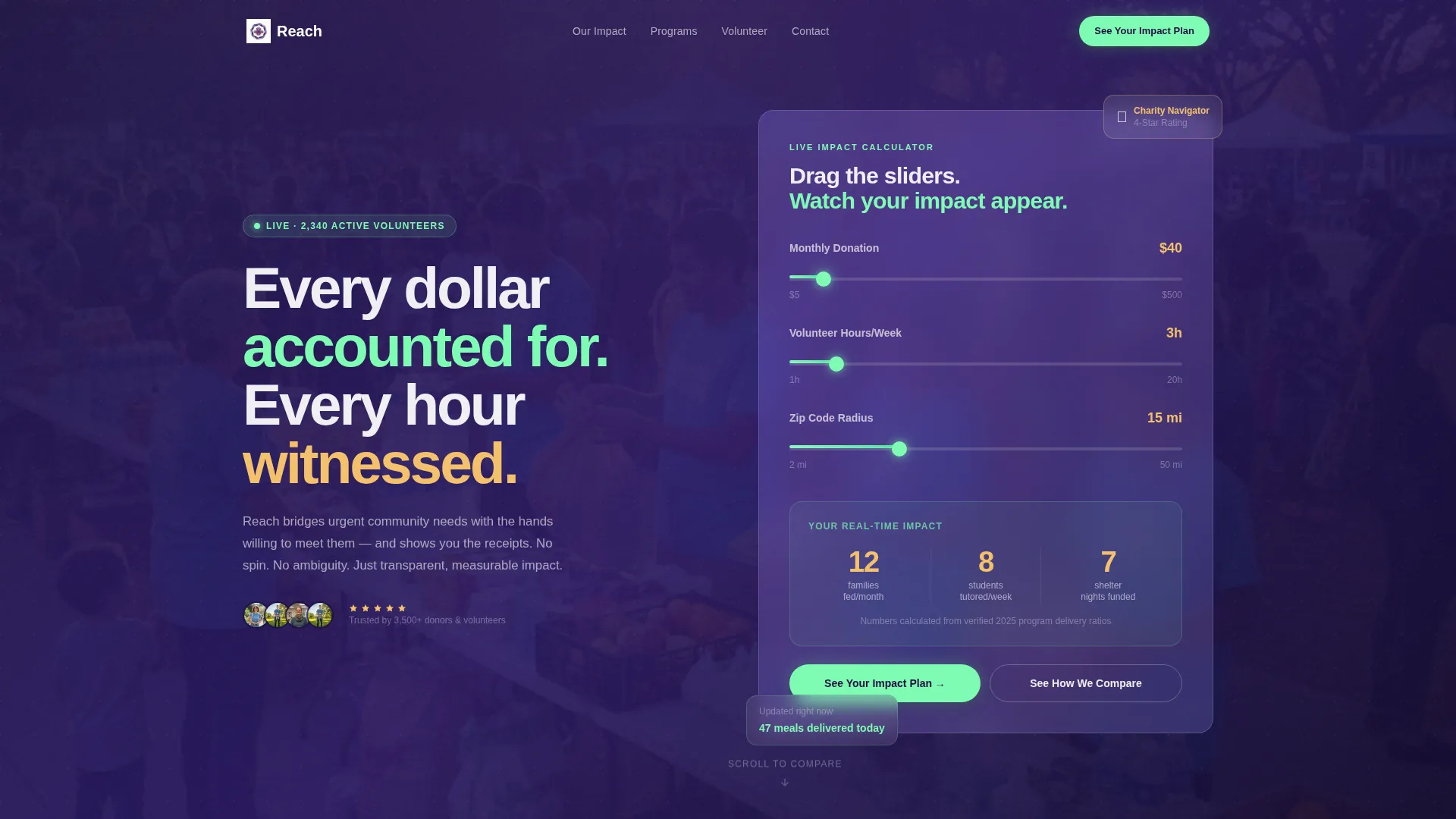
- A frosted-glass impact calculator in the header with three animated sliders and real-time result display
- Four progressively revealed comparison sections covering overhead ratios, program outcomes, and volunteer time metrics
- A two-step branching contact form that adapts its second screen based on whether the visitor identifies as a donor, volunteer, or organization
Feature list
This template packs practical, purpose-driven features into a single scroll-through experience. Each one addresses a specific moment of visitor hesitation.
Real-Time Impact Calculator
Three glowing sliders let visitors set their monthly donation amount, weekly volunteer hours, and local zip code radius. As each slider moves, animated counters below update instantly, showing families fed, students tutored, and other concrete program outcomes derived from actual ratios.
Scroll-Triggered Progressive Reveal
Every comparison panel enters the viewport with spring-physics easing, sliding and fading into position as the visitor scrolls. The motion feels deliberate and calm, like objects settling in still water, never rushed or distracting.
Overhead Ratio Comparison Charts
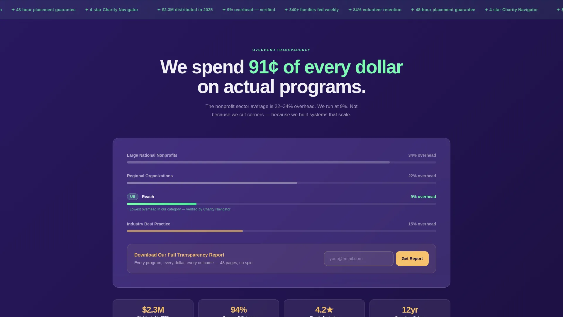
Animated bar charts materialize on scroll to compare this organization's overhead percentage against published industry averages. Visitors see the gap visually before reading a single number, making the transparency argument immediate and undeniable.
Program-by-Program Flip Cards
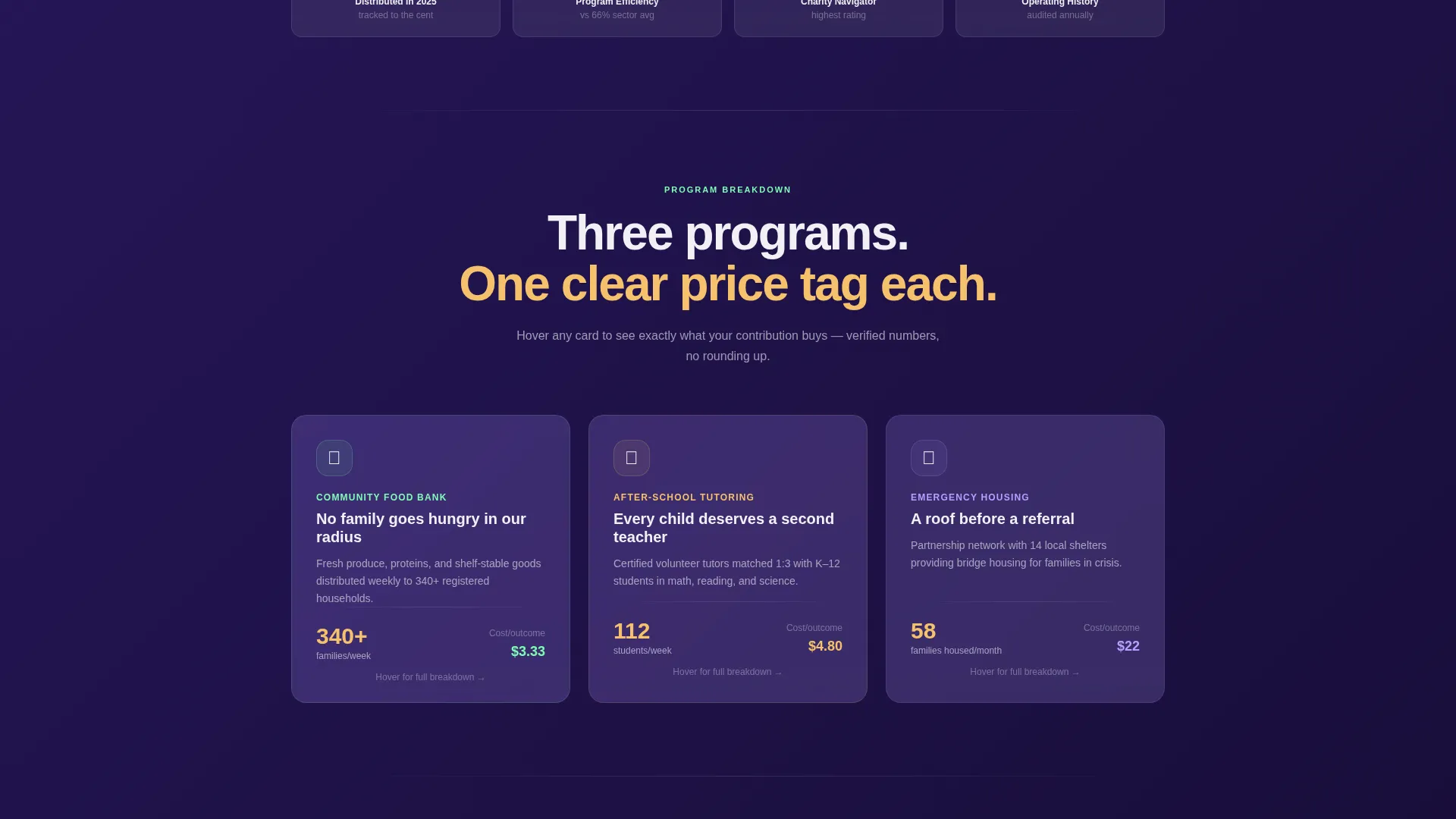
Food bank, tutoring, and housing program cards each display a summary on the front. On hover, each card flips to reveal the cost-per-outcome figure for that program, giving donors a per-dollar accountability view across every service area.
Branching Two-Step Contact Form
Step one captures name, email, and visitor type via a three-option toggle. Step two branches automatically: donors receive a suggested monthly giving plan tied to their calculator input, volunteers see a schedule-matching tool, and organizations reach a partnership inquiry screen.
Sticky Secondary Call to Action
After the third comparison panel, a frosted-glass button stays fixed in view as the visitor continues scrolling. The "See Your Impact Plan" label connects directly back to the calculator result the visitor already built, reinforcing personal relevance at the moment of decision.
Page sections overview
| Section | Purpose |
|---|---|
| Calculator Header | Engage visitors with a live impact estimator before any ask |
| Overhead Ratio Panel | Show cost efficiency versus industry averages via animated charts |
| Program Breakdown Cards | Compare food bank, tutoring, and housing cost-per-outcome on hover |
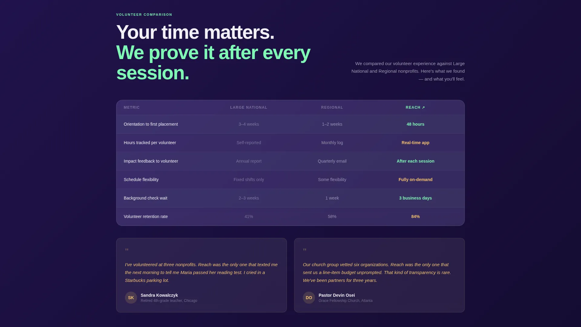
| Volunteer Metrics Panel | Display time-to-impact data side by side with peer organizations |
| Sticky Impact call to action | Keep the primary call to action in view after the third comparison |
| Branching Contact Form | Route donors, volunteers, and partners to tailored next steps |
| Transparency Report Link | Capture email with a low-friction secondary conversion option |
Design & branding system
The visual identity uses a Glassmorphic color system that places translucent white panels over a deep mission-purple gradient, creating layered depth without visual clutter. Every element is designed to feel alive and trustworthy at the same time.
- Core palette: translucent white panels at 12% opacity over a purple gradient from #2D1B69 to #1A0F3D, with soft mint (#7EFCB4) on interactive elements and warm amber (#F5C16C) highlighting impact numbers and testimonials
- Typography sits in crisp off-white (#F0F0F5) that reads clearly against blurred, frosted backgrounds at any scroll depth
- Parallax depth and backdrop-filter blur give cards a physical sense of lift as they enter the viewport, reinforcing the theme of things becoming visible as you engage
Mobile & speed optimization
The Dynamic Motion theme and parallax effects are structured to remain smooth on modern mobile browsers without overwhelming the layout on smaller screens. Scroll-trigger thresholds and spring animations are set to feel natural on touch devices.
- Glassmorphic panels reflow into single-column stacks on narrow viewports, keeping comparison data readable without horizontal scrolling
- Slider inputs in the impact calculator are touch-friendly, with large drag targets suitable for thumb interaction on phones and tablets
How this template helps you convert
Reach is built around the principle of participation before persuasion. The visitor does something before they are ever asked to give something.
- The calculator turns passive visitors into active participants within seconds of landing, creating personal investment in the outcome numbers before the first call to action appears
- Each scroll-triggered comparison panel adds a new layer of verified proof, so by the time the sticky "See Your Impact Plan" button is prominent, the visitor has already built their own argument for trusting the organization
- The branching form routes each visitor type to a relevant next step rather than a generic thank-you screen, reducing drop-off at the most critical moment of conversion
Other information about this template
This template is categorized under nonprofit organization website templates and is specifically designed for the nonprofit organization contact page niche. It is a single scroll-reveal landing page, not a multi-page site, making it ideal as a standalone campaign or outreach page.
- The template style is Scroll Reveal (Progressive), meaning sections animate into view one by one as the visitor scrolls rather than loading all at once
- The creative direction follows a Spec Sheet approach, meaning the layout functions like a transparent evidence document rather than a traditional charity appeal
- The header concept is a Calculator/Estimator, which is an uncommon choice in the nonprofit space and creates an immediate point of differentiation
- The conversion structure is Comparison/Versus, designed to help mission-driven organizations demonstrate measurable superiority in cost efficiency and program reach
Theme
Dynamic Motion
Creative direction
Spec Sheet
Color system
Glassmorphic
Style
Scroll Reveal (Progressive)
Direction
Comparison/Versus
Page Sections
Real-time Impact Calculator
Scroll-triggered Progressive Reveal
Overhead Ratio Comparison Charts
Program Flip Cards with Cost-per-outcome
Branching Two-step Contact Form
Sticky Frosted-glass Call to Action
Related questions
Can I edit the slider values in the impact calculator?
Is this template suitable for a small or local nonprofit?
What happens when a visitor clicks See Your Impact Plan?
Does the template include a Transparency Report download option?
How many comparison sections does this template include?



