Online Skill Courses Professional Website Template
A single-page landing page template built for React and frontend online courses. It opens with an interactive quiz that reveals the visitor's skill gap before they scroll, then guides them through a comparison table, mentor profiles, and capstone project showcases. Two conversion paths, a free module and a syllabus download, reduce friction and meet learners at different stages of readiness.
by Rocket studio
Quick summary
This is a comparison table landing page template for a React and frontend online course. It uses a Hero's Journey narrative structure, opening with a diagnostic quiz and descending through escalating proof sections. Two freemium conversion paths capture both ready-to-commit developers and early researchers. The Botanical color system gives the page a scholarly, confident visual tone.
Who this template is for
This template is built for course creators, developer educators, and online training programs targeting working developers. It speaks directly to learners who have hit a ceiling with tutorials and need structured, production-level guidance.
- Self-taught developers who have completed tutorials but struggle with real codebases
- Bootcamp graduates who can build small apps but freeze inside larger component trees
- Mid-career backend engineers who need frontend fluency to move faster and work independently
What problem this template solves
Most online course landing pages list features and pricing. They do not show the learner what they currently lack or prove that the course can close the gap. This template solves that by making the visitor's skill gap visible before the pitch even begins.
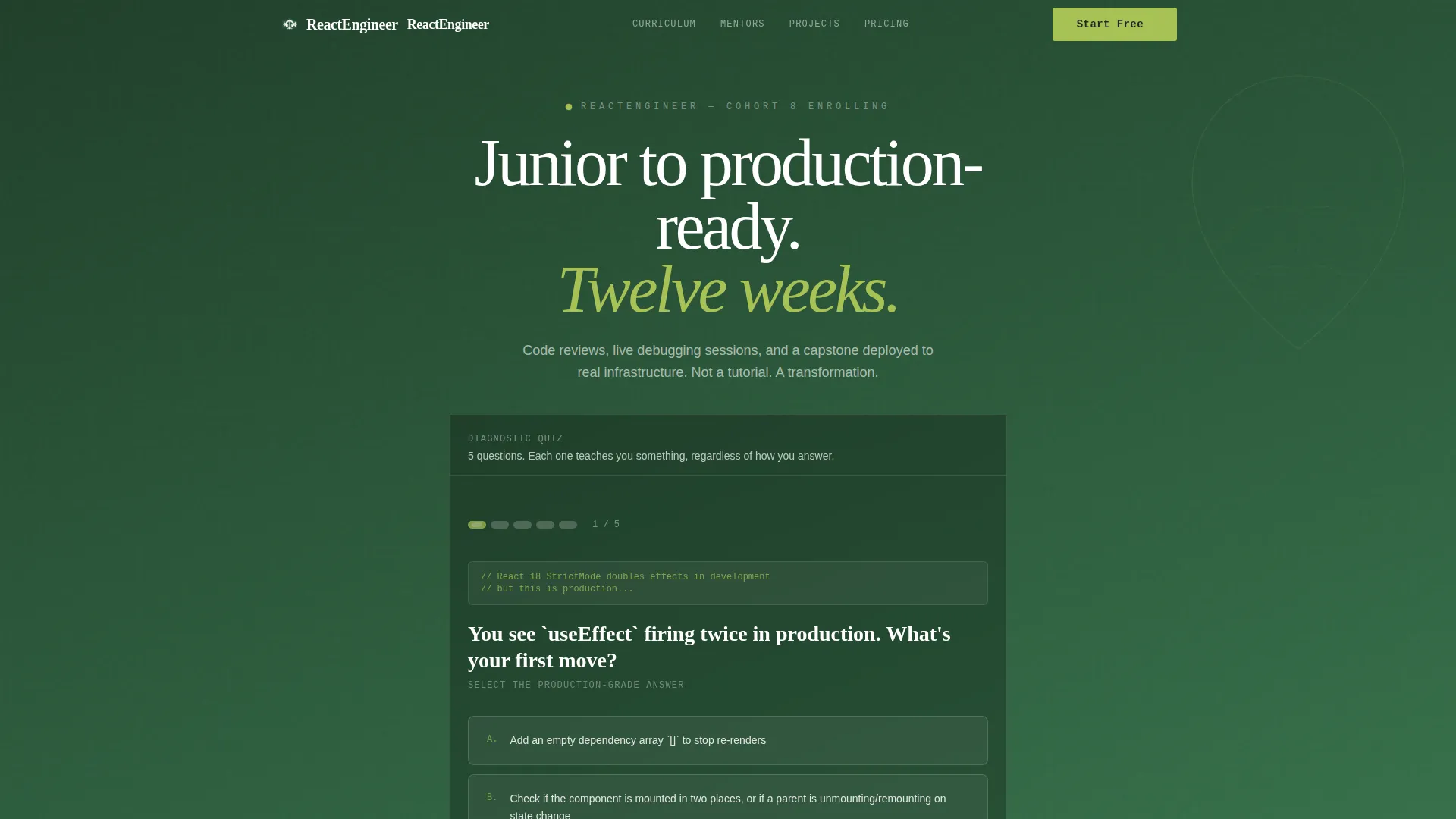
- The quiz starter confronts the visitor's current knowledge in an engaging, non-threatening way
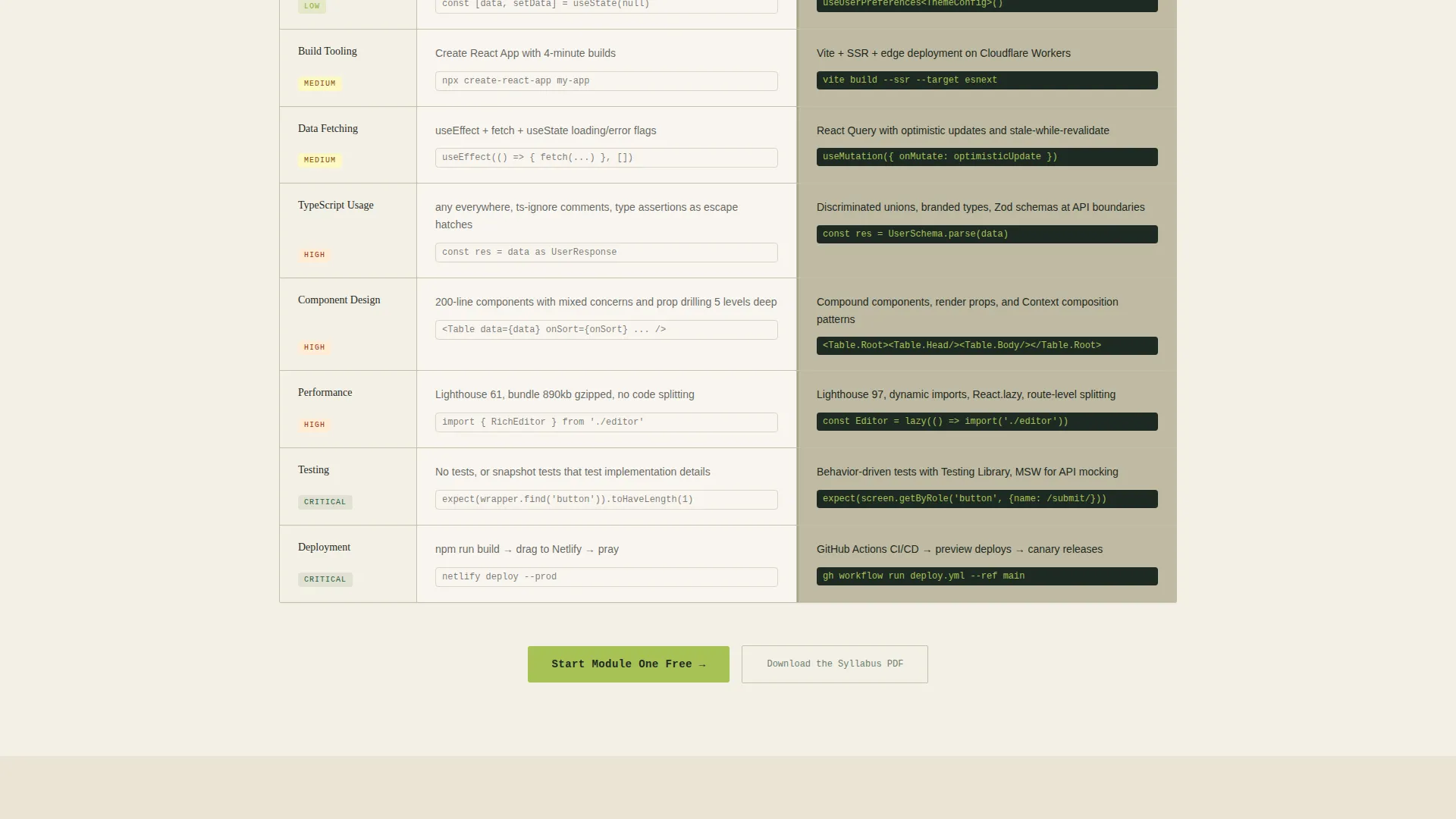
- The comparison table makes the before-and-after transformation concrete and specific
- Two conversion paths remove the all-or-nothing pressure that causes hesitation
What you get with this template
The template delivers a fully structured, single-page layout with every section built around the Hero's Journey narrative arc. Each section has a defined role in moving the visitor from curiosity to commitment.
- An interactive quiz header with four answer cards, explanation paragraphs, and a leaf-styled progress bar
- A side-by-side comparison table contrasting current skill artifacts against course-built outcomes
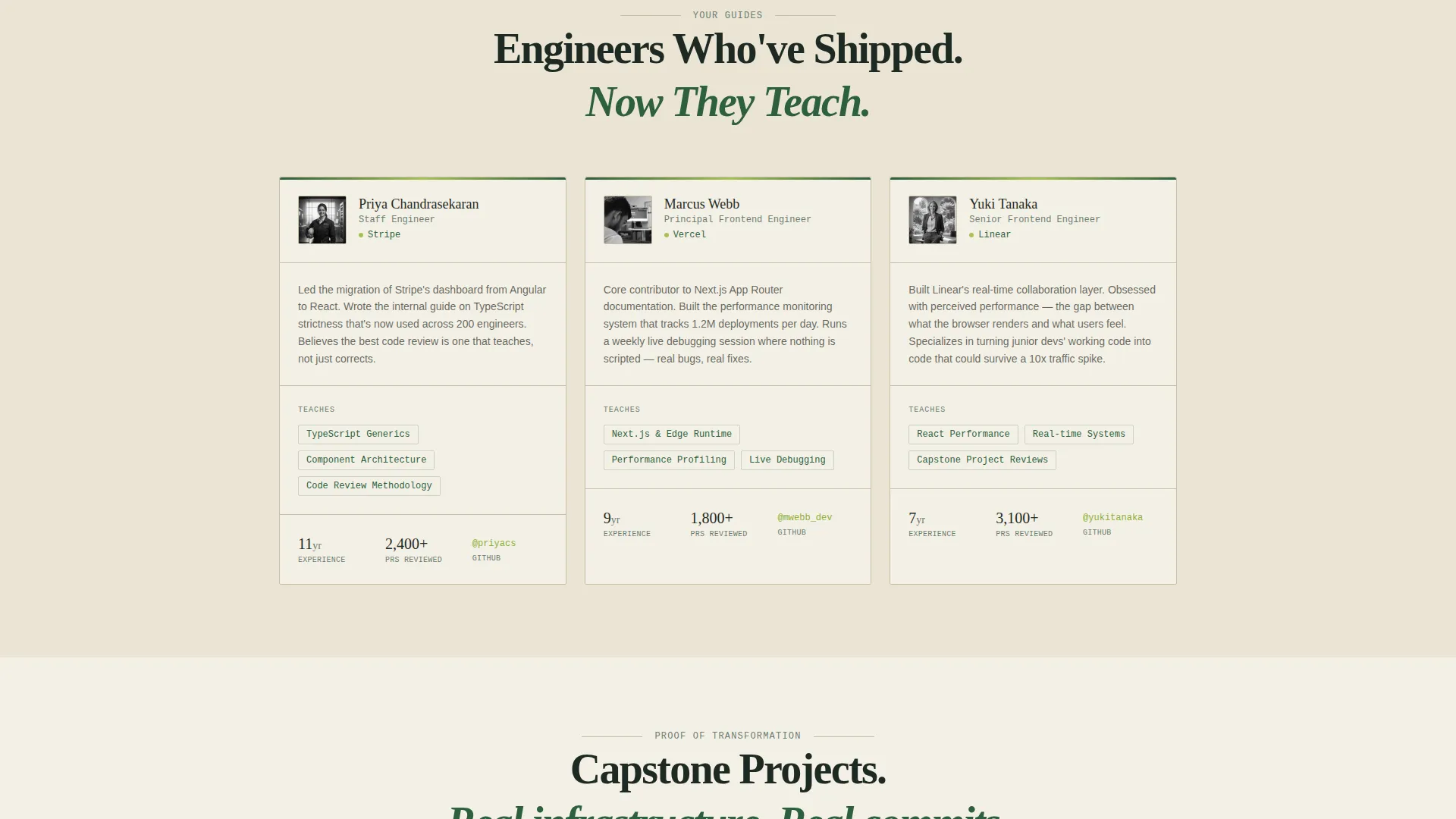
- Mentor profile blocks, capstone project showcases, and before-and-after GitHub contribution graph displays
- Two conversion forms: a two-field free module signup (GitHub username and email) and a syllabus PDF lead capture
Feature list
This template is built around six distinct functional components, each serving a specific role in the conversion journey.
Interactive Diagnostic Quiz Header
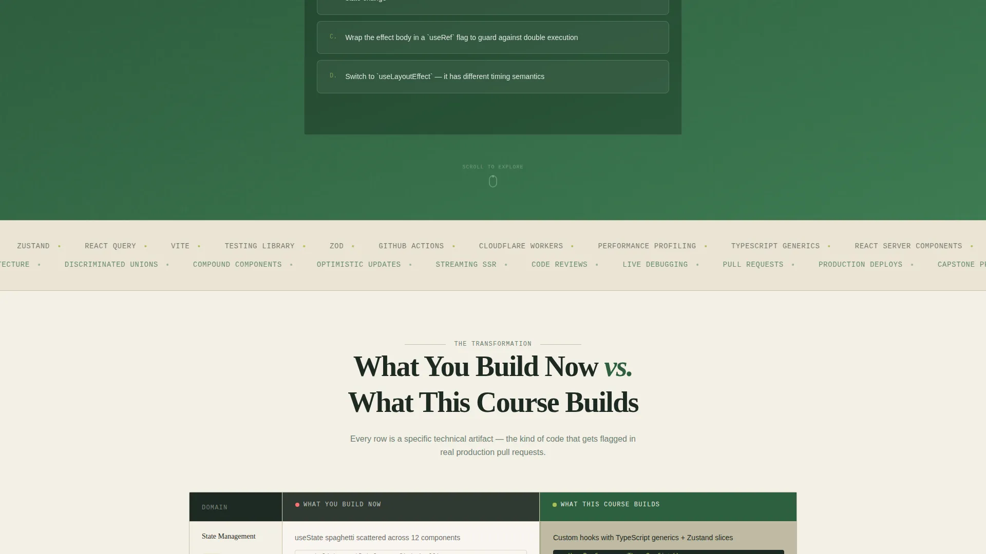
The page opens with a single monospaced question rendered against deep fern green. Visitors choose from four answer cards, each decorated with subtle botanical border illustrations. Every answer reveals a full explanatory paragraph, not just a right or wrong label. This teaches before it sells, which builds immediate trust.
Escalating Comparison Table
The core section contrasts "What You Build Now" against "What This Course Builds" row by row. Each row escalates in technical complexity, moving from state management patterns up to deployment infrastructure. Specific technical artifacts are named in each cell, making the gap concrete rather than abstract.
Dual Conversion Path Forms
The primary call to action, "Start Module One Free," opens a two-field form asking for a GitHub username and an email address. The GitHub field signals seriousness and supports automatic starter repository provisioning. A secondary path, "Download the Syllabus PDF," captures leads who want to review the curriculum before committing.
Mentor Profile Section
Mentor profiles appear in the page flow as narrative guides, consistent with the Hero's Journey structure. Each profile is positioned after the comparison table, lending credibility and human context to the course's teaching approach.
Capstone Project Showcase
Student capstone projects are displayed as proof of transformation. These are real deliverables deployed to real infrastructure, not toy examples. The showcase section closes the argument the comparison table opens.
Before-and-After GitHub Contribution Graphs
Real graduate contribution graphs appear at the end of the proof sequence. They provide a visual, data-grounded summary of the transformation the course produces over twelve weeks.
Page sections overview
| Section | Purpose |
|---|---|
| Quiz Starter Header | Surfaces the visitor's skill gap before scrolling |
| Answer Explanation Cards | Teaches on first interaction, builds trust early |
| Leaf Progress Bar | Sets expectation for a five-question diagnostic journey |
| Comparison Table | Contrasts current artifacts against course-built outcomes |
| Free Module call to action | Primary conversion point placed after quiz results |
| Mentor Profiles | Adds human credibility and narrative guide figures |
| Capstone Project Showcase | Provides real proof of learner transformation |
| GitHub Graph Display | Visual before-and-after evidence from real graduates |
| Syllabus PDF Capture | Secondary lead path for research-stage visitors |
Design & branding system
The visual identity follows an Institutional Authority theme using a Botanical color system. The palette is designed to feel like a well-resourced academic environment, structured and serious, but alive with forward motion.
- Deep fern green (#2D5F3E) anchors primary backgrounds and section dividers; aged parchment (#F4F0E6) fills the main canvas; blackboard slate (#1E2A24) handles body text and code block containers
- New-growth chartreuse (#A8C256) drives all calls to action, progress indicators, and hover states, giving interactive elements a pulse-like energy
- Code snippets sit in slate containers against the parchment background; monospaced fonts are used for quiz questions and code examples to reinforce the technical, scholarly tone
Mobile & speed optimization
The template is structured with a single-page, section-led layout that translates cleanly to smaller screens. Each section is self-contained, which makes responsive adaptation straightforward to implement.
- The quiz answer cards, comparison table rows, and mentor profiles are each designed as discrete blocks that reflow naturally on narrower viewports
- The two-field conversion forms are minimal by design, reducing input friction on mobile devices
How this template helps you convert
The page is built around a freemium conversion model that reduces financial and commitment friction at every stage. Conversion is treated as a journey, not a single ask.
- The quiz creates personal stakes immediately. By the time the visitor sees a call to action, they have already identified a gap in their own knowledge, which makes the offer feel relevant rather than generic.
- The free module call to action appears twice, once after the quiz results and once beneath the comparison table, ensuring it is visible at the two highest-engagement moments in the page flow.
- The syllabus PDF path provides a second exit ramp for visitors who are researching but not yet ready to enter a GitHub username, keeping those leads inside the funnel.
Other information about this template
This template is built specifically for the React and frontend online course niche, where the buyer is a working developer who evaluates resources critically. The design and copy structure reflect that audience's skepticism and respect for technical depth.
- The twelve-week course structure, live debugging sessions, and real infrastructure deployment are the curriculum details the template is designed to showcase
- The GitHub username field in the primary form is both a conversion signal and a functional trigger for starter repository provisioning, making the free module feel like a real onboarding step rather than a drip email sequence
- The template style is a comparison table landing page, well suited for courses competing in a crowded market where differentiation requires showing specific outcomes rather than listing features
Theme
Institutional Authority
Creative direction
Hero's Journey
Color system
Botanical
Style
Comparison Table
Direction
Freemium/Trial
Page Sections
Interactive Diagnostic Quiz
Escalating Comparison Table
Dual Freemium Conversion Forms
Mentor Profiles and Capstone Showcase
Before-and-after Github Graphs
Botanical Design System
Related questions
What type of page is this template?
Who is the target audience for this template?
What are the two conversion paths included?
Can I edit the comparison table rows?
Does the quiz require a backend to function?



