Dynamic Vue.js | Free Website Template | Rocket
Reactive is a split-screen Vue.js developer blog landing page built for frontend developers who want depth, not documentation. It pairs a live Vue Complexity Estimator with a Problem-to-Solution scroll arc, glassmorphic dark visuals, and calls to action earned through demonstrated competence. Every section proves value before asking for a click.
by Rocket studio
Quick summary
Reactive is a single-page landing page template for a Vue.js developer blog. It uses a 50/50 split-screen layout, a live complexity estimator in the header, and a scroll-driven Problem-to-Solution arc. The design runs on a glassmorphic dark theme with Vue's emerald green and lavender accents throughout.
Who this template is for
This template is built for developers and technical creators who run or plan to run a Vue.js-focused content platform. It speaks directly to people who write about frontend architecture from experience, not from slides.
- Mid-level frontend developers who publish deep-dive articles on Vue.js reactivity, watchers, and component architecture
- Tech leads and solo founders who want a landing page that earns developer trust before asking for a subscription
- Vue.js educators and content creators who need a visually credible, interactive home for their writing
What problem this template solves
Most blog landing pages ask developers to trust the author before showing any proof of competence. That approach fails with technical audiences. Developers scan fast, distrust hype, and leave the moment a page feels generic.
- Generic blog templates lack interactive, developer-native elements that signal technical depth
- Static layouts cannot demonstrate Vue.js expertise the way a live, reactive interface can
- Standard call-to-action placement puts the ask before the proof, which repels skeptical readers
What you get with this template
You get a fully structured, single-page landing page layout designed around a Vue.js developer blog. Every section is purpose-built to move a skeptical frontend developer from first glance to trusted subscriber.
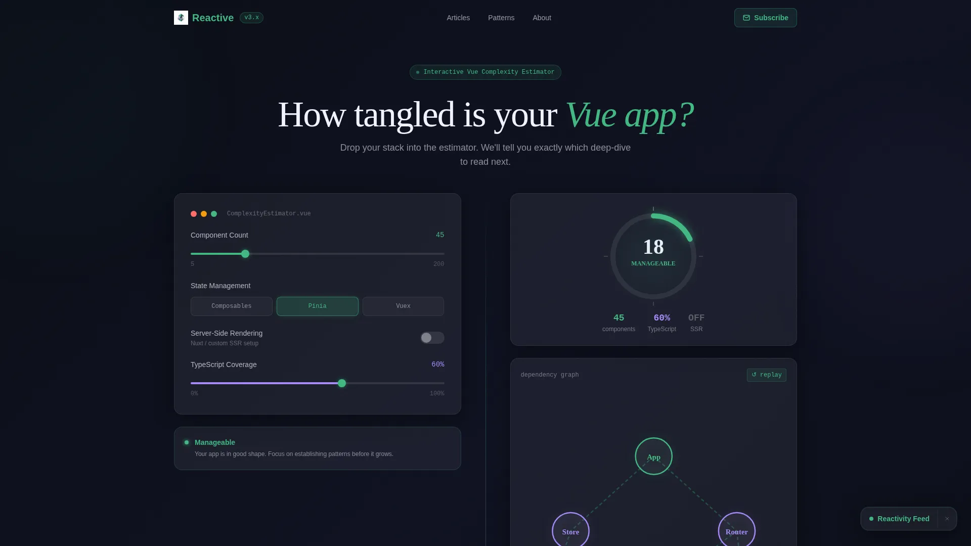
- A 50/50 split-screen layout with a live Vue Complexity Estimator in the header section
- A Problem-to-Solution scroll arc with syntax-highlighted code panels, animated transitions, and per-pair article calls to action
- A persistent floating subscription bar and embedded article recommendation cards inside the estimator result panel
Feature list
This template covers every visual and interactive layer described in the brief. Here is what each major feature delivers.
Live Vue Complexity Estimator
The header splits into two equal panels. The left panel holds an interactive calculator with glassmorphic dropdowns and sliders for component count, state management approach, server-side rendering toggle, and TypeScript coverage. The right panel renders a real-time complexity score through an animated radial gauge, a self-drawing dependency graph, and personalized article recommendation cards that update as inputs change.
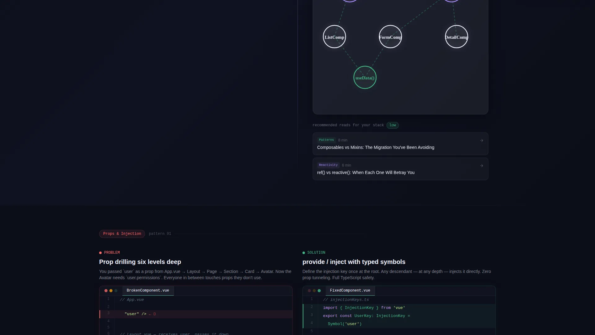
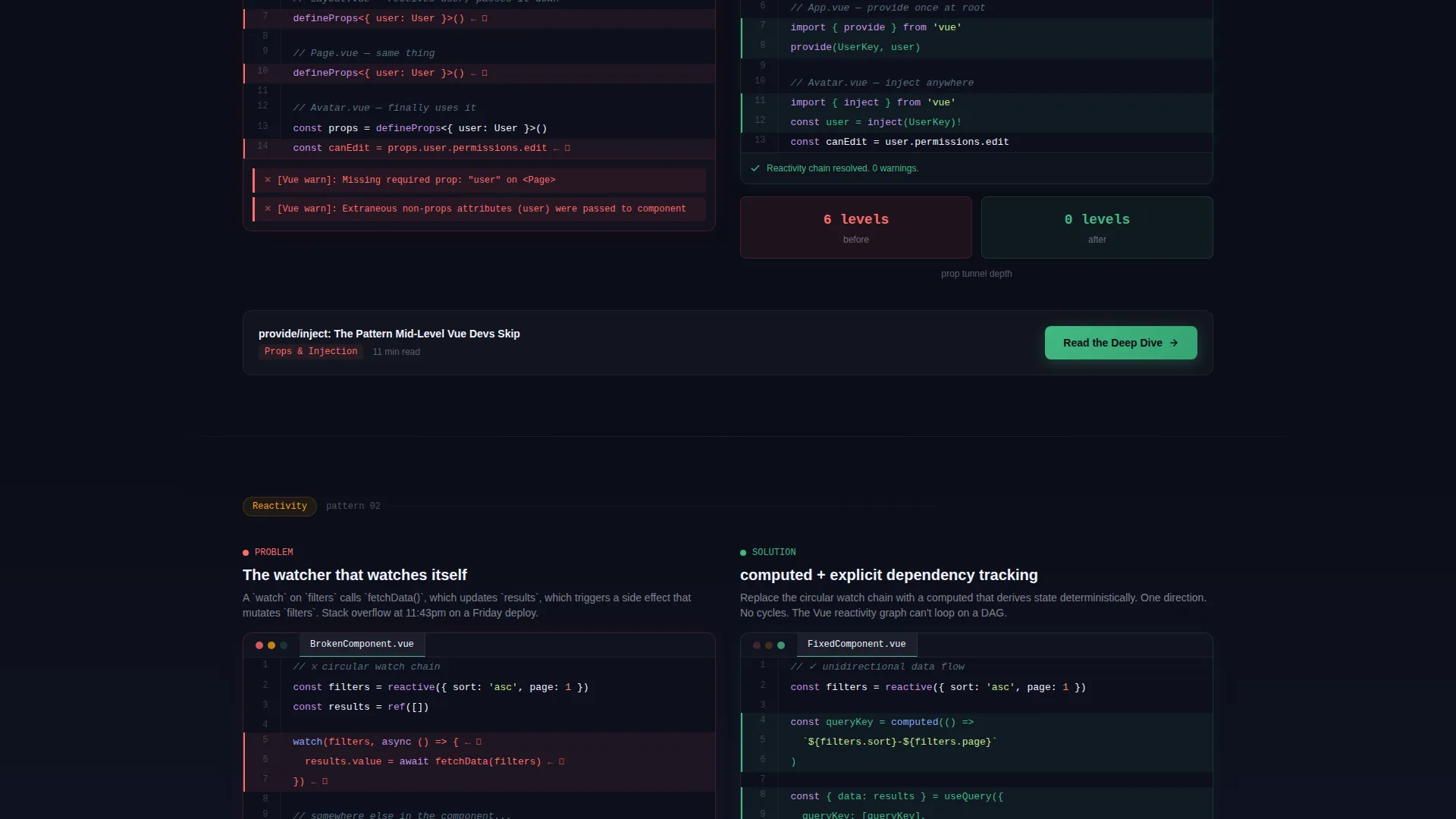
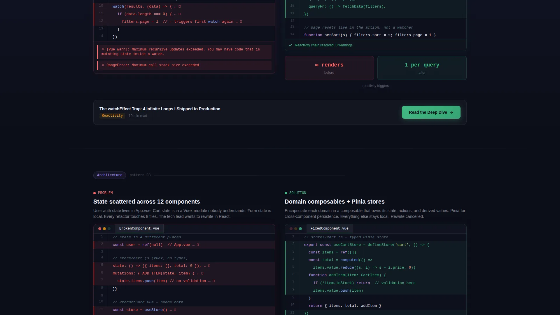
Problem-to-Solution Scroll Arc
Each content section opens on the left with a recognizable, syntax-highlighted code smell complete with red underlines and simulated console errors. The right panel then reveals the refactored solution with a staggered mounting transition. Problems escalate in scope from single-component fixes to full application architecture, keeping technically literate readers engaged through the entire page.
Glassmorphic Dark Visual System
The entire layout is built on a deep void black base with frosted translucent panels, soft blur layers, and glowing emerald borders. Every surface suggests depth without feeling heavy. The palette mirrors the experience of looking at a floating IDE window over a dark infinite canvas.
Persistent Floating Subscription call to action
A glassmorphic floating bar stays visible as users scroll. It contains a single email input field that validates with a green emerald checkmark animation. The design keeps the subscription ask present without interrupting the content reading experience.
Embedded Article call to action Cards
After each Problem-to-Solution pair, a "Read the Deep Dive" call-to-action routes readers to the corresponding full article. The estimator result panel also contains clickable article recommendation cards. calls to action are placed only after the template has demonstrated value, matching how developers actually decide to click.
Spring-Eased Motion and SVG Animations
Numbers in the estimator tick upward with spring-eased motion. Dependency graph nodes connect through traced SVG paths that draw themselves progressively. Component mounting transitions are staggered so each solution panel feels like a live Vue instance responding to new props.
Page sections overview
| Section | Purpose |
|---|---|
| Header Estimator Panel | Interactive complexity calculator with real-time score output |
| Complexity Score Display | Animated gauge, dependency graph, and article recommendations |
| Problem Code Panel | Syntax-highlighted code smell with errors shown |
| Solution Code Panel | Refactored answer with staggered mounting animation |
| Article call to action Block | Per-section deep-dive link after each problem pair |
| Floating Subscribe Bar | Persistent email capture with validation animation |
Design & branding system
The visual identity is built around a Dynamic Motion theme expressed through a glassmorphic color system. Every layer is intentional, from the base canvas to the glowing active states.
- Base color is deep void black (#0B0D17), with frosted panels using rgba white at 6% opacity and 12px blur
- Vue's signature emerald (#42B883) drives borders, active states, checkmark animations, and the gauge accent
- Cool syntax-highlight lavender (#A78BFA) provides secondary accents, making the palette feel like a live code editor
Mobile & speed optimization
The layout is designed to remain visually coherent on smaller screens while preserving the interactive elements that make it distinct. The glassmorphic layering and split-screen structure are handled to avoid visual overload on mobile viewports.
- Split-screen panels are structured to reflow vertically on smaller screens without breaking the problem-solution pairing
- Animated elements including the radial gauge and SVG dependency graph are contained within their panel boundaries to prevent layout shift
- The floating subscription bar maintains its position and function across viewport sizes
How this template helps you convert
Reactive is built around a single insight: developers do not respond to generic trust signals. They respond to demonstrated competence. Every layout decision supports that conversion logic.
- The complexity estimator delivers immediate, personalized value before any call to action appears, so readers arrive at article recommendations already engaged with their own data
- The Problem-to-Solution arc uses code that readers have personally shipped to production, creating recognition and trust that no testimonial section could replicate
- calls to action appear only after proof is established, following the natural decision rhythm of a technical reader who needs to see the answer before deciding to subscribe
Other information about this template
This template is categorized under Vue.js Documentation and targets the Vue.js developer blog niche. It is a strong fit for content creators working within the Vue ecosystem, particularly those writing about Vue 3 composition API patterns, Pinia state management, and migration paths from Vue 2.
- The template is built as a single landing page and does not include multi-page routing or blog index structures
- It is suited for pairing with a separate blog or article system where the landing page drives top-of-funnel discovery and subscription
- The intersection match score for this template is 13, reflecting a tight alignment between the Documentation and Support category, the Vue.js Documentation subcategory, and the Vue.js developer blog niche
Theme
Dynamic Motion
Creative direction
Problem→Solution Arc
Color system
Glassmorphic
Style
Split Screen (50/50)
Direction
Click-Through
Page Sections
Live Vue Complexity Estimator
Problem-to-solution Scroll Arc
Glassmorphic Dark Visual System
Persistent Floating Subscription Bar
Embedded Article Call to Action Cards
Spring-eased Motion and SVG Path Animations
Related questions
Can I customize the complexity estimator inputs for my own blog topics?
Does this template include the actual blog articles or content?
Is this template a good fit for a Vue 3 composition API-focused blog?
How does the floating subscription bar work?
What layout style does this template use?


