Fitness Email Marketing Professional Website Template
Recapture is a dashboard-style landing page template built for fitness abandoned cart email platforms. It pairs a Data Command visual identity with a Feature Matrix layout to show exactly how a win-back email engine outperforms generic tools. Designed for boutique studio owners, supplement brands, and franchise marketers who need to stop revenue from walking out the door mid-checkout.
by Rocket studio
Quick summary
Recapture is a single-page, dashboard-driven landing page template for a fitness abandoned cart email platform. It uses a dark terminal aesthetic, a side-by-side comparison grid, and live-feed product visuals to show recovery in action. The layout builds a logical case, row by row, until clicking the call to action feels like the only rational next step.
Who this template is for
This template speaks directly to operators who watch revenue disappear at checkout and need a credible, data-forward page to present their recovery solution.
- Boutique fitness studio owners running membership and personal training bookings
- Supplement e-commerce managers losing high-value cart revenue every month
- Franchise marketing directors who need one consistent recovery system across many locations
What problem this template solves
Most fitness businesses have no clear way to communicate the scale of their cart abandonment problem, let alone how their solution fixes it. Generic email tool pages look the same and prove nothing. This template solves the presentation gap.
- Visitors leave competitor pages unconvinced because comparisons are vague or buried
- Studio owners and e-commerce managers need hard numbers before they trust a new tool
- A cluttered or off-brand page loses the exact buyers who care most about precision and performance
What you get with this template
The template delivers a complete, single-page layout structured around evidence and conversion. Every section is purposeful, and the visual hierarchy does the persuasion work before a single word is read closely.
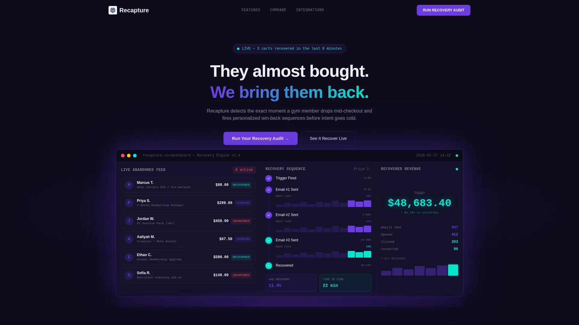
- A product screenshot header showing a live recovery dashboard mid-operation
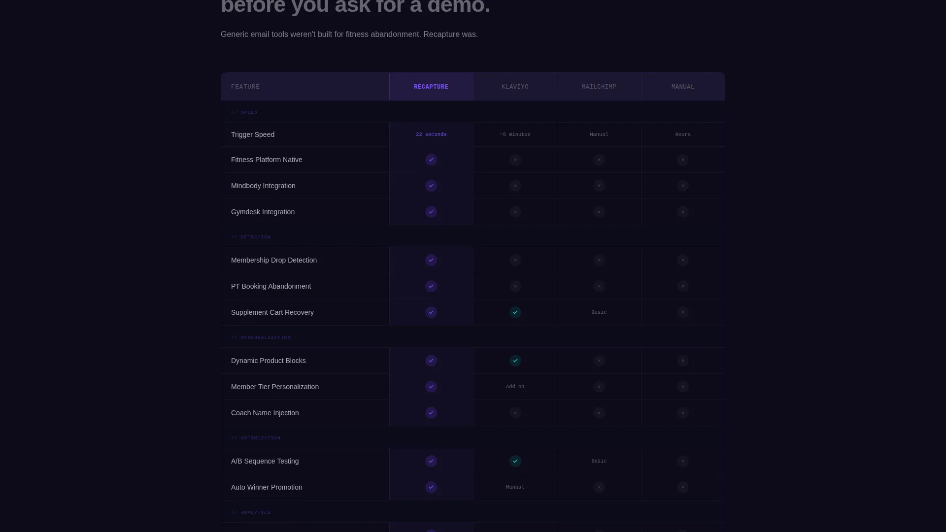
- A sixteen-row feature comparison grid with checkmarks and visual gaps that make the verdict immediate
- Two conversion paths: a free recovery audit entry point and an interactive live demo trigger
Feature list
This template includes a focused set of built-in layout components, all drawn directly from the Data Command design brief.
Live Recovery Dashboard Header
The header section displays a pixel-perfect product screenshot of the platform in operation. It shows an abandoned cart feed on the left with member name, item, drop-off timestamp, and cart value. An email sequence timeline sits in the center with open-rate sparklines. A recovered revenue counter ticks upward in the top right. A single headline anchors the visual: "They almost bought. We bring them back."
Feature Matrix Comparison Grid
The core content section is a two-column comparison grid with sixteen feature rows. Each row isolates one capability such as trigger speed, personalization depth, fitness platform integrations, dynamic product blocks, sequence testing, and real-time revenue attribution. Indigo checkmarks and dimmed gaps make the verdict visible before it needs explaining.
Single-Stat Rhythm Breakers
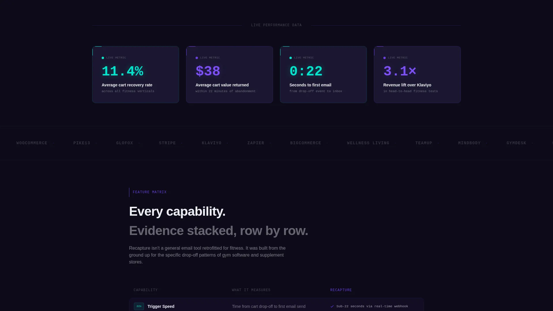
Between comparison grid sections, full-width callout blocks interrupt the scroll with one hard number each. Examples from the brief include "Average recovery rate: 11.4%" and "$38 average cart value returned within 22 minutes." These breaks reset attention and reinforce credibility at the exact moment momentum could stall.
Dual Conversion Path calls to action
The page closes with two clearly differentiated action paths. The primary call to action, "Run Your Recovery Audit," uses a single email input field to trigger a free cart abandonment diagnostic. The secondary path, "See It Recover Live," opens an interactive demo seeded with real fitness store data. Both paths lower commitment friction before asking for anything more.
Terminal-Black Data Grid Layout
The dashboard-style grid layout uses the terminal-black background to make every data label and metric feel monitored and urgent. The structure is designed to present information the way a mission control screen does: dense, readable, and purposeful. No decorative elements distract from the numbers.
Page sections overview
| Section | Purpose |
|---|---|
| Product Screenshot Header | Anchors the page with a live dashboard visual and the core headline |
| Single-Stat Callout One | Breaks scroll rhythm with a hard recovery rate figure |
| Feature Comparison Grid | Builds the sixteen-row case against generic email tools row by row |
| Single-Stat Callout Two | Reinforces credibility with an average recovered cart value and time metric |
| Recovery Audit call to action | Converts visitors with a single-field email input for a free diagnostic |
| Live Demo Path | Offers a lower-commitment second action via an interactive demo trigger |
Design & branding system
The visual identity follows a Data Command theme built entirely around the Electric Indigo color system. The palette is designed to feel like a mission control interface at 2 a.m.: every element radiates signal, nothing is decorative.
- Deep terminal black (#0D0B1A) forms the full-page background, making every data point feel urgent and monitored
- High-voltage indigo (#6C3CE1) drives interactive states, primary buttons, checkmarks, and dominant user interface accents
- Live-signal cyan (#00E5CC) pulses on live metrics, success indicators, and recovery counters to signal active status
- Interface white (#EDEEF2) is reserved for data labels and body text to maintain sharp legibility against the dark base
Mobile & speed optimization
The template is structured with a mobile-first scroll in mind. The comparison grid and dashboard header are laid out to remain readable and functional at smaller viewport widths.
- The product screenshot header scales cleanly so the dashboard visual communicates clearly on narrow screens
- Stat callout blocks are single-column by nature, so they translate directly to mobile without layout restructuring
- The dual call to action section uses a stacked flow that keeps both action paths visible without crowding
How this template helps you convert
The layout is engineered to eliminate hesitation. Every section adds a layer of proof before the page ever asks for a click.
- The dashboard header puts the product's value in motion before a visitor reads a single bullet point, setting a tone of operational competence from the first scroll position.
- The Feature Matrix grid removes comparison ambiguity by making capability gaps visual and immediate, so the buying decision feels logical rather than emotional.
- The dual call to action structure gives hesitant visitors a lower-friction path through the interactive demo, capturing intent even from buyers not yet ready to share their email.
Other information about this template
This template sits inside the Fitness Email Templates subcategory and is built specifically for the fitness abandoned cart email niche. It is a strong fit for teams evaluating purpose-built recovery tools against broader platforms.
- The comparison grid is designed with generic email platforms in mind, including tools like Klaviyo, Mailchimp, and manual follow-up workflows as the named alternatives in the grid rows
- The template supports fitness platform-specific context, referencing Mindbody and Gymdesk as the types of integrations the platform narrative is built around
- The page type is a single landing page, not a multi-page site, so all conversion paths resolve within one scrollable experience

Theme
Data Command
Creative direction
Feature Matrix
Color system
Electric Indigo
Style
Dashboard/Data Grid
Direction
Comparison/Versus
Page Sections
Live Recovery Dashboard Header
Sixteen-row Feature Comparison Grid
Single-stat Rhythm Callouts
Dual Conversion Path Ctas
Data Command Visual Framework
Related questions
Who is this landing page template designed for?
What does the comparison grid actually show?
What are the two conversion paths on this page?
Can this template work for a supplement e-commerce brand?
What makes the design feel distinct from a standard marketing page?



