Accounting Firm Software Specialist Cost Calculator Website Template
Ledger is a scroll reveal landing page template built for accounting firm order management platforms. It combines a glassmorphic dark-user interface aesthetic with an interactive intake calculator, progressive capability reveals, and a demo-first call to action. The result is a confident, conversion-focused page that speaks directly to managing partners, office managers, and senior associates drowning in manual tracking.
by Rocket studio
Quick summary
Ledger is a single-page, scroll-driven landing page template designed for accounting firm software that centralizes client engagements, deadlines, and deliverables. It opens with a glowing glassmorphic dashboard header, hands visitors an interactive calculator before asking for anything, and builds a case one capability at a time as the user scrolls toward a personalized demo call to action.
Who this template is for
This template is built for software teams and founders marketing platforms that bring order to accounting firm workflows. It speaks to the exact people inside those firms who feel the daily weight of manual coordination.
- Managing partners overseeing hundreds of active client engagements across tax, audit, and advisory service lines
- Office managers chasing missing documents and tracking deliverable status across unresponsive clients
- Senior associates losing billable hours to spreadsheet management instead of actual accounting work
What problem this template solves
Accounting firm software is a hard sell when visitors cannot immediately feel the cost of their current process. A generic feature list does not do it. This template leads with a calculator that quantifies coordination overhead in hours per month, making the pain tangible before a single product feature is shown.
- Firms struggle to communicate the value of centralized engagement tracking to time-pressed partners who skim pages quickly
- Standard landing pages bury the product behind headlines and stock photography instead of showing the software doing real work
- Visitors leave before the call to action because the page never earns their attention or trust
What you get with this template
You get a fully structured, scroll reveal landing page with a defined visual system, interactive calculator section, progressive capability reveals, and a dual call-to-action layout. Every section is purpose-built for an accounting firm order management audience.
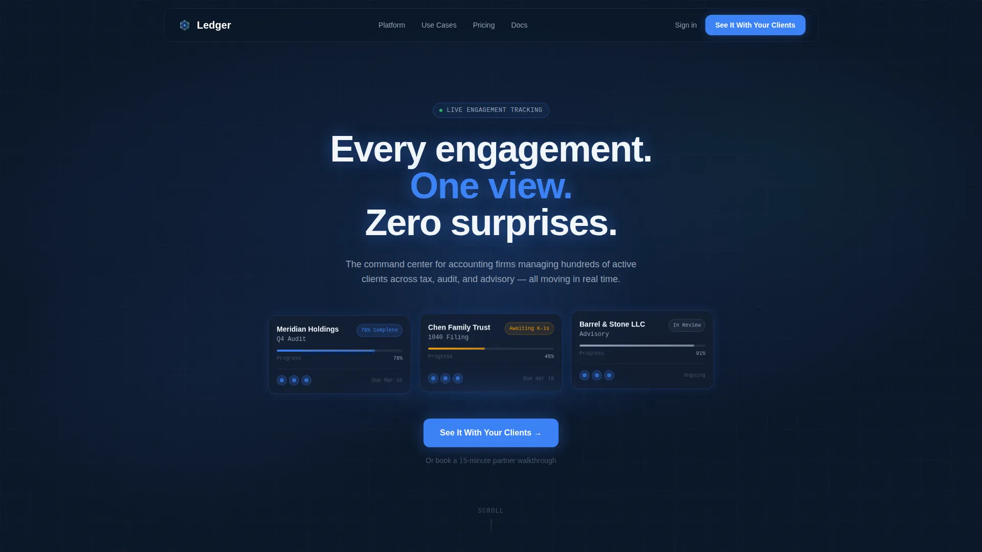
- A dark full-bleed header with a live-feel glassmorphic dashboard card showing three sample client engagements and pulsing progress bars
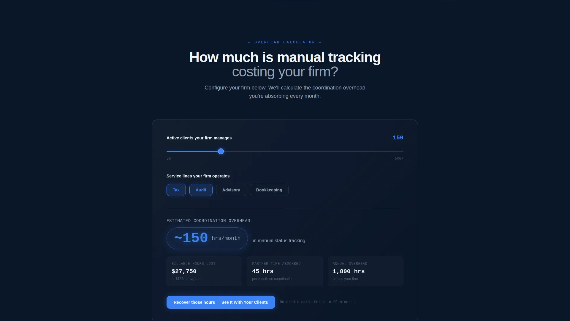
- An interactive intake calculator below the fold that estimates coordination overhead in real time based on client count and service lines
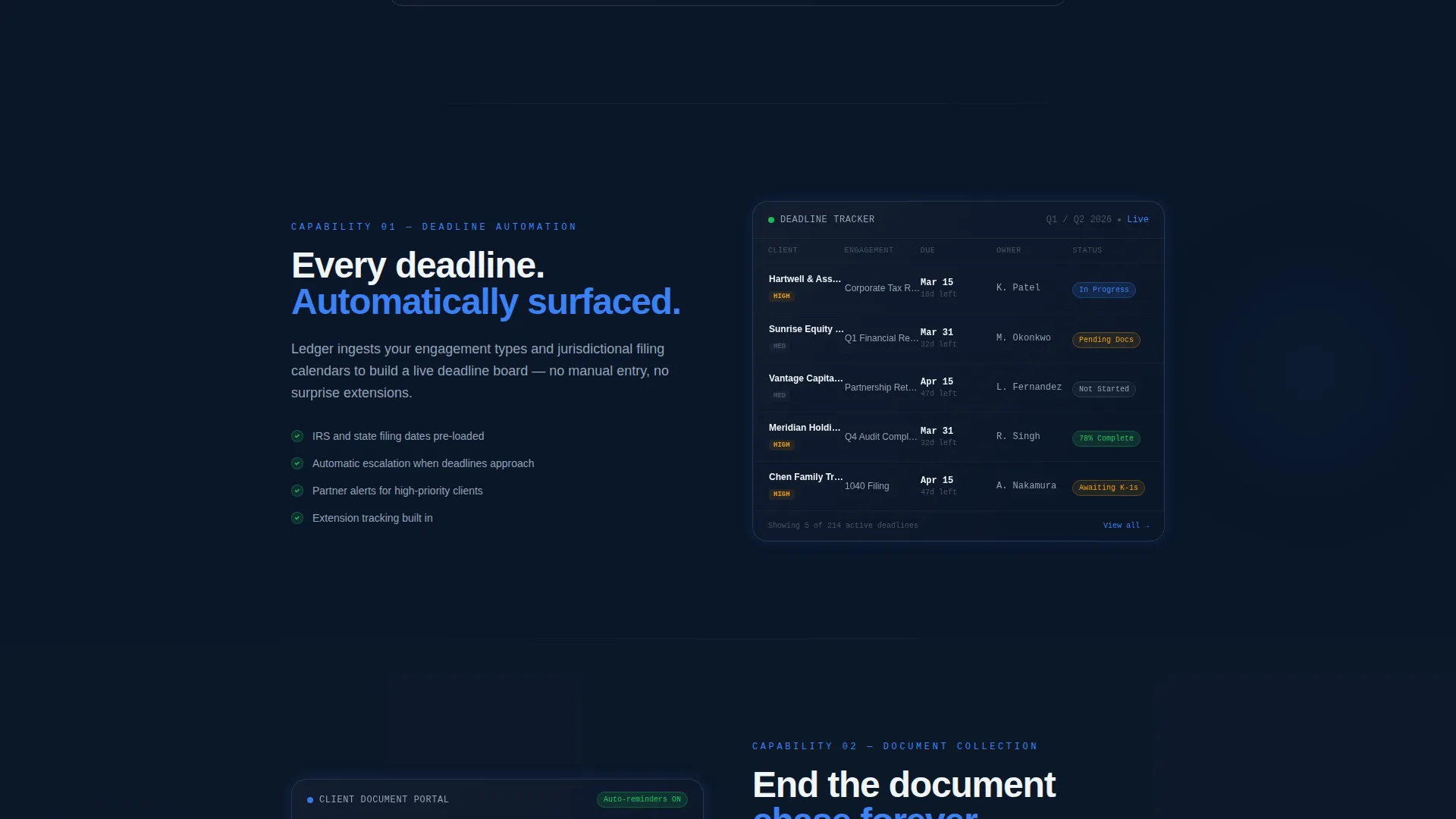
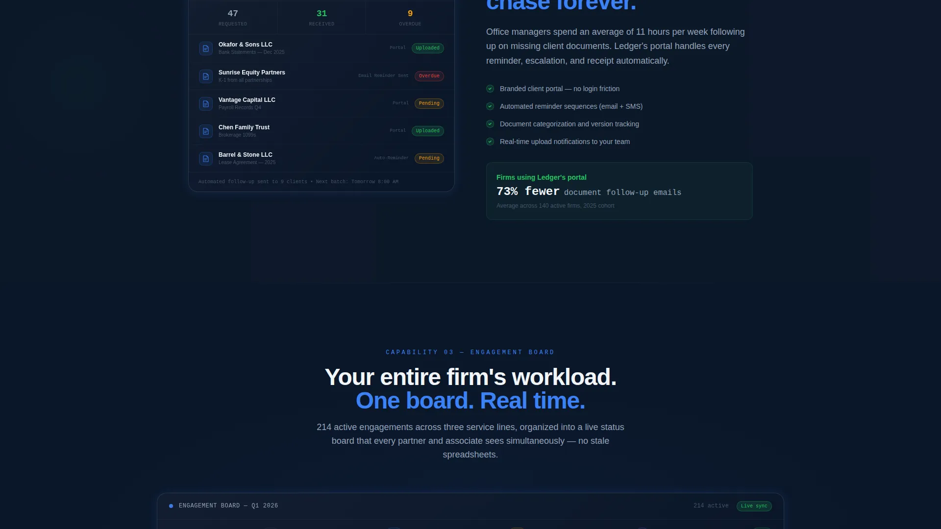
- Progressive section reveals, each dedicated to a single platform capability, building credibility one viewport at a time
Feature list
This template is built around a set of purposeful design and interaction decisions. Each one serves the goal of earning visitor trust and moving them toward the demo.
Glassmorphic Dashboard Hero
The header opens with a full-bleed dark viewport centered on a translucent glass-effect dashboard card. It displays three active client engagement rows with progress bars that pulse in electric ledger blue. The card glows outward like light through smoked glass, giving visitors an immediate sense of the product in motion.
Interactive Intake Calculator
Placed directly below the fold, the calculator asks two questions: how many active clients the firm manages and which service lines it operates. A slider runs from 50 to 500-plus clients. Toggle buttons cover Tax, Audit, Advisory, and Bookkeeping. The result appears instantly in a glowing pill showing estimated monthly coordination hours lost to manual tracking.
Scroll Reveal Capability Sections
Each product capability gets its own full viewport. Sections emerge from darkness as the visitor scrolls, with glassmorphic cards and a subtle parallax shift. The rhythm is deliberate: one idea per screen, building a coherent case for the platform without overwhelming the reader.
Sticky and Full-Width Call to Action
The primary call-to-action button, labeled "See It With Your Clients," locks to the bottom of the viewport during the calculator interaction. After the final capability reveal, it reappears at full width. A secondary text link below it offers a 15-minute partner walkthrough for visitors who prefer a human conversation.
Tech Glass Visual System
The entire page uses a Midnight Blue color palette. Deep terminal navy forms the background, polished obsidian surfaces the cards, cool interface silver handles secondary text, and electric ledger blue powers every glow, hover state, and progress indicator. A faint confirmation green appears only on completed-status badges.
Page sections overview
| Section | Purpose |
|---|---|
| Dark Hero Header | Introduces the platform with a glowing glassmorphic dashboard card and the headline "Every engagement. One view. Zero surprises." |
| Intake Calculator | Lets visitors input client count and service lines to see estimated monthly coordination overhead in real time |
| Deadline Automation | Reveals how the platform handles deadline tracking as a standalone capability section |
| Document Collection Portal | Shows client portal document collection as a single focused capability reveal |
| Engagement Status Board | Presents the engagement pipeline view, one viewport dedicated to this core feature |
| Team Workload Balancing | Explains how the platform distributes work across staff in a progressive reveal section |
| Final call to action Block | Full-width demo call to action with primary button and secondary partner walkthrough link |
Design & branding system
The visual identity is built around a Tech Glass theme using a Midnight Blue color system. Every design decision reinforces precision and calm, matching the emotional register of a Bloomberg terminal in a quiet office at dawn.
- Color palette: deep terminal navy (#0A1628) for backgrounds, polished obsidian (#141E30) for card surfaces, cool interface silver (#94A3B8) for secondary text and dividers, electric ledger blue (#3B82F6) for all interactive states, and confirmation green (#22C55E) used sparingly on completed badges only
- Visual style: glassmorphism with frosted-card surfaces, outward glow effects, and no stock photography or human faces, keeping focus entirely on the product interface
- Motion and depth: subtle parallax shifts as sections reveal, pulsing progress bars in the hero card, and a scroll-driven progressive layer effect that feels like frosted glass panels sliding apart
Mobile & speed optimization
The scroll reveal structure and glassmorphic layers are designed with a single-page flow in mind. The layout prioritizes a clean hierarchy that translates across screen sizes without losing the atmospheric quality of the dark visual system.
- Each capability section occupies its own full viewport, which makes the layout naturally responsive and easy to reflow for smaller screens
- The calculator interaction uses a slider and toggle buttons, both of which are touch-friendly input patterns suited to mobile visitors
- No stock images or heavy photography assets are used anywhere in the template, keeping the visual load lean by design
How this template helps you convert
The page is built around a click-through conversion model. Every structural decision serves the goal of moving a skeptical, time-pressed partner from scroll to demo click.
- The calculator earns attention before asking for anything. By quantifying coordination overhead in hours, it makes the cost of inaction concrete and personal, so the visitor is already motivated when the product sections begin.
- Progressive section reveals control the pace of persuasion. One capability per viewport means the visitor absorbs each idea fully before the next one appears, building a cumulative case without cognitive overload.
- The dual call-to-action layout serves two types of buyers. High-intent visitors click "See It With Your Clients" for a pre-loaded demo. More deliberate buyers use the secondary link to book a 15-minute partner walkthrough, keeping both paths open without diluting either.
Other information about this template
This template is categorized under Technology, specifically within the Accounting Firm Software subcategory. It is matched to the Accounting Firm Order Management niche and carries a strong intersection match score reflecting tight alignment between the design system, creative direction, and audience intent.
- Template style: Scroll Reveal (Progressive), meaning each section enters the viewport on scroll rather than loading all at once
- Header concept: Dark Full-Bleed with Glow, built around a single floating user interface element rather than imagery or illustration
- Creative direction: Calculator/Tool First, meaning the page leads with a value-generating interaction before presenting any feature content
- Landing page direction: Click-Through, with the primary conversion goal being a demo environment visit rather than a form submission
Theme
Tech Glass
Creative direction
Calculator/Tool First
Color system
Midnight Blue
Style
Scroll Reveal (Progressive)
Direction
Click-Through
Page Sections
Glassmorphic Dashboard Hero Section
Interactive Intake Calculator
Progressive Scroll Reveal Layout
Sticky and Full-width Call-to-action Design
Midnight Blue Tech Glass Visual System
Related questions
Who is the ideal buyer for this template?
Can I change the calculator values and service line toggles?
Does the template include real dashboard data or just visual mockups?
How many sections does this landing page include?
What makes this template different from a generic SaaS landing page?



