Financial Services Software Pricing Website Template
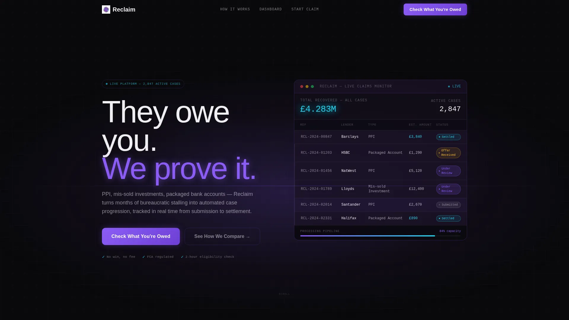
Reclaim is a dashboard-style landing page template built for financial services claims management platforms. It uses a dark Void & Violet visual identity, a feature comparison matrix, and a live-data header to communicate speed and authority. The template is designed to convert visitors handling PPI, mis-sold investment, and packaged bank account claims.
by Rocket studio
Quick summary
Reclaim is a single-page claims management landing page template designed for financial technology platforms. It leads with a live-looking claims tracker dashboard, moves visitors through a sharp versus-style feature matrix, and closes with a three-step progressive form. The overall feel is mission-control precision: dark, data-forward, and built to earn trust before asking for a single detail.
Who this template is for
This template is built for businesses operating in the financial services claims management space. It speaks directly to the people running these platforms and the clients they serve.
- Claims management companies (CMCs) handling high volumes of PPI, mis-sold investment, and packaged bank account cases
- Independent financial advisers (IFAs) working through legacy portfolio complaints on behalf of retirees
- Operations managers facing Financial Ombudsman Service (FOS) deadlines who need a scalable digital front-end
What problem this template solves
Traditional claims processes are slow, opaque, and frustrating. Consumers feel stonewalled. Firms lose capacity chasing paperwork instead of progressing cases. A landing page that mirrors those pain points directly, then shows the alternative in real data terms, closes that gap in credibility faster than any brochure could.
- No clear case visibility means clients chase updates by phone, burning staff time on both sides
- Paper-heavy workflows drag average resolution times past twelve weeks with no automated progression
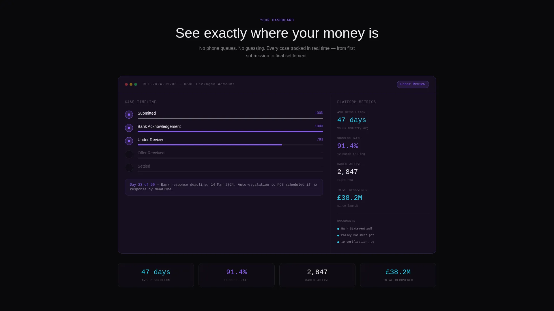
- Generic landing pages fail to show claimants what the platform experience actually looks like before sign-up
What you get with this template
You get a complete, single-page layout built around a dashboard-first conversion flow. Every section is designed to move a skeptical visitor from curiosity to confidence before the form appears.
- A dark full-bleed header with a radial violet glow and a live-style claims tracker mockup showing real case data labels
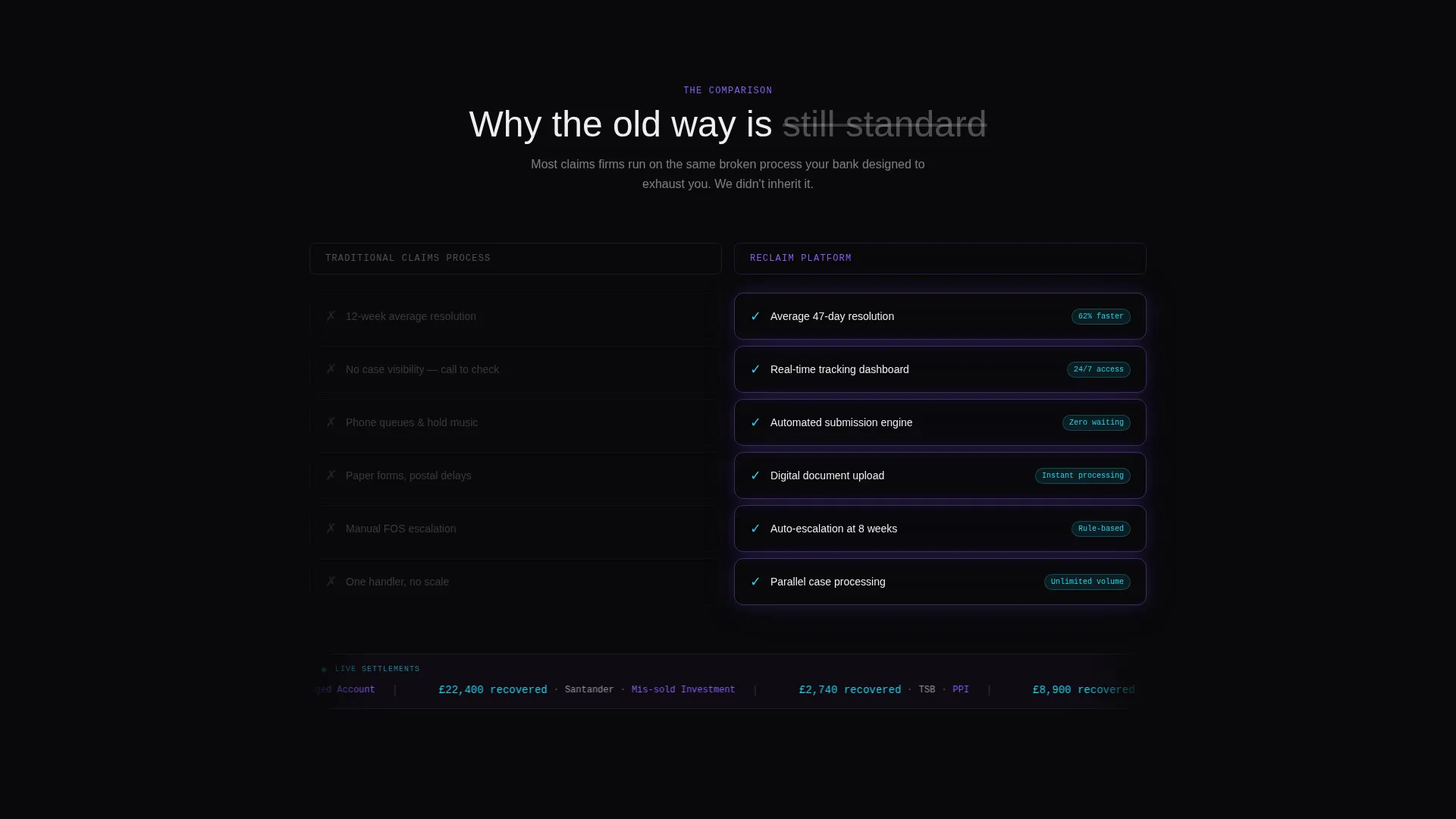
- A horizontal feature comparison matrix contrasting the traditional claims process against the platform's automated approach
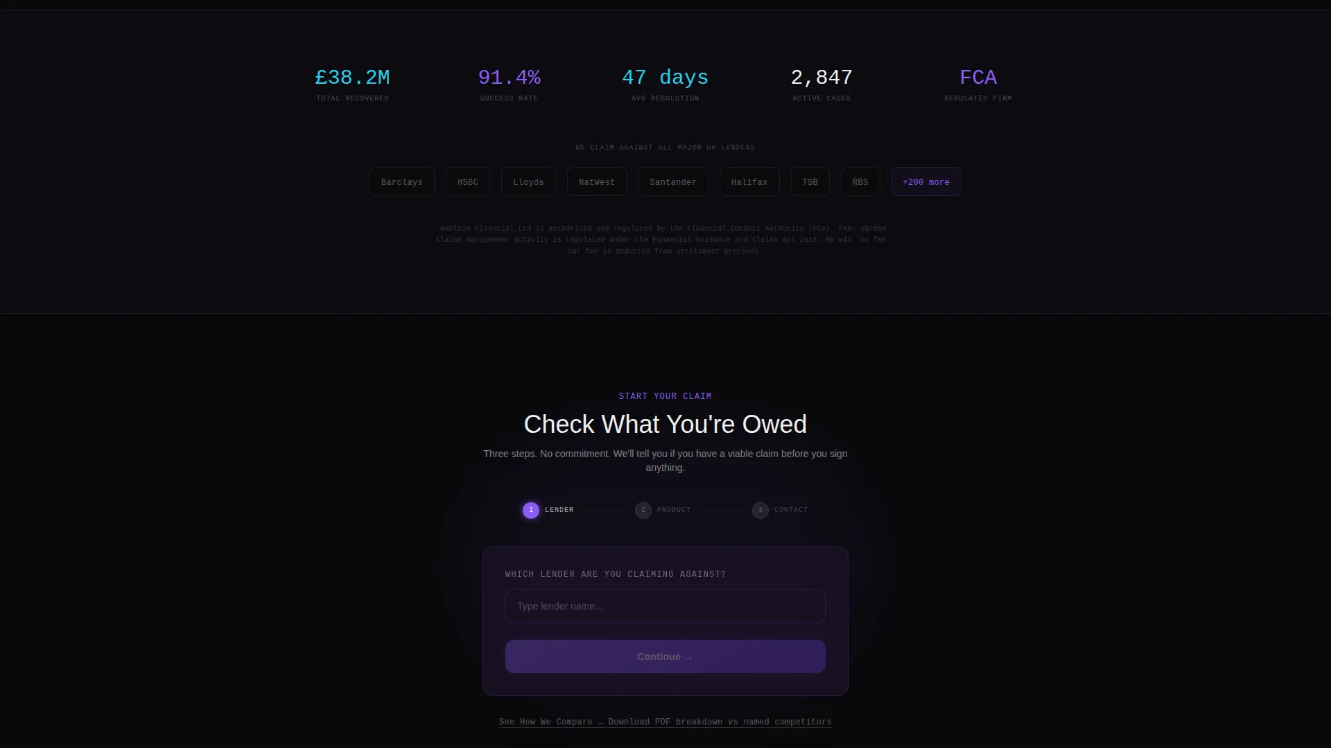
- A three-step progressive intake form collecting lender name, product type, and email address
Feature list
This template includes several purpose-built components that reflect how a claims management platform actually works and what its visitors need to see.
Live-Style Claims Tracker Header
The header centers a dashboard mockup showing case reference numbers, lender names, status pills progressing from Submitted through to Settled, and a cumulative recovered amount displayed in reactive cyan. No photography is used. Data carries the visual weight entirely.
Versus Feature Matrix
A two-column scroll-animated comparison section labels the left column "Traditional Claims Process" in muted gray and presents platform counters in violet-lit data cards on the right. Each row animates on scroll, with the gray side dimming and the violet side brightening, making the platform advantage feel structural rather than promotional.
Animated Settlement Ticker
A live-feed-style ticker below the matrix displays anonymised recent settlements in the format of recovered amount, lender name, and claim type. This builds social proof through volume and continuous movement without revealing personal data.
Three-Step Progressive Form
The primary call to action leads into a short three-field intake sequence: an autocomplete lender name dropdown, a product type selector covering PPI, investment, and bank account claims, and an email address field. The form is designed to feel fast and low-commitment.
Sticky Navigation with Primary call to action
The call to action "Check What You're Owed" appears both in a sticky navigation bar and again after the feature matrix. This dual placement keeps the primary conversion path visible throughout the full scroll without interrupting the content flow.
Secondary Comparison Path
A supporting call to action labelled "See How We Compare" links to a downloadable PDF breakdown. This gives more analytical visitors a deeper reference point before committing to the main form.
Page sections overview
| Section | Purpose |
|---|---|
| Dark Full-Bleed Header | Establish platform credibility with live dashboard mockup and headline |
| Claims Tracker Mockup | Show visitors the real case-progress experience before sign-up |
| Versus Feature Matrix | Compare traditional process pain points against platform advantages row by row |
| Settlement Feed Ticker | Build social proof with anonymised recent recovery figures |
| Primary call to action Block | Prompt form entry with "Check What You're Owed" after the matrix |
| Three-Step Intake Form | Collect lender, product type, and email in a minimal progressive sequence |
| Secondary call to action Link | Offer PDF comparison for visitors who want deeper due diligence |
| Sticky Navigation Bar | Keep primary call to action accessible across the full page scroll |
Design & branding system
The visual identity is built around a Void & Violet palette that reads like a mission-control terminal. Every color choice carries functional meaning: dark backgrounds eliminate distraction, violet signals activity, and cyan marks live data.
- Core palette: absolute void black (#09090B), deep interstellar (#1A1125), electric violet (#8B5CF6), reactive cyan (#22D3EE) for live highlights and hover states, and spectral white (#EEEEF0) for body text
- Glow effects are used intentionally: the header radial glow bleeds outward from the dashboard mockup, and violet card pulses in the matrix reinforce which side of the comparison is winning
- The Startup Velocity theme keeps all visual energy forward-pointing, with no stock photography and no decorative imagery
Mobile & speed optimization
The template layout is structured to remain clear and navigable on smaller screens. The dashboard mockup, comparison matrix, and sticky navigation are all designed with a responsive-first approach in mind.
- The sticky navigation call to action and the three-step form are compact enough to remain fully usable on mobile viewports without horizontal scrolling
- The versus matrix columns stack cleanly on narrow screens, preserving the row-by-row comparison logic without requiring side-by-side rendering
- Scroll animations are tied to viewport entry, so they trigger correctly whether a visitor is on desktop or a touch device
How this template helps you convert
The conversion architecture of this template is deliberate. Visitors see the platform experience before they are asked to do anything, which removes the biggest barrier to form completion: not knowing what they are signing up for.
- The header dashboard mockup shows the exact case-tracking interface visitors will use, building product confidence before any copy asks for commitment
- The versus matrix reframes the decision as a logical comparison rather than a sales pitch, letting data make the case and reducing the need for persuasive language
- The dual call to action placement (sticky nav plus post-matrix block) and the lightweight three-step form keep the path to conversion short and low-friction at every scroll point
Other information about this template
This template sits within the Technology category under the Financial Services Software subcategory. It is purpose-matched to the Financial Services Claims Management niche and carries a high intersection match against that context.
- The template style is Dashboard and Data Grid, making it well suited to platforms where showing live or real-looking data states is central to the value proposition
- The creative direction is Feature Matrix with a Comparison and Versus landing-page structure, a format that performs well when the key buying question is "why this platform over the status quo"
- The header concept is Dark Full-Bleed with Glow, consistent with the Startup Velocity theme used across the Void & Violet color system
- This template can support claims management platforms operating across PPI recovery, mis-sold investment redress, and packaged bank account complaint categories
Theme
Startup Velocity
Creative direction
Feature Matrix
Color system
Void & Violet
Style
Dashboard/Data Grid
Direction
Comparison/Versus
Page Sections
Live-style Claims Tracker Header
Versus Feature Matrix with Scroll Animation
Anonymised Settlement Feed Ticker
Three-step Progressive Intake Form
Dual-placement Sticky Call to Action
Related questions
Who is this landing page template designed for?
Can I customise the colors and branding?
What is the primary conversion goal of this template?
Does the template include the PDF comparison document?
How does the versus matrix section work visually?



