Photography Email Marketing Booking Website Template
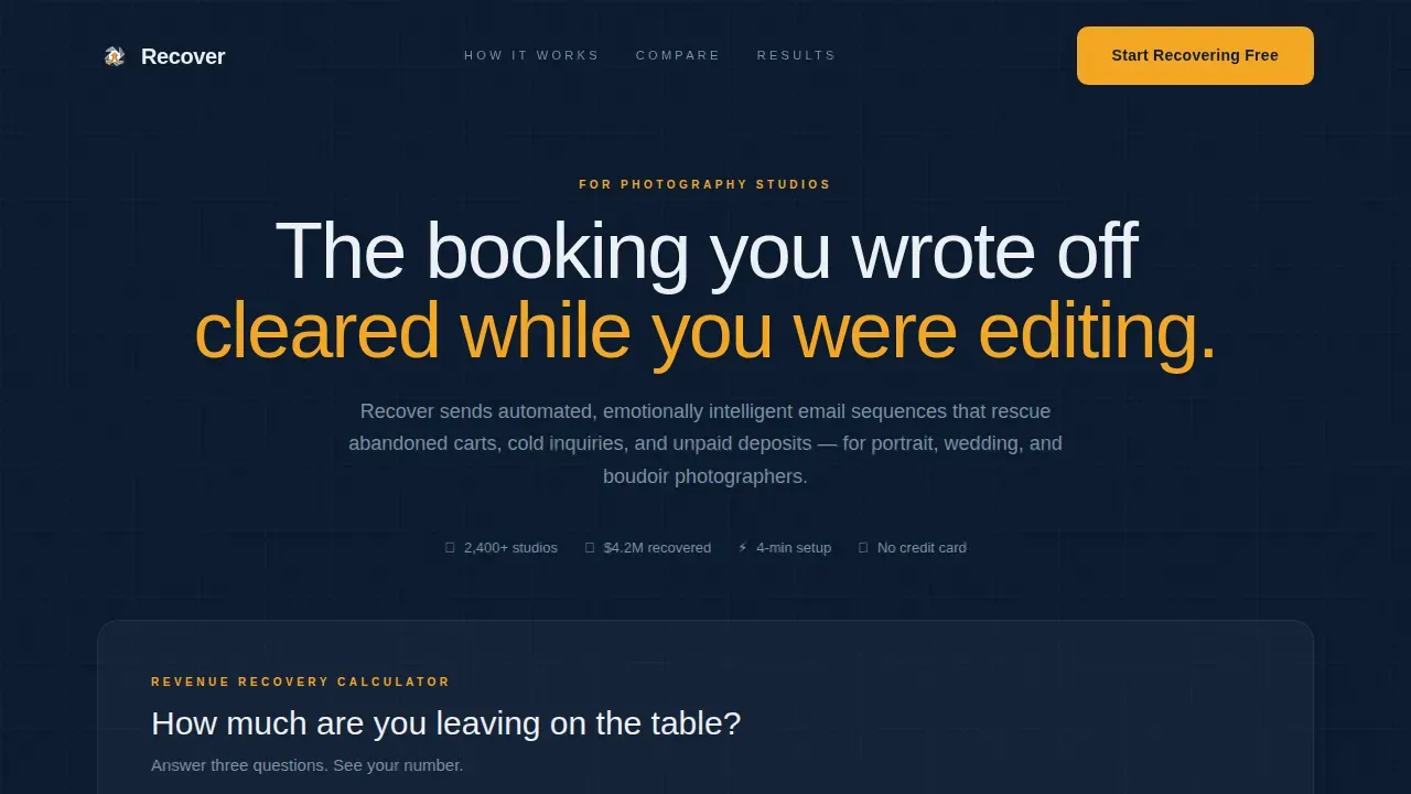
Recover is a single-page freemium landing page template built for photography studios losing bookings to follow-up gaps. It opens with a live revenue-loss calculator, walks visitors through a Problem-to-Solution arc, and anchors the middle with a Free versus Pro comparison table. No credit card is needed to start, and the design runs on a dark editorial palette built for late-night editing rooms.
by Rocket studio
Quick summary
Recover is a conversion-focused landing page template for photographers who lose revenue when inquiries go cold. It leads with a live calculator that shows visitors their personal annual loss figure, then guides them through an emotional Problem-to-Solution arc before presenting a Free versus Pro tier comparison table. The freemium signup requires only an email address and booking platform selection.
Who this template is for
This template is built for photography business owners who know they are losing bookings but have not yet put an automated follow-up system in place. It speaks directly to the daily reality of studios managing high inquiry volume without a reliable recovery process.
- Portrait and boudoir photographers losing packages worth hundreds of dollars to late-night indecision
- Wedding photographers watching high-value bookings go quiet because life got in the way
- Photography studio managers evaluating automated booking follow-up tools for the first time
What problem this template solves
Photography studios receive inquiries that never convert. A potential client opens a booking page, hesitates, and never comes back. Without a timed, emotionally intelligent follow-up sequence, that revenue simply disappears. This template makes that cost visible and then presents a clear recovery path.
- Photographers struggle to follow up consistently while editing, shooting, and managing clients
- Generic manual emails or DMs rarely land at the right moment and lack the right tone
- Studios have no way to see how much revenue they are losing until a number appears in front of them
What you get with this template
You get a complete, single-page layout designed around a freemium conversion funnel for a photography abandoned cart email service. Every section has a specific job, from the opening calculator to the closing call to action.
- A live revenue-loss calculator above the fold with an animated amber counter and a results line that follows visitors down the page as a sticky element
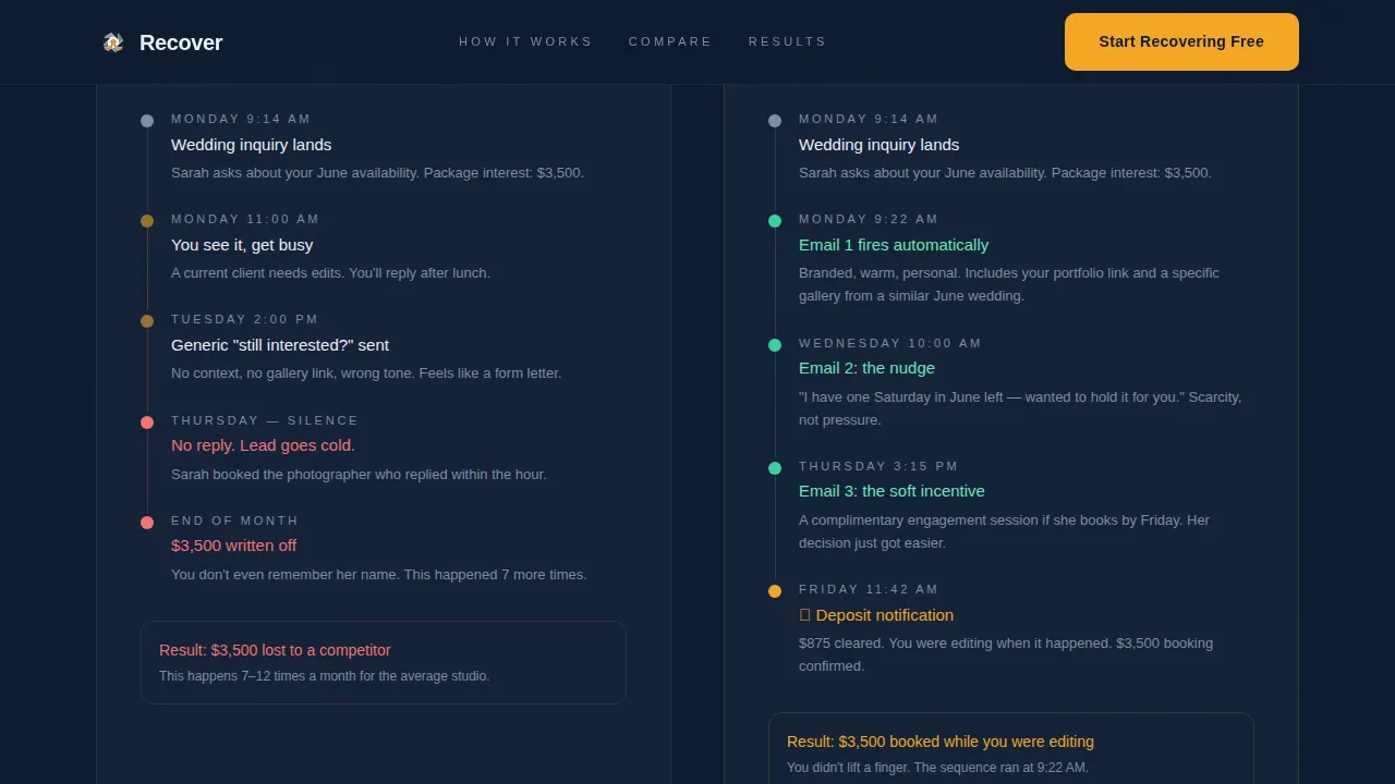
- A parallel timeline section visualizing the ignored inquiry path versus the recovered booking path side by side
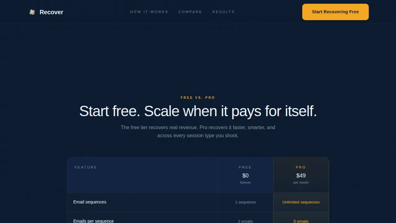
- A Free versus Pro feature comparison table, three photographer case studies with dollar figures, and a modal showing a real three-email sample sequence
Feature list
This template ships with interactive and editorial components purpose-built for the photography studio vertical.
Live Revenue-Loss Calculator
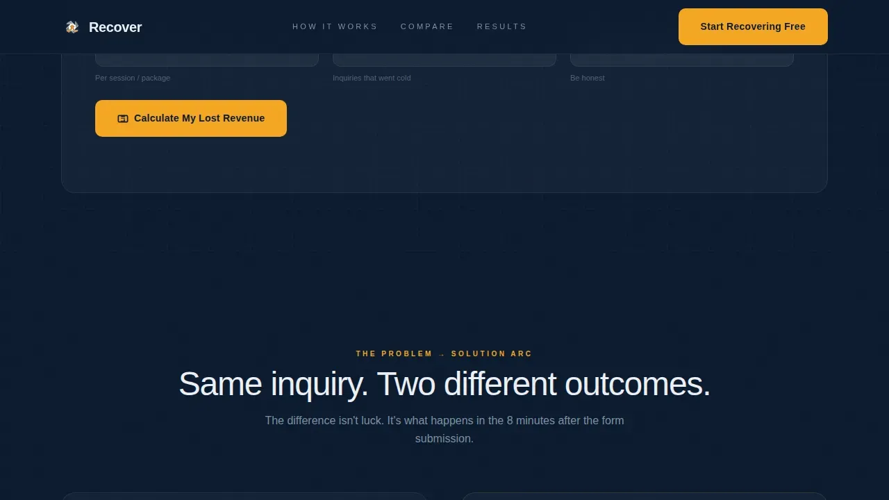
The header section asks three questions: average booking value, abandoned carts per month, and current follow-up method. The visitor clicks "Calculate My Lost Revenue" and watches an animated counter tick up to their estimated annual loss in amber. Below the result, a single line reads: "Now imagine recovering 30% of that on autopilot."
Sticky Loss Tracker
After the calculator produces a result, that amber figure stays visible as a sticky element while the visitor scrolls. It serves as a quiet, persistent reminder of what inaction costs, keeping the conversion motive alive throughout the entire page experience.
Problem-to-Solution Timeline Arc
Two parallel timelines run side by side. The first shows a real abandonment sequence: inquiry arrives, hours pass, a generic message gets ignored, the lead books elsewhere. The second shows the same inquiry handled by a timed, branded email sequence that ends with a deposit notification.
Free versus. Pro Comparison Table
A structured feature grid stacks the free tier against the pro tier across rows covering email sequences, customization depth, analytics dashboard access, A/B testing, and booking platform integration. Checkmarks appear in moonlight white against navy cells, with the pro column subtly highlighted to guide upgrade intent.
Photographer Case Studies
Three before-and-after case studies appear below the comparison table. Each one shows real recovery rate percentages and dollar figures. Email sequence screenshots are blurred just enough to feel confidential while still giving visitors a credible preview of the product in action.
Sample Sequence Modal
A secondary call-to-action button labeled "See a Sample Sequence" triggers a modal displaying a three-email series written for a wedding photographer. Visitors experience the product's tone and structure before committing to the free signup.
Page sections overview
| Section | Purpose |
|---|---|
| Hero Calculator | Show personal revenue loss above the fold |
| Sticky Loss Tracker | Reinforce cost of inaction while scrolling |
| Problem Timeline | Visualize the ignored inquiry path |
| Solution Timeline | Show the recovered booking outcome |
| Comparison Table | Compare Free and Pro tier features |
| Photographer Case Studies | Prove recovery outcomes with real figures |
| Primary Call to Action | Drive freemium signup after the table |
| Sample Sequence Modal | Let visitors preview the email product voice |
| Footer | Linear single-row navigation and links |
Design & branding system
The visual identity follows a Directory and Discovery theme executed in a dark editorial style that feels like a photographer's laptop glowing in a quiet editing room. Every color has a defined role: the navy holds the structure, the silver-blue carries supporting text, the white handles readability, and the amber marks where money lands.
- Deep terminal navy (#0B1A2E) as the primary background, muted silver-blue (#7B8FA1) for supporting labels and secondary text, and crisp moonlight white (#EDF0F5) for body copy and checkmarks
- Conversion-hot amber (#F5A623) reserved exclusively for call-to-action buttons, animated revenue figures, and recovered-revenue highlights
- Plus Jakarta Sans handles all typography with editorial weight contrast between headings and body text; no stock photography is used anywhere on the page
Mobile & speed optimization
The template is designed desktop-first to match how photographers work: seated at a laptop in a dark editing room after a shoot. Interactive elements use client-side components while static sections render on the server to keep the layout stable.
- GSAP powers the calculator counter animation and scroll-reveal transitions for a smooth, high-fidelity feel on larger screens
- Interactive components including the calculator, sticky tracker, dropdown, and modal are isolated as client components so they do not slow down the static sections
- The layout scales responsively to mobile so clients encountering the page on a phone still experience the full conversion flow
How this template helps you convert
The page is structured so every section increases the visitor's motivation to act. No single element carries the weight alone; the conversion logic is distributed across the entire scroll path.
- The calculator makes the cost of inaction personal before the visitor reads a single feature claim, anchoring the value proposition to a number they calculated themselves
- The parallel timelines create emotional recognition, the visitor sees their own experience in the problem timeline and their desired outcome in the solution timeline
- The sticky amber figure, the case studies, the comparison table, and the sample sequence modal all reinforce one message: the free tier costs nothing to try and the upside is already on the screen
Other information about this template
This template is purpose-built for the photography studio vertical and designed to support a freemium Software as a Service (SaaS) conversion model. The free signup flow requires only an email address and a booking platform selection, with no credit card required.
- The comparison table rows cover integration compatibility with booking platforms, giving studios context for how the email sequences connect to their existing workflow
- The three case study blocks are designed to hold real photographer stories with before-and-after recovery rates and dollar figures, making the social proof section feel earned rather than generic
- The template is suitable for any photography studio abandoned cart email service looking to present a clear free versus paid tier offer with a strong visual hierarchy
Theme
Directory & Discovery
Creative direction
Problem→Solution Arc
Color system
Midnight Blue
Style
Comparison Table
Direction
Freemium/Trial
Page Sections
Live Revenue-loss Calculator
Sticky Loss Tracker Element
Parallel Problem-solution Timelines
Free Versus. Pro Comparison Table
Photographer Case Studies Block
Sample Sequence Modal
Related questions
Do I need a credit card to use the free tier?
What does the revenue-loss calculator actually calculate?
Can I see what the email sequences look like before signing up?
What features are included in the Free tier versus the Pro tier?
Is this template built only for wedding photographers?



