Specialist Advanced Tech & AI Platforms Reviews & Social Proof Website Template
Recommend is a hub-and-spoke landing page template built for recommendation system platforms. It uses a Carbon Fiber visual identity, animated metric counters, and an anchor-nav structure styled like a research whitepaper. The layout guides technical buyers through escalating evidence, then converts them with a live sandbox call to action.
by Rocket studio
Quick summary
Recommend is a single-page, anchor-nav landing page template designed for AI-powered recommendation platforms. It opens with a live stats wall, walks visitors through chapter-style spoke sections, and closes the gap between skepticism and action with compounding technical proof. The Carbon Fiber color system keeps it sharp, dark, and credible.
Who this template is for
This template is built for teams selling sophisticated recommendation infrastructure to a technically literate audience. It speaks directly to people who have already hit the limits of off-the-shelf solutions and are looking for something with more depth.
- Product engineers at growth-stage software companies evaluating recommendation infrastructure
- E-commerce technology leaders looking beyond catalog-search ceiling limitations
- Growth leads at streaming platforms where session depth and algorithmic lift are daily concerns
What problem this template solves
Generic product pages do not work when your buyer is an engineer reading latency benchmarks before they even scroll. This template solves the credibility gap between "we have an AI feature" and "here is proof it outperforms what you are running today."
- Visitors arrive skeptical and leave before a standard hero section builds enough trust
- Technical audiences need data visualizations and structured analytical copy, not marketing fluff
- The cold-start problem, collaborative filtering tradeoffs, and real-time feature stores all need explanation before a call to action lands
What you get with this template
You get a fully structured, research-paper-style landing page with a clear conversion flow baked in. Every section is designed to earn the next click through evidence, not enthusiasm.
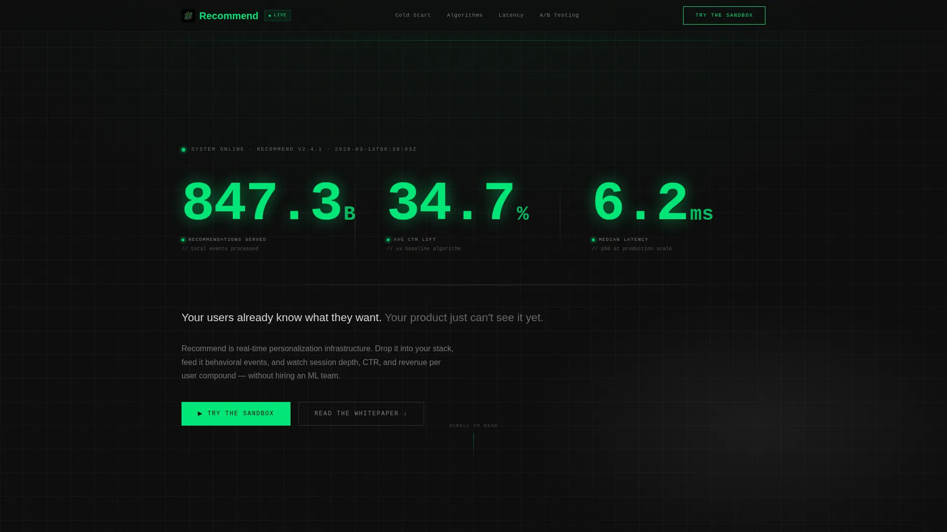
- A Stats/Metrics header wall with three animated odometer-style counters showing billions of recommendations served, average click-through rate lift, and median latency in single-digit milliseconds
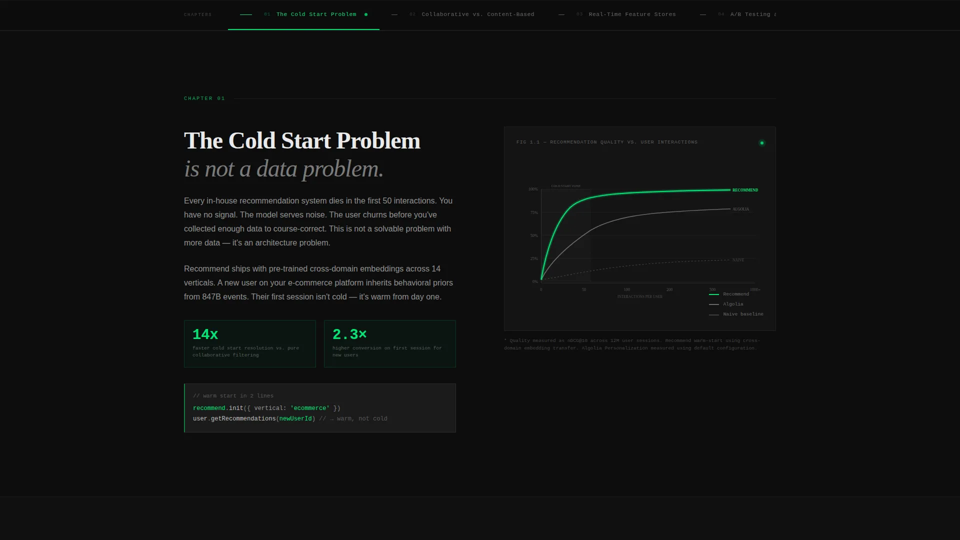
- An anchor navigation bar styled as a whitepaper table of contents, with four spoke chapters covering the cold start problem, collaborative versus content-based filtering, real-time feature stores, and A/B testing at scale
- A progressive call-to-action system where the primary "Try the Sandbox" button starts as a ghost outline and fills with signal green only after the third spoke section
Feature list
This template packs a focused set of purpose-built components. Each one serves the conversion flow described in the brief.
Animated Stats Header Wall
Three viewport-scale counters tick upward like mechanical odometers, rendered in a monospaced typeface in signal green on carbon black. They display recommendations served, average click-through rate lift, and median latency. A single line of cold white copy anchors the emotional message directly below.
Anchor Navigation with Chapter Structure
The sticky anchor nav mirrors a research-paper table of contents. Each link jumps to a spoke chapter with a distinct analytical focus. This keeps long-scroll visitors oriented and encourages sequential reading through the evidence stack.
Progressive Call-to-Action System
The primary call to action starts as a ghost-outlined button in the header. It solidifies into a filled signal-green button after the third spoke. This staged reveal matches the psychological moment when enough proof has accumulated.
Interactive SVG Data Visualizations
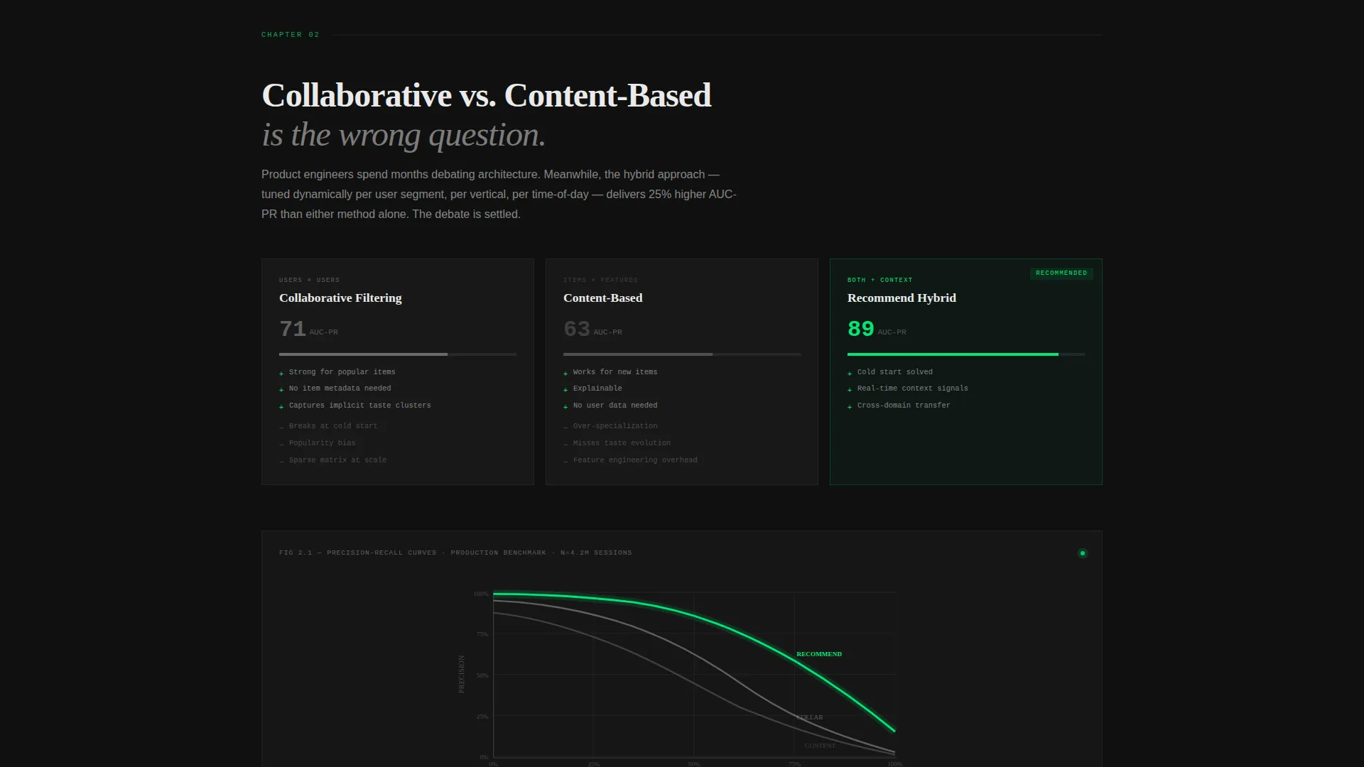
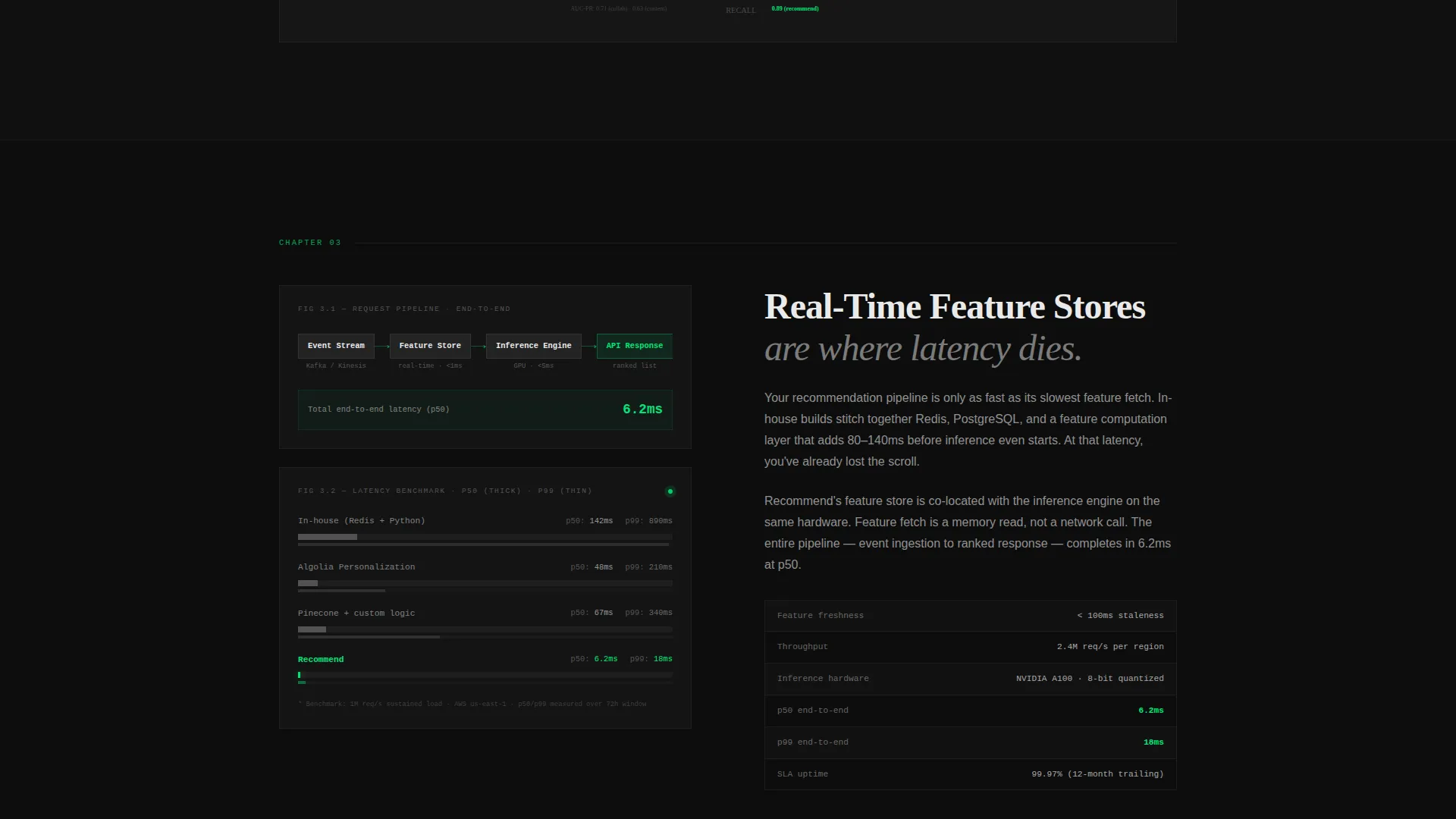
Spoke sections feature rendered charts including latency comparison graphs and precision-recall curves. These are built as interactive SVG elements, letting visitors engage with benchmark data rather than just read about it.
Secondary Email Capture call to action
A "Read the Full Whitepaper" call to action captures visitors who are not yet ready to try the sandbox. It collects email addresses from high-intent but early-stage buyers who need more time before touching code.
Hub and Spoke Section Architecture
The page is structured as a hub with four radiating spoke chapters. Each spoke alternates between data visualization blocks and tight analytical copy. The narrative escalates deliberately, making each section feel like the most important one until the next loads.
Page sections overview
| Section | Purpose |
|---|---|
| Stats Metrics Header | Opens with animated counters and the core positioning statement |
| Anchor Nav Bar | Orients visitors and signals the whitepaper chapter structure |
| Cold Start Problem | Addresses the first and most recognized pain point for recommendation builders |
| Collaborative versus Content-Based | Explains filtering tradeoffs with analytical copy and visual support |
| Real-Time Feature Stores | Presents infrastructure depth and benchmarks for latency-sensitive buyers |
| A/B Testing at Scale | Rounds out the evidence stack with experimentation credibility |
| Progressive Primary call to action | Delivers the filled sandbox button after sufficient proof has landed |
| Whitepaper Email Capture | Converts not-yet-ready visitors into a nurture-ready list |
Design & branding system
The Carbon Fiber color system was chosen to feel like the inside of a GPU server rack late at night. Every color has a functional role, not just a decorative one.
- Carbon black (#0D0D0D) dominates all backgrounds, titanium mid-gray (#3A3A3C) separates sections like machined bezels, and cold white (#EAEAEA) keeps body text razor-sharp against dark surfaces
- Signal green (#00E676) appears only where data is alive: hover states, chart lines, active anchor nav indicators, and the filled call to action button after the third spoke
- The monospaced typeface used in the header counters reinforces precision and technical authenticity throughout the visual hierarchy
Mobile & speed optimization
The template is built with a responsive layout that preserves the dark, data-dense aesthetic across screen sizes. No component sacrifices readability on smaller viewports.
- The anchor nav collapses gracefully on mobile so chapter navigation stays accessible without crowding the screen
- SVG chart components are sized responsively so latency graphs and precision-recall curves remain legible on tablet and phone displays
How this template helps you convert
This template treats conversion as a process, not a moment. Every design and copy decision pushes the visitor one step further down the evidence stack before the primary call to action appears.
- The animated counter header creates immediate credibility by showing real-scale metrics before any marketing copy appears, setting a technical tone that keeps engineers reading
- The chapter-by-chapter anchor nav structure makes the page feel like a definitive industry resource, so visitors invest more time and arrive at the sandbox call to action already convinced by data they recognized from their own stack
- The progressive call to action system ensures the filled "Try the Sandbox" button only appears after three spokes of compounding proof, timing the conversion ask to the moment of maximum trust
Other information about this template
This template was built under the Startup Velocity theme, which prioritizes momentum, technical confidence, and forward motion in every visual and structural decision. It is part of the Advanced Tech and AI Platforms subcategory and is purpose-matched to the recommendation system builder niche.
- The Industry Report creative direction means the page reads like a definitive whitepaper, not a typical software product page
- The Click-Through landing page direction means every section serves a single goal: moving the visitor toward the live sandbox environment
- The Hub and Spoke template style supports both linear reading and non-linear jump navigation, accommodating both methodical researchers and impatient practitioners
- The template supports two distinct conversion paths simultaneously: immediate sandbox trial for ready buyers, and email capture via the whitepaper call to action for visitors still in evaluation mode
Theme
Startup Velocity
Creative direction
Industry Report
Color system
Carbon Fiber
Style
Hub & Spoke (Anchor Nav)
Direction
Click-Through
Page Sections
Animated Stats Header Wall
Anchor Navigation Chapter Structure
Progressive Call-to-action System
Interactive SVG Data Visualizations
Secondary Whitepaper Email Capture
Escalating Proof Narrative Architecture
Related questions
Who is this landing page template designed for?
What does the hub and spoke structure mean for this template?
How does the progressive call to action system work?
What are the interactive SVG charts included for?
Can both calls to action be used at the same time?



