Recommend - Precision Retail Landing Page Template
Recommend is a hub-and-spoke landing page template built for retail AI recommendation engines. It targets e-commerce directors, merchandising leads, and CTOs evaluating personalization platforms. With a Tech Glass visual identity, anchor navigation, live metric panels, and dual conversion paths, it turns technical proof into qualified leads without sacrificing clarity or credibility.
by Rocket studio
Quick summary
Recommend is a single-page, anchor-nav landing page template designed for a retail AI recommendation engine. It speaks directly to mid-market direct-to-consumer brand leaders who need proof, not promises. The template front-loads hard performance data, walks visitors through architecture and integration depth, and closes with a low-friction lead form that qualifies intent automatically.
Who this template is for
This template is built for technology and retail commerce teams that need to convince skeptical buyers with data rather than marketing copy. It works best when your product has real benchmarks and your buyers want to verify them before talking to sales.
- E-commerce directors at mid-market direct-to-consumer brands evaluating personalization tools
- Merchandising leads who manage complex manual curation rules and need an automated alternative
- Chief Technology Officers assessing their first serious personalization layer beyond basic recommendation widgets
What problem this template solves
Most AI product landing pages bury the proof. They open with lifestyle imagery, talk about "intelligence" in vague terms, and ask for a demo before the visitor understands what the engine actually does. Technical buyers leave early because trust is never established.
- Visitors cannot verify performance claims without seeing real test data and confidence intervals
- CTOs evaluating platforms need architecture specifics before they will share a work email
- Merchandising leads need to see integration timelines and platform compatibility before engaging sales
What you get with this template
You get a fully structured, single-page layout organized around a fixed anchor navigation bar. Each navigation spoke links to a dedicated content section that reads like a technical deep-dive. The layout rewards visitors who want specificity and still converts those who just want to run the numbers.
- A fixed hub-and-spoke anchor nav with five labeled spokes: Performance, Architecture, Integration, Benchmarks, and Security
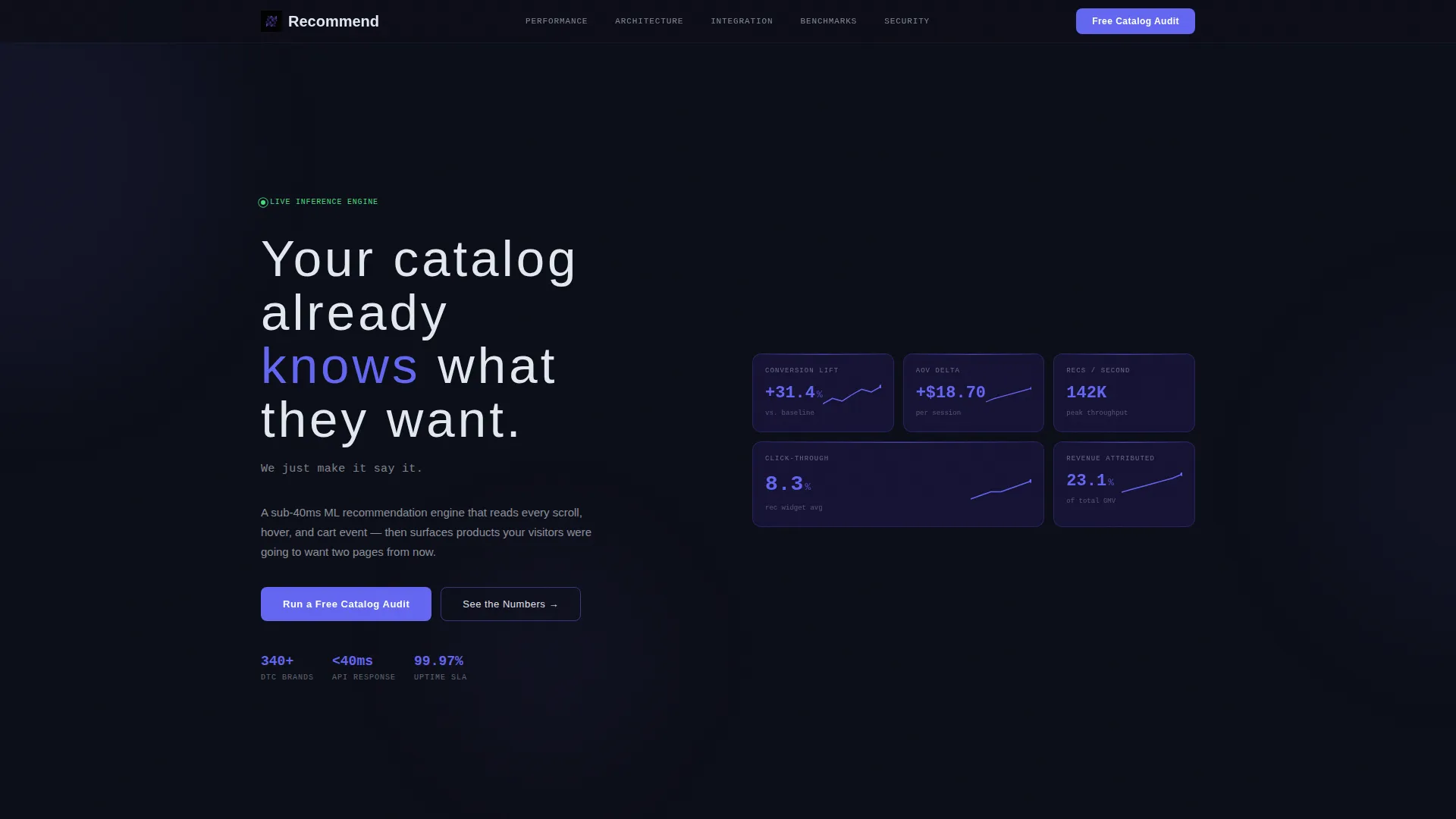
- A header section built from staggered dark glass panels, each displaying a single live metric with a frosted glass surface and indigo edge glow
- Two distinct conversion paths: a three-field catalog audit form and an email-gated integration specification download
Feature list
This template is built around a set of deliberate structural and visual decisions. Each feature below reflects a prompt-defined capability included in the layout.
Staggered Metric Header Panels
The header replaces a traditional hero image with five or six translucent dark glass rectangles arranged in a staggered grid. Each panel displays one live metric: conversion lift, average order value delta, recommendations served per second, click-through rate, and a sparkline of revenue attribution. The panels float at different z-depths with frosted surfaces and faint indigo edge glow.
Fixed Anchor Navigation Hub
A persistent navigation bar stays anchored at the top of the page throughout the scroll. It links to five content spokes: Performance, Architecture, Integration, Benchmarks, and Security. The primary call-to-action button "Run a Free Catalog Audit" is embedded directly in the nav so it remains visible at every scroll depth.
Expandable Glass Panel Sections
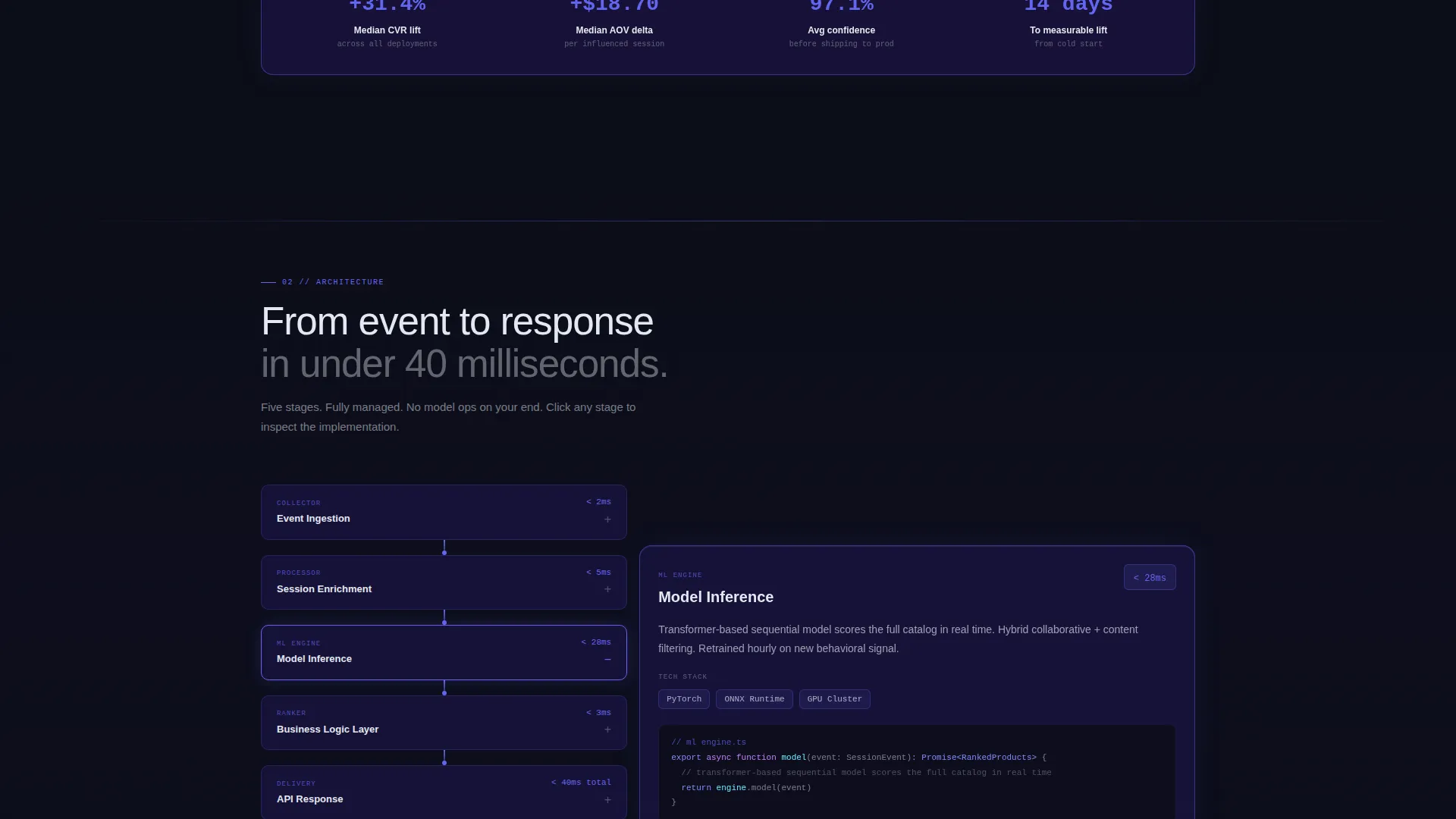
Each spoke section is built as a glass panel that expands on click to reveal the next layer of technical content. This progressive disclosure format keeps the page skimmable for fast readers while rewarding visitors who want deeper proof before converting.
Dual Conversion Path Layout
The primary conversion path is a three-field lead form asking for store URL, monthly unique visitor range, and work email. The secondary path offers a downloadable integration specification document behind an email-only gate. Both paths are designed to minimize friction while qualifying visitor intent through the information they voluntarily provide.
Benchmarks Section with Competitive Data
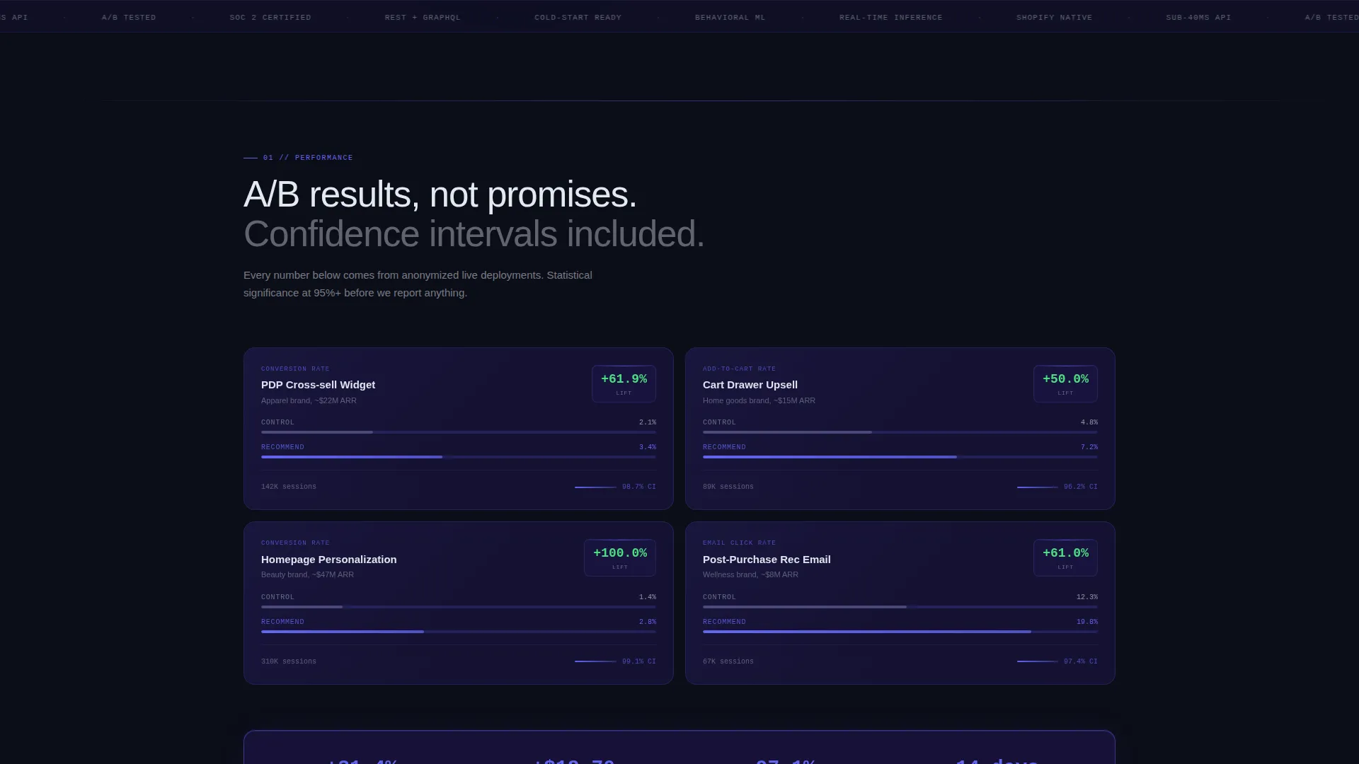
The Benchmarks spoke presents cold-start accuracy comparisons using anonymized client data. Confidence intervals and A/B test deltas are displayed in the Performance section. This gives technical evaluators a structured way to assess the engine's claims against the broader market without requiring a sales conversation first.
Tech Glass Visual System
The entire template is built on a void black background with deep indigo glass card surfaces, electric indigo accent elements, and frosted white body text. Glass-morphism panels with subtle backdrop blur sit layered at different z-depths, with edges catching indigo light. The palette and depth system create a visual language that feels native to a data-driven software product.
Page sections overview
| Section | Purpose |
|---|---|
| Dark Glass Header | Display live metrics and headline above the fold |
| Anchor Nav Hub | Provide persistent navigation and primary call to action access |
| Performance Spoke | Show A/B test deltas with confidence intervals |
| Architecture Spoke | Diagram the full recommendation pipeline and response time |
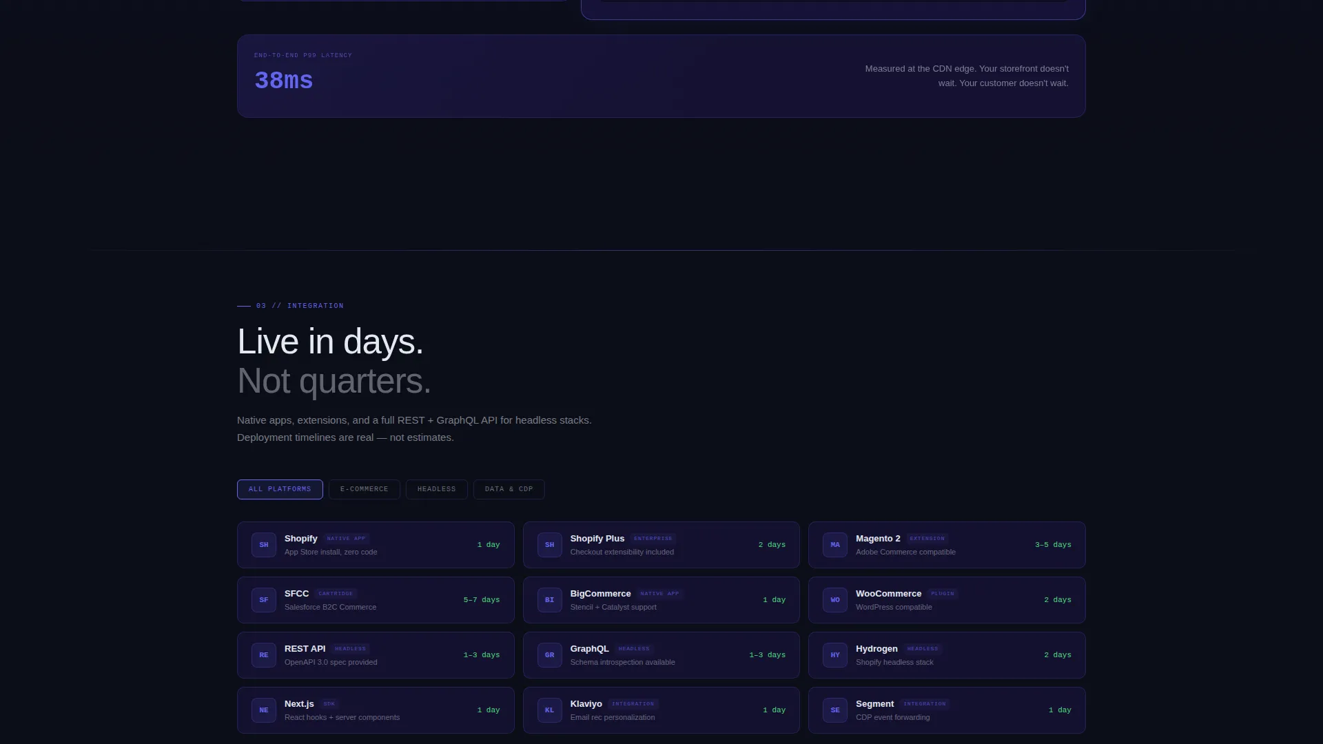
| Integration Spoke | List platform compatibility and deployment timelines |
| Benchmarks Spoke | Compare cold-start accuracy using anonymized client data |
| Security Spoke | Address data handling concerns for technical evaluators |
| Catalog Audit Form | Capture leads via a three-field low-friction form |
| Spec Download Gate | Convert CTOs with an email-only integration spec offer |
Design & branding system
The visual identity follows a Tech Glass theme built entirely around the Electric Indigo color system. Every design decision reinforces the sense that the product is alive inside the interface, running in real time, visible only through its own data output.
- Void black (#0B0D17) as the primary background, deep indigo glass (#1A1440) for card and divider surfaces, electric indigo (#6366F1) for calls-to-action and hover states, and frosted white (#E2E8F0) for body text
- Glass-morphism panels with backdrop blur layered at multiple z-depths, with edges catching indigo light like beveled crystal surfaces
- Thin, wide-tracked white headline typography paired with a minimal single-line subhead, creating a spec-sheet tone that matches the content strategy
Mobile & speed optimization
The template is designed with a layout structure that supports responsive behavior across screen sizes. The anchor nav and expandable panel approach are both well-suited for condensed viewports, where progressive disclosure keeps content manageable without requiring a separate mobile design.
- The staggered grid header collapses gracefully so metric panels remain readable on smaller screens without overcrowding the viewport
- Expandable glass panels reduce initial page weight by deferring deeper content until a visitor actively requests it, which supports faster perceived load times
How this template helps you convert
The conversion architecture in this template is deliberate. Every structural choice is designed to move a skeptical technical buyer closer to submitting the catalog audit form or downloading the integration spec.
- The header front-loads quantified proof through live metric panels, so visitors see real performance signals before reading a single word of body copy, reducing early exit rates from disbelief.
- The anchor nav keeps the primary call-to-action "Run a Free Catalog Audit" visible throughout the entire page scroll, removing any friction caused by having to search for the next step.
- The three-field audit form uses the store URL and visitor volume dropdown to self-qualify intent, meaning the leads that submit are already pre-screened by the information they choose to provide.
Other information about this template
This template is purpose-built for the retail AI personalization category, where buyers are technically sophisticated and require more than a feature list before they engage. The Spec Sheet creative direction means every section reads like documentation rather than a sales deck, which builds the kind of trust that converts engineers and directors alike.
- The template style is Hub and Spoke with Anchor Navigation, making it easy to add or reorder spokes without rebuilding the page structure
- The secondary email-gated download path was designed specifically for CTOs who are in an evaluation phase and not yet ready for a sales call
- The benchmarks section references anonymized client data comparisons, which supports credibility without requiring disclosure of proprietary client information
- This template fits naturally into a broader retail technology marketing stack alongside tools like personalization platforms, headless commerce setups, and catalog management systems
Theme
Tech Glass
Creative direction
Spec Sheet
Color system
Electric Indigo
Style
Hub & Spoke (Anchor Nav)
Direction
Lead Generation
Page Sections
Staggered Dark Glass Metric Header
Fixed Hub-and-spoke Anchor Nav
Expandable Glass Panel Sections
Dual Conversion Path Design
Benchmarks and Performance Data Blocks
Tech Glass Visual Identity System
Related questions
What types of businesses is this landing page template best suited for?
Can I customize the metric panels in the header?
How does the dual conversion path work?
Does this template include the anchor navigation structure out of the box?
How many sections does this landing page include?



