Local AI & Machine Learning Comparison Website Template
Signal is a dashboard-style recommendation engine landing page built for AI and machine learning products. It features live-data header panels, an interactive algorithm explorer, a head-to-head comparison grid, and a benchmark request form. The Monochrome Steel color system and terminal-inspired visuals communicate technical credibility before a single word is read.
by Rocket studio
Quick summary
Signal is a single-page, data-grid landing page template for recommendation engine products. It opens with three glassmorphism header panels showing live-style metrics, then walks visitors through algorithm modes, a versus grid, and a hands-on product demo field. The entire flow builds toward one conversion action: running a benchmark.
Who this template is for
This template is built for technical product teams who need to prove performance, not just describe it. It speaks the language of engineering-led buyers and data-driven decision makers.
- Product leads at mid-stage SaaS platforms evaluating recommendation infrastructure
- E-commerce directors managing large catalogs who need smarter item surfacing
- Streaming platform engineering and product teams replacing hand-curated content rows
What problem this template solves
Most recommendation engine product pages read like whitepapers. They describe algorithms in paragraphs while buyers quietly open a competitor's tab. Signal flips that dynamic by letting visitors interact with the system before they ever fill out a form.
- Buyers struggle to evaluate recommendation quality without a live demonstration
- Legacy comparison pages list features without showing real performance differences
- High-intent technical visitors leave when pages feel like marketing decks instead of tools
What you get with this template
You get a full single-page layout that earns trust through interactivity and data transparency. Every section is designed to move a skeptical technical buyer one step closer to requesting a benchmark.
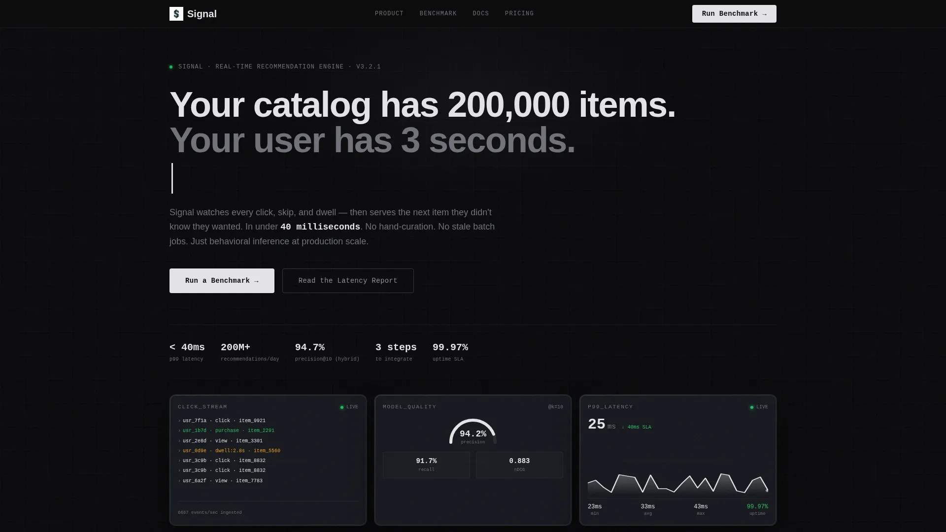
- Three animated Dark Glass Panel header displays: a click-stream waterfall, a precision/recall gauge, and a latency sparkline
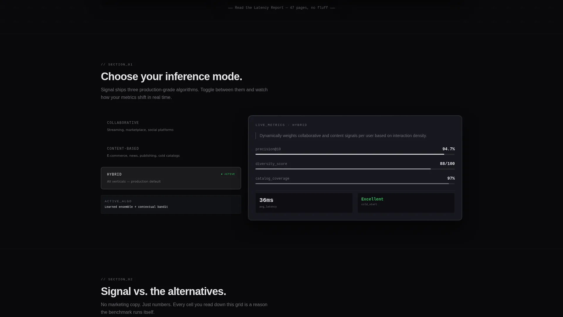
- An algorithm mode toggle letting visitors switch between Collaborative Filtering, Content-Based, and Hybrid views with changing dummy metrics
- A split comparison data grid, a live product ID demo field, and a benchmark request form with segmentation fields
Feature list
This template includes purpose-built components that reflect how technical buyers actually evaluate recommendation engine software.
Animated Dark Glass Panel Header
Three frosted, translucent panels float on a void-black background. Each panel displays a distinct live-style data visualization: a click-stream waterfall on the left, a precision/recall accuracy gauge in the center, and a latency sparkline on the right. Numbers tick and bars shift to reinforce the sense of a system already running.
Interactive Algorithm Mode Explorer
Section one of the page lets visitors toggle between three recommendation approaches: Collaborative Filtering, Content-Based, and Hybrid. Switching modes updates a simulated dashboard with different dummy metrics in real time. This lets buyers feel the product logic rather than just read about it.
Head-to-Head Comparison Data Grid
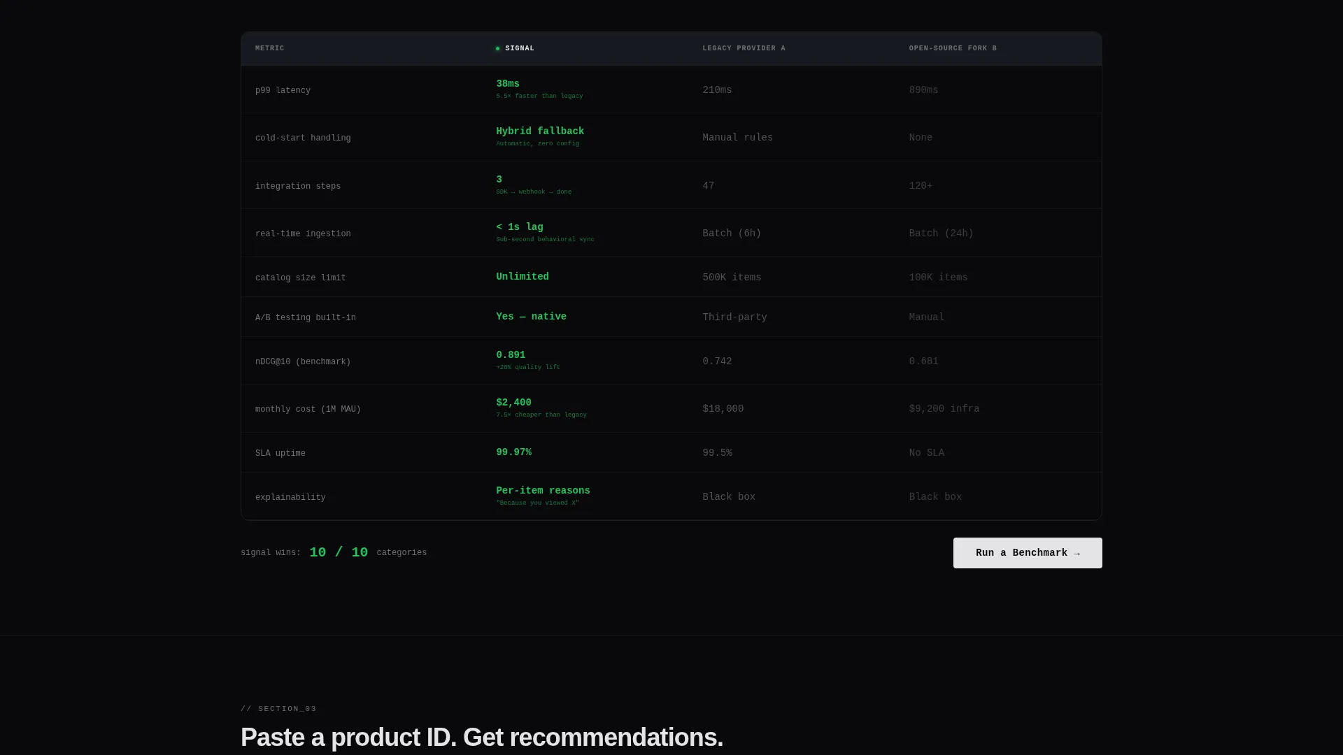
A structured split grid compares response time, cold-start handling, and integration step count across three columns: the featured engine, a legacy provider, and an open-source fork. Cells highlight green or red as the visitor reads down each row. The grid makes performance differences visible without requiring any prior technical knowledge.
Live Product Recommendation Demo
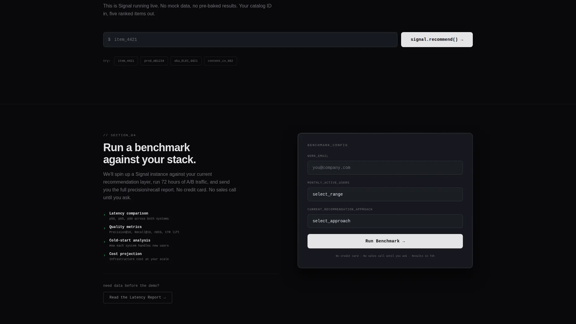
Visitors can paste a sample product identifier into an input field and immediately see five recommended items generated on screen. This hands-on moment converts curiosity into confidence. It is the most direct proof-of-concept interaction on the page.
Benchmark Request Form with Segmentation
The primary call-to-action form collects a company email address, a monthly active user count selected from a dropdown (10K, 100K, or 1M+), and the visitor's current recommendation approach chosen from four options. This segmentation helps sales teams prioritize and personalize follow-up conversations.
Self-Typing Headline with Terminal Aesthetic
A single headline types itself into view above the header panels: "Your catalog has 200,000 items. Your user has 3 seconds." The effect sets the stakes immediately. Combined with the Monochrome Steel palette, it frames the product as a precision instrument rather than a marketing claim.
Page sections overview
| Section | Purpose |
|---|---|
| Dark Glass Header | Display live-style metrics and set technical tone |
| Secondary call to action Bar | Offer whitepaper download for research-stage visitors |
| Algorithm Mode Toggle | Let visitors explore filtering modes interactively |
| Versus Comparison Grid | Show performance differences row by row |
| Live Demo Field | Allow hands-on product ID recommendation testing |
| Benchmark Request Form | Capture qualified leads with segmentation context |
Design & branding system
The visual identity follows a Startup Velocity theme built entirely on the Monochrome Steel color system. Every color choice reinforces the idea of precision hardware: no warmth, no decoration, just data.
- Core palette: void black (#09090B) and brushed gunmetal (#1C1F26) for all backgrounds, cold alloy gray (#71717A) for dividers and secondary text, and electric silver (#E4E4E7) reserved for data highlights, hover states, and call-to-action borders
- Glassmorphism edge-lighting on header panels simulates physical monitors mounted on a dark wall
- Dividers render as barely-visible lines that separate data cells the way thin bezels separate monitor panels
Mobile & speed optimization
The template is structured for fast rendering and clear readability across screen sizes. The dashboard-style grid layout adapts without losing its data-dense character.
- Header panels reflow to a single-column stack on smaller screens, keeping metric displays legible
- Interactive sections use lightweight state toggles so mode switching stays responsive on mobile connections
- The comparison grid collapses gracefully so cell highlights remain visible without horizontal scrolling
How this template helps you convert
The page is designed around a Comparison/Versus conversion strategy. Every section earns the next click before asking for anything in return.
- The header panels and self-typing headline create immediate credibility by showing system activity the moment the page loads, so visitors are already engaged before reading a single feature claim.
- The algorithm explorer and versus grid build conviction progressively, with the benchmark form appearing only after the visitor has watched the product win every comparison row.
Other information about this template
This template sits at the intersection of the Technology category, the AI and Machine Learning subcategory, and the Recommendation Engine niche. It is suited for teams building or selling personalization infrastructure where buyer trust depends on demonstrated performance.
- The template style is Dashboard/Data Grid, which means layout decisions prioritize data density and scannable structure over decorative visuals
- The creative direction is Interactive Explorer, meaning each scroll depth rewards visitors with a new interactive element rather than more static copy
- The landing page direction is Comparison/Versus, so the primary conversion path is anchored to a competitive evidence moment
- A secondary call-to-action labeled "Read the Latency Report" sits below the header panels for visitors who need supporting documentation before requesting a demo
Theme
Startup Velocity
Creative direction
Interactive Explorer
Color system
Monochrome Steel
Style
Dashboard/Data Grid
Direction
Comparison/Versus
Page Sections
Animated Dark Glass Panel Header
Interactive Algorithm Mode Toggle
Head-to-head Comparison Data Grid
Live Product ID Demo Field
Segmented Benchmark Request Form
Self-typing Terminal Headline
Related questions
Who is this landing page template designed for?
Can I replace the dummy metrics with real data?
What information does the benchmark request form collect?
How does the versus grid section work?
Does this template need additional pages to convert visitors?



