Recover - Precision Cart Recovery Landing Page Template
Recover is a bold brutalist landing page template built for SaaS abandoned cart email platforms. It uses a modular card grid layout, a scrolling logo bar header, and a data-driven Industry Report creative direction to turn proprietary send statistics into conversion pressure. The page guides high-intent ecommerce buyers toward a personalized demo with zero forms and maximum credibility.
by Rocket studio
Quick summary
Recover is a single-page, click-through landing page template designed for SaaS abandoned cart email platforms. It pairs a Bold Brutalist visual identity with a card grid layout and an Industry Report narrative arc. Every section is built to earn trust through hard data before asking visitors to book a demo.
Who this template is for
This template speaks directly to ecommerce operators who move fast and measure everything. It is built for teams that need to make a compelling case with data, not decorative imagery.
- Direct-to-consumer ecommerce directors managing seven-figure checkout leakage every quarter
- Shopify Plus operators who have outgrown simpler email logic builders and need a more powerful recovery platform
- Marketplace sellers on platforms like BigCommerce who want recovery flows that feel personal, not automated
What problem this template solves
Most SaaS landing pages undersell their platform by leading with features instead of proof. Recover flips that structure. It opens with mass social proof and moves visitors through a carefully sequenced data narrative before ever asking for a click.
- Abandoned cart platforms struggle to communicate precision and intelligence without sounding like every other email tool
- Prospects arrive skeptical and leave without acting because the page never earns credibility at the right pace
- Generic layouts waste the persuasive power of proprietary benchmark data that platforms have already collected
What you get with this template
You get a fully structured, modular landing page built around a single conversion goal: getting visitors to book a personalized demo. Every section has a defined role in the narrative arc.
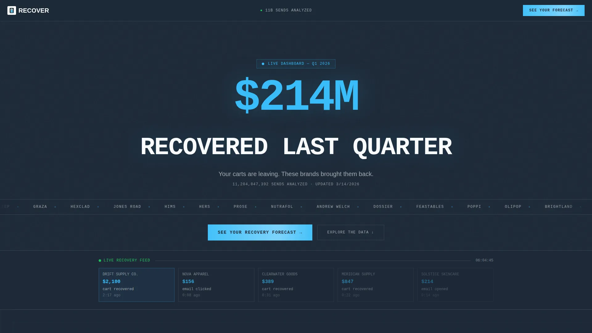
- A scrolling logo bar header with oversized headline stat and a single supporting line in chalk white
- A modular card grid that sequences industry benchmarks, feature explanations, and case studies with hard revenue numbers
- A sticky bottom bar that appears after 60 percent scroll depth, carrying the primary call to action and a 90-second value hook
Feature list
This section covers the core template components and how each one contributes to the overall page experience.
Scrolling Logo Bar Header
The header opens with a horizontal ticker of 40-plus ecommerce brand logos scrolling in a single unbroken ribbon. Above it sits an oversized grotesque-type stat: "$214M recovered last quarter." Below, one line in chalk white closes the hook. No imagery, no illustration. The logos and the number carry the full persuasive weight.
Modular Card Grid Layout
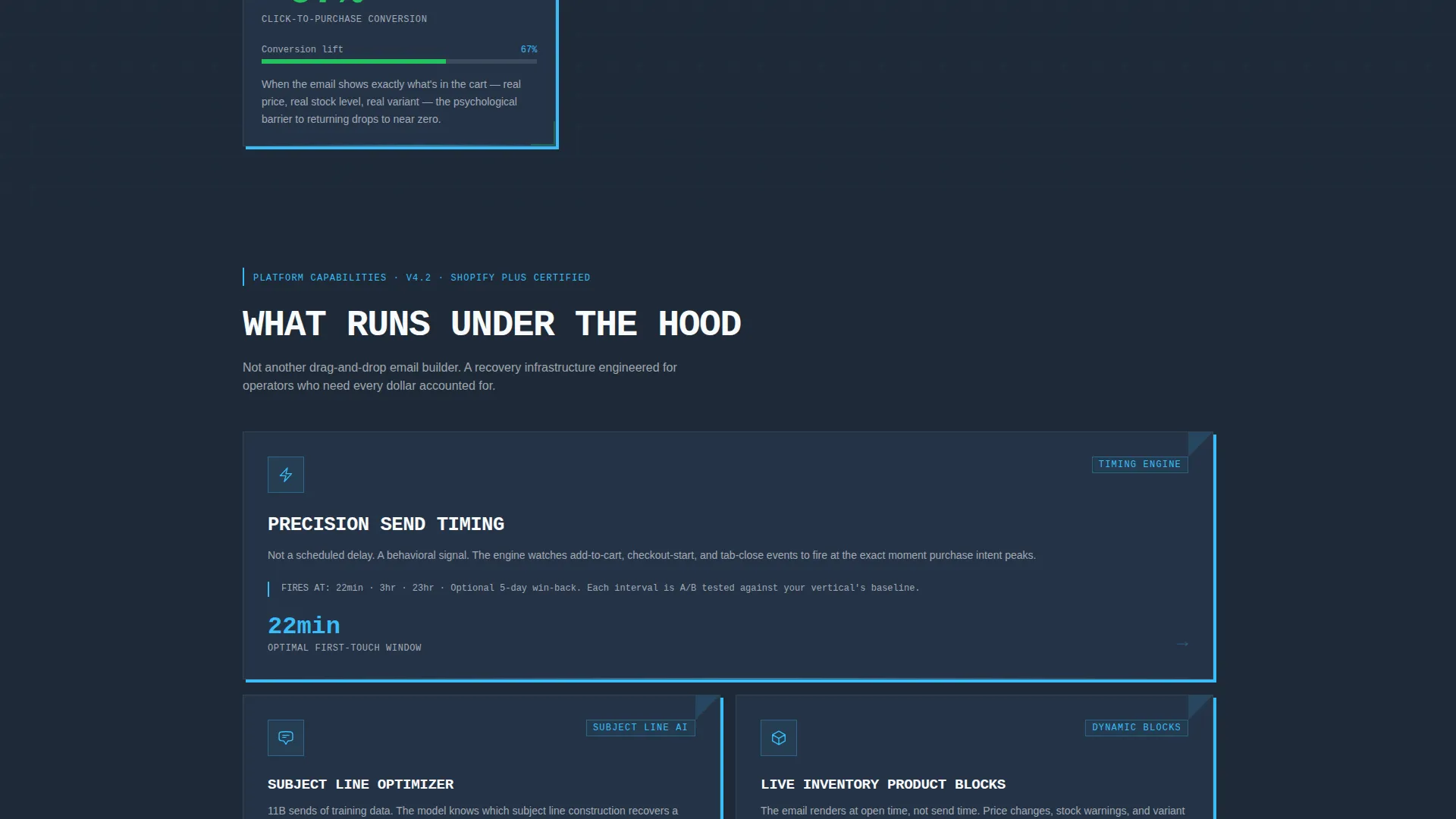
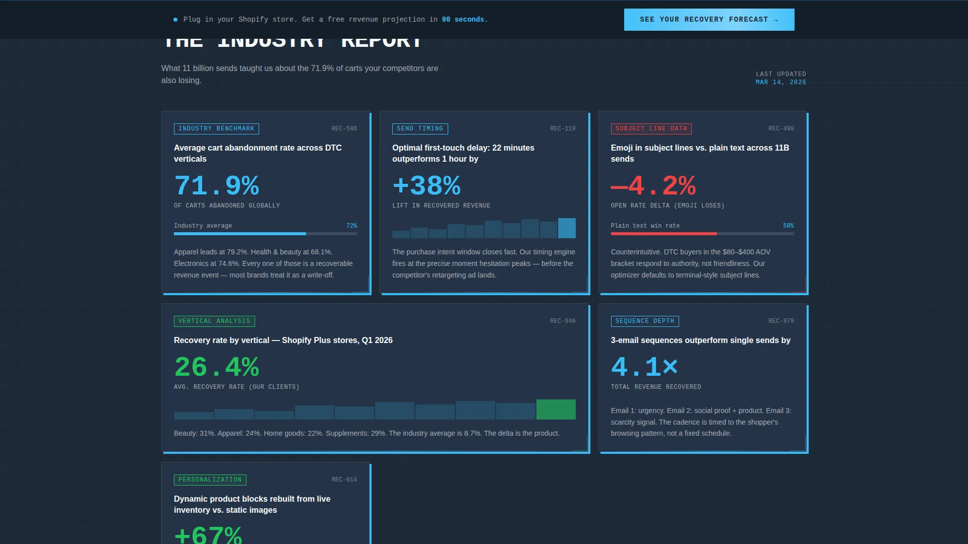
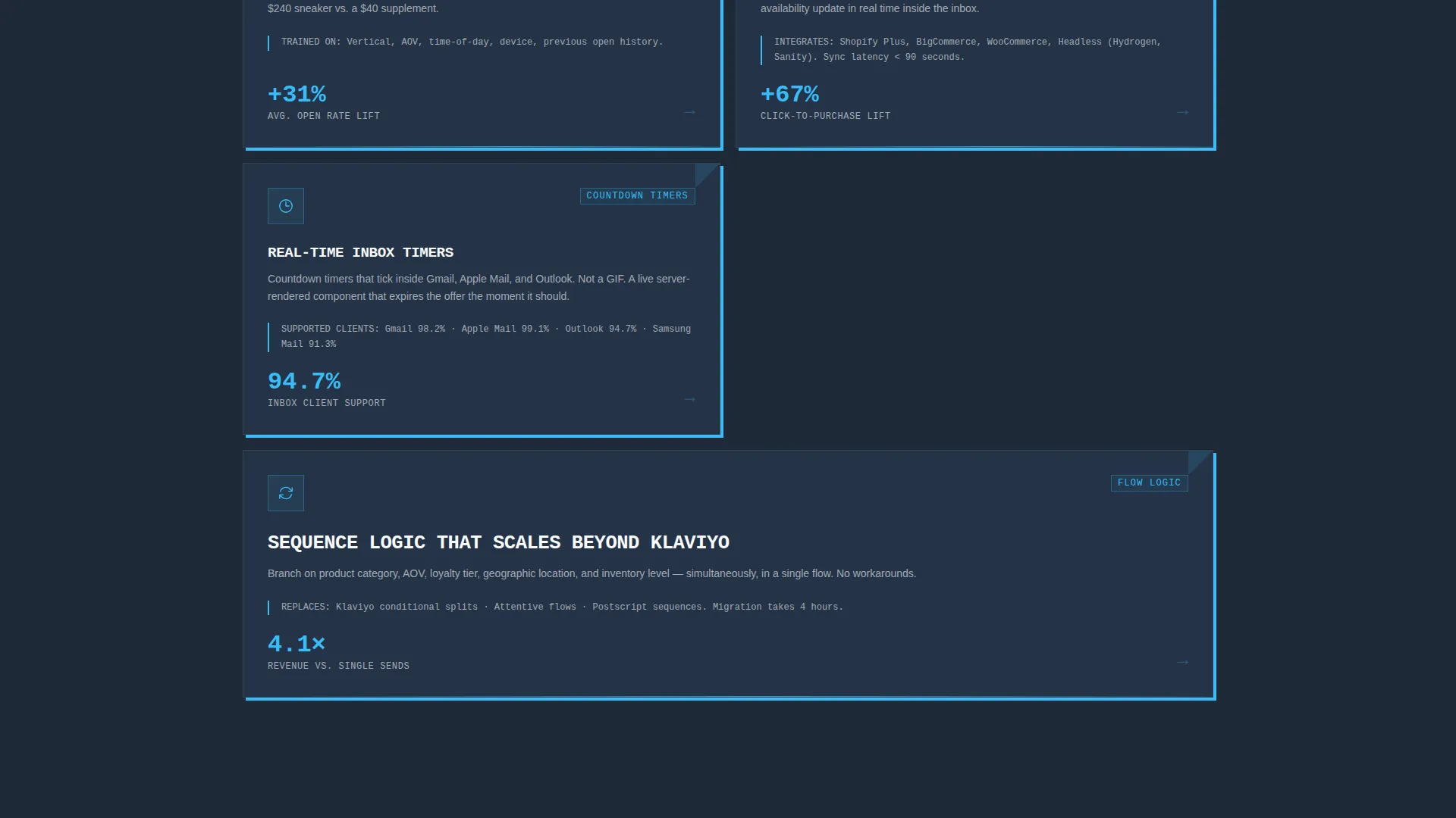
The page body is built as a card grid where each card is a standalone data finding. Cards carry stat-forward headlines like average recovery rates by vertical, subject line open rate comparisons, and optimal send delay benchmarks. The grid tightens as visitors scroll, shifting from market context to missed opportunity to proof.
Brutalist Data Card Design
Each card sits on deep gunmetal slate with no border radius, a hard sky blue shadow offset four pixels down and right, and monospaced numerals that give every stat the visual authority of a terminal readout. The design system makes data feel urgent and credible at a glance.
Click-Through call to action Row
The final card row replaces any form with a uniform call to action: "See Your Recovery Forecast" in electric sky blue on slate. The click is earned by the cumulative weight of the data narrative above it, not by a lead capture wall.
Sticky Bottom Bar
After visitors pass 60 percent scroll depth, a sticky bar appears at the bottom of the viewport. It carries the same primary call to action alongside the line: "Plug in your Shopify store. Get a free revenue projection in 90 seconds." It stays visible without interrupting the scroll.
Industry Report Narrative Arc
The page is structured as a proprietary industry report, not a feature list. Cards move from sector benchmarks to specific platform capabilities to customer case studies with real revenue numbers. The arc guides visitors from awareness of the problem to confidence in the solution.
Page sections overview
| Section | Purpose |
|---|---|
| Logo Bar Header | Opens with mass social proof via scrolling brand logos and a nine-figure recovery stat |
| Benchmark Data Cards | Delivers proprietary industry findings that create urgency and credibility |
| Feature Explanation Cards | Translates platform capabilities into concrete performance outcomes |
| Case Study Cards | Anchors claims with hard revenue numbers from real recovery scenarios |
| call to action Card Row | Closes the grid with a uniform demo-booking call to action on every final card |
| Sticky Bottom Bar | Captures late-scroll intent with a persistent, low-friction click prompt |
Design & branding system
The visual identity follows a Bold Brutalist theme built on a Slate and Sky color system. The palette reads like a steel-and-glass control tower at dusk: industrial weight at the base, electric clarity at the top.
- Core colors: deep gunmetal slate (#1E2A38) for card backgrounds, exposed concrete gray (#4A5568) for secondary surfaces, electric sky blue (#38BDF8) for calls to action and data highlights, and chalk white (#F8FAFC) for body type punched into dark fields
- Typography uses oversized grotesque type for headline stats and monospaced numerals for every data point, giving the page the visual authority of a live terminal readout
- Cards use zero border radius, hard four-pixel offset shadows in sky blue, and no decorative imagery, keeping all visual weight on the data itself
Mobile & speed optimization
The modular card grid is built to reflow cleanly at smaller viewport widths. Each card is a self-contained unit, so the layout adapts without losing the brutalist visual structure.
- Cards stack vertically on mobile, preserving the data-first narrative arc and the hard shadow treatment
- The sticky bottom bar remains anchored at the base of the mobile viewport, keeping the call to action reachable without requiring an upward scroll
How this template helps you convert
Recover is engineered as a click-through page, meaning it earns the conversion through accumulated evidence rather than form friction. The structure is deliberate and sequential.
- The logo bar and nine-figure headline stat establish immediate peer-level credibility before a visitor reads a single feature description
- The card grid moves visitors through a narrative arc that makes them feel the cost of inaction, with each data card adding a layer of proprietary proof
- The sticky bottom bar and the final call to action row both carry the same low-friction action, so visitors who are ready can convert at any scroll depth without hunting for a button
Other information about this template
This template is built specifically for the SaaS abandoned cart email category, where conversion depends on demonstrating platform intelligence rather than listing integrations. The page tone is deliberately high-stakes, matching the tension that ecommerce operators feel on peak revenue days.
- The card grid is modular, meaning individual cards can be swapped, reordered, or replaced with updated benchmark data without restructuring the page
- The header stat and supporting line are plain text elements, making them straightforward to update as platform numbers change over time
- This template suits teams evaluating abandoned cart email tools across competitive ecommerce technology stacks
Theme
Bold Brutalist
Creative direction
Industry Report
Color system
Slate & Sky
Style
Card Grid (Modular)
Direction
Click-Through
Page Sections
Scrolling Logo Bar Header
Modular Brutalist Card Grid
Industry Report Narrative Arc
Click-through Call to Action Final Row
Sticky 60-percent Scroll Bar
Terminal-style Data Typography
Related questions
Does this template include a lead capture form?
Can I replace the data cards with my own benchmark statistics?
How does the sticky bottom bar work?
Is this template a good fit for high-volume ecommerce email platforms?
What does the Bold Brutalist design system include?



