Smart ITSM Platform Landing Page Template
Resolve is a scroll-reveal landing page template built for no-code IT service management platforms. It pairs a data-driven Industry Report narrative with a dark glass visual identity to guide IT operations managers, help desk leads, and CIOs toward a gated benchmark report or an inline demo. Every section earns trust before asking for anything.
by Rocket studio
Quick summary
Resolve is a single-page, scroll-reveal landing page template designed for no-code IT service management (ITSM) platforms. It uses a structured Industry Report rhythm to present real operational pain points, then reveals the platform interface as the answer. The design feels like a live monitoring dashboard: controlled, authoritative, and quietly impressive.
Who this template is for
This template is built for go-to-market teams promoting no-code ITSM tools to a technically aware but time-pressed audience. It speaks directly to people who live inside operations dashboards, not marketing decks.
- IT operations managers at mid-market companies who have outgrown shared inboxes and spreadsheets
- Help desk leads who need form changes done without filing a developer request
- CIOs who require audit-ready workflows without the cost or timeline of an enterprise implementation
What problem this template solves
Mid-market IT teams are caught between tools that are too simple and platforms that take six months to deploy. This template presents that exact tension with evidence, then positions your platform as the practical middle ground.
- Teams still routing incidents through email lack the structure to scale or report on resolution times
- Help desk leads waste cycles waiting on engineering for basic configuration changes
- Budget-conscious CIOs need audit trail visibility without committing to enterprise-grade contracts
What you get with this template
You get a fully structured, scroll-reveal landing page with two distinct conversion paths and a research-backed narrative arc. The template is built to move a skeptical, mid-senior IT buyer from awareness to action in a single scrolling session.
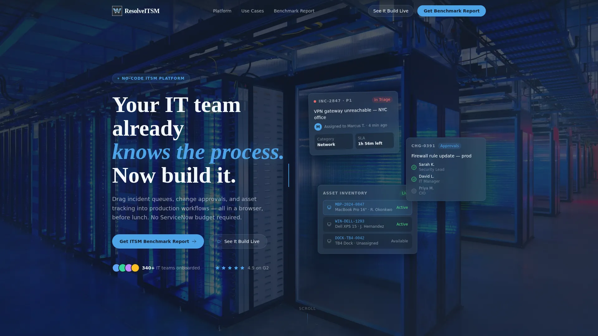
- A viewport-filling dark glass header with parallax-drifting frosted panels showing live ITSM workflow fragments
- A progressive data reveal structure alternating between industry findings and platform interface screens
- Two conversion paths: a gated benchmark report form and a soft-gated inline interactive demo
Feature list
This template is built around a set of purposeful, prompt-defined capabilities. Each one serves the lead generation goal and the no-code ITSM positioning.
Scroll Reveal Progressive Layout
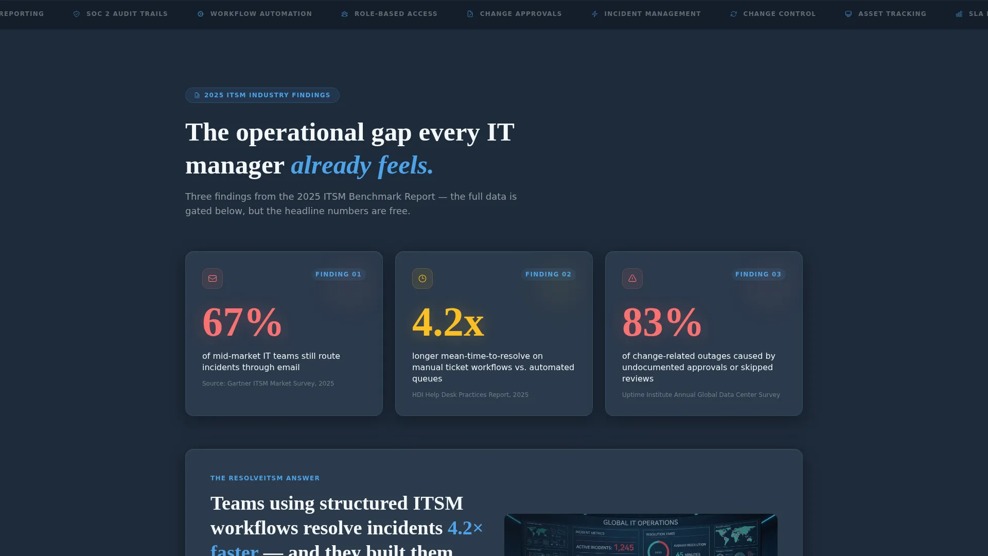
The page unfolds as a structured briefing. Each scroll step introduces a new industry data point, then transitions into a platform screen that addresses it. The rhythm keeps visitors engaged without overwhelming them upfront.
Dark Glass Panel Header
The header fills the entire viewport with a dark background and translucent, frosted-glass cards floating at staggered depths. Each card shows a fragment of a real workflow: an incident ticket in triage, a change approval chain, an asset inventory row. A headline types itself in as the page loads.
Gated Industry Report Form
The primary call to action (call to action) is placed after the third data reveal. The form collects work email, company size via dropdown (50-200, 200-1000, 1000+), and primary ITSM challenge via multi-select (incident management, change control, asset tracking, and SLA reporting).
Inline Interactive Demo Path
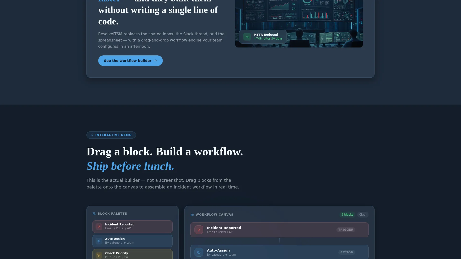
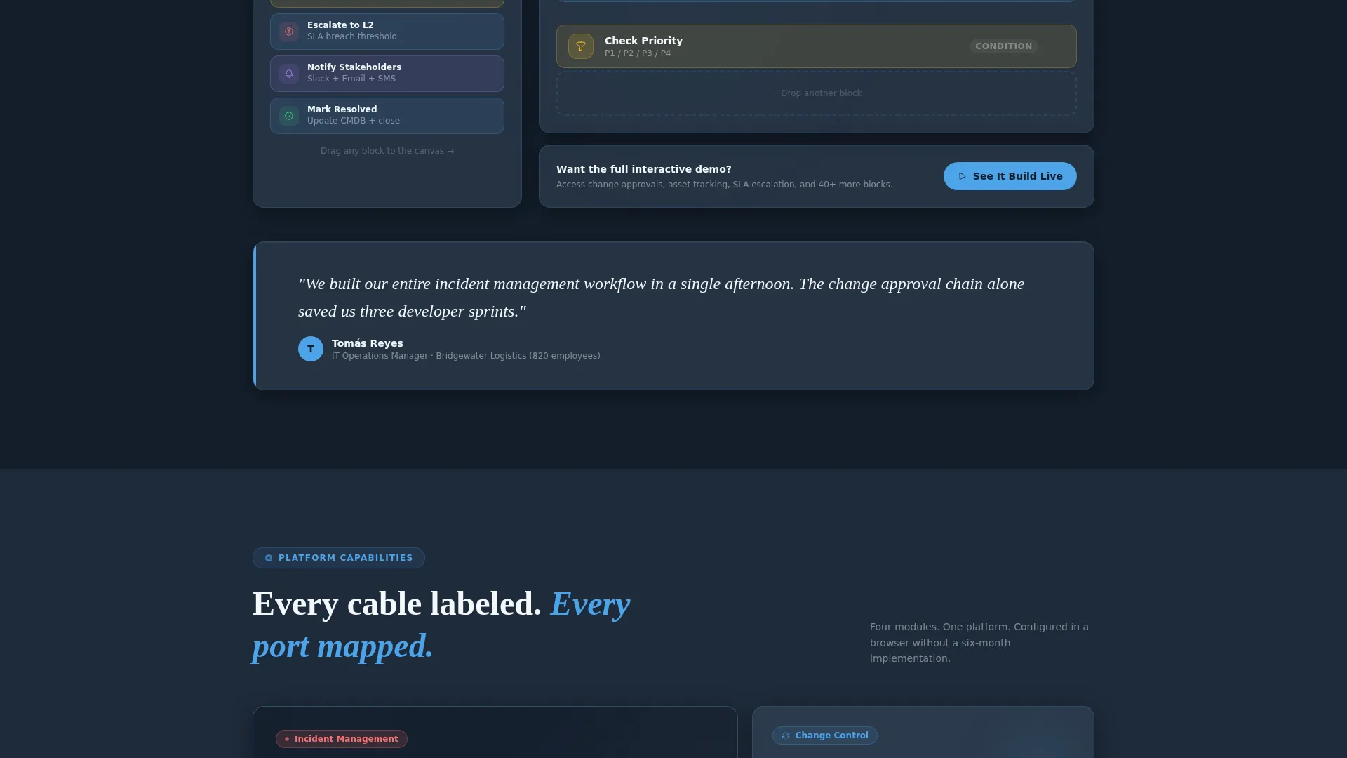
A secondary conversion path labeled "See It Build Live" triggers an inline drag-and-drop workflow builder demo. Visitors can explore without a form fill. A single email field soft-gates the full demo, capturing intent at a lower commitment threshold.
Industry Benchmark Data Panels
Bold stat panels open the narrative before any product claim is made. Findings such as ticket resolution benchmarks, cost-per-incident comparisons, and workflow automation adoption curves appear as progressive reveals, building an evidence case that feels researched rather than marketed.
Parallax Drift Visual System
The header panels carry a subtle parallax drift effect, creating the impression of looking through a glass wall into a live operations center. This motion is restrained and purposeful, reinforcing the template's "complex made simple" positioning without distraction.
Page sections overview
| Section | Purpose |
|---|---|
| Dark Glass Header | Establish authority with a viewport-filling animated headline and frosted ITSM workflow panels |
| Bold Stat Panel | Open the industry report narrative with a compelling benchmark figure before any product mention |
| First Data Reveal | Present the first industry finding with a paired platform interface screen |
| Second Data Reveal | Introduce ticket resolution benchmarks alongside the workflow builder interface |
| Third Data Reveal | Show cost-per-incident and automation adoption data before the primary call to action appears |
| Gated Report Form | Capture work email, company size, and ITSM challenge via the benchmark report offer |
| Inline Demo Section | Let visitors trigger a drag-and-drop workflow demo with a soft-gate single email field |
| Closing Conversion | Reinforce the value proposition and present a final sign-up or demo prompt |
Design & branding system
The visual identity follows a Directory and Discovery theme built on a Slate and Sky color system. Every color choice reinforces the feeling of a live operations environment: purposeful, legible, and always in control.
- Deep operations slate (#1E2A3A) forms the primary background, grounding the page in a monitoring dashboard aesthetic
- Cloud-layer gray (#3B4D61) surfaces cards and secondary panels with enough contrast to stay readable
- Open-sky blue (#4DA3E8) marks interactive elements and data highlights, drawing the eye without competing with content
- Crisp white (#F4F7FA) provides text and canvas contrast, reading like a blank configuration screen ready for input
Mobile & speed optimization
The scroll-reveal structure and layered glass panels are designed with a staggered layout that adapts to narrower viewports without losing its visual hierarchy. The progressive reveal keeps the mobile experience focused and sequenced rather than overwhelming.
- Frosted glass panels restack gracefully on smaller screens, preserving the depth effect without horizontal overflow
- Conversion forms are field-minimal by design: work email first, then two follow-up inputs, keeping mobile friction low
How this template helps you convert
This template is engineered around a single strategic insight: earn trust with evidence before asking for anything. That principle drives every placement decision.
- The bold stat panel ("67% of mid-market IT teams still route incidents through email") establishes authority in the first visible scroll, making visitors more receptive to the platform offer that follows
- The gated report call to action appears only after three data reveals, when the visitor has seen enough findings to genuinely want the rest, reducing form abandonment at the most critical moment
- The inline demo path captures intent from visitors who are not ready to share their email for a report, giving you a second conversion opportunity without a separate page or flow
Other information about this template
This template is designed specifically for the no-code ITSM category, where buyers are evaluating whether a platform can replace legacy ticketing tools and manual spreadsheet workflows. The Industry Report creative direction is particularly effective in this space because IT buyers respond to benchmarks and peer data over feature lists alone.
- The template style is Scroll Reveal (Progressive), meaning content appears in deliberate stages as the visitor scrolls, not all at once
- The theme is Directory and Discovery, which frames the platform as a structured, findable solution rather than a generic SaaS pitch
- The header concept, Dark Glass Panels, is a distinct visual device that sets a professional, operations-room tone from the first second
- The lead generation direction means both conversion paths (gated report and inline demo) are primary design considerations, not afterthoughts
- This template is well suited for teams positioning against over-engineered enterprise tools or under-powered shared inbox workflows
Theme
Directory & Discovery
Creative direction
Industry Report
Color system
Slate & Sky
Style
Scroll Reveal (Progressive)
Direction
Lead Generation
Page Sections
Scroll Reveal Progressive Layout
Dark Glass Panel Header
Gated Industry Report Form
Inline Interactive Demo Path
Industry Benchmark Data Panels
Parallax Drift Visual System
Related questions
Can I customize the industry benchmark data shown in the stat panels?
Do both conversion paths use the same form?
Is the inline demo component a real functional builder or a visual prototype?
Who is the ideal visitor this landing page is designed to convert?
Can the gated form fields be changed or reduced?



