Smart Veterinary Billing Landing Page Template
Triage is a Bold Brutalist comparison landing page template built for veterinary marketing automation platforms. It opens with a glowing $104,000 attrition stat, walks visitors through a data-driven comparison table, and closes with a two-step progressive form. The template is designed to help veterinary clinics quantify revenue loss and act on it immediately.
by Rocket studio
Quick summary
Triage is a single-page comparison template built for B2B SaaS platforms that serve veterinary practices. It leads with a hard revenue-loss stat, builds a brutal side-by-side table, and converts visitors through a two-step form. Every scroll reveals new data before any explanation arrives. The page is built to make the cost of inaction feel immediate and personal.
Who this template is for
This template is made for software companies and platform teams targeting the veterinary sector. It works for anyone who needs to show, not just tell, why their solution beats the alternatives.
- Practice managers who handle manual reminder calls and watch appointments slip away each week
- Multi-location veterinary group leaders benchmarking performance across sites
- Solo veterinarians who have built strong clinics but lose roughly 30% of pets to annual patient lapse
What problem this template solves
Veterinary clinics lose significant revenue between appointments. Missed charges can account for up to 10% of missed revenue per year in veterinary medicine. Legacy software creates inefficiencies that hinder growth, and a lack of client adherence directly reduces treatment plan completion. This template bridges the gap between emergency care urgency and financial efficiency by making those losses visible before a single form field appears.
- Generic landing pages fail to quantify the cost of inaction for vet practice buyers
- Standard comparison pages use checkboxes instead of data, which fails to move skeptical practice managers
- Clinics stuck on manual processes need evidence-backed contrast, not feature lists
What you get with this template
You get a fully structured, single-page comparison layout designed around a Stats-First creative direction. The page escalates from awareness metrics to revenue metrics across multiple sections, each built to deepen the visitor's understanding of their own losses. Every element is pre-wired for high-stakes B2B conversion in the veterinary software space.
- A dark full-bleed header with a glowing $104,000 stat and a primary call-to-action button
- A multi-row comparison table contrasting your platform against generic CRM, email-only tools, and manual processes
- Full-width stat breakers, a two-step progressive form, and a secondary PDF capture path
Feature list
This template packages several purposeful components. Each one is designed to support veterinary teams in converting skeptical buyers through data, clarity, and momentum.
Glowing Header Stat Block
The header renders the average annual patient attrition figure at oversized scale in clinical white, edged with a soft violet luminance effect. There is no hero image. The number does the heavy lifting. A one-line subhead fades in beneath it, setting the competitive framing immediately. The primary "Run My Clinic's Numbers" call-to-action button sits directly below.
Data-Driven Comparison Table
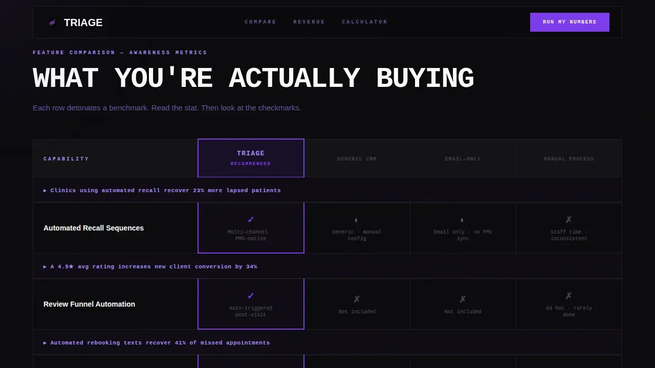
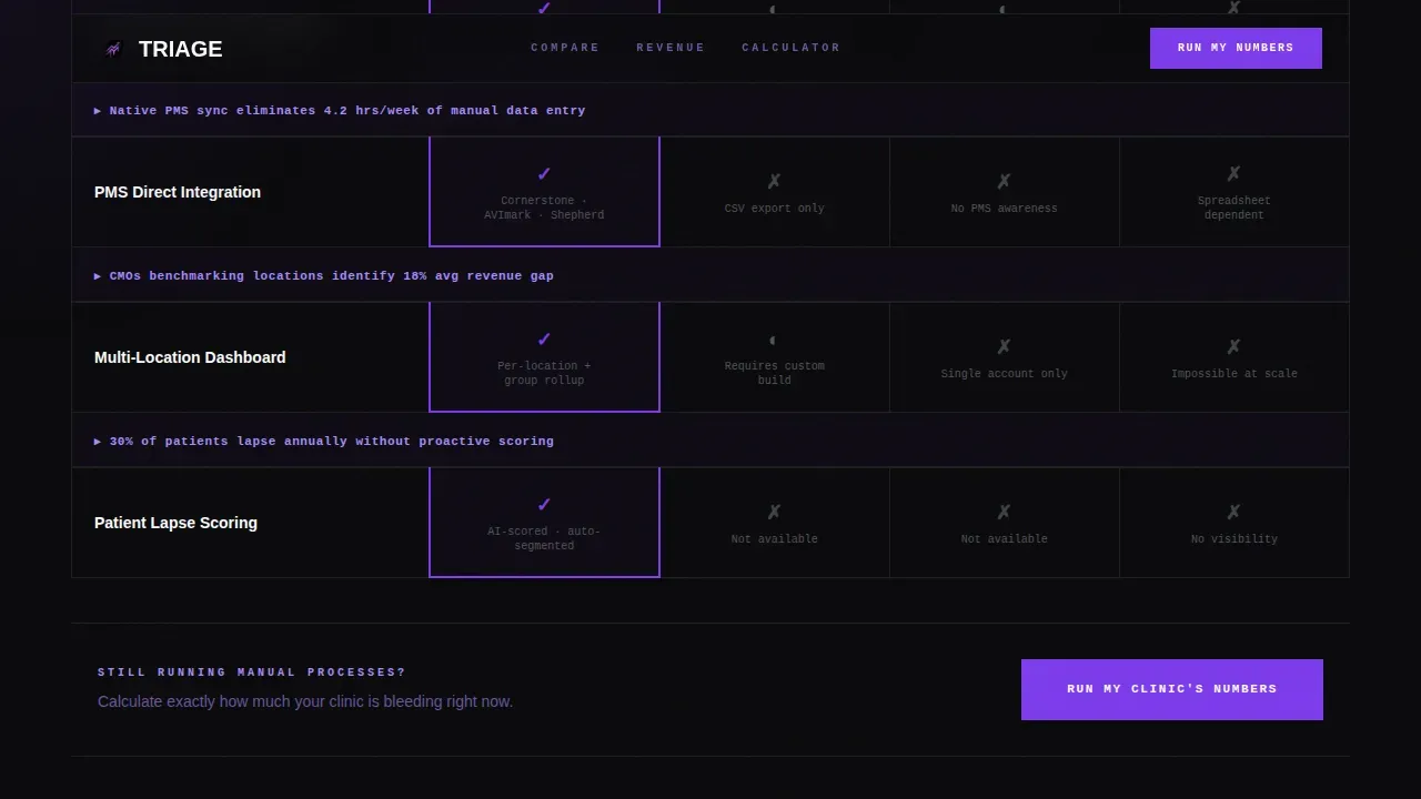
The spine of the page is a raw brutalist grid comparing your platform against three alternatives: generic CRM, email-only tools, and manual processes. Each row includes a live benchmark stat such as open rates, reactivation percentages, no-show reduction, and revenue recovered per seat. Thick violet borders and monospaced numerals make every data point hit harder. Veterinarians and practice managers can scan the table and immediately assess the risk of staying on their current system.
Full-Width Stat Breakers
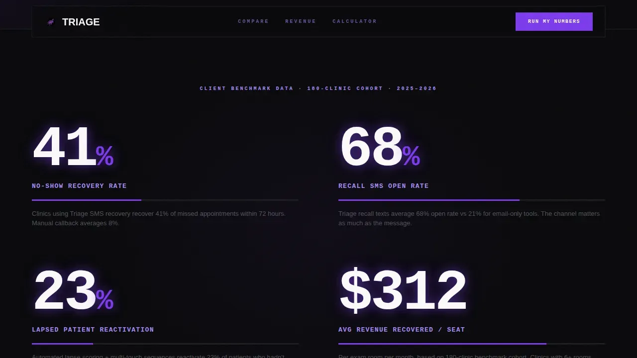
Between table sections, full-width interrupt panels display client benchmark data at 120-pixel type size. These breakers force the visitor to absorb critical information before scrolling into the next comparison category. For example, reactivation percentages and no-show reduction figures appear here, making the outcome of switching feel concrete and measurable.
Two-Step Progressive Form
The final call-to-action section includes a two-step form designed to reduce friction and collect qualified data. Step one asks for clinic name, practice management software (with a dropdown covering several major platforms), and number of active patients. Step two asks for monthly no-show rate and current automation status. Keeping each step to three to five fields helps prevent user abandonment during the process.
Secondary PDF Capture Path
A parallel conversion path labeled "See the Full Comparison PDF" captures email-only leads who are not ready to commit. This form collects a single field, an email address, in exchange for the full comparison document. It expands the addressable audience beyond visitors ready to run their numbers immediately.
GSAP-Powered Scroll Animations
The template uses GSAP ScrollTrigger for staggered reveals, cursor glow effects, magnetic buttons, and stat counter animations. GPU-accelerated transforms keep the experience smooth on desktop workstations where practice managers most often access this site.
Page sections overview
| Section | Purpose |
|---|---|
| Dark Header Stat | Display $104K attrition figure with primary call-to-action |
| Awareness Metrics Table | Compare open rates and client communication performance across four options |
| Stat Breaker One | Interrupt scroll with reactivation percentage benchmark |
| Revenue Metrics Table | Compare no-show reduction and revenue recovered per vet seat |
| Stat Breaker Two | Interrupt scroll with no-show reduction benchmark data |
| Mid-Page Form call to action | Place second "Run My Clinic's Numbers" call-to-action mid-table |
| Final call to action Section | Two-step progressive form plus PDF email capture |
| Minimal Footer | Single-row developer-minimal footer layout |
Design & branding system
The visual identity follows a Bold Brutalist theme built on the Void and Violet color system. The background is absolute void black (#09090B) across 80% of surfaces. Deep ultraviolet (#7C3AED) pulses through borders, progress bars, and hover states. Bruised orchid (#A78BFA) softens secondary labels. Clinical white (#FAFAFA) is reserved exclusively for data text and table cell content, so numbers read like vitals on a monitor. The palette feels like a surgery suite after hours: a single UV sterilization lamp humming, every surface hard and purposeful.
- Typography: JetBrains Mono for all numerals and data, DM Sans for body copy and labels
- No rounded corners anywhere; thick violet borders define every grid boundary
- Cursor glow, magnetic buttons, and staggered GSAP reveals reinforce the electric visual tone
Mobile & speed optimization
The template is built desktop-first, matching how practice managers typically access this site from workstations during clinic hours. A mobile fallback is included so the page remains functional for users on smartphones. GPU-accelerated transforms are used exclusively to keep scroll animations smooth without layout jank.
- Server Components handle all static sections to deliver faster initial load times
- GPU-accelerated transforms are the only animation method, keeping paint performance consistent
- The layout is structured to load quickly so visitors reach the comparison data before they scroll away
How this template helps you convert
The page is engineered for Comparison and Versus conversion. Every structural decision is designed to make switching feel necessary before the visitor reaches a single form field.
- The header stat quantifies the problem immediately. Visitors arrive already aware of a $104,000 risk before reading a single feature claim, which sets clear expectations and makes the comparison feel urgent rather than abstract.
- The escalating table structure moves visitors from awareness metrics to revenue metrics. Each row adds weight by attaching a real benchmark figure to the cost of staying on generic CRM, email-only tools, or manual processes. Seeing that data makes the decision to schedule a demo or run their numbers feel logical, not pressured.
- Three placed calls-to-action and a parallel PDF path address visitors at every confidence level. Practice managers who are ready commit via the two-step form. Those who need more time provide an email for the full comparison PDF, keeping them in the pipeline.
Other information about this template
This template is purpose-built for the veterinary marketing automation niche. It reflects current thinking in transforming veterinary practices through technology and automation. Several contextual facts shaped its design approach and are worth noting for teams deploying it.
- Missed charges in veterinary medicine can reach 10% of annual revenue; this template is designed to surface that figure early and keep it visible throughout the page
- Upfront payment integration concepts and deposit capture for no-show protection are natural companions to this template's conversion flow
- Metrics such as recovering up to 31% more from accounts receivable can be used as benchmark stat breaker content within the template layout
- Artificial intelligence tools are reshaping daily routines in veterinary practices by automating appointment scheduling, record-keeping, and client communication; this template's messaging framework supports platforms built on those capabilities
- A triage AI-agent that identifies critical symptoms and notifies the appropriate team member is an example of the kind of service this template is designed to represent
- Digital tools for managing patient records, medical records, and SOAP note syncing can be positioned as differentiators inside the comparison table rows
- Veterinary professionals can use this template for a veterinary hospital group, an independent clinic, or a multi-location network; the comparison structure scales to any competitive positioning need
- The template supports training teams on how to frame automated recall sequences and review funnels as revenue-protection tools rather than marketing add-ons
- Companies building in the veterinary software sector can adapt the stat breaker content to reflect their own benchmark data, including reactivation rates, wait times improvement, and no-show reduction percentages
- Pet care platforms focused on cats, dogs, and mixed-species practices will find the template's clinical framing credible and appropriate for their audience
- The triage automated revenue recovery veterinary landing page template is also adaptable for urgent care positioning, where smart symptom assessment and conditional triage logic are core platform features

Theme
Bold Brutalist
Creative direction
Stats-First Impact
Color system
Void & Violet
Style
Comparison Table
Direction
Comparison/Versus
Page Sections
Glowing Header Stat Block
Brutalist Comparison Table
Full-width Stat Breakers
Two-step Progressive Form
Secondary PDF Email Capture
GSAP Scroll Animation System
Related questions
Who is this landing page template designed for?
Can I adapt the comparison table rows to match my platform's own data?
Does the template include the two-step progressive form logic?
How does the secondary PDF capture path work?
Is this template suitable for a multi-location veterinary hospital group?



