Staffing & Recruiting Digital Presence Careers Website Template
Recruit is a scroll-reveal landing page template built for staffing and recruiting training platforms. It opens with a live interactive recruiter dashboard simulation, guides visitors through a data-driven Problem→Solution Arc, and converts them through a three-step progressive form. The design follows a Data Command visual identity using gunmetal, alloy gray, and signal green.
by Rocket studio
Quick summary
Recruit is a single-page scroll-reveal template designed for a staffing and recruiting training platform. It opens on a simulated recruiter dashboard, walks visitors through animated pain-point stats, maps each training module to a specific metric, and closes with a three-step progressive form that unlocks a free seven-day trial.
Who this template is for
This template is built for businesses that sell recruiting or staffing training to working professionals. The layout and messaging are designed around users who already understand the desk and want to get faster results.
- Agency owners who are scaling past their first five desks and need a training offer that speaks to pipeline growth
- Corporate talent acquisition leads tired of watching requisitions age out without a repeatable sourcing process
- Solo recruiters who know LinkedIn but have not yet built a pipeline that compounds over time
What problem this template solves
Most training platform pages look like course catalogs. They list topics but never connect those topics to the specific pain a recruiter feels at 7 AM staring at forty-day-old requisitions. Visitors leave without understanding what changes if they enroll.
- There is no visual proof that the platform actually works the way a recruiter's desk works
- Generic landing pages fail to connect curriculum modules to real business metrics like time-to-fill or falloff rates
- Freemium entry points often feel like sales traps rather than genuine diagnostic tools, reducing form completion rates
What you get with this template
You get a complete, production-ready scroll-reveal landing page with five clearly defined sections, a live interactive dashboard hero, animated diagnostic statistics, curriculum module cards, a cohort leaderboard section, and a three-step progressive conversion form.
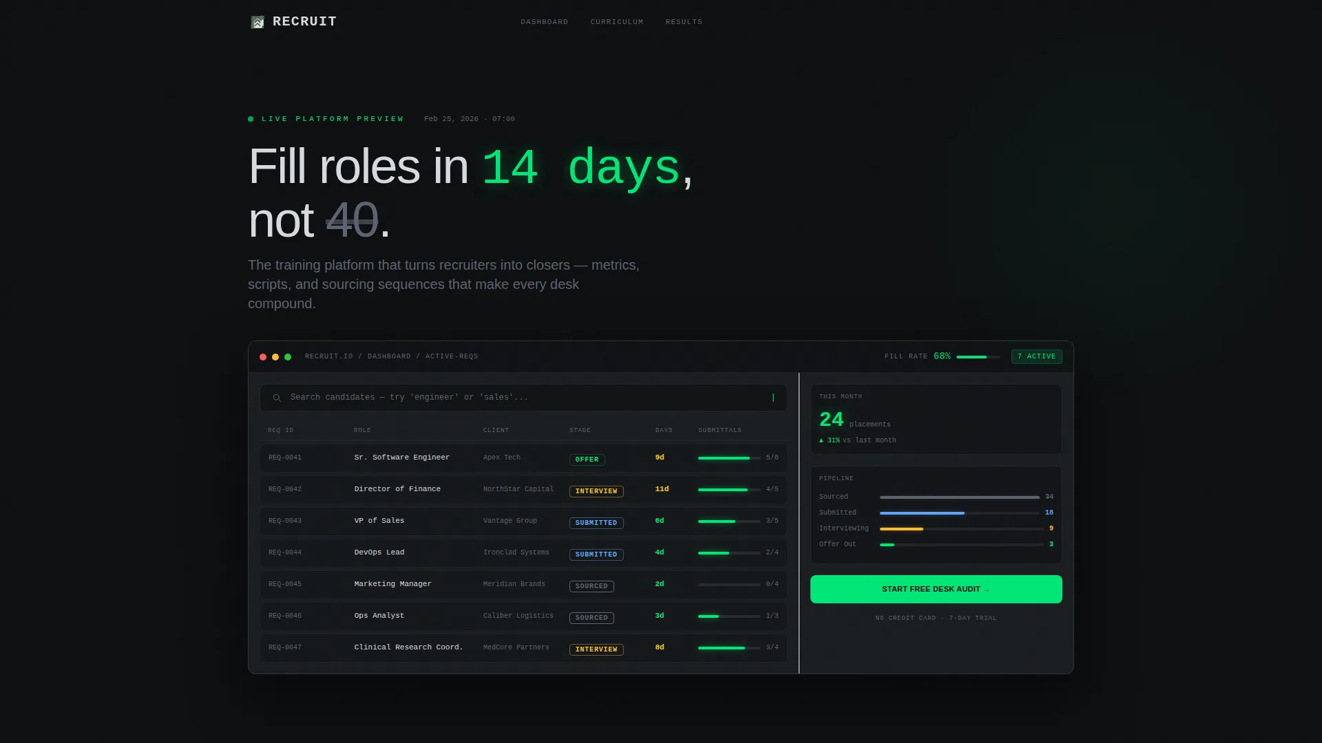
- A fully coded interactive header that simulates a recruiter dashboard with animated req cards, a fill-rate ticker, and a live typing search bar
- Scroll-triggered counter animations that reveal pain-point statistics as the visitor reads deeper into the page
- A three-step progressive form that segments visitors by placements, team size, and bottleneck before capturing their email
Feature list
This template is built with high interactivity and a focused conversion goal. Each feature below comes directly from the template's coded structure.
Interactive Dashboard Hero
The header renders a simulated recruiter dashboard live in the browser. Visitors see seven open roles with stage indicators covering sourced, submitted, interviewing, and offer stages. A fill-rate percentage ticks upward in real time, and a candidate search bar accepts actual typing input. When a visitor types a job title, the dashboard animates mock results with boolean strings auto-generating and candidate cards sliding in.
Scroll-Triggered Pain Stats
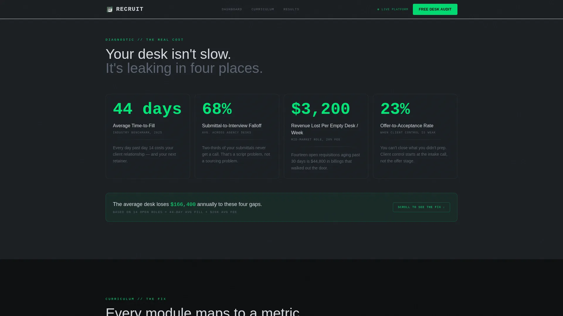
Section two uses GSAP ScrollTrigger counter animations to reveal hard numbers as visitors scroll. Time-to-fill benchmarks, funnel falloff rates, and the weekly dollar cost of an empty desk all animate into view one by one. Each stat builds a diagnostic case before the curriculum is introduced.
Curriculum Arc Module Cards
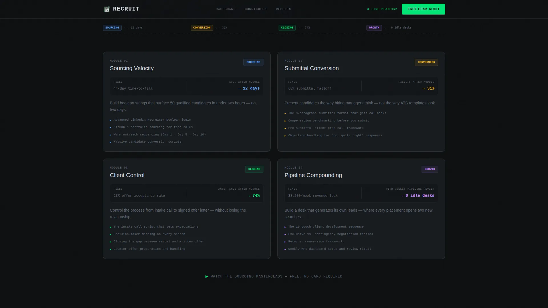
Three module cards appear in section three, each mapped directly to one pain stat from the previous section. Sourcing Velocity answers the time-to-fill number, Submittal Conversion answers the falloff rate, and Client Control answers the revenue leak. Staggered card entrances reinforce the one-to-one relationship between problem and fix.
Live Cohort Leaderboard
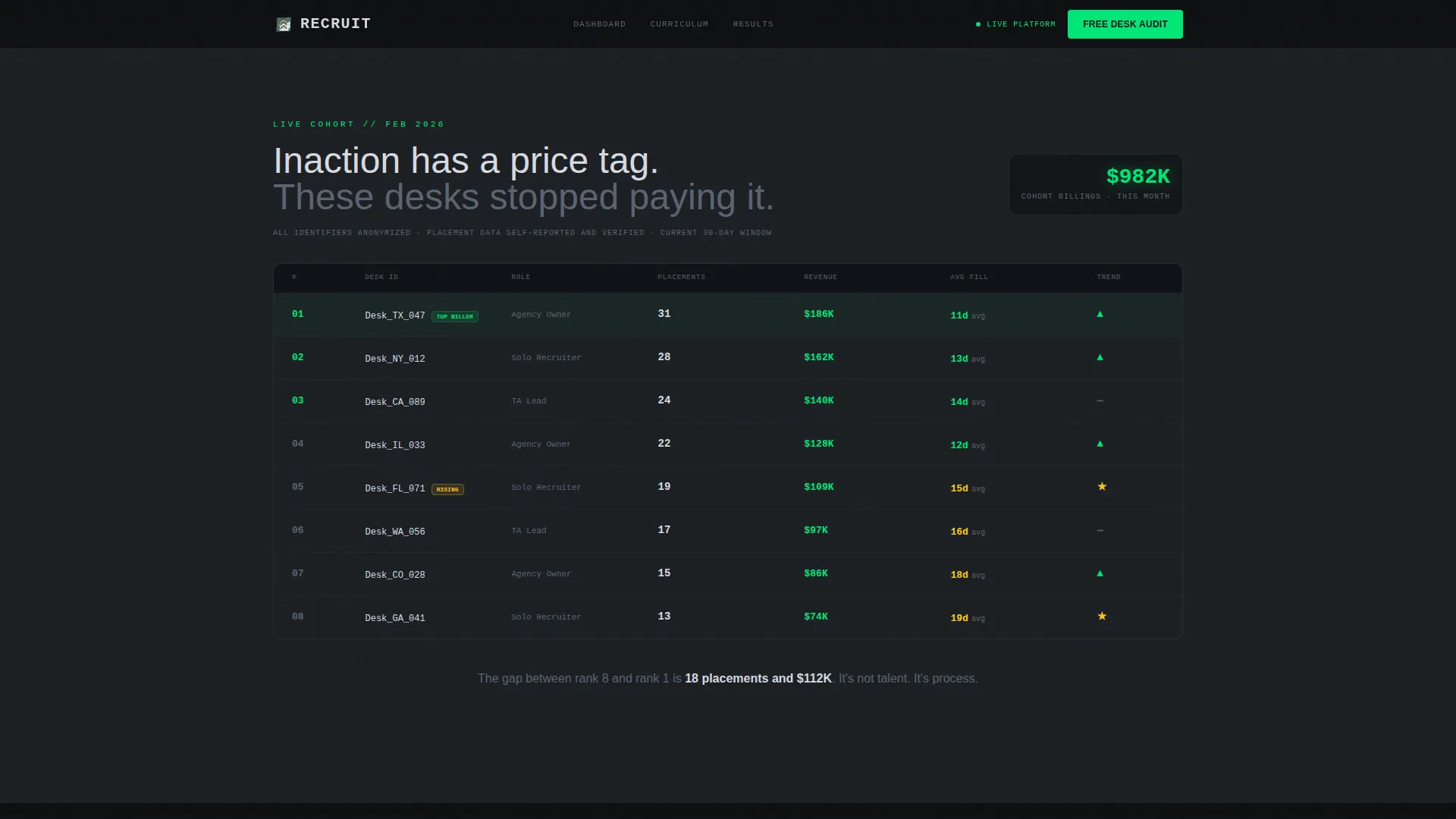
Section four displays anonymized learner placement data in a live-style leaderboard format. Real numbers make inaction feel expensive. A secondary conversion link sits below the leaderboard for visitors who are not yet ready for the full audit form.
Three-Step Progressive Form
The desk audit form collects information across three steps. Step one asks for current monthly placements and team size, step two asks for the visitor's biggest bottleneck, and step three captures email and unlocks a personalized module recommendation plus a free seven-day platform trial.
Pinned Navigation call to action
The primary call to action, "Start Your Free Desk Audit," appears first inside the interactive hero and then pins to the navigation bar as the visitor scrolls. This keeps the primary conversion action visible at every stage of the scroll journey without interrupting the reading flow.
Page sections overview
| Section | Purpose |
|---|---|
| Interactive Dashboard Hero | Simulates a live recruiter dashboard with req cards, fill-rate ticker, and typing search to hook visitors immediately |
| Pain Stats Diagnostic | Animates time-to-fill, falloff rates, and desk revenue cost on scroll to build a data-backed case for change |
| Curriculum Arc Cards | Maps three training modules directly to the pain stats above using staggered card reveal animations |
| Cohort Leaderboard | Shows anonymized learner placement numbers to provide social proof and a secondary conversion link |
| Desk Audit Form | Three-step progressive form that segments visitors and unlocks a personalized recommendation plus free trial |
| Footer | Linear single-row footer with essential links |
Design & branding system
The visual identity follows a Data Command theme that combines the information density of a financial terminal with the discipline of a military briefing room. There is no warmth, no decorative imagery, and no stock photography. The product interface is the hero.
- Color system uses deep gunmetal (#1B1F23) as the primary background, brushed steel mid-tone (#5C6370) for secondary surfaces, light alloy gray (#D7DAE0) for body text, and signal green (#00E676) reserved strictly for progress indicators, live data readouts, and calls to action
- Typography pairs JetBrains Mono for all data values, numbers, and dashboard elements with DM Sans for body copy and headings
- Backgrounds alternate between gunmetal and near-black across sections, with signal green only firing when an element demands immediate action
Mobile & speed optimization
The template is built desktop-first to serve the Bloomberg-terminal dashboard metaphor at full fidelity. A responsive mobile fallback is included so the page remains usable across devices.
- Dashboard hero and interactive elements are built with Client Components to keep animation logic isolated from the static sections rendered as Server Components
- Scroll-triggered animations use intersection observer reveals and GSAP ScrollTrigger to fire only when elements enter the viewport, avoiding unnecessary processing on page load
- The three-step progressive form and fill-rate ticker are scoped as interactive Client Components, keeping the rest of the page lightweight
How this template helps you convert
The page earns the click by showing proof before asking for anything. Every scroll deepens the case for action before the form appears.
- The interactive dashboard hero demonstrates the platform's methodology immediately. Visitors see the product working before they read a single headline, which builds trust faster than text alone.
- The Problem→Solution Arc ties every pain stat to a specific curriculum module. By the time a visitor reaches the form, they already understand exactly which part of their desk the training addresses.
- The three-step progressive form lowers commitment friction by asking for context first and email last. Visitors feel like they are receiving a personalized diagnostic rather than entering a generic sales funnel.
Other information about this template
This template is part of a broader category of staffing and recruiting digital presence assets designed specifically for the training and course platform niche. It is built for the technology category and targets the intersection of B2B software-as-a-service training and the staffing vertical.
- The template style is Scroll Reveal (Progressive), meaning sections animate into view as the visitor reads rather than loading all at once
- The creative direction follows a Problem→Solution Arc, a structure that surfaces the cost of inaction before presenting curriculum as the remedy
- The header concept is classified as Interactive Preview, meaning the hero section renders a functional product simulation rather than a static image or video
- The conversion model is Freemium/Trial, with the primary path being a free desk audit and the secondary path being a no-commitment sourcing masterclass email capture
- The page is localized for English (United States) with USD currency formatting and MM/DD/YYYY date display
Theme
Data Command
Creative direction
Problem→Solution Arc
Color system
Monochrome Steel
Style
Scroll Reveal (Progressive)
Direction
Freemium/Trial
Page Sections
Interactive Recruiter Dashboard Hero
Scroll-triggered Diagnostic Stats
Curriculum-to-metric Module Cards
Anonymized Cohort Leaderboard
Three-step Progressive Conversion Form
Pinned Navigation Call to Action
Related questions
What is the primary call to action on this landing page?
Who is this template designed for?
Does the dashboard hero require real data to function?
Can the three-step form steps be customized?
What visual style does this template use?



