Fitness & Gym Software Careers Website Template
Recruit is a modular card-grid landing page template built for fitness and gym volunteer management platforms. It showcases automated shift scheduling, certification matching, and real-time check-in tracking through a dark Tech Glass visual system. Designed for YMCA directors, CrossFit affiliate owners, and university recreation coordinators, it converts spreadsheet-weary managers into confident platform adopters.
by Rocket studio
Quick summary
Recruit is a single-page, card-grid landing page template purpose-built for gym volunteer management software. Its Tech Glass design and Spec Sheet creative direction present each platform capability as a discrete proof point. The page guides fitness facility directors from problem awareness to demo click in one focused scroll.
Who this template is for
This template speaks directly to the people responsible for coordinating volunteer labor inside fitness facilities. If your product helps them stop relying on paper rosters and shared spreadsheets, this page is built for your audience.
- YMCA branch directors who coordinate 200 or more seasonal volunteers across multiple program areas
- CrossFit affiliate owners who depend on community coaches for Saturday open gyms and specialty sessions
- University recreation center coordinators managing work-study students across weight rooms, pools, and group fitness studios
What problem this template solves
Fitness facility managers waste hours each week chasing no-shows, manually logging volunteer hours, and hoping that whoever shows up for the 5 AM weight floor shift actually holds a current certification. The chaos is invisible to visitors until it isn't. This template makes that pain concrete, then immediately presents the resolution.
- No-show volunteer shifts left uncovered at peak opening hours
- Expired fitness certifications slipping through manual tracking processes
- Hour logging done by hand, making payroll and compliance reporting slow and error-prone
What you get with this template
This template delivers a fully structured, conversion-focused landing page layout ready to present your volunteer management platform. Every section has a defined role, and the design system is consistent throughout.
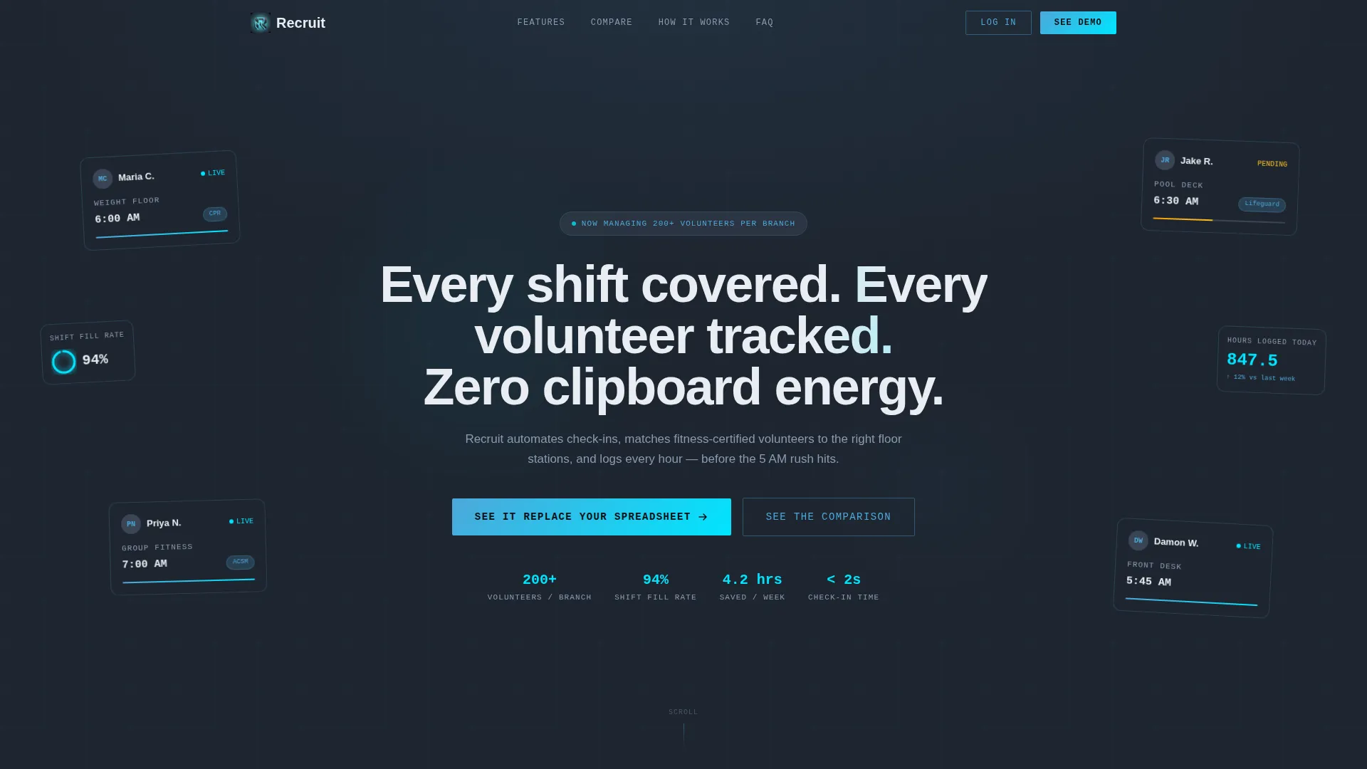
- A dark full-bleed header with a floating dashboard interface and real volunteer shift data displayed as glass-tile cards
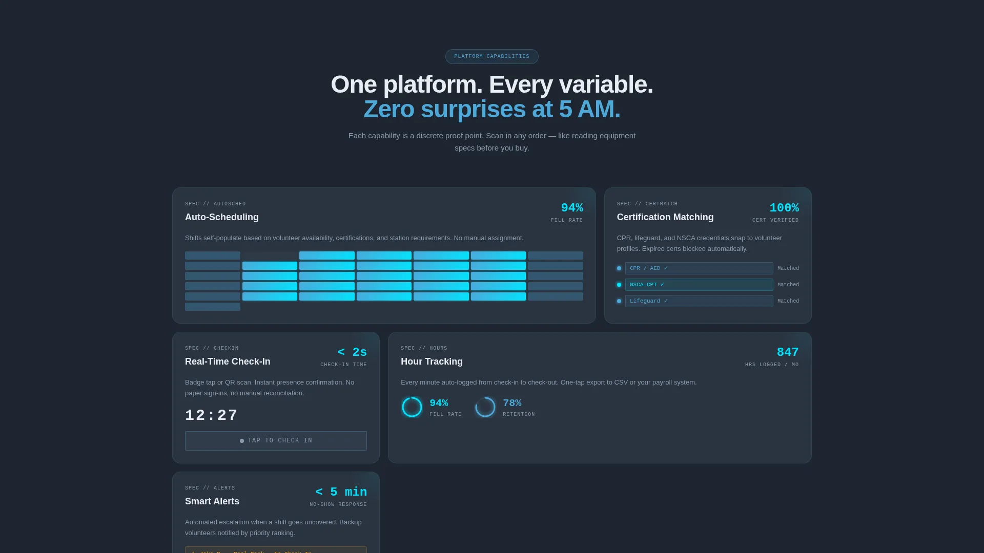
- A modular capability card grid, each card isolating one platform feature with a stat, a micro-animation prompt, and a one-line explanation
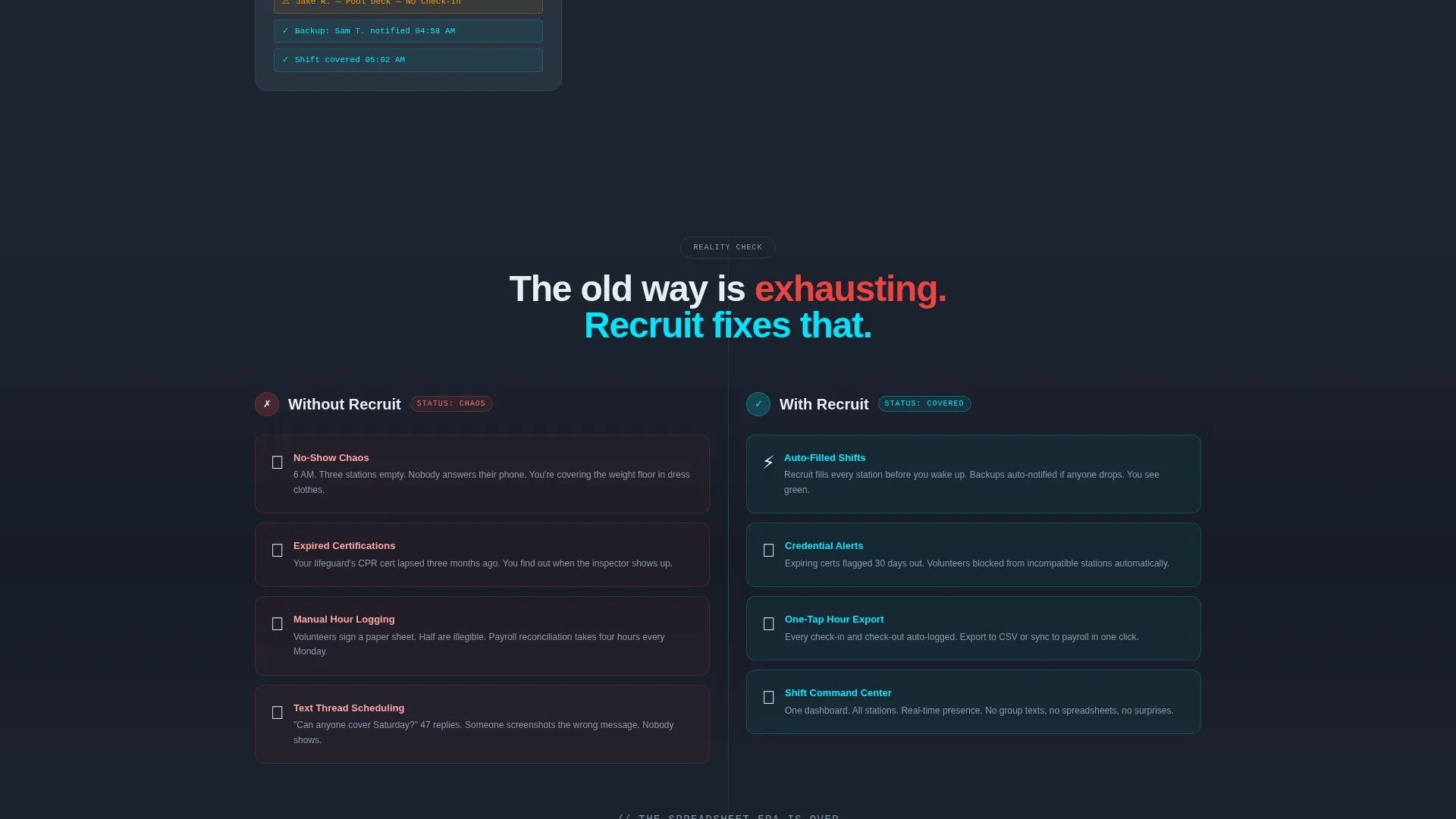
- A mid-page Comparison section contrasting the old spreadsheet workflow against your platform's solution in a persistent two-column layout
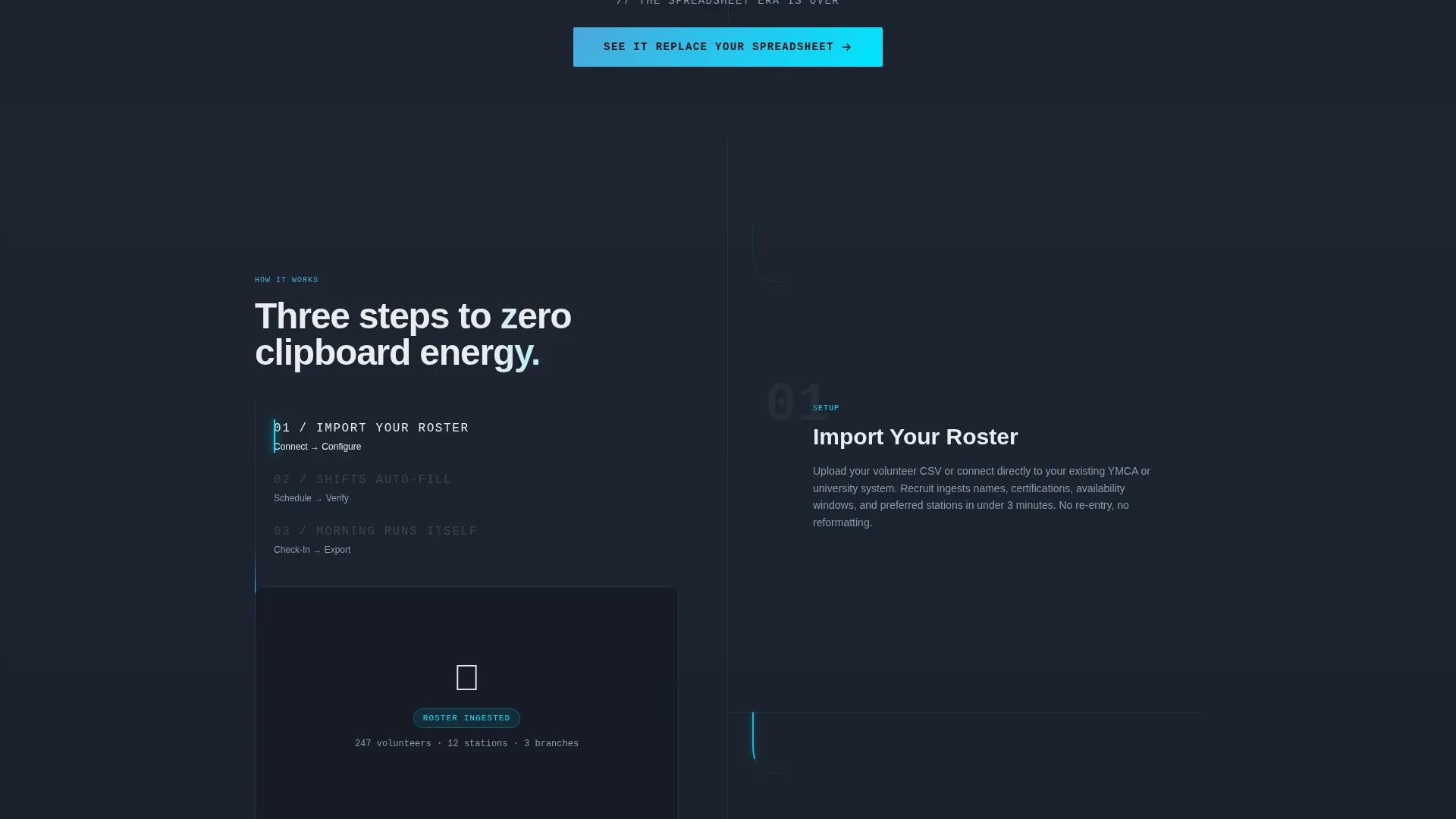
- Two distinct calls to action: a primary demo link and a secondary email-capture path for directors still evaluating
Feature list
This template organizes platform capabilities into focused, skimmable blocks. Each feature card is self-contained, letting visitors scan in any order without losing context.
Auto-Scheduling Card
An animated calendar card visually fills open shifts as the animation plays. This communicates the core automation promise instantly, before a visitor reads a single word of body copy.
Certification Matching Display
CPR badges and lifting-certification icons snap visually onto volunteer profile tiles. The animation makes credential verification feel fast and precise rather than bureaucratic.
Real-Time Check-In Module
A live clock and tap animation illustrate the moment a volunteer confirms their arrival. This replaces the mental image of a clipboard with the clean feedback of a digital turnstile.
Comparison Grid Section
A persistent two-column layout separates the old workflow from the new one. Pain cards on the left carry red-flag visual markers; solution cards on the right glow in the template's cyan accent color.
Dual Call-to-Action Path
The primary call to action, "See It Replace Your Spreadsheet," links to an interactive demo. The secondary path, "Download the Switching Checklist," captures a single email field for directors at an earlier evaluation stage.
Dark Full-Bleed Hero Header
The header fills the viewport with a near-black background and a translucent dashboard interface floating in dimensional space. Volunteer shift cards fan out like glass tiles, each softly backlit, with readable data visible at a glance.
Page sections overview
| Section | Purpose |
|---|---|
| Hero Header | Introduce the platform with a floating dashboard and headline |
| Capability Card Grid | Present each feature as a discrete, scannable proof point |
| Comparison Grid | Contrast old spreadsheet pain against platform-powered solutions |
| Primary call to action Block | Drive demo sign-ups with a direct action prompt |
| Email Capture Strip | Collect leads from directors still in the evaluation phase |
Design & branding system
The visual identity uses a Tech Glass theme built on a Slate and Sky color system. Every color choice reinforces the atmosphere of a premium fitness facility at midnight.
- Background layers use deep gym-floor charcoal (#1E2530) and brushed equipment slate (#3A4555); card surfaces float in frosted glass with blur-effect borders
- Body text renders in cool white (#E8EDF2) for easy reading against dark backgrounds, while altitude sky blue (#4DA8DA) carries primary interactive weight
- Reactive glow cyan (#00E5FF) activates exclusively on hover states, button interactions, and live data points, keeping the interface feeling responsive without visual clutter
Mobile & speed optimization
The card-grid layout is inherently responsive. Modular blocks reflow cleanly from a full desktop grid down to a stacked single-column view on smaller screens.
- Each capability card is self-contained, so it scales and repositions without breaking the visual hierarchy
- The two-column comparison section adapts to a stacked format on narrow viewports, preserving the side-by-side contrast intent
- Heavy visual elements like the header dashboard are styled with layered CSS effects rather than large media files, keeping the layout lightweight by design
How this template helps you convert
The page is structured to build conviction progressively, not to overwhelm visitors with feature lists upfront.
- The header positions the platform as already-working before the visitor scrolls, using visible real data inside the floating dashboard to create immediate credibility.
- The Spec Sheet card grid lets skeptical buyers scan capabilities in any order, removing the pressure of a linear sales narrative and letting the evidence accumulate naturally.
- The Comparison section makes the cost of inaction tangible right before both calls to action appear, so the click feels like relief rather than commitment.
Other information about this template
This template is built with the Recruit platform's core audience in mind. The design, copy structure, and interactive cues all align with how fitness operations professionals evaluate software tools.
- The template style is Card Grid (Modular), making it straightforward to add, remove, or reorder capability cards as the platform's feature set evolves
- The Tech Glass theme and Slate and Sky color system are defined at the component level, so updating brand colors requires changes in one place
- The header concept, Dark Full-Bleed with Glow, is designed to display product interface data rather than stock photography, keeping the page focused on the actual software
- The Comparison section uses the Versus layout direction, a proven structure for converting prospects who are actively comparing options or migrating from manual tools
- This template suits fitness and gym volunteer management platforms at any stage, from early-stage products seeking first-mover credibility to established platforms refreshing their market presence
Theme
Tech Glass
Creative direction
Spec Sheet
Color system
Slate & Sky
Style
Card Grid (Modular)
Direction
Comparison/Versus
Page Sections
Auto-scheduling Calendar Card
Certification Matching Display
Real-time Check-in Module
Comparison Grid Layout
Dual Call-to-action Structure
Dark Full-bleed Hero Header
Related questions
Who is this landing page template built for?
Can I adjust the capability cards to match my platform's features?
Does this template include more than one call to action?
What makes the Comparison section effective for conversions?
Is this template suitable for a platform that is still early stage?



