Redeem - Instant Giftcard Landing Page Template
Redeem is a split-screen gift card platform landing page built on a Tech Glass visual theme with a Teal Catalyst color system. It combines a live-metrics hero, an interactive brand explorer, and a dual Send-versus-Swap demonstration to guide visitors toward downloading the app or sending a card directly from the browser.
by Rocket studio
Quick summary
Redeem is a single-page landing page for a digital gift card platform. It uses a 50/50 split-screen layout, a frosted-glass visual identity, and interactive product mechanics to convert visitors before they even reach the call to action. The page serves last-minute gifters, bulk buyers, and balance-swappers with equal confidence.
Who this template is for
This template is built for teams and founders launching or marketing a gift card platform with a consumer-facing app. It suits both early-stage launches and established platforms refreshing their acquisition page.
- Consumer app teams who need a polished, app-download-focused landing page
- Office managers or B2B reward teams showcasing bulk gifting capabilities
- Gifting platform operators who want visitors to experience the product before installing
What problem this template solves
Most gift card platform pages describe features instead of demonstrating them. Visitors leave without understanding the product and without downloading. This template closes that gap by letting visitors interact with real product mechanics above the fold.
- Visitors lack confidence in a platform they have never touched before downloading
- Late-night gifters need instant reassurance that delivery is fast and the brand selection is wide
- Platforms lose conversions because the app value is never felt on the landing page itself
What you get with this template
You get a fully structured, single-page layout built around the core gift card platform experience. Every section has a defined role in moving a visitor from curious to converted.
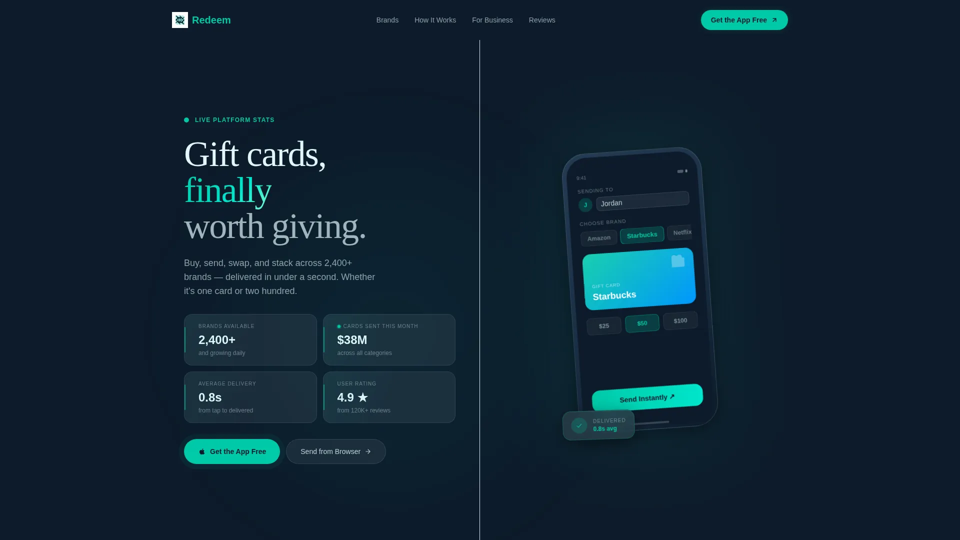
- A stats-driven hero header with live-metric frosted glass tiles and a phone mockup panel
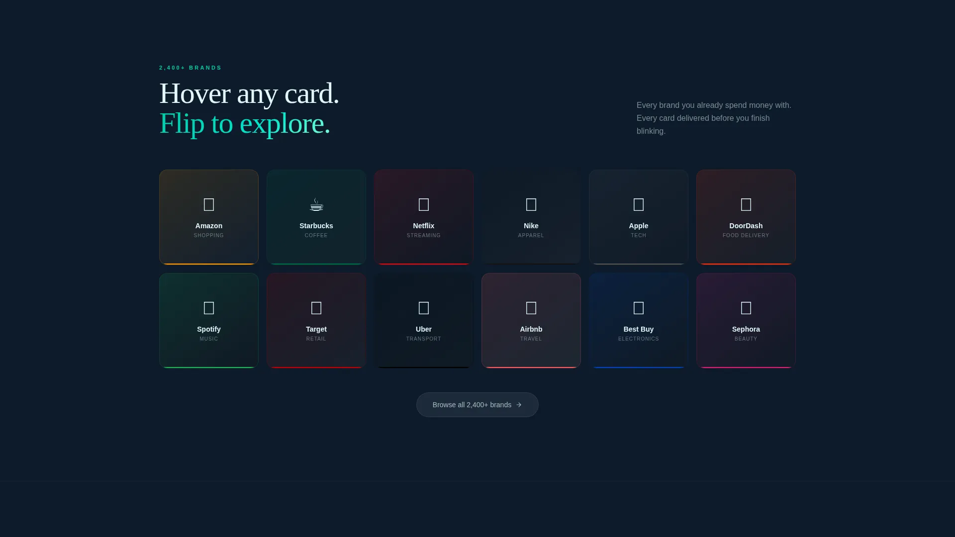
- An interactive brand grid with hover-flip tiles revealing card designs, denominations, and personalization previews
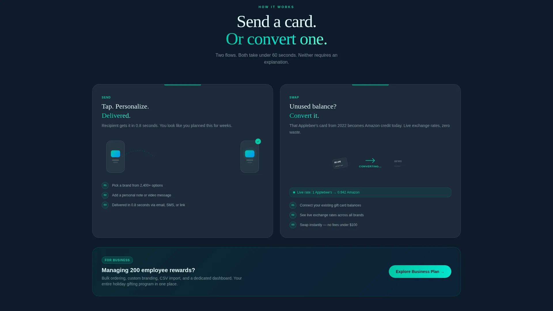
- A Send-versus-Swap split section, a floating teal call-to-action button, and a browser-based secondary conversion path
Feature list
This template ships with six tightly scoped sections that build trust and drive action. Each one reflects the Teal Catalyst design system and the Interactive Explorer creative direction.
Stats-Driven Hero Header
The header uses a 50/50 split. The left panel displays four live-updating metrics: 2,400-plus brands, 38 million dollars in cards sent this month, a 4.9-star rating from 120,000 reviews, and an average delivery time of 0.8 seconds. Each metric sits inside a frosted glass tile with a teal edge glow. The right panel shows an angled phone mockup with a gift card customization screen mid-interaction.
Interactive Brand Grid
Hovering any brand logo in the grid flips the tile. The reverse face reveals the card design, available denominations, and a miniature personalization screen preview. The interaction teaches visitors how the product works without any written instruction.
Send versus. Swap Demonstration Section
A two-panel split shows both core platform actions side by side. The left panel animates a card moving from one phone to another. The right panel shows an unused gift card balance converting into a different brand card with a live exchange rate displayed.
Floating App Download Button
A teal call-to-action button is pinned as a floating element and pulses every eight seconds to maintain gentle attention without being disruptive. Tapping it detects the visitor's operating system and routes them to the correct app store.
Browser Send Path with Email Capture
Visitors who are not ready to install the app can send a card directly from the browser. This secondary path captures an email address and offers a five-dollar bonus balance on the visitor's first purchase, creating a lower-friction conversion option.
Escalating Stakes Scroll Flow
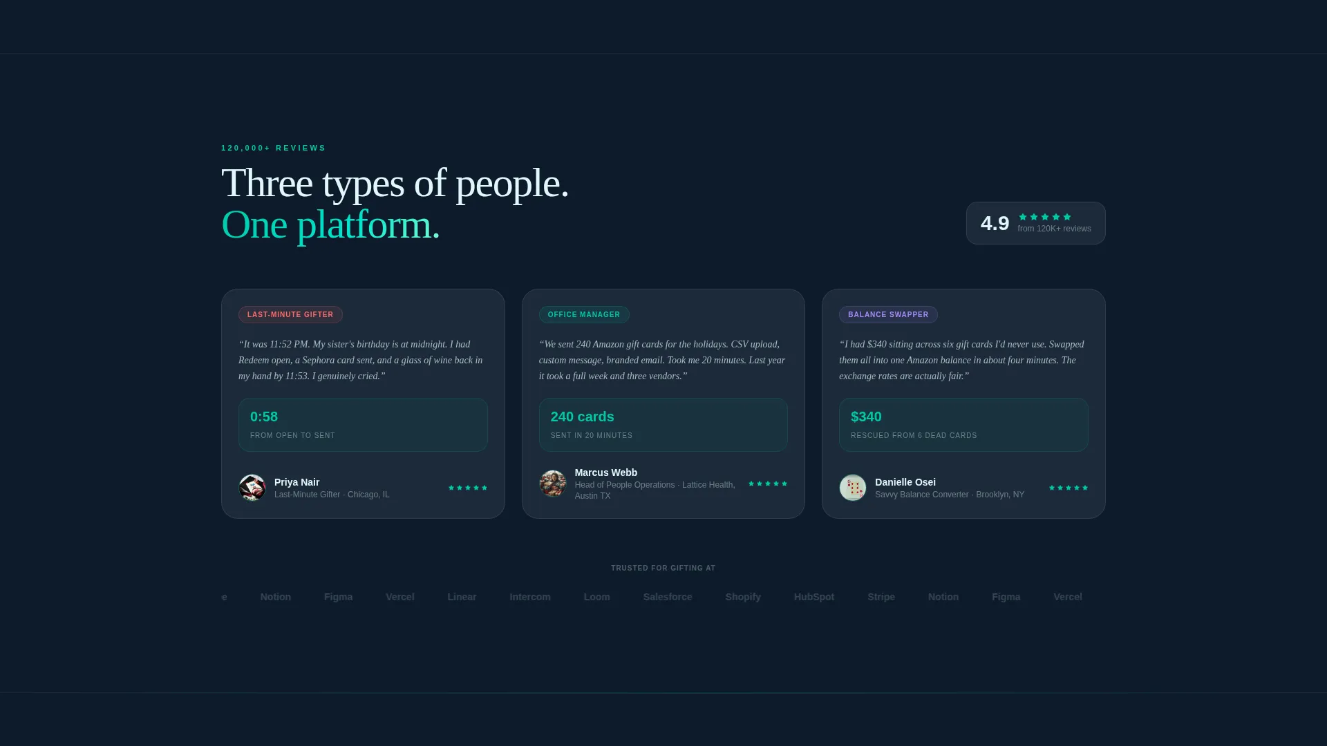
The page is structured so the narrative stakes grow as the visitor scrolls. The experience moves from sending a single card at the top to managing a full company rewards program by the bottom, naturally guiding different audience segments to their relevant use case.
Page sections overview
| Section | Purpose |
|---|---|
| Hero metrics panel | Establish trust with live platform stats and phone mockup |
| Brand grid explorer | Let visitors preview card designs by hovering brand logos |
| Send versus. Swap split | Demonstrate the two primary platform actions side by side |
| Escalating use case | Shift narrative from personal gifting to company rewards |
| Floating call to action button | Persistent app download prompt that pulses every 8 seconds |
| Browser send path | Secondary email-capture conversion for non-install visitors |
Design & branding system
The visual identity follows the Tech Glass theme using the Teal Catalyst color system. Every color and surface decision reinforces the feeling of a premium, responsive consumer app.
- Deep app-dark (#0D1B2A) as the base background, reactive teal (#00C9A7) on all interactive elements, frosted panel white (#E0F7FA) for card surfaces and modals, and sharp graphite (#1B2838) for typography
- Frosted glass tiles with subtle teal edge glows house every metric and card surface, creating a backlit translucent effect throughout
- No stock photography is used anywhere; the hero relies entirely on data visualizations, user interface mockups, and interactive components
Mobile & speed optimization
The template is designed with a mobile-first interaction model that matches how real users discover and download apps. The layout adapts the 50/50 split into a stacked single-column view on smaller screens.
- The floating call-to-action button and OS-detection routing are built for thumb-tap behavior on mobile devices
- The phone mockup in the hero and the brand grid tiles are sized and spaced to remain usable on compact viewports
- Lightweight frosted-glass panel styling keeps visual weight manageable without sacrificing the premium feel
How this template helps you convert
The conversion strategy is built into the page structure itself. Visitors do not read about the platform and then decide; they interact with it and then confirm what they already know.
- The hero header leads with four specific, credible metrics rather than generic claims, so visitors form trust before reading a single feature description.
- The interactive brand grid and Send-versus-Swap section let visitors experience both core platform actions before the call to action appears, reducing the mental leap required to download.
- The secondary browser-send path with email capture and a five-dollar bonus balance captures visitors who are interested but not yet ready to install, turning a potential exit into a future conversion.
Other information about this template
This template is part of a broader set of consumer app and platform templates designed for the Technology category. It is well suited to gift card platform launches, app marketing campaigns, and seasonal gifting promotions.
- The template style is Split Screen (50/50), the theme is Tech Glass, and the creative direction is Interactive Explorer
- The header concept is Stats/Metrics, and the primary landing page direction is App Download
- This layout can support gift card platform use cases ranging from individual gifting to enterprise employee reward programs
- The Teal Catalyst color system and frosted-glass panel aesthetic make this template visually distinctive within the Consumer App and Platform subcategory
Theme
Tech Glass
Creative direction
Interactive Explorer
Color system
Teal Catalyst
Style
Split Screen (50/50)
Direction
App Download
Page Sections
Stats-driven Frosted Glass Hero
Interactive Brand Grid with Hover Flip
Send Versus. Swap Split Demonstration
Os-detecting Floating Call to Action Button
Browser Send Path with Bonus Offer
Escalating Scroll Narrative
Related questions
Who is this landing page template designed for?
Can the page capture leads from visitors who do not want to download the app?
What makes the hero section different from a standard feature list?
Does the floating call-to-action button work for both iOS and Android visitors?
How does the interactive brand grid work?



