Healthcare Email Marketing Reviews Website Template
Refer is a scroll-reveal landing page template built for healthcare referral request workflows. It pairs a Dashboard Preview header with a Stats-First impact structure, guiding practice managers, primary care physicians, and health system navigators toward downloading a referral app. The Midnight Blue design system gives every section a calm, clinical authority that earns trust before the call to action appears.
by Rocket studio
Quick summary
Refer is a single-page, scroll-reveal landing page template designed for a healthcare referral request app. It opens with a live-looking dashboard preview, builds a data-driven case section by section, and drives visitors toward an app download. The visual tone is calm and clinical, built for busy healthcare professionals who make fast decisions.
Who this template is for
This template is built for healthcare teams and digital product owners who need to reach clinical staff quickly and credibly. It speaks directly to people who live inside referral workflows every day.
- Practice managers overwhelmed by callback loops and specialist scheduling gaps
- Primary care physicians who lose patients to the referral gap between recommendation and booked appointment
- Health system navigators managing in-network specialist lists across multiple counties
What problem this template solves
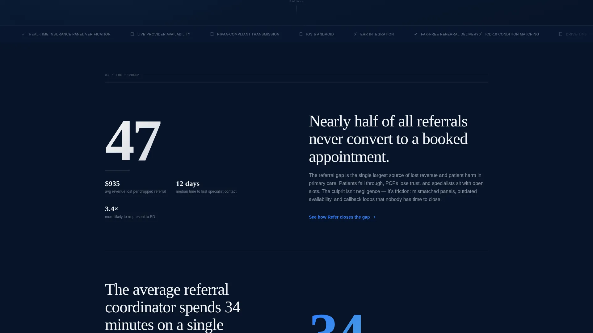
Referral management is one of the most friction-heavy processes in outpatient care. Nearly half of all referrals never convert to a booked appointment, and the people closest to that failure are exactly the audience this template targets. The page addresses that gap directly, using evidence before explanation.
- Visitors often leave a landing page before connecting the product to their daily pain points
- Static pages fail to build a case progressively, so the urgency of inaction never lands
- Generic healthcare pages lack the specificity that clinical professionals need before they trust a new tool
What you get with this template
You get a fully structured, scroll-reveal landing page ready to represent a healthcare referral request app. Every section is sequenced to carry a skeptical clinical professional from problem awareness to confident download decision.
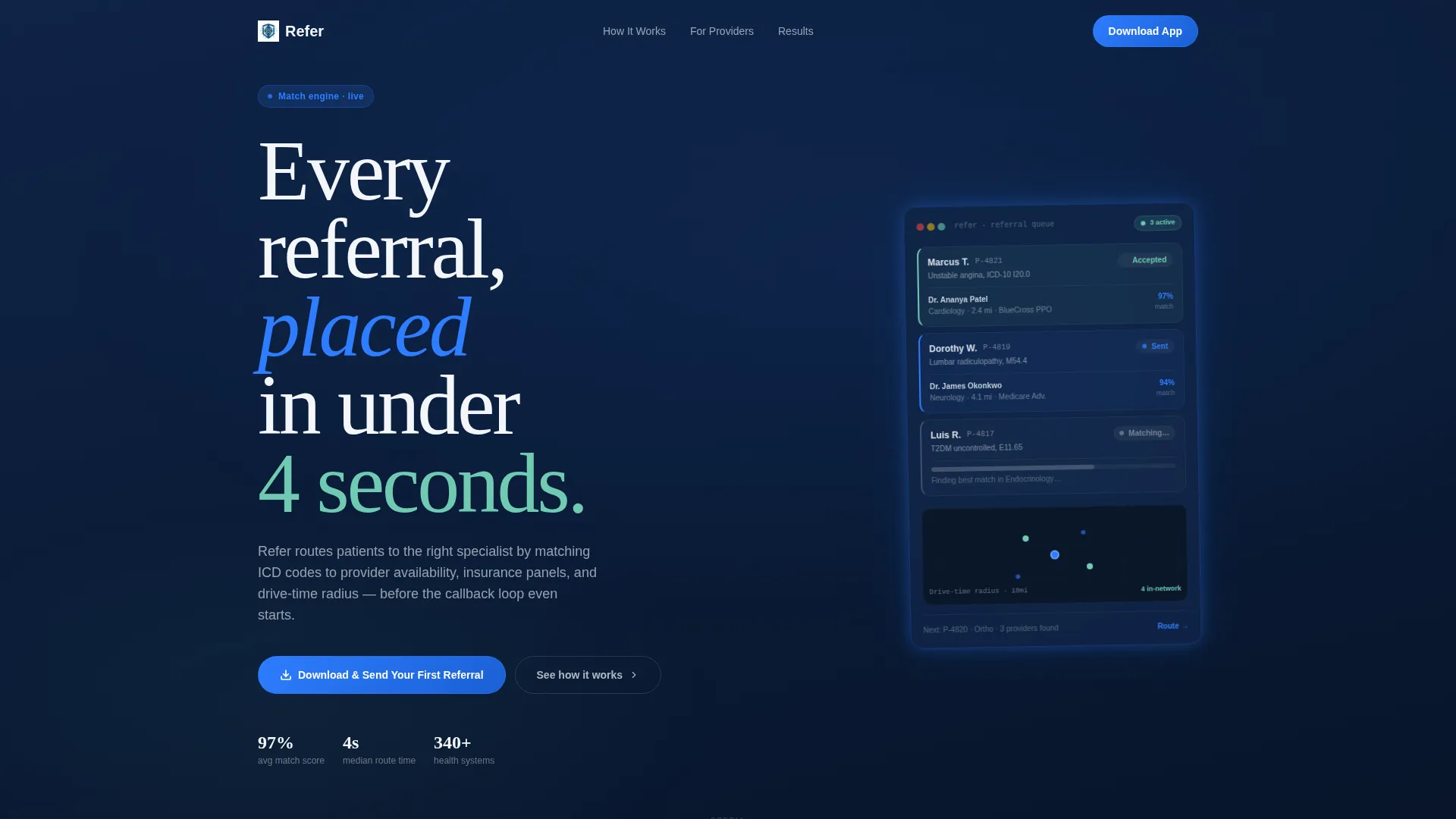
- A Dashboard Preview header showing a referral queue in action, with readable patient cards, a provider match score, and a pulsing drive-time map widget
- Stats-First section reveals that each deploy a single oversized statistic before the supporting explanation scrolls into view
- A dual-path app download section with App Store and Google Play badge placement, plus a phone number field for an instant SMS download link
Feature list
This template includes several purpose-built components that reflect the realities of healthcare referral workflows. Each one is designed to carry the right message to the right person at the right scroll depth.
Dashboard Preview Header
The header opens with a floating app screen rendered against the midnight background. It shows three patient cards in different referral states, a 97% provider match score, and a map widget with drive-time radii pulsing from a clinic pin. Specific readable data like specialist name, specialty, distance, insurance, and next availability make the product feel real on first load.
Scroll Reveal Section Flow
Each content section enters the viewport as the visitor scrolls, revealing one oversized statistic first and then the supporting context. This progressive structure keeps readers moving forward into new evidence rather than scanning a completed wall of text.
Stats-First Impact Blocks
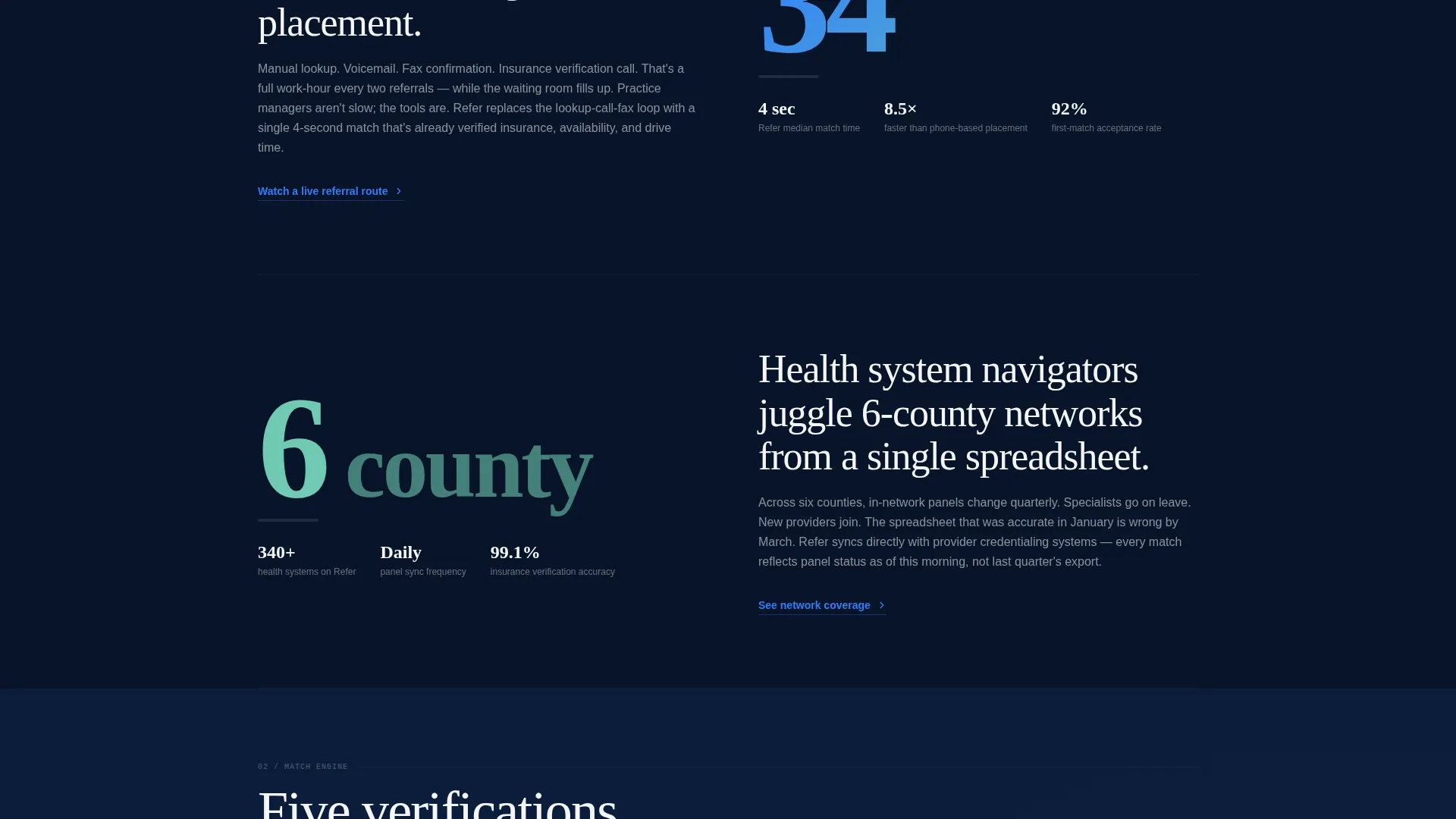
Every major section opens with a single bold statistic, such as the fact that 47% of referrals never convert to a booked appointment. The section then reveals the root cause, the product intervention, and the outcome in sequence, building a grand-rounds-style argument as the visitor scrolls.
Micro-call to action Reinforcement
Each statistic section closes with a small, contextual call to action. These micro-calls to action deepen commitment gradually, so the final download prompt feels like the natural conclusion of a case already made rather than a cold ask.
Dual-Path App Download Section
The primary call to action reads "Download and Send Your First Referral" with paired App Store and Google Play badges. A secondary path offers a phone number input field that sends an instant SMS download link, accommodating practice managers who browse on desktop but prefer to use the app on mobile between patients.
Midnight Blue Clinical Color System
The Midnight Blue palette uses deep navy as the primary background, white card surfaces for readability, pulse-blue for active states and data highlights, and seafoam for success confirmations and completed-referral indicators. The combination feels like the focused glow of a monitor at the start of a clinical shift.
Page sections overview
| Section | Purpose |
|---|---|
| Dashboard Preview Header | Opens with a floating app screen showing a live referral queue, provider match score, and drive-time map |
| Hero Copy Block | Delivers the primary value statement alongside the dashboard visual |
| Problem Statistic Reveal | Presents the first oversized stat to establish the cost of inaction |
| Root Cause Section | Explains why referrals fail, revealed progressively after the statistic lands |
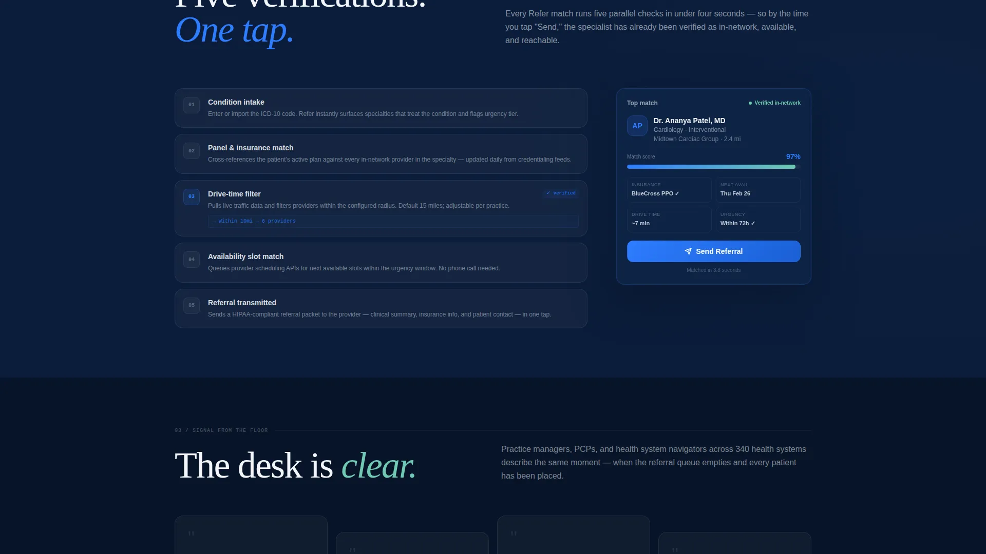
| Product Intervention Block | Shows how the app closes the referral gap with condition matching and provider data |
| Outcome Data Section | Presents results evidence in the same scroll-reveal structure |
| Micro-call to action Strip | Reinforces commitment at the end of each major evidence section |
| App Download Section | Primary call to action with App Store and Google Play badges and SMS link field |
| Secondary Download Path | Phone number input for instant SMS link targeting desktop-browsing mobile users |
Design & branding system
The design follows a Directory and Discovery theme centered on the Midnight Blue color system. Every color choice reinforces a sense of clinical authority and calm precision, as if the interface itself is always composed under pressure.
- Deep clinical navy (#0B1D3A) as the primary background, sterile corridor white (#F4F6FA) for card surfaces, pulse-blue (#2E7DFF) for active states and data highlights
- Quiet seafoam (#6FCAB1) reserved exclusively for success confirmations and completed-referral indicators, creating a clear visual reward for completed actions
- The overall palette evokes the focused glow of a monitor in a dimly lit nurse's station, authoritative and always on
Mobile & speed optimization
The template is designed with the reality that practice managers often browse on desktop but switch to mobile between patients. The layout and download path are structured to support that split-device journey.
- The scroll-reveal animation structure is built for sequential viewing, keeping mobile users engaged section by section without overwhelming them with content at once
- The SMS download link field addresses the desktop-to-mobile handoff directly, allowing a user to receive the app link on their phone without leaving the desktop session
How this template helps you convert
This template converts by earning the download before it asks for it. Every structural decision is designed to reduce friction and increase confidence progressively.
- The Dashboard Preview header makes the product feel real and specific before any copy is read, establishing credibility in the first viewport
- The Stats-First scroll structure builds a cumulative, evidence-based case that mirrors how clinical professionals already evaluate new tools, section by section
- The dual-path download section removes the last point of friction by giving desktop users a seamless way to get the app on their phone instantly
Other information about this template
This template is categorized under Technology and specifically targets the Healthcare Email Templates subcategory, with a niche focus on healthcare referral request email workflows. It is built as a single scroll-reveal landing page, not a multi-page site.
- The template style is Scroll Reveal (Progressive), meaning each section animates into view as it enters the viewport
- The header concept is Dashboard Preview, and the landing page direction is App Download, both of which are baked into the template structure
- The theme is Directory and Discovery, reflected in the provider-matching dashboard visual and the data-specific card design
- The creative direction is Stats-First Impact, which shapes the sequencing of every major content section on the page
Theme
Directory & Discovery
Creative direction
Stats-First Impact
Color system
Midnight Blue
Style
Scroll Reveal (Progressive)
Direction
App Download
Page Sections
Dashboard Preview Header
Scroll Reveal Section Flow
Stats-first Impact Blocks
Micro-cta Reinforcement Strips
Dual-path App Download Section
Related questions
Who is this landing page template designed for?
What makes the header different from a standard hero section?
How does the scroll-reveal structure support conversions?
What is the SMS download link field for?
Can I adapt this template if my app is only on one platform?



