Refercommand - High-Converting Referral Landing Page Template
Refercommand is a hub-and-spoke referral landing page template built for e-commerce brands ready to turn post-purchase momentum into a revenue channel. It combines an interactive email preview, stats-first section openers, and a compact qualification form to move seven-figure Shopify founders from curiosity to conversion in a single scroll session.
by Rocket studio
Quick summary
Refercommand is a single-page, anchor-nav template that showcases a high-converting referral request email service. It opens with a live interactive email preview, leads every section with an oversized performance metric, and closes with a focused qualification form. The result feels less like a marketing page and more like a results dashboard built for serious growth operators.
Who this template is for
This template is built for growth-minded operators who already have customers worth activating. If you are selling a referral email service or a post-purchase referral system, this page gives your pitch instant credibility.
- Shopify direct-to-consumer founders running seven-figure stores who want to lower customer acquisition cost without increasing paid spend
- Retention marketers at mid-market beauty and supplement brands looking for margin-safe growth alternatives
- Agency strategists who need a polished, ready-to-pitch landing page for referral flow proposals
What problem this template solves
Paid acquisition costs keep climbing while organic word-of-mouth remains untapped. Most brands have happy customers but no structured way to activate them as a referral channel. A generic page does not communicate the precision or proof that a data-driven referral email product demands.
- There is no clear way to show referral email performance at a glance before a visitor reads a single paragraph
- Generic templates dilute trust and slow the qualification of serious buyers
- Builders waste hours assembling a credible referral pitch from scratch instead of launching
What you get with this template
You get a fully structured, single landing page designed around one core conversion goal: qualifying founders and marketers for a referral email service. Every section is pre-built with intentional hierarchy and data-forward visual logic.
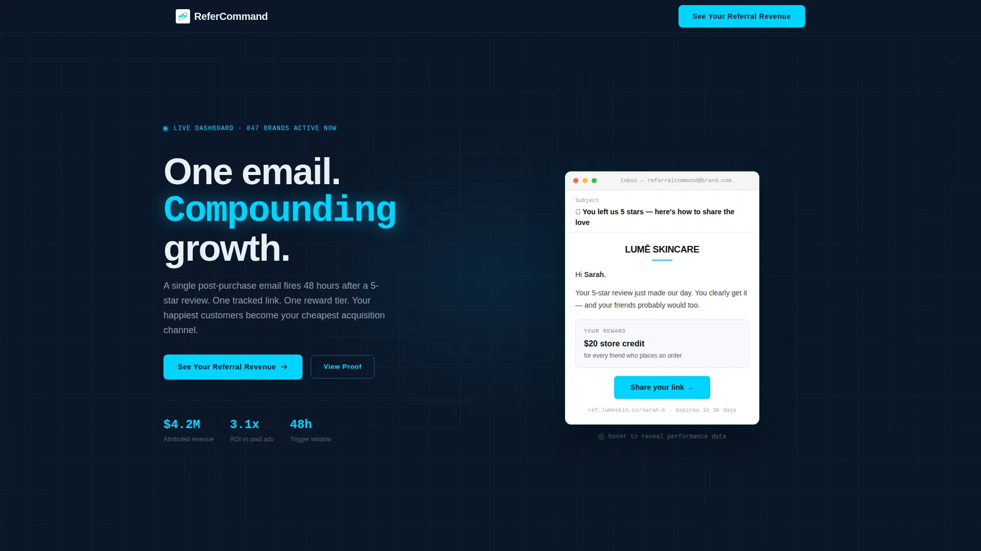
- An interactive email preview in the header that reveals open rate, click-through rate, and revenue-per-send annotations on hover
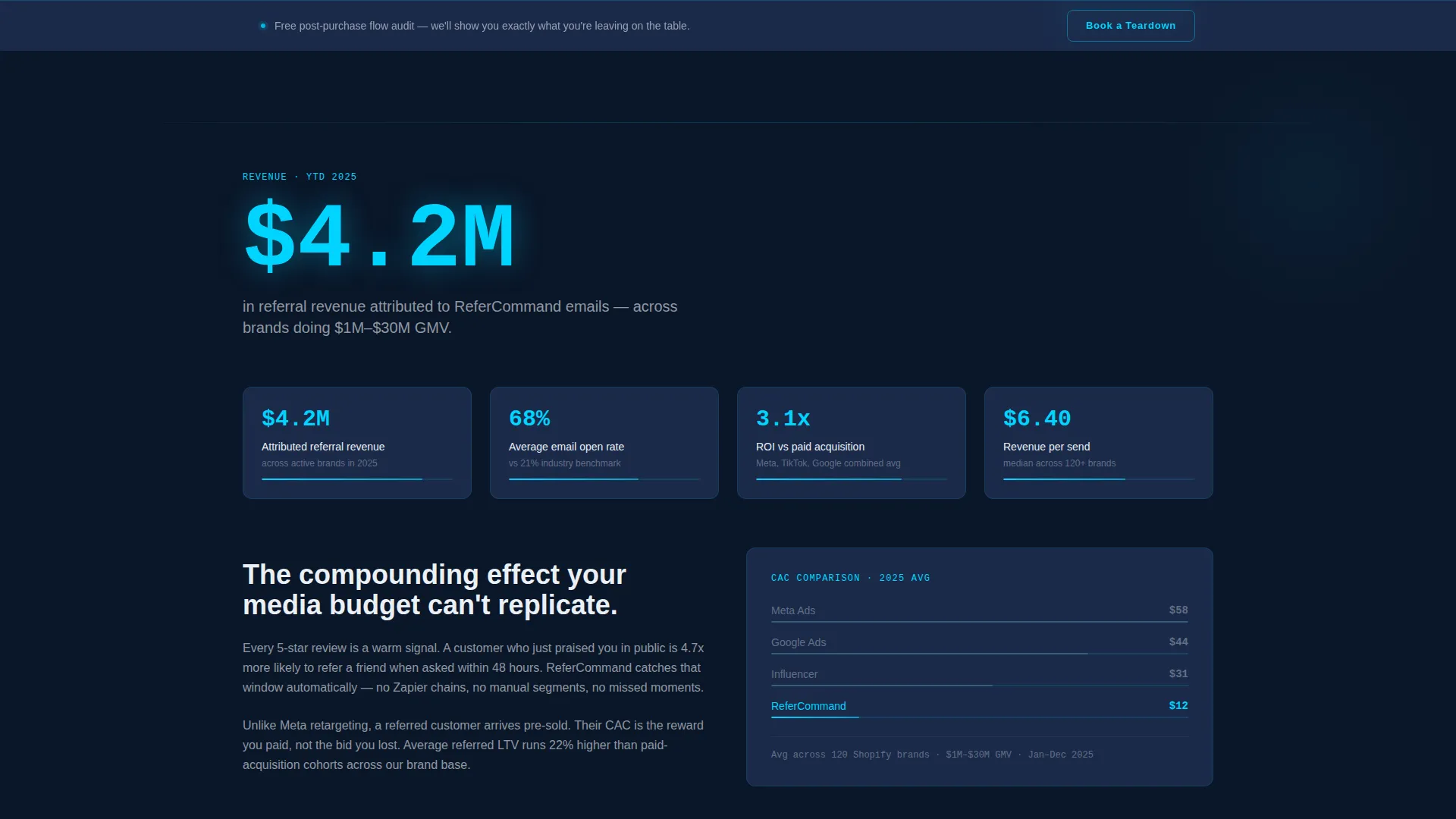
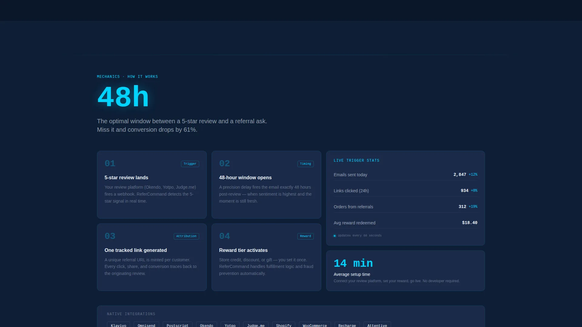
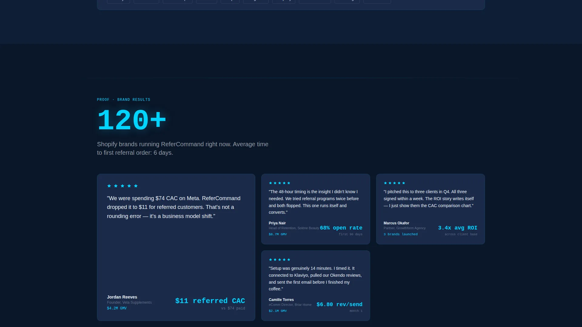
- Four anchor-nav spoke sections (Revenue, Mechanics, Proof, Pricing) each opening with a single oversized metric before supporting copy
- A compact lead qualification form requesting monthly order volume, current email platform, and work email, plus a secondary sticky-bar call to action offering a free post-purchase flow audit
Feature list
This template is built around specific components described in the brief. Each feature is designed to serve a distinct role in moving a visitor toward the qualification form.
Interactive Email Preview Header
The header renders a realistic email template mid-viewport. Hovering reveals floating performance annotations: open rate beside the subject line, click-through rate pinned to the call-to-action button, and revenue-per-send glowing beneath the reward offer. The product is the hero, not stock photography.
Stats-First Section Openers
Every spoke section begins with one oversized metric before any paragraph text appears. Examples built into the template include figures like "$4.2M attributed referral revenue," "68% average open rate," and "3.1x return on investment versus paid acquisition." The number lands first; the explanation follows.
Anchor Navigation Bar
A sticky anchor nav locks to the top of the viewport after the header. It links directly to Revenue, Mechanics, Proof, and Pricing sections. Visitors can jump to the section most relevant to their decision without losing context or momentum.
Compact Lead Qualification Form
The primary call to action, labeled "See Your Referral Revenue," anchors to a short form. It collects monthly order volume via dropdown, current email platform selection, and work email. The form is positioned after six proof metrics, so it reads as a calculator rather than a gate.
Sticky Secondary Call to Action Bar
A persistent bar across the viewport offers a "Book a Teardown" option at every scroll position. This secondary call to action invites visitors to request a free audit of their existing post-purchase flow, capturing intent from visitors who are not yet ready for the primary form.
Data Command Visual Theme
The layout uses a mission-control visual system where cyan accents appear only on live metrics and interactive elements. Deep navy backgrounds and muted slate card surfaces keep focus on numbers. Every color decision reinforces the sense that this page displays real, actionable intelligence.
Page sections overview
| Section | Purpose |
|---|---|
| Interactive Email Header | Showcases the referral email product with live hover-reveal performance annotations |
| Sticky Anchor Nav | Locks to viewport top and links to all four spoke sections for fast navigation |
| Revenue Section | Opens with a flagship revenue metric then explains the referral attribution model |
| Mechanics Section | Opens with an open-rate metric then walks through the single-email trigger flow |
| Proof Section | Opens with a return-on-investment metric then presents supporting performance evidence |
| Pricing Section | Presents offer tiers or pricing context after proof has been established |
| Qualification Form | Collects order volume, email platform, and work email via the primary call to action |
| Sticky Teardown Bar | Persistent secondary call to action offering a free post-purchase flow audit |
Design & branding system
The visual identity follows a Data Command theme rooted in a Midnight Blue color system. The palette is built to feel like a mission-control screen at midnight: authoritative, always-on, and precise.
- Deep terminal navy (#0A1628) for full-bleed section backgrounds, muted slate (#1B2A4A) for card surfaces, live-wire cyan (#00D4FF) reserved strictly for metrics and interactive accents, and crisp signal white (#EAF0F6) for body text
- Cyan appears only where a number lives or a click is possible, never as decoration, which trains the eye to treat every cyan element as a data point worth reading
Mobile & speed optimization
The template is structured for fast, clean rendering at all screen sizes. The stats-first layout prioritizes visible impact before text loads, which supports strong perceived performance even on slower connections.
- Single-column stacking on smaller screens keeps the interactive preview and metric openers readable without horizontal scrolling
- The anchor nav and sticky secondary bar are designed to remain accessible and visible across mobile viewport sizes
How this template helps you convert
Every design and content decision in this template is sequenced to reduce friction and build conviction before the form appears.
- The interactive email preview in the header immediately demonstrates the product in a tangible, real-feeling way, establishing credibility before a visitor reads a headline
- Six oversized metrics spread across the spoke sections each hit the gut before the mind, so by the time a visitor reaches the qualification form, the evidence feels overwhelming and the ask feels small
Other information about this template
This template was designed with a specific buyer psychology in mind: the Shopify direct-to-consumer founder or retention marketer who is skeptical of marketing claims and responds to proof at a glance. The page structure mirrors the experience of opening a performance dashboard and seeing every metric in the green.
- The referral mechanic built into the email concept uses one tracked link, one reward tier, and a nudge sent forty-eight hours after a five-star review, keeping the operational complexity minimal while the revenue impact is clear
- The template is suited for teams pitching or selling a referral request email service to e-commerce brands running on platforms such as Klaviyo or Omnisend, as reflected in the form's email platform dropdown field
- The hub-and-spoke anchor navigation structure makes this template adaptable for services beyond referral email if the section content and metrics are updated to match
Theme
Data Command
Creative direction
Stats-First Impact
Color system
Midnight Blue
Style
Hub & Spoke (Anchor Nav)
Direction
Lead Generation
Page Sections
Interactive Email Preview Header
Stats-first Spoke Section Openers
Sticky Anchor Navigation Bar
Compact Lead Qualification Form
Persistent Secondary Call to Action Bar
Data Command Color System
Related questions
Who is this landing page template designed for?
What does the interactive email preview in the header actually show?
Can I update the metrics shown in each section opener?
What is the "Book a Teardown" sticky bar for?
Does this template require a specific email platform to work?



