Referralflow - Dynamic Fitness Landing Page Template
Referralflow is a single-page fitness referral landing page built around a live reward simulator and a side-by-side comparison table. It guides gym-goers to invite friends through a pre-composed email flow, with a fixed full-width call-to-action bar and a two-field sign-up path for new visitors. The Dynamic Motion design runs on a Midnight Blue color system with ignition orange reserved for every tap point.
by Rocket studio
Quick summary
Referralflow is a single-page fitness referral landing page that combines an animated reward calculator with a feature comparison table. It shows visitors exactly what they and their friends gain by joining together, then moves them toward action through a fixed orange call-to-action bar and a pre-composed email flow.
Who this template is for
This template is built for fitness brands, gym apps, and personal training programs that grow through word-of-mouth. If your acquisition strategy relies on member referrals, this page gives that strategy a polished, conversion-focused home.
- Fitness app teams looking to launch or scale a referral program page
- Gym owners and training coaches who want members to invite friends digitally
- Growth marketers who need a standalone referral landing page with a built-in incentive display
What problem this template solves
Most referral programs fail quietly because the ask feels awkward and the reward feels abstract. Members know they want to share, but there is no frictionless path from "I should tell my friend" to "I just sent the link." This template closes that gap.
- Visitors can see their potential rewards immediately, removing the guesswork from the referral incentive
- The comparison table makes the solo-membership experience look incomplete beside the referral path
- A pre-composed email preview and a fixed send button reduce the steps between interest and action
What you get with this template
You get a complete, single-page referral landing page with every section pre-built and ready to customize. The layout moves visitors from curiosity to commitment through three clear zones: simulate, compare, and send.
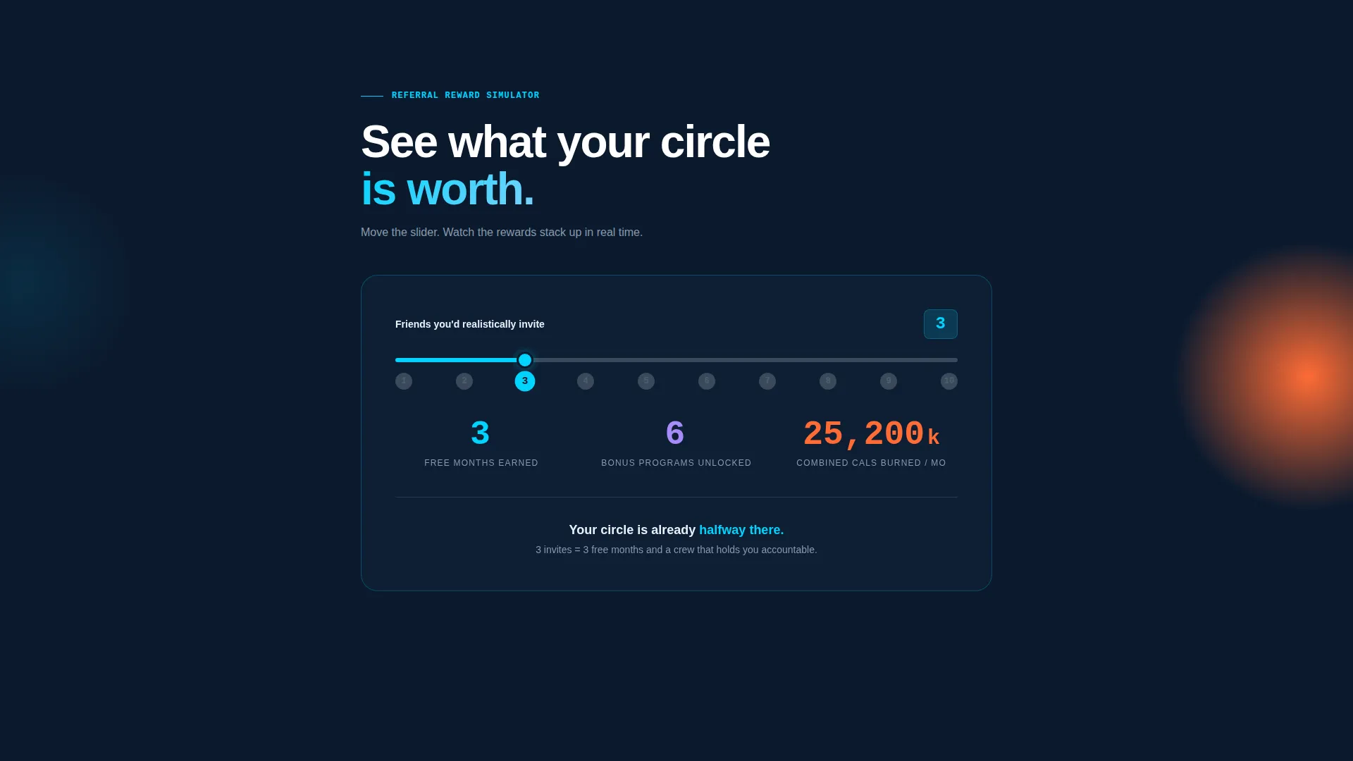
- An animated referral reward calculator with spring-physics digit counters at the top of the page
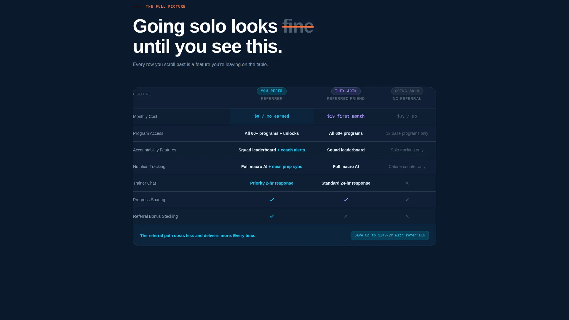
- A full feature comparison table stacked with referrer, referred friend, and solo-member columns
- A fixed full-width "Send Your First Referral" bar and a secondary sign-up path for new visitors
Feature list
This template covers the full referral funnel in one page. Each component below is defined in the source brief and built into the layout.
Live Referral Reward Simulator
Visitors type in how many friends they would realistically invite. Animated counters respond instantly, showing free months earned, bonus workout programs unlocked, and combined calories the referral group could burn. The digits flip with spring physics, styled like a split-flap departure board.
Side-by-Side Comparison Table
A structured table lines up three columns: what the referrer gets, what the referred friend gets, and what a solo member gets. Rows cover monthly cost, program access, accountability features, nutrition tracking tiers, and trainer chat availability. Each row loads with a left-to-right horizontal wipe animation.
Fixed Full-Width Call-to-Action Bar
A persistent ignition-orange bar sits at the bottom of the viewport on every scroll position. Tapping it opens a pre-composed email preview with the visitor's name auto-filled and a deep link to the app store, making the send action a single tap.
Secondary Sign-Up Path
Visitors who arrive without an account see a "Download the App First" option below the primary call-to-action. It routes them through a two-field form, collecting phone number and first name, before surfacing the referral flow inside the onboarded experience.
Dynamic Motion Animation System
The entire page follows a Dynamic Motion theme. The comparison table rows wipe in like plates being loaded onto a barbell. Calculator counters spring into position. Active states glow in electric cyan, and every interactive element in orange pulses only where action is expected.
Page sections overview
| Section | Purpose |
|---|---|
| Reward Calculator Header | Simulate referral rewards with animated counters |
| Summary Prompt Line | Reinforce momentum with a single motivating sentence |
| Feature Comparison Table | Compare referrer, friend, and solo-member benefits |
| Fixed call to action Bar | Trigger the pre-composed referral email send |
| Secondary Sign-Up Path | Onboard new visitors before entering the referral flow |
Design & branding system
The Midnight Blue color system creates a gym-floor-at-competition atmosphere. The room is dark, every point of action glows, and the palette guides the eye naturally from information to interaction.
- Navy (#0B1A2E) dominates backgrounds and card surfaces; titanium gray (#3A4A5C) carries body text and secondary interface elements; electric cyan (#00D4FF) highlights data points and active states
- Ignition orange (#FF6B35) appears exclusively on call-to-action buttons and progress indicators, never used for decoration
- The Dynamic Motion theme drives all transitions: spring-physics digit flips on the calculator, horizontal wipe animations on table rows, and glowing active states on interactive elements
Mobile & speed optimization
The fixed call-to-action bar and two-field sign-up form are designed with thumb-reach in mind. The layout stacks cleanly on smaller screens so the comparison table remains readable without horizontal scrolling.
- The calculator input and animated counters are touch-friendly and respond to single-field entry on mobile devices
- The pre-composed email preview with auto-filled name opens natively on mobile, using the device's default mail client or the app deep link
How this template helps you convert
This page is built to make the referral send feel inevitable rather than optional. Every design and copy decision pushes toward that one tap.
- The reward simulator makes the incentive personal and visible before any commitment is asked, so visitors arrive at the comparison table already motivated
- The comparison table removes doubt by showing the concrete gap between going solo and joining through a referral, making the shared path the obvious choice
- The persistent orange call-to-action bar keeps the send action one tap away at every scroll position, eliminating the need to hunt for a button
Other information about this template
This template is categorized under Fitness Email Templates within the Technology category. It is designed specifically for the fitness referral request email use case, where the goal is to convert existing members into active referrers.
- The template style is a Comparison Table layout, and the header concept is a Calculator/Estimator, both defined by the intersection match between the niche and the creative direction
- The landing page direction is App Download, meaning the end goal of the page is to get either a referral email sent or an app installed via the two-path flow
- This template works well alongside fitness app onboarding flows, member reward programs, and gym challenge campaigns where social sharing drives new sign-ups

Theme
Dynamic Motion
Creative direction
Feature Matrix
Color system
Midnight Blue
Style
Comparison Table
Direction
App Download
Page Sections
Live Referral Reward Simulator
Side-by-side Feature Comparison Table
Fixed Full-width Send Button
Two-field New Visitor Sign-up
Dynamic Motion Animation System
Related questions
What is the main purpose of this landing page template?
Can I customize the reward values shown in the calculator?
How does the two-path call-to-action work?
Is this template suitable for a gym that does not have a mobile app?
What makes the comparison table effective for referral conversion?



