Expert Pharmacy Software Professional Website Template
Refill is a split-screen pharmacy subscription management landing page built for independent pharmacies, regional chains, and long-term care consultants. It combines a glowing Dashboard Pro interface with interactive scroll sections, a live refill queue, a med-sync builder, and a freemium signup flow so pharmacists can experience the platform before committing.
by Rocket studio
Quick summary
Refill is a single-page template designed for a pharmacy subscription management platform. It presents a dark, mission-control interface that feels purposeful and calm. Visitors scroll through interactive sections, test mock patient profiles, and reach a three-step signup form, all before they ever enter a credit card number.
Who this template is for
This template speaks directly to pharmacy professionals who manage high patient volumes and complex refill workflows every day. It is built for operators who need a tool that earns trust fast and converts on first impression.
- Independent pharmacy owners managing hundreds of patients on auto-refill schedules
- Regional chain operations directors handling prior authorization queues across multiple locations
- Consultant pharmacists overseeing synchronized therapy for long-term care facilities
What problem this template solves
Pharmacy platforms are often hard to evaluate from a marketing page alone. Prospects either bounce before they understand the value or sign up without truly testing the product. This template closes that gap by turning the landing page itself into a product preview.
- Visitors rarely trust a platform they cannot touch before signing up
- Complex refill and insurance workflows are hard to explain in static text
- Pharmacists need to see live data behavior before they commit to a new system
What you get with this template
You get a fully designed, interaction-rich landing page template with a clear conversion path and a cohesive visual identity rooted in the Dashboard Pro theme. Every section is purposeful and sequenced to build confidence from the first scroll to the final click.
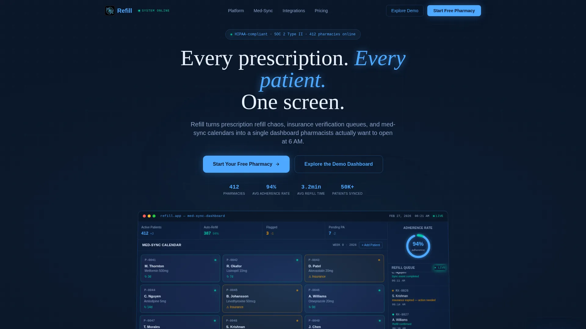
- A dark full-bleed header featuring a glowing product screenshot as the hero element
- Two interactive split-screen sections with mock patient profiles, a med-sync builder, and a live cost-savings calculator
- A three-step progressive signup form and a secondary demo dashboard path for zero-friction exploration
Feature list
This template ships with carefully designed components that reflect real pharmacy platform behavior. Each feature is built to reduce visitor hesitation and move them toward action.
Glowing Dashboard Hero Header
The header fills the full viewport in deep terminal navy (#0A1628). A realistic product screenshot emerges from the center with soft cyan and blue glow edges. The dashboard shows a med-sync calendar with 12 patient tiles, three amber-flagged for insurance lapse, a scrolling refill queue ticker, and a donut chart displaying a 94% adherence rate in prescription-pad glow blue (#4DA8FF).
Interactive Patient Profile Explorer
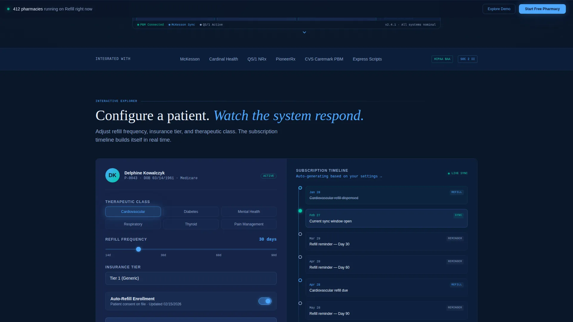
The first split-screen section places a mock patient profile on the left with editable fields. As the visitor toggles refill frequency, insurance tier, and therapeutic class on the right, the subscription timeline auto-populates in real time. This lets prospects feel the platform's responsiveness without leaving the page.
Drag-and-Drop Med-Sync Builder
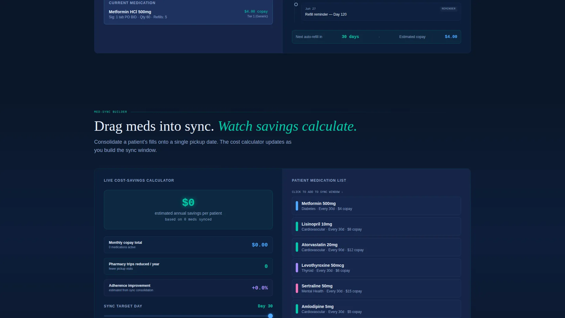
The second split-screen section inverts the layout. A drag-and-drop med-sync builder sits on the right while a live cost-savings calculator updates dynamically on the left. Every interaction proves that the underlying system responds instantly to real-world pharmacy inputs.
Layered Scroll Depth Architecture
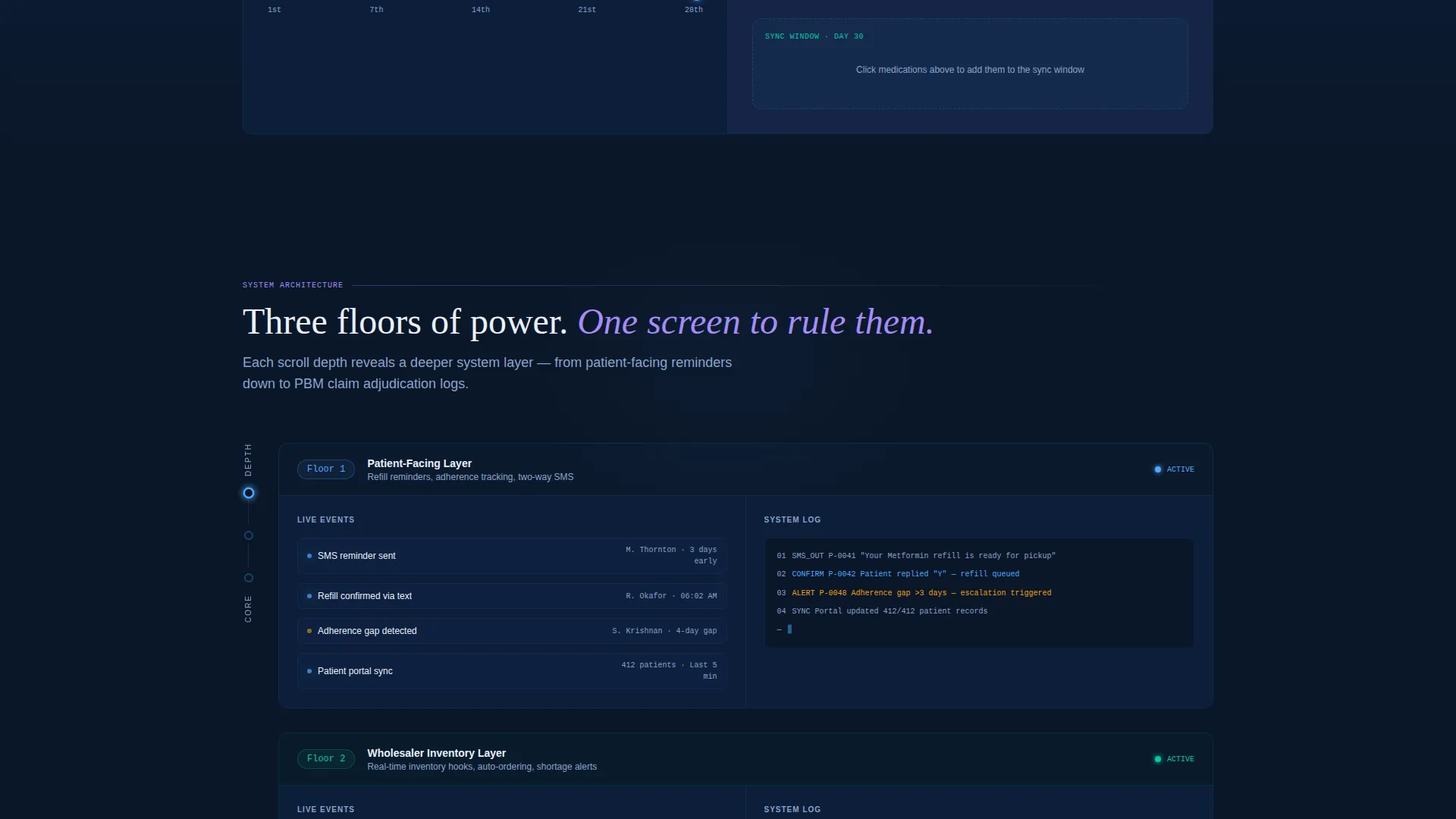
Each scroll depth reveals a deeper system layer. The visitor moves from patient-facing refill reminders down to wholesaler inventory context and then to claim adjudication log views. The experience feels like descending floors in an elevator, each one showing more platform depth than the last.
Three-Step Progressive Signup Form
The primary call to action opens a focused three-step form. Step one collects pharmacy National Provider Identifier (NPI) number and state with real-time auto-validation. Step two asks for current patient count and primary dispensing software. Step three asks only for email and password, keeping friction as low as possible at the final moment.
Sandbox Demo Dashboard Path
A secondary call to action labeled "Explore the Demo Dashboard" bypasses signup entirely. It loads a sandbox environment pre-populated with 50 synthetic patient profiles. Visitors can click every button and pull every available report before making any commitment.
Page sections overview
| Section | Purpose |
|---|---|
| Full-Bleed Header | Introduces the platform with a glowing dashboard hero and primary call to action |
| Patient Profile Explorer | Lets visitors interact with a mock profile and watch the subscription timeline respond |
| Med-Sync Builder | Demonstrates drag-and-drop scheduling alongside a live cost-savings calculator |
| Scroll Depth Layers | Reveals deeper platform layers from refill reminders to claim adjudication views |
| Persistent Bottom Bar | Keeps the primary call to action visible after the second scroll section |
| Progressive Signup Form | Guides prospects through a three-step form with real-time NPI validation |
Design & branding system
The visual identity follows a Dashboard Pro theme built entirely on a Midnight Blue color system. Every color choice is intentional and references real pharmacy workflow states, from active toggles to confirmed sync events.
- Deep terminal navy (#0A1628) as the primary background, pharmaceutical midnight (#162447) for card surfaces, and clinical ice (#E8F0FE) for body text and data labels
- Prescription-pad glow (#4DA8FF) marks active states, toggle switches, notification pulses, and hover micro-interactions throughout the page
- Compliance green (#00C9A7) appears exclusively on successful sync events and confirmed refills, giving operators an instant visual confirmation signal
Mobile & speed optimization
The split-screen layout is built to adapt cleanly to smaller viewports without sacrificing the interactive quality that makes this template effective. Visitors on mobile devices still encounter a polished, purposeful experience.
- The 50/50 split screen reflows gracefully for tablet and mobile screen widths
- Micro-interactions and glow effects are scoped to avoid visual overload on smaller displays
- The persistent bottom call-to-action bar remains visible on scroll across all device sizes
How this template helps you convert
Conversion is earned here, not demanded. The template builds proof before it asks for anything, and the signup path removes as much friction as possible at every step.
- Visitors interact with live mock data before they ever see a signup prompt, so the platform's value is demonstrated rather than described
- The three-step progressive form breaks commitment into small, low-pressure steps, with real-time NPI validation reducing form abandonment at step one
- The sandbox demo path gives hesitant visitors a complete product preview, turning explorers into confident leads without forcing account creation
Other information about this template
This template is categorized under Technology, specifically within the Pharmacy Software subcategory and the Pharmacy Subscription Management niche. It is designed as a single-page landing page using a Split Screen (50/50) template style with an Interactive Explorer creative direction.
- The header concept is Dark Full-Bleed with Glow, meaning the product interface itself serves as the only visual focal point in the hero area
- The conversion direction is Freemium and Trial, supporting both a direct signup path and a no-commitment demo exploration path
- The template is suitable for building a pharmacy subscription management landing page that speaks to clinical operators and platform decision-makers equally
Theme
Dashboard Pro
Creative direction
Interactive Explorer
Color system
Midnight Blue
Style
Split Screen (50/50)
Direction
Freemium/Trial
Page Sections
Glowing Full-bleed Dashboard Hero
Interactive Split-screen Patient Explorer
Drag-and-drop Med-sync Builder
Layered Scroll Depth Reveals
Three-step Progressive Signup Form
No-commitment Sandbox Demo Path
Related questions
Who is this landing page template designed for?
Can visitors try the platform before signing up?
What makes the three-step signup form low-friction?
Does the template include the interactive scroll behavior described in the design brief?
What color system and theme does this template use?



