Optometry Email Newsletter Landing Page Template
Refract is a bento grid landing page template built to showcase and sell a weekly optometry email newsletter kit. Designed for independent practices and multi-location optical groups, it combines a Void & Violet dark-mode aesthetic with live email previews, benchmark data cards, and a direct download call to action that turns curious visitors into confident users.
by Rocket studio
Quick summary
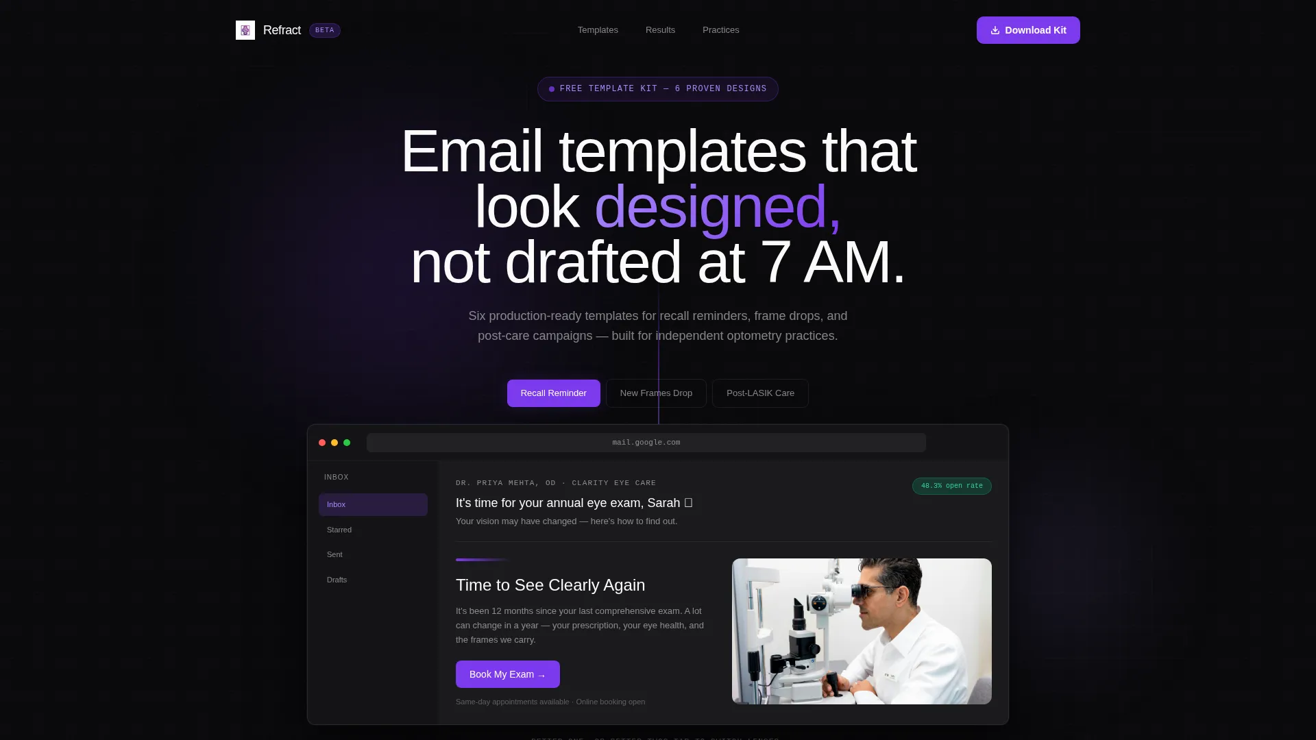
Refract is a single-page bento grid template purpose-built to present an optometry email newsletter product. It opens with a tab-switching header that previews three real email layouts, then walks visitors through open-rate benchmarks and practice owner testimonials before closing with a clear download prompt. The visual system is dark, precise, and unmistakably modern.
Who this template is for
This template was designed with a specific type of optometry professional in mind. It speaks directly to people who manage patient communications regularly and want those communications to look credible and contemporary.
- Solo practice owners who draft recall reminders and appointment follow-ups on their own
- Multi-location managers who need one consistent email design across several offices
- Optical dispensary teams who promote new frame arrivals to segmented patient lists
What problem this template solves
Most optometry practices rely on email templates that look dated, generic, or visually inconsistent. Patients notice. A polished, well-structured email builds trust before the appointment even begins.
- Practices struggle to communicate professionally without a design team or budget for custom work
- Generic email layouts fail to differentiate a practice or drive meaningful action from patients
- Recall and promotional emails often underperform because the design does not match the message
What you get with this template
Refract delivers a fully designed landing page that sells the email newsletter kit and makes the value case instantly clear. Every section works together to inform, persuade, and convert.
- A Feature Tab Switcher header showing three real email previews inside an inbox mockup
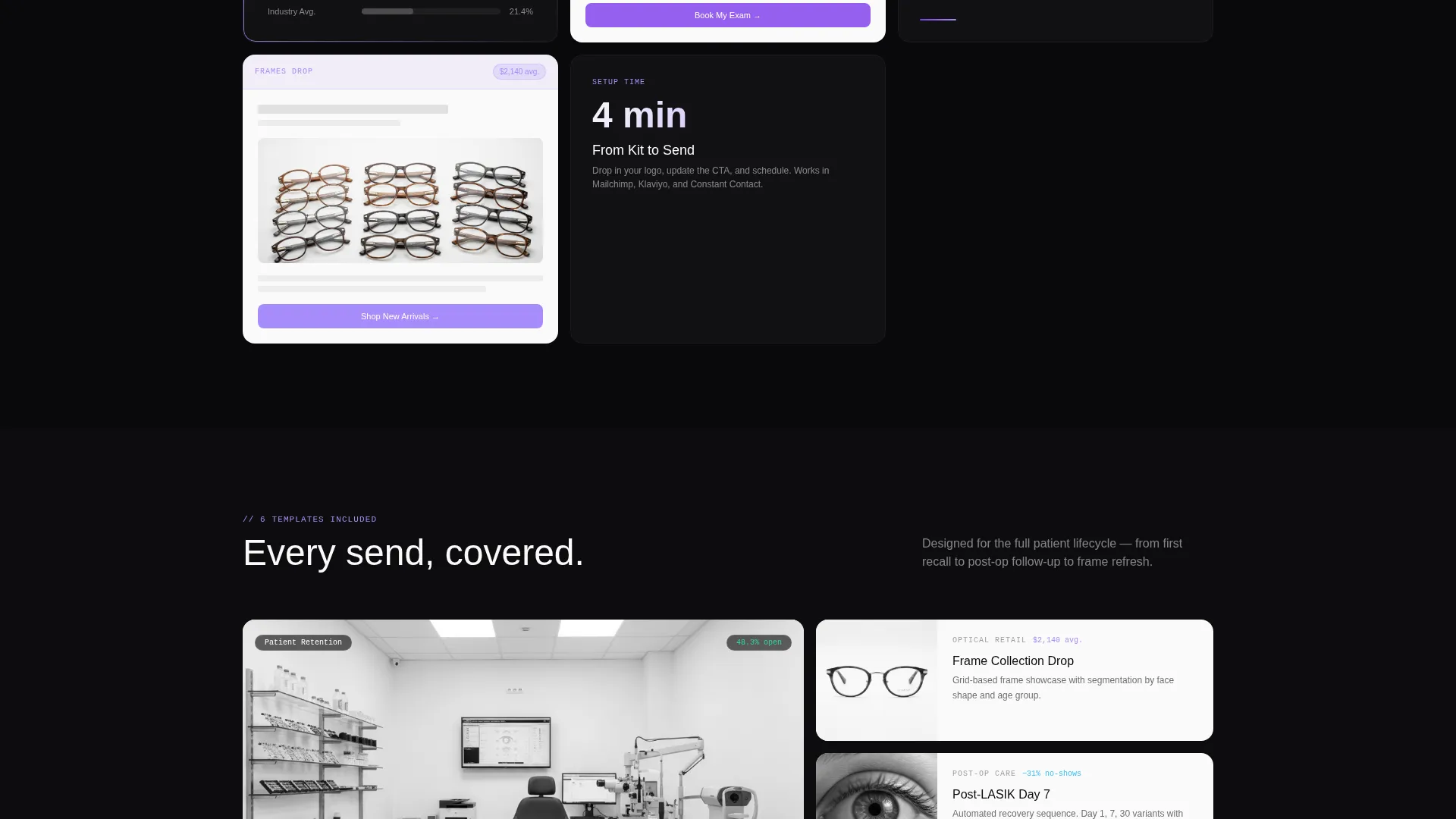
- A scrollable bento grid mixing live metric tiles, miniature template previews, and testimonial cards
- A primary download call to action paired with a secondary inline email preview prompt
Feature list
Refract packages several deliberate design decisions into a single cohesive page. Each feature serves a specific function in the conversion journey.
Interactive Email Preview Header
The page opens with a Feature Tab Switcher that displays three actual email templates: "Recall Reminder," "New Frames Drop," and "Post-LASIK Care." Each lives inside a realistic inbox mockup. Clicking a tab triggers a smooth crossfade, swapping the subject line, preview text, and body content. The active tab glows violet while inactive tabs recede into void black.
Bento Grid Data Layout
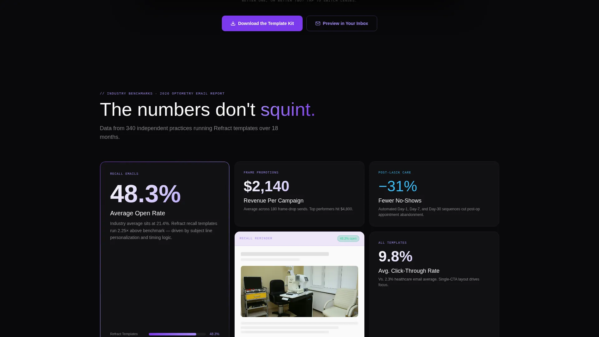
The main content area uses a bento grid format where cards expand and contract as the visitor scrolls. Metric tiles surface real optometry email benchmarks, including a 48.3% average open rate for recall emails and $2,140 average revenue per frame promotion campaign. Each stat card is paired with a miniature email template preview showing the design behind the number.
Testimonial and Social Proof Cards
Three practice owner quotes are embedded directly in the bento grid alongside the metric tiles. Mixing peer testimony with hard data creates a peer-reviewed cadence rather than a sales pitch feel. By the time a visitor reaches the bottom, they have seen proof from multiple practice types.
Dual Call to Action System
The page includes a primary "Download the Template Kit" call to action with paired download buttons. A secondary inline prompt, "Preview in Your Inbox," asks only for an email address and returns a live sample immediately. The two-step structure respects visitor readiness without losing momentum.
Void & Violet Visual System
The color palette pairs absolute void black (#09090B) with deep iris purple (#7C3AED), soft retinal violet (#A78BFA), and clinical white (#FAFAFA). Violet gradients trace card borders and hover states. Deep iris marks every interactive anchor. The result reads like a dark-mode dashboard viewed in a dim exam room.
Page sections overview
| Section | Purpose |
|---|---|
| Tab Switcher Header | Show three live email previews with crossfade transitions |
| Benchmark Metric Tiles | Present open-rate and revenue data paired with template previews |
| Testimonial Cards | Embed practice owner quotes inside the scrolling bento grid |
| Download call to action Block | Drive primary template kit download with paired buttons |
| Inline Preview Prompt | Capture email address and deliver a live sample instantly |
Design & branding system
Refract follows a Startup Velocity theme built on a Void & Violet color system. The palette is intentional: dark backgrounds create contrast that makes violet elements feel precise and active, like a diagnostic instrument rather than a decorative choice.
- Background uses absolute void black (#09090B); card surfaces use clinical white (#FAFAFA) for clear content separation
- Deep iris purple (#7C3AED) marks all interactive elements; soft retinal violet (#A78BFA) traces borders and hover gradients
- The overall tone reads like a dark-mode SaaS dashboard, modern and focused without feeling clinical or cold
Mobile & speed optimization
The bento grid layout is built to adapt naturally across screen sizes. Cards reflow and resize to maintain visual hierarchy without losing the rhythm of the scroll experience.
- Bento grid cards restack responsively so metric tiles and testimonial cards remain readable on smaller screens
- The tab switcher header maintains its inbox mockup framing on mobile for consistent first impressions
- Lightweight card structure keeps the page feeling fast regardless of how many visual assets are loaded
How this template helps you convert
Refract is structured to build confidence gradually. Each scroll step adds a new layer of evidence before the visitor reaches any download prompt.
- The interactive header lets visitors experience the email templates firsthand before reading a single word of copy, reducing skepticism early.
- Benchmark data cards show real optometry performance numbers alongside the exact template designs that produced them, making the value tangible and specific.
- The dual call to action system meets visitors where they are: ready to download immediately, or wanting to see the template in their own inbox first.
Other information about this template
Refract is a standalone landing page template, not a multi-page website. It is delivered as a ready-to-customize design file intended for optometry practices and optical product teams who want to present a polished email newsletter product without starting from a blank canvas.
- The template kit referenced on the page covers three email formats: recall reminder, new frames promotion, and post-LASIK care follow-up
- The page is designed for the Technology category with a subcategory focus on optometry digital presence
- Refract is part of a broader Startup Velocity theme family and pairs well with other Void & Violet system templates

Theme
Startup Velocity
Creative direction
Industry Report
Color system
Void & Violet
Style
Bento Grid
Direction
App Download
Page Sections
Feature Tab Switcher Header
Bento Grid with Benchmark Data
Dual Call to Action System
Void & Violet Color System
Embedded Social Proof Cards
Related questions
Who is this landing page template designed for?
What email template types does this page showcase?
Does the page include real optometry email performance data?
What does the call to action on this page do?
Can the colors and branding be customized?



