Container Registry Landing Page Template
Registry is a hub-and-spoke landing page template built for container registry products. It opens with an interactive pricing calculator, a product screenshot header, and frosted glass card sections covering features, security scanning, edge latency, and integrations. The template is designed to convert platform engineers and DevOps teams into qualified leads through utility-first interaction and a progressive sign-up form.
by Rocket studio
Quick summary
Registry is a single-page, anchor-nav landing page template for container registry products. It leads with a live pricing calculator before any marketing copy, then guides visitors through feature highlights, vulnerability scanning previews, edge latency maps, and a GitHub Actions integration snippet. The design uses a dark glassmorphic visual system with electric cyan accents.
Who this template is for
This template is built for infrastructure-focused software products that need to earn trust with a technically demanding audience. It speaks directly to the people who evaluate and purchase container registry tooling.
- Platform engineers who configure continuous integration and delivery pipelines and need a fast way to assess a new registry tool
- DevOps leads who justify infrastructure spend and need a cost comparison before committing to a new solution
- Site reliability engineers who have experienced rate limit failures or slow image pulls during live production incidents
What problem this template solves
Selling developer infrastructure requires more than a feature list. Technical buyers are skeptical of vague promises and want to interact with a tool before they read about it. Generic landing page templates do not account for this expectation.
- Visitors leave before engaging because the page leads with paragraphs instead of something useful
- Teams cannot quickly see how the pricing compares to existing solutions without doing the math themselves
- The page fails to speak the language of engineers who think in pull commands, YAML snippets, and vulnerability scores
What you get with this template
You get a complete, structured landing page with every section pre-designed for a container registry product. The layout is hub-and-spoke: a fixed anchor navigation bar links visitors to each spoke section, and every spoke is a self-contained frosted glass card.
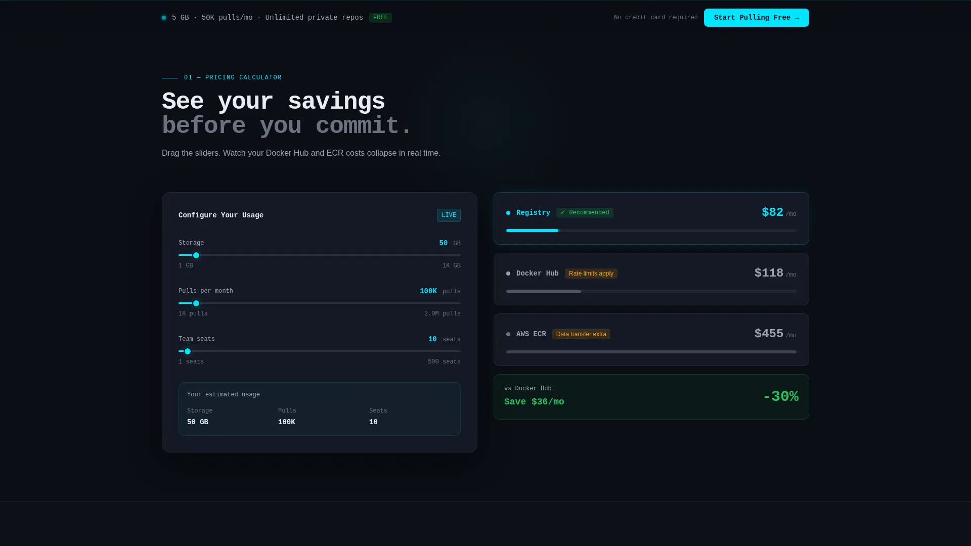
- A live pricing calculator section with sliders for storage, monthly pulls, and team seats, plus a side-by-side comparison column for estimated competitor costs
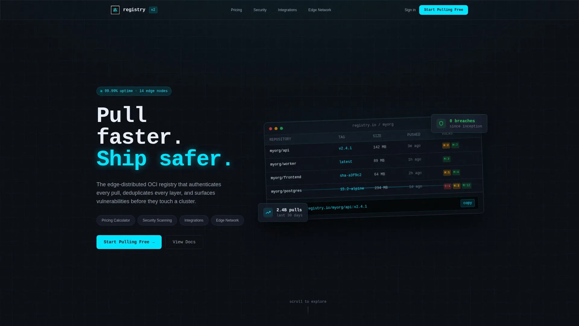
- A product screenshot header showing a registry dashboard with image tags, vulnerability badges, and a copy-ready pull command, all inside a frosted glass frame
- A progressive lead capture form pre-filled from calculator inputs, plus a secondary conversion path for high-volume teams via a Calendly modal embed
Feature list
This template includes several purpose-built components. Each one is designed to serve a specific stage of the visitor's decision process.
Interactive Pricing Calculator
A slider-based calculator lets visitors set storage in gigabytes, monthly pull volume, and team seat count. The monthly cost updates in real time. A ghost column beside it shows estimated equivalent costs for competing services, making the value case without needing a sales call.
Frosted Glass Card Layout
Every spoke section is a frosted glass card floating over a void black background. Cards use a translucent panel color with a frosted border and soft depth shadow. This visual treatment makes dense technical content feel clean and scannable rather than overwhelming.
Vulnerability Scanning Preview
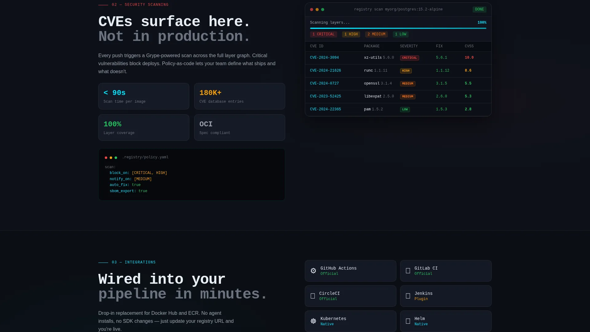
A dedicated section displays real vulnerability scanning output on a sample image, using green, amber, and red badges to indicate severity levels. This shows the product working, not just described.
Edge Latency Map
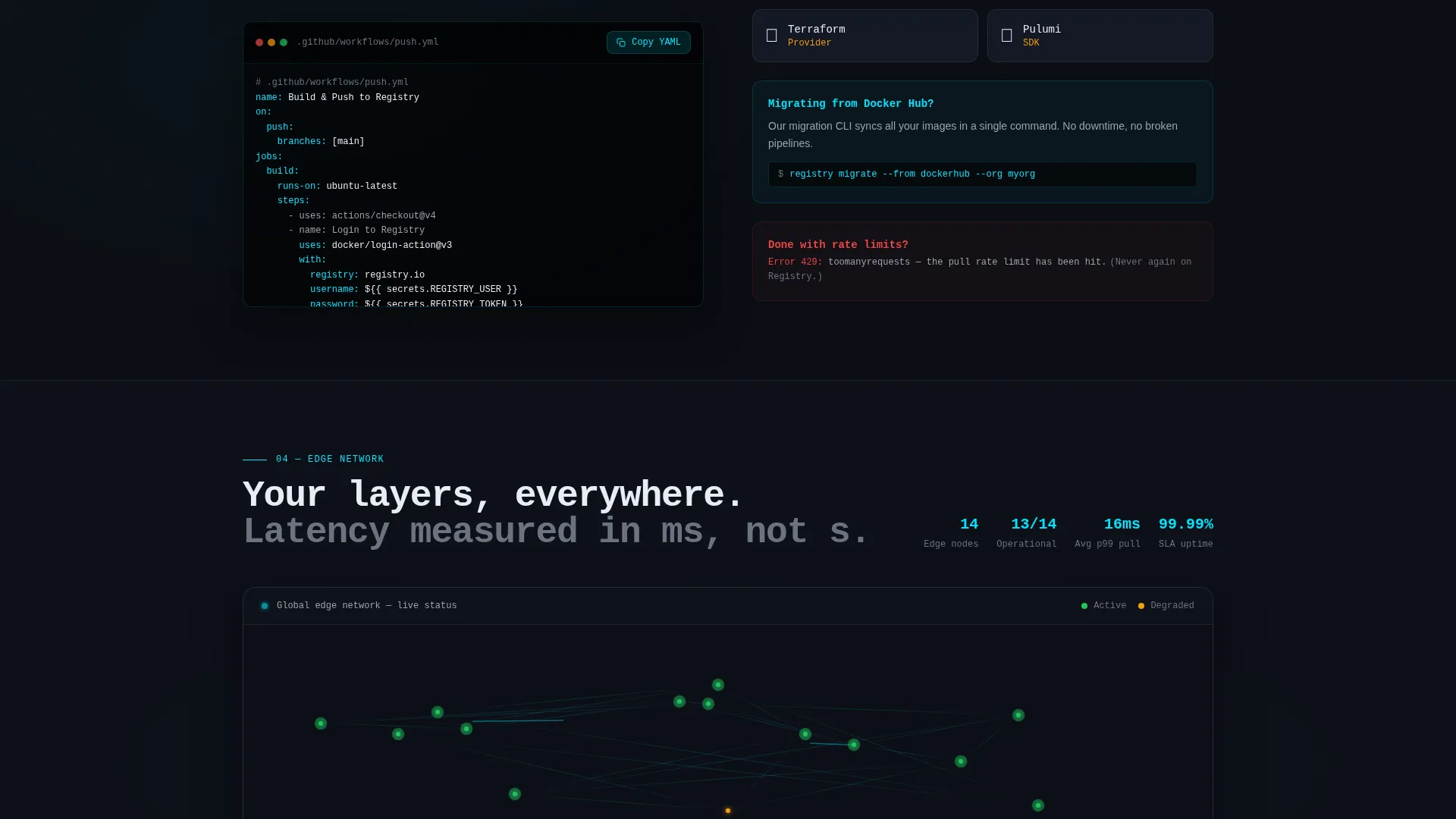
A visual map section shows edge node locations with ping time indicators. Visitors can see geographic coverage at a glance, which matters to teams where image pull speed directly affects deployment time.
One-Click Integration Snippet
A YAML code block for GitHub Actions integration is presented in a copy-ready format. Visitors can copy the snippet with a single click. This reduces the perceived setup effort for pipeline integration.
Fixed Anchor Navigation Bar
The hub navigation stays fixed at the top of the page. It tracks scroll position and highlights the active section with a glowing cyan underline. Pill-shaped buttons let visitors jump directly to Pricing Calculator, Features, Security, or Integrations.
Page sections overview
| Section | Purpose |
|---|---|
| Header with screenshot | Establishes product credibility with a dashboard image and headline |
| Anchor nav bar | Provides fixed hub navigation linking to all spoke sections |
| Pricing calculator | Lets visitors model their own cost and compare against alternatives |
| Sticky call to action bar | Repeats the primary sign-up prompt after the calculator interaction |
| Features section | Highlights core product capabilities in frosted card format |
| Security scanning | Shows live vulnerability output with severity badge examples |
| Edge latency map | Visualizes node locations and pull speed across regions |
| Integrations snippet | Displays a copy-ready GitHub Actions YAML code block |
| Lead capture form | Collects work email with progressive field expansion |
| Sales modal | Routes high-volume teams to a Calendly booking embed |
Design & branding system
The visual identity is built on a Tech Glass theme using a glassmorphic color system. The palette is designed to feel like a terminal floating in a dark workspace, where every surface carries depth and every accent cuts through clearly.
- Core colors: void black (#0B0E14) as the base, translucent panel (#1A1F2E at 60% opacity) for cards, frosted border (#FFFFFF at 8% opacity) for edges, and electric cyan (#00E5FF) for interactive states and data highlights
- Typography uses a monospace style for headlines and code elements, reinforcing the engineering context without requiring a separate font configuration
- Glass card depth is created through backdrop blur and soft shadows, with subtle Z-axis rotation on the header screenshot frame to add three-dimensional perspective
Mobile & speed optimization
The template is structured so that every section stacks cleanly on smaller screens. The anchor navigation and sticky call-to-action bar are both designed to remain functional on mobile viewports.
- Frosted glass cards reflow to single-column layout on narrow screens, keeping content readable without horizontal scrolling
- The pricing calculator sliders are touch-friendly, allowing mobile visitors to interact with the tool the same way desktop visitors do
- The Calendly modal and progressive lead form are designed to open and close cleanly within a mobile viewport without breaking the page layout
How this template helps you convert
The conversion strategy is built around earning attention through utility before asking for anything. Each stage of the page reduces hesitation.
- The pricing calculator is the first interactive element a visitor encounters. By the time they have dragged the sliders and seen their projected savings, the value case is already made. The lead form that follows feels like a natural next step rather than an interruption.
- The sticky call-to-action bar that appears after the calculator keeps the primary sign-up prompt visible as the visitor scrolls through technical sections. The secondary path to an infrastructure sales call gives high-volume teams a route that matches their buying process.
Other information about this template
This template is categorized under Technology, specifically Developer Tools and Application Programming Interface tooling, within the Container Registry niche. It is designed as a single-page, section-led hub-and-spoke layout with anchor navigation.
- The template style is Hub and Spoke with Anchor Navigation, meaning all sections connect back to a fixed top bar that tracks scroll position
- The header concept is Product Screenshot, using a full-width dashboard capture as the primary visual instead of an illustration or abstract graphic
- The creative direction is Calculator First, placing the interactive pricing tool ahead of any descriptive marketing copy to lead with immediate value
- The landing page direction is Lead Generation, with a progressive form, a sticky call-to-action bar, and a secondary sales booking path all serving that goal
- The color system is Glassmorphic, and the theme is Tech Glass, both of which are reflected in every card, modal, and navigation component throughout the page
Theme
Tech Glass
Creative direction
Calculator/Tool First
Color system
Glassmorphic
Style
Hub & Spoke (Anchor Nav)
Direction
Lead Generation
Page Sections
Interactive Pricing Calculator with Comparison
Product Screenshot Header Frame
Vulnerability Badge Scanning Section
Edge Latency Node Map
Copy-ready Ci/cd Integration Snippet
Progressive Lead Capture Form
Related questions
What kind of product is this template designed for?
Can the pricing calculator pre-fill the lead capture form?
Who is the secondary conversion path designed for?
How does the fixed anchor navigation work?
Is the GitHub Actions YAML snippet editable?



