Results-Focused Agency Landing Page Template
A dark, data-driven landing page built for real estate website builders. This template opens with a live performance estimator, then walks visitors through animated comparison grids, real customer metrics, and a feature-versus table, all styled in a Carbon Fiber color system. Every section builds the case before the call to action even appears.
by Rocket studio
Quick summary
This is a single-page, dashboard-style landing page template built for real estate website builder platforms. It opens with a working performance calculator and moves visitors through animated data comparisons, live metric counters, and a feature-by-feature competitive table. The design runs on a Carbon Fiber palette, deep blacks, titanium grays, and electric green highlights, built to feel fast, sharp, and authoritative.
Who this template is for
This template is designed for real estate software and SaaS platforms that want to convert agents and brokerages through data, not decoration. It speaks directly to buyers who are already frustrated with slow, expensive, or feature-light website solutions.
- Solo agents paying high monthly fees for templated property sites with limited control
- Team leads who need to manage multiple agent subsites under one brokerage domain
- Independent brokerages that need a modern tech presence to compete against larger, well-funded rivals
What problem this template solves
Most real estate website builder marketing pages rely on stock photography, vague benefit statements, and late-appearing calls to action. Visitors leave before they feel the product's value. This template flips that model entirely.
- Visitors see their own site's weaknesses before they read a single marketing claim
- Animated comparison grids make the performance gap impossible to ignore
- The call to action appears only after the visitor has already lost three head-to-head comparisons
What you get with this template
This template delivers a complete, conversion-focused landing page with motion-driven storytelling built into its structure. Every section is designed to escalate the visitor's awareness of the gap between where they are and where they could be.
- A live calculator widget at the top that simulates a performance audit for any entered website URL
- Animated comparison grids, live metric counters, and a scrolling feature-versus table
- A sticky call-to-action bar and a low-friction secondary lead capture form requiring only email and website URL
Feature list
This template packs several purposeful, motion-driven components into a single focused page. Each one is built to carry the conversion narrative forward.
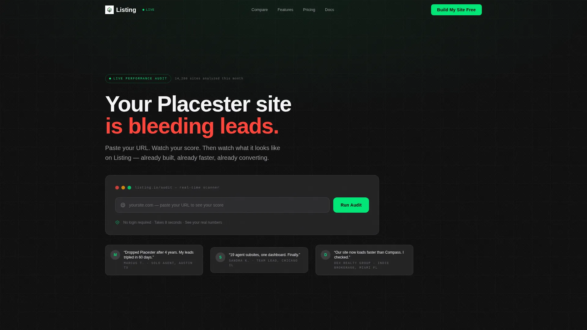
Live Performance Estimator Widget
The header section is a working calculator. Visitors type in their current website URL and instantly see a simulated audit covering load speed score, mobile responsiveness grade, estimated search engine optimization gaps, and monthly leads lost. Scores animate with spring-eased counters, shifting from red to green as the tool previews potential improvements.
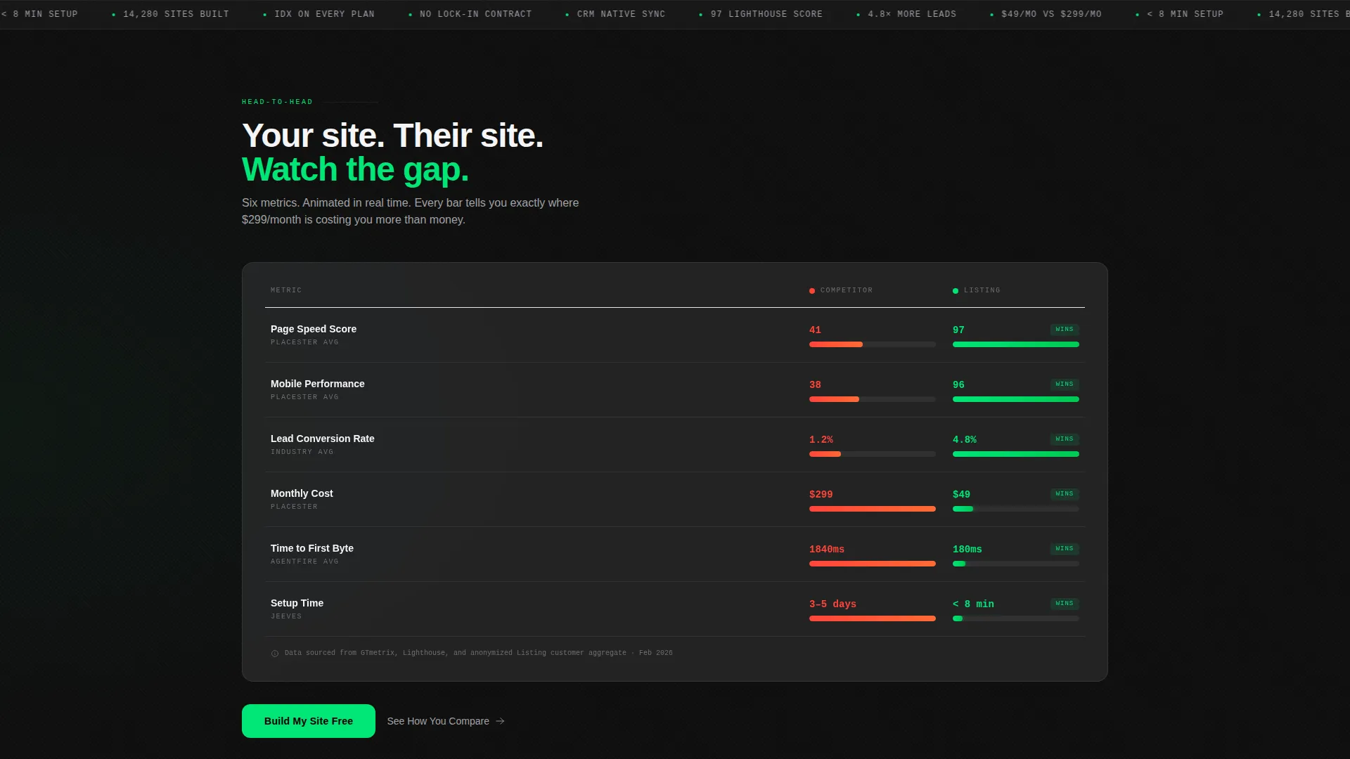
Animated Head-to-Head Comparison Grid
The first scroll section presents an animated side-by-side grid comparing the visitor's current site against a platform-built site. Animated bars race across columns for page speed, mobile score, lead conversion rate, and monthly cost. The motion makes the data feel live and the gap feel real.
Real Customer Metrics Counter Block
A dedicated section pulls from anonymized aggregate customer data and displays counters that tick upward in real time. This gives potential buyers social proof grounded in numbers rather than testimonials, keeping the data-first tone consistent throughout the page.
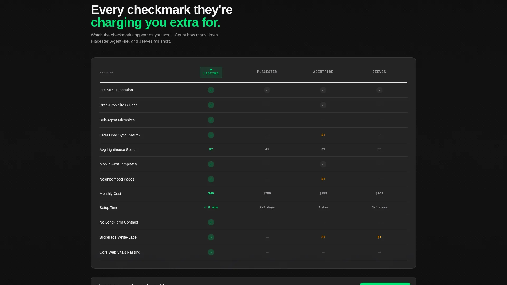
Scrolling Feature-Versus Table
A full competitive comparison table covers feature-by-feature differences with checkmarks that animate in row by row as the visitor scrolls. This section is built to answer the exact questions a comparison-stage buyer is already asking.
Sticky Call-to-Action Bar
After the comparison grid section, a sticky bar locks to the viewport and repeats the primary call to action. It stays visible as visitors scroll deeper, reducing the distance between a decision moment and a conversion action.
Low-Friction Lead Capture Form
The secondary conversion path triggers a deeper audit flow. It asks only for an email address and a website URL, keeping friction near zero while still qualifying the lead. The value is already delivered before the form appears.
Page sections overview
| Section | Purpose |
|---|---|
| Performance Estimator Header | Simulate a live audit of the visitor's current site |
| Comparison Grid Block | Animate speed, score, and cost differences side by side |
| Customer Metrics Counter | Display real aggregate platform performance data |
| Feature Versus Table | Compare features row by row against competing platforms |
| Sticky call to action Bar | Keep the primary action visible after the comparison grid |
| Email Lead Capture | Collect email and URL for a deeper audit flow |
Design & branding system
The visual identity follows a Dynamic Motion theme built on a Carbon Fiber color system. The palette is designed to feel like the instrument panel of a performance vehicle at night, dark, purposeful, and precise.
- Backgrounds stay in the deep cockpit black range (#0D0D0D to #1C1C1E), with data cards floating on #2C2C2E surface panels
- Titanium mid-gray (#3A3A3C) and brushed aluminum (#A1A1A6) provide contrast for text, borders, and secondary user interface elements
- Electric conversion green (#00E676) appears only on calls to action, live data pulses, and upward-trending metrics, never decoratively
Mobile & speed optimization
The template is designed with a mobile-first layout that preserves the data-grid structure and motion components across screen sizes. The performance narrative the template tells must be credible, and that starts with how the template itself behaves on a phone.
- Animated components and counter blocks are built to render cleanly on smaller viewports without layout collapse
- The sticky call-to-action bar adapts to mobile screen heights so it does not obscure key content
- The estimator widget and comparison grid reflow into single-column layouts on narrow screens while maintaining visual hierarchy
How this template helps you convert
This template is structured around a specific conversion logic: earn trust with data before asking for anything. Every section advances that logic in sequence.
- The estimator widget delivers immediate, personalized value before the visitor has scrolled once, making the first impression functional rather than decorative
- The comparison grid and customer metrics sections build compounding proof, so that by the time the sticky call-to-action bar appears, the visitor has already seen their current site lose multiple direct comparisons
- The secondary lead capture form asks for only two inputs after the value has been fully delivered, reducing abandonment and qualifying leads at the same time
Other information about this template
This template is built for a specific competitive context in the real estate website builder market. The design and content structure reflect the real pressures that agents and brokerages face when evaluating software platforms.
- The feature-versus table is structured to address common decision points that buyers research when comparing real estate website builder options, including platforms such as Placester and AgentFire
- The template supports MLS feed drag-and-drop sections, neighborhood pages, and lead capture flows that connect to a customer relationship management system, as described in the platform brief
- IDX integration, meaning Internet Data Exchange connectivity that pulls live property listings from a multiple listing service, is a core capability the template is designed to highlight
- The brokerage subsite use case, where one domain hosts up to twenty agent pages, is reflected in the page structure and messaging hierarchy
- This template is available as part of a broader real estate software and SaaS category within the marketplace

Theme
Dynamic Motion
Creative direction
Stats-First Impact
Color system
Carbon Fiber
Style
Dashboard/Data Grid
Direction
Comparison/Versus
Page Sections
Live Performance Estimator Widget
Animated Head-to-head Comparison Grid
Real-time Customer Metrics Counter
Scroll-triggered Feature Versus Table
Sticky Call-to-action Bar
Low-friction Lead Capture Form
Related questions
Who is this landing page template built for?
What makes the header section different from a standard hero?
Do I need technical skills to use the animated components?
Can the comparison table be edited to reflect different competitors?
How does the secondary lead capture form work?



