Rekindle - Dynamic Reengagement Landing Page Template
Rekindle is a hub-and-spoke landing page template built for SaaS re-engagement platforms. It opens with three animated metric counters, guides visitors through anchored sections covering results, workflow, integrations, benchmarks, and case studies, and funnels them toward a personalized recovery forecast. The design uses a dark cockpit palette with sky-blue accents and continuous motion to keep data front and center.
by Rocket studio
Quick summary
Rekindle is a single-page, anchor-navigated landing page template for SaaS re-engagement email platforms. It leads with live-style animated counters, walks visitors through progressive proof layers, and closes with two focused calls to action. The design is built around a dark slate and sky-blue palette that makes every metric feel urgent and alive.
Who this template is for
This template is built for growth-focused teams at Series B software companies. It speaks directly to the people staring at dashboards where a large share of trialists never converted.
- Growth leads who need to show stakeholders that dormant subscribers can be recovered
- Product marketers whose onboarding sequences feel more like instruction manuals than conversations
- Revenue operations teams watching monthly recurring revenue leak through a churn floor they cannot seem to patch
What problem this template solves
Most re-engagement platforms struggle to earn trust quickly. Visitors arrive skeptical and leave before the value lands. This template solves that by leading with undeniable numbers and building credibility section by section.
- Dormant subscriber lists feel like sunk costs until real recovery data makes the case otherwise
- Generic platform pages bury the proof that buyers actually need to make a decision
- Teams without a clear next step abandon pages that ask for too much too soon
What you get with this template
You get a complete, single-page layout with a pinned anchor navigation bar and six distinct content spokes. Every section is purpose-built to move a skeptical SaaS buyer one step closer to clicking.
- A full-page structure covering Results, How It Works, Integrations, Benchmarks, Case Studies, and a persistent header
- Two conversion paths: a primary recovery forecast call to action and a secondary demo ghost button fixed in the nav
- A dynamic motion design system where animated counters, bar charts, timeline visuals, and logo grids keep the page feeling live
Feature list
This section breaks down the specific built-in components and design decisions that make Rekindle work as a re-engagement platform landing page.
Animated Stats Header
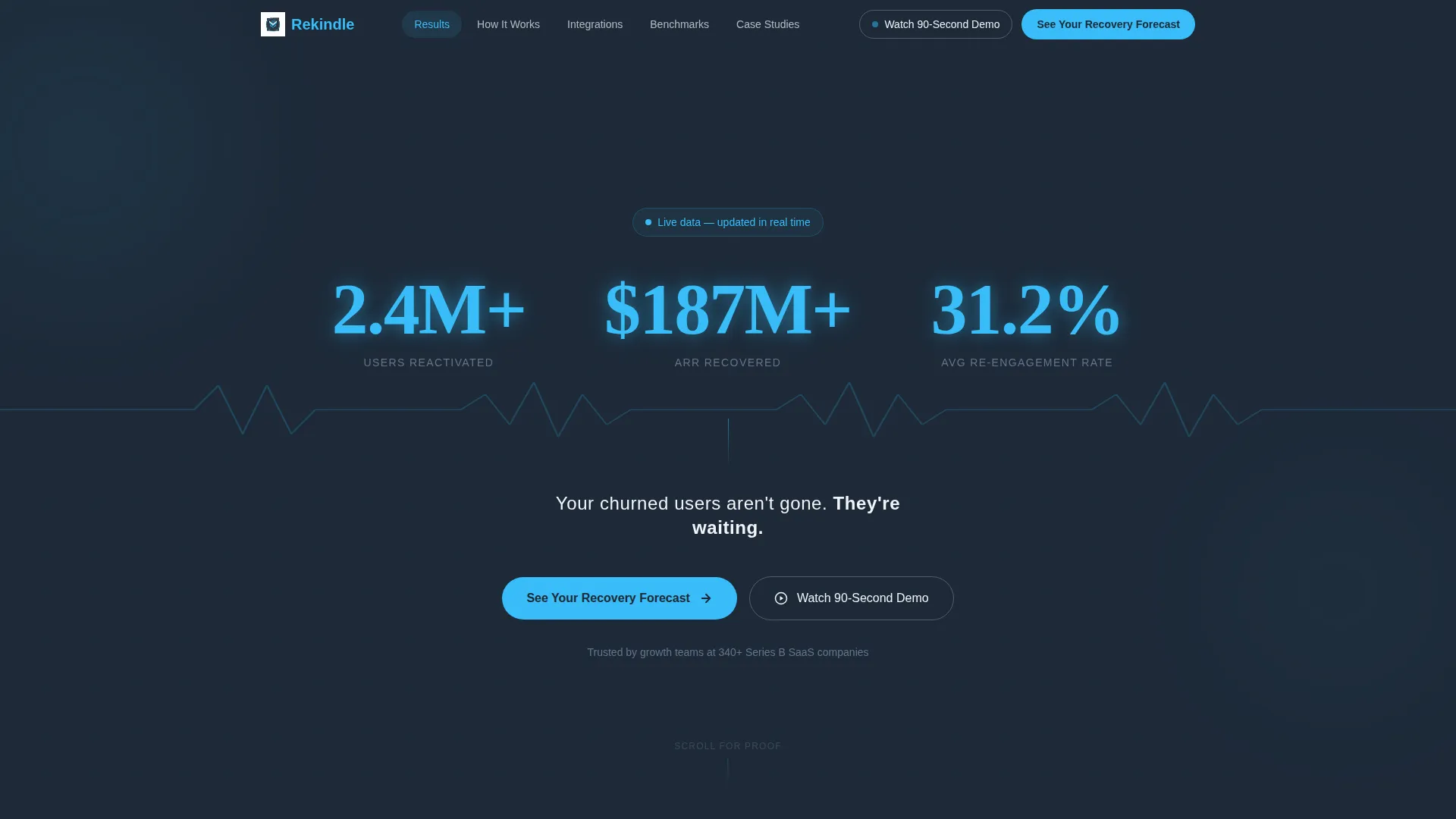
Three large metric counters open the page against the deep slate background. They tick upward in real time, rendering reactivated users past 2.4 million, recovered annual recurring revenue past $187 million, and an average re-engagement rate settling at 31.2 percent. Numbers display in sky blue with a subtle motion blur trail. A single line of white text sits beneath: "Your churned users aren't gone. They're waiting."
Pinned Anchor Navigation
A sticky navigation bar anchors to the top of the viewport on scroll. It carries five labeled links: Results, How It Works, Integrations, Benchmarks, and Case Studies. The secondary call to action, "Watch the 90-Second Demo," floats as a ghost button inside the nav throughout the entire session.
Results Section with Animated Bar Charts
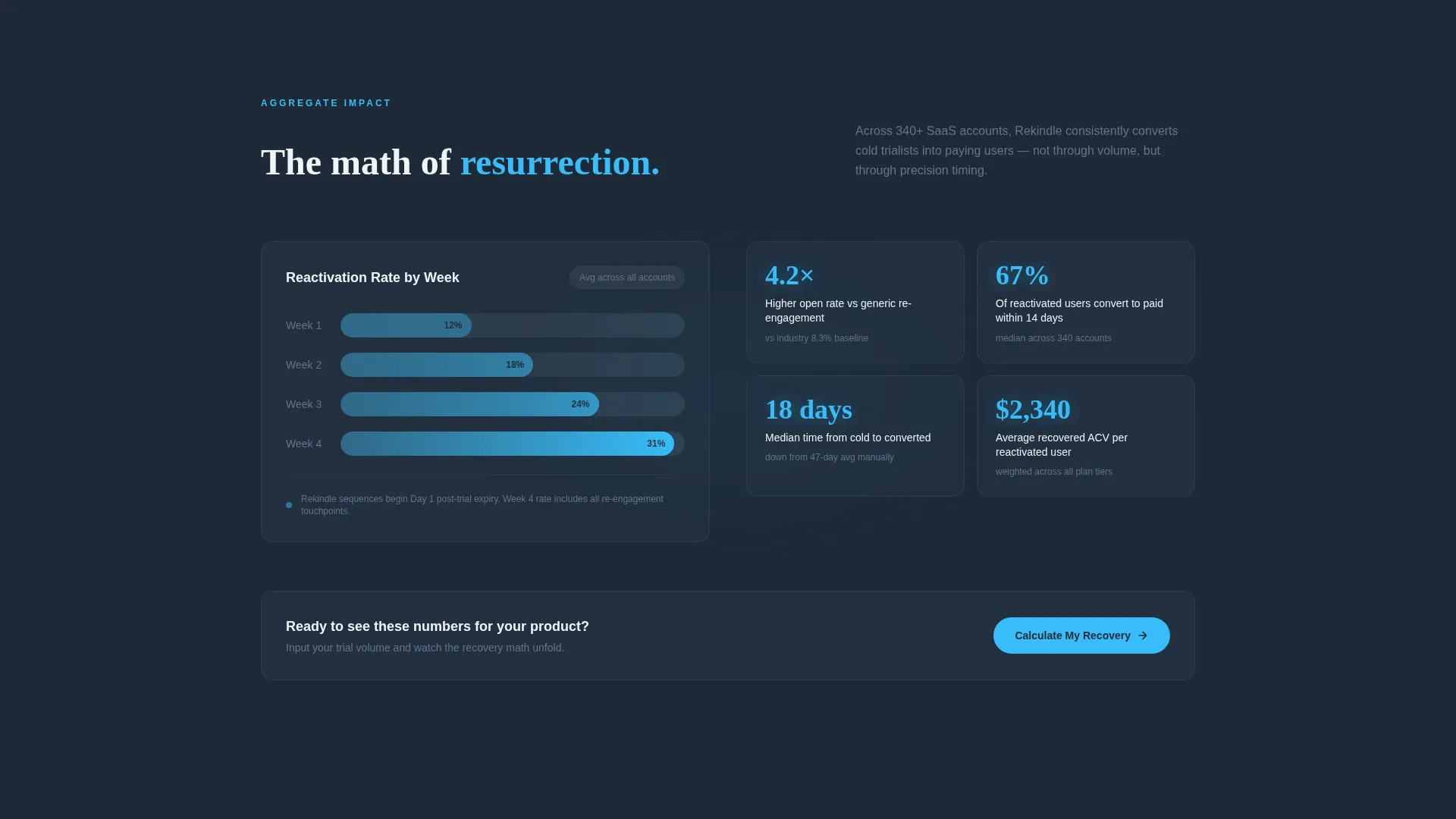
The Results spoke displays aggregate platform impact. Bar charts build visibly as the section enters the viewport, giving visitors a visual proof layer that reinforces the header metrics with more granular breakdown.
How It Works Timeline Visual
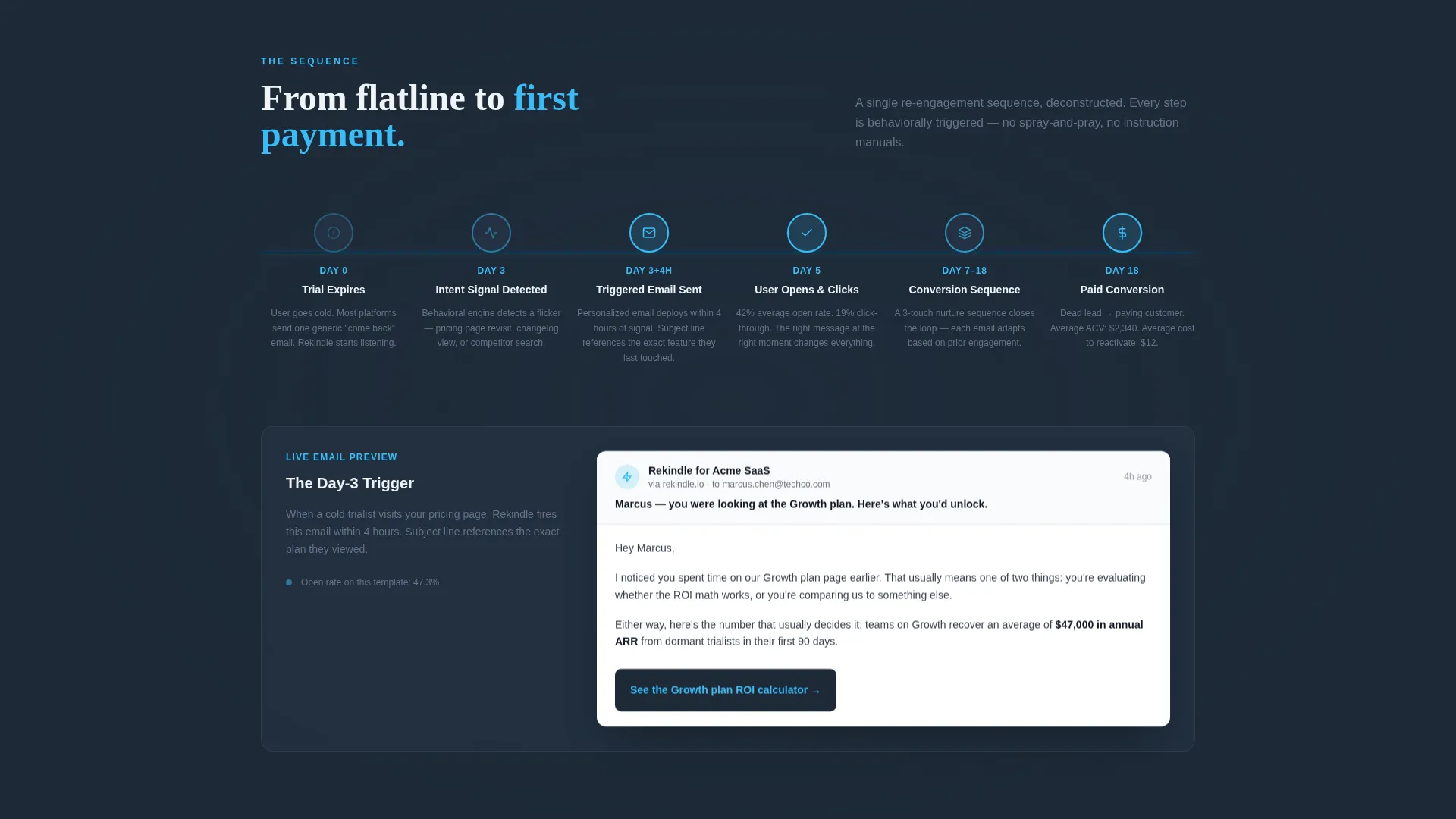
A horizontal timeline deconstructs a single re-engagement email sequence. Emails, behavioral triggers, and user actions pulse along the axis so visitors can follow the exact logic of how a dormant subscriber gets reactivated step by step.
Interactive Benchmarks Calculator
Visitors can input their own churn rate directly on the page and see a projected recovery figure update in response. This section makes the value proposition personal before the primary call to action resurfaces beneath it.
Dual Call-to-Action Conversion Flow
The primary call to action, "See Your Recovery Forecast," appears in the header and again after the Benchmarks section with added contextual reinforcement. Clicking it routes to a dedicated calculator page where visitors enter subscriber count, churn rate, and average contract value to receive a personalized projection.
Page sections overview
| Section | Purpose |
|---|---|
| Stats metrics header | Opens with three animated counters and a single proof statement to establish instant credibility |
| Results aggregate view | Shows platform-wide impact through animated bar charts that build on scroll |
| How It Works timeline | Deconstructs a re-engagement sequence so visitors understand the trigger logic |
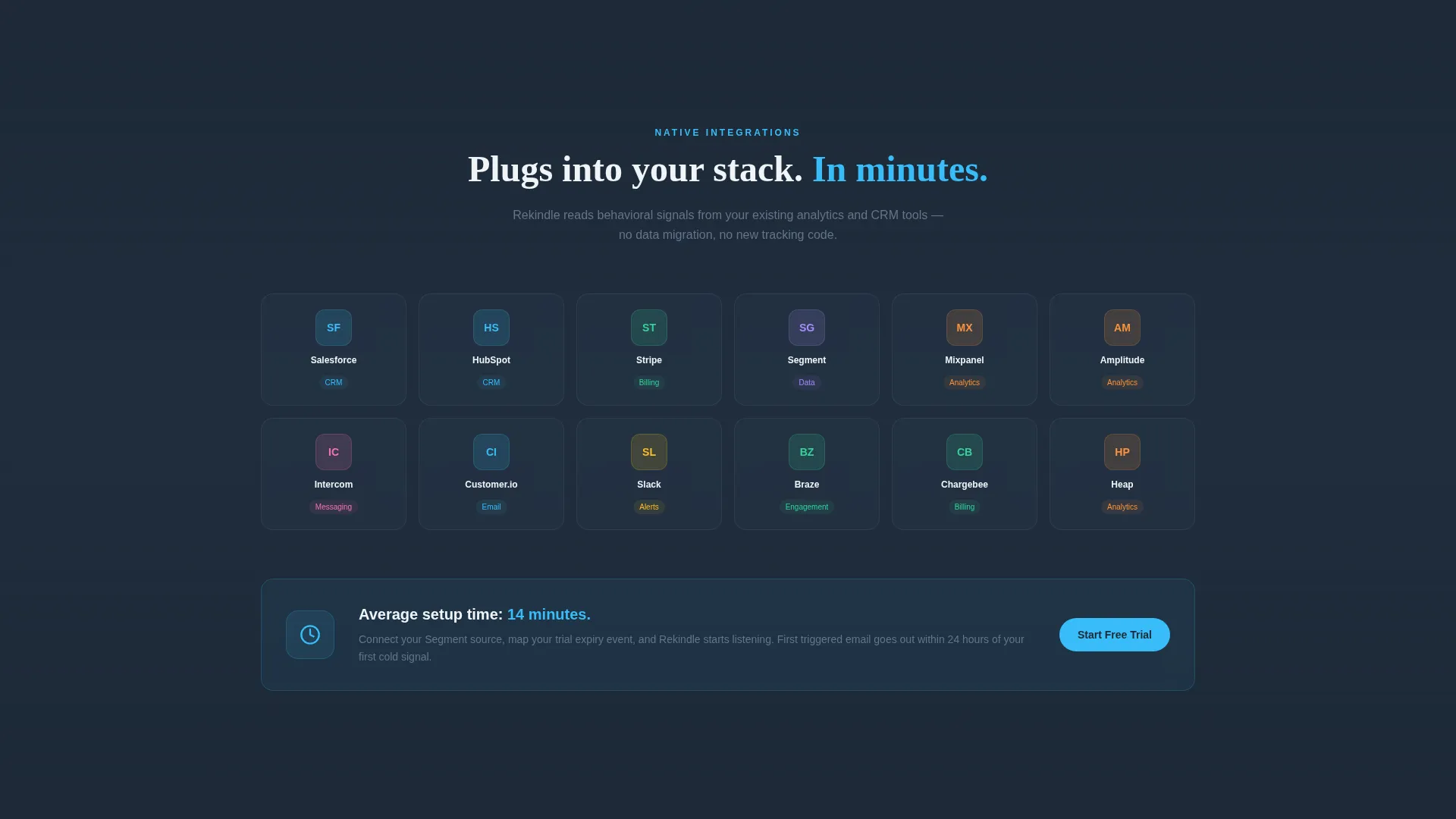
| Integrations logo grid | Displays partner logos in a breathing grid layout to signal ecosystem fit |
| Benchmarks calculator | Lets visitors input their churn rate and see a live projected recovery figure |
| Case Studies spoke | Adds the final layer of social proof before the closing call to action |
Design & branding system
The visual identity follows a Dynamic Motion theme anchored in a Slate and Sky color system. The palette was designed to feel like a cockpit instrument panel: dark, precise, and punctuated by data points that demand attention.
- Deep graphite slate (#1E2A38) as the primary background, mid-tone steel (#4A5568) for secondary surfaces, open-sky blue (#38BDF8) for metrics and interactive states, and cirrus white (#F0F4F8) for all body type and breathing space
- No stock photography and no illustrations; the visual language is built entirely from live data, motion, and typographic hierarchy
- Continuous motion throughout every section: counters tick, charts build, logos breathe, and the timeline pulses so the page always feels like a live dashboard rather than a static brochure
Mobile & speed optimization
The template is structured to maintain its motion-forward design across screen sizes. Layout decisions prioritize the metrics and calls to action at every viewport width.
- Anchor navigation collapses cleanly so the sticky bar and ghost button remain accessible on smaller screens
- Animated elements are sequenced to trigger on scroll entry, keeping the motion intentional rather than overwhelming on mobile
- The Benchmarks calculator input field and the recovery forecast call to action are both prominently positioned in the mobile layout flow
How this template helps you convert
Rekindle is built around a click-through conversion strategy. Every design and layout decision points toward one of two actions: requesting the recovery forecast or watching the demo.
- The page frontloads three animated proof metrics so visitors accept the core claim before they read a single line of body copy, lowering resistance before the ask arrives
- The Benchmarks calculator makes the value feel personal and specific, which means the call to action that follows reads like a logical next step rather than a sales push
Other information about this template
Rekindle is categorized under Technology, specifically within the SaaS email templates subcategory. It is purpose-built for the SaaS re-engagement email niche and carries a hub-and-spoke structure that works well for platforms needing to cover multiple proof dimensions without losing the visitor to scroll fatigue.
- The template style is Hub and Spoke with Anchor Navigation, meaning each section functions as an independent spoke that can be updated or expanded without restructuring the full page
- The creative direction is Stats-First Impact, so the visual hierarchy always leads with a number before it leads with a claim
- The landing page direction is Click-Through, meaning all layout choices prioritize routing visitors to either the recovery forecast calculator or the 90-second demo path
Theme
Dynamic Motion
Creative direction
Stats-First Impact
Color system
Slate & Sky
Style
Hub & Spoke (Anchor Nav)
Direction
Click-Through
Page Sections
Animated Metrics Header with Live Counters
Sticky Anchor Navigation Bar
Scroll-triggered Animated Bar Charts
Horizontal Re-engagement Timeline
Interactive Churn Recovery Calculator
Dual Conversion Path Architecture
Related questions
What type of platform is Rekindle built for?
Who is the target visitor this landing page speaks to?
What are the two calls to action in this template?
Does the Benchmarks section support custom churn rate input?
Does this template use photography or illustrations?



