Nonprofit Email Marketing Specialist Directory Website Template
Rekindle is a dashboard-style landing page template built for nonprofit re-engagement email platforms. It pairs kinetic data visualizations with an industry-report scroll structure, guiding development directors and annual fund coordinators from a striking donor-attrition statistic to a live-feeling dashboard panel, and finally to a free app download call to action.
by Rocket studio
Quick summary
Rekindle is a single-page landing page template designed for a nonprofit donor re-engagement email platform. It opens with an interactive dashboard mockup, walks visitors through escalating attrition statistics, and closes with a clear app download path. The design uses a void-black background with iridescent accent colors to make data feel alive and urgent.
Who this template is for
This template is built for teams that need to communicate complex platform value quickly and convincingly. It suits people who are pitching a data-driven solution to an audience that already feels the pain of donor loss.
- Development directors at mid-size nonprofits managing lists full of lapsed contacts
- Annual fund coordinators watching donor retention rates fall below 40%
- Consultants hired to demonstrate re-engagement ROI before a year-end campaign launches
What problem this template solves
Most landing pages for email platforms rely on feature lists and stock imagery. This template takes the opposite approach. It leads with the financial and operational cost of donor dormancy, then immediately shows the platform solving each problem in real time.
- Visitors feel the weight of inaction before they see a single feature
- The punch-then-proof scroll rhythm converts skeptics into engaged prospects
- The free dormancy audit offer creates reciprocity without requiring a credit card
What you get with this template
You get a fully structured, single-page layout built around the industry-report creative direction. Every scroll segment is designed to carry a visitor from crisis awareness to confident action.
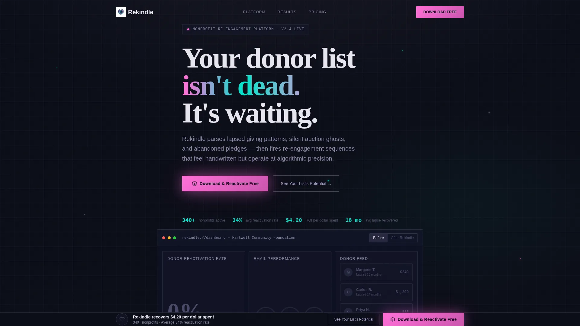
- An interactive "Before Rekindle / After Rekindle" toggle header with animated donor reactivation metrics
- Kinetic statistic panels where large-format numbers animate into position as the visitor scrolls
- A floating bottom bar with a pulsing primary call to action that appears after the third data panel
- A secondary conversion path leading to a lightweight dormancy audit via email and CSV upload
Feature list
This template includes purpose-built layout components that serve both visual storytelling and conversion. Each feature is directly tied to the prompt brief and reflects the template's dashboard and data-grid design approach.
Interactive Dashboard Header
The header renders a functioning mockup of the platform's core dashboard. Donor reactivation rates animate from 0% to 34% on load, open-rate rings fill like liquid, and a scrolling feed of donor cards flips from gray to iridescent. A toggle lets visitors switch between the dormant "Before" state and the active "After" state.
Kinetic Statistic Panels
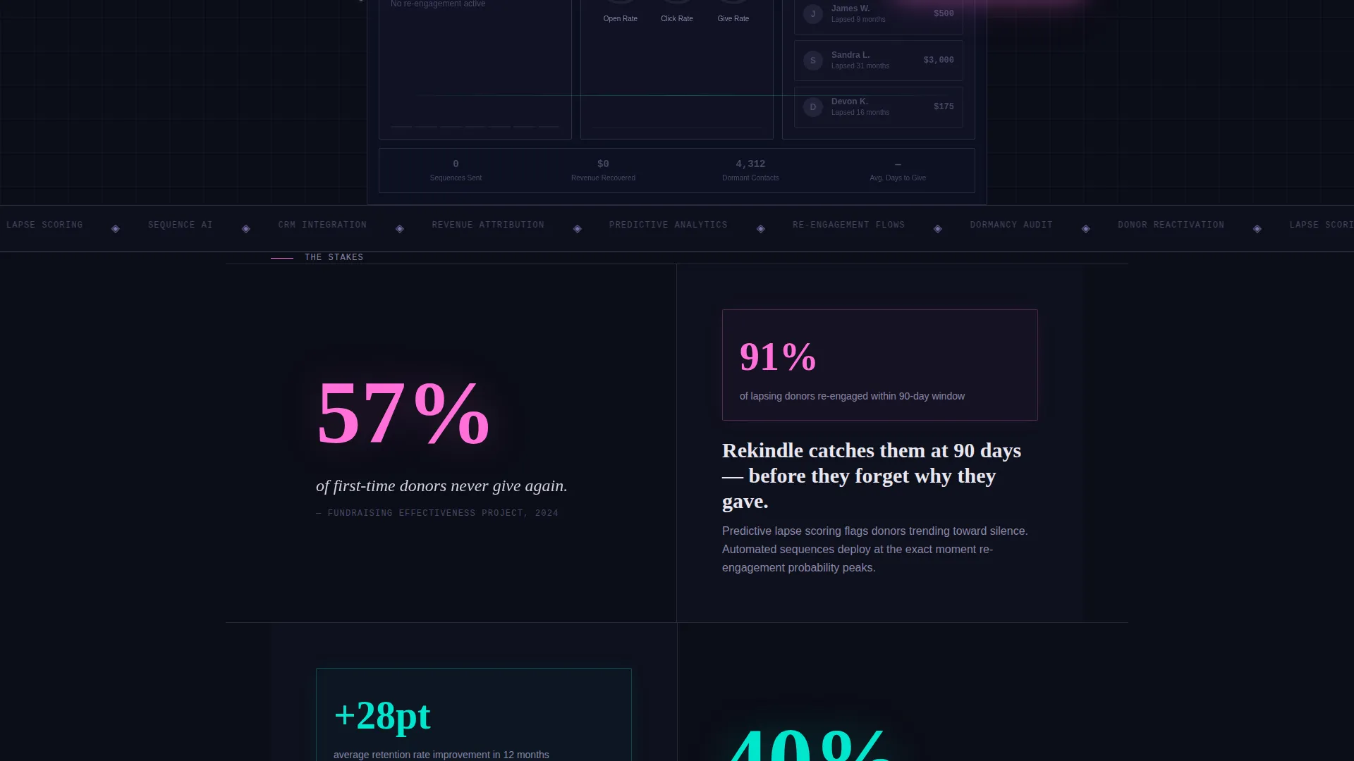
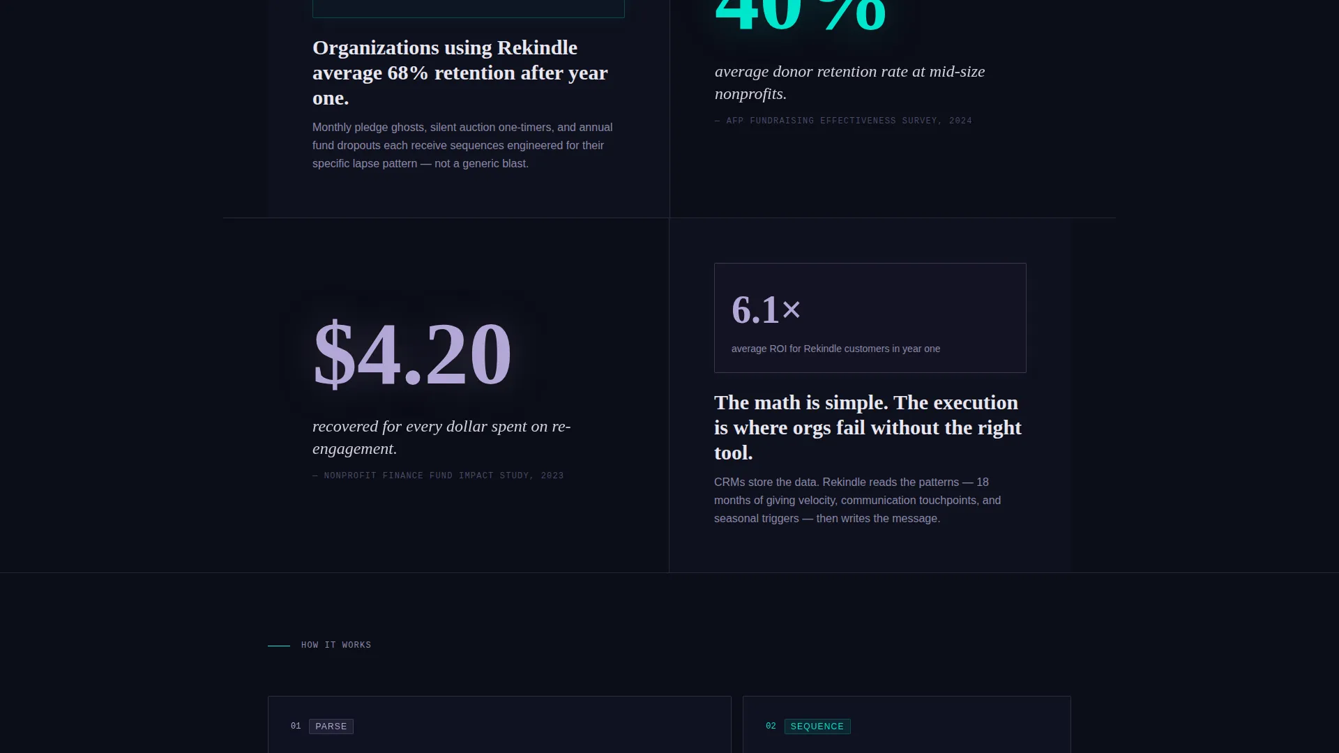
Each scroll section opens with a single devastating donor-attrition statistic rendered as large, animated typography. The number enters the viewport with motion, establishing stakes before the dashboard proof panel follows directly beneath it.
Floating App Download Bar
A persistent bottom bar materializes after the visitor passes the third data panel. The primary button reads "Download and Reactivate Free" and pulses in neural pink. A micro-animation shows a dormant donor icon waking up each time the bar enters the viewport.
Dormancy Audit Conversion Path
A secondary call to action invites visitors to upload their email list as a CSV file to receive a free dormancy audit. This flow generates immediate reciprocal value and creates a natural on-ramp for users who are not yet ready to download.
Data Particle Motion System
Animated data particles drift between scroll sections, visually connecting each statistic to its corresponding dashboard answer. The motion is continuous but controlled, designed to make the scroll feel like watching a system process information rather than reading a brochure.
AI Iridescent Color System
The template uses a four-tone palette applied with strict hierarchy: void black for backgrounds, holographic lavender for grid borders, shifting cyan for animated data flows, and neural pink reserved exclusively for live data pulses and call to action states.
Page sections overview
| Section | Purpose |
|---|---|
| Interactive Dashboard Header | Opens with animated metrics and a Before/After toggle to show the platform in action immediately |
| Statistic Panel One | Presents the first donor-attrition statistic in kinetic typography to establish the cost of inaction |
| Dashboard Answer One | Shows the platform's direct response to the first statistic via an animated data panel |
| Statistic Panel Two | Escalates urgency with a second large-format attrition figure |
| Dashboard Answer Two | Pairs the second statistic with platform proof, maintaining the punch-then-proof rhythm |
| Statistic Panel Three | Delivers the final escalating stat, shifting the tone from problem to financial recovery potential |
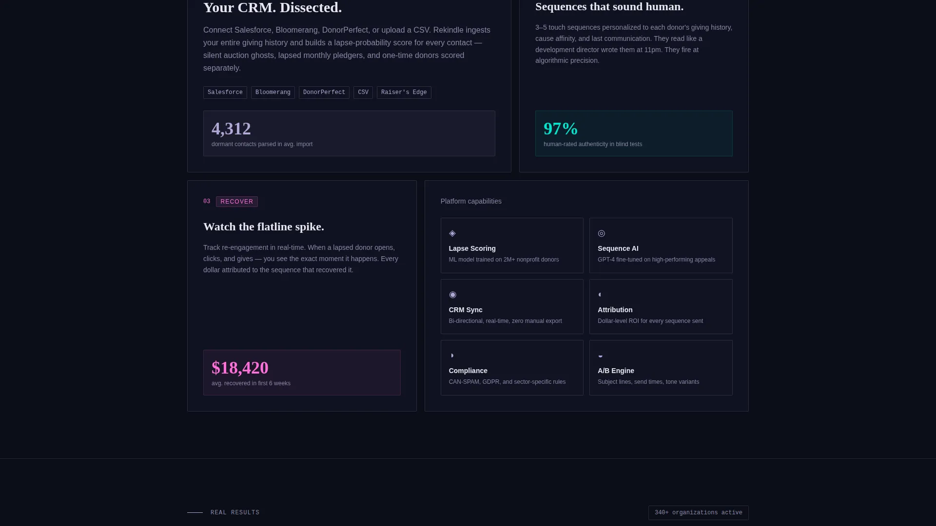
| Dashboard Answer Three | Closes the proof sequence and primes the visitor for the conversion offer |
| Dormancy Audit call to action | Secondary path offering a free list audit via email and CSV upload |
| Floating Download Bar | Persistent call to action pinned to the bottom of the viewport after the third data panel |
Design & branding system
The visual identity follows a Dynamic Motion theme built around the AI Iridescent color system. Every color has a fixed role in the layout, creating a clear visual hierarchy that guides the eye toward action.
- Deep void black (#0B0D17) for all backgrounds, keeping the data visualizations sharp and prominent
- Holographic lavender (#B4A7D6) for grid cell borders and structural user interface elements throughout the dashboard
- Shifting cyan (#00E5CC) for animated data flow traces that connect nodes between sections
- Neural pink (#FF6FD8) reserved strictly for live data pulses, the primary download button, and interactive call to action states
Mobile & speed optimization
The template is structured for responsive display across device sizes. The dashboard mockup and animated panels are designed to scale without losing the visual logic of the data-grid layout.
- Animated metric components are built to reflow cleanly on smaller viewports
- The floating bottom bar is designed for thumb-reach placement on mobile screens
- Data particle animations are intentionally lightweight to avoid interfering with scroll behavior on touch devices
How this template helps you convert
The template is engineered around a specific conversion psychology. Visitors are shown the financial cost of donor dormancy before they are ever asked to act, making the download feel like a rational response rather than a sales prompt.
- The interactive header creates immediate product credibility by showing real-feeling anonymized metrics before the visitor reads a single line of body copy.
- The punch-then-proof scroll structure escalates stakes across three statistic-and-dashboard pairs, so each call to action feels earned rather than premature.
- The dormancy audit secondary path lowers the commitment barrier for hesitant visitors, generating reciprocity and capturing leads from people who are not yet ready to download.
Other information about this template
This template is categorized under Technology with a subcategory focus on nonprofit email templates. It is specifically designed for the nonprofit re-engagement email niche and carries an intersection match score of 13, indicating a well-targeted use case.
- The template style is Dashboard and Data Grid, making it suitable for platforms where live data is the primary proof of value
- The creative direction is Industry Report, meaning the layout is built around cited statistics and sequential proof panels rather than traditional feature-benefit copy
- The header concept is Interactive Preview, with the product itself serving as the hero rather than any photography or illustration
- The primary landing page direction is App Download, with a secondary micro-conversion path built around the free dormancy audit offer
Theme
Dynamic Motion
Creative direction
Industry Report
Color system
AI Iridescent
Style
Dashboard/Data Grid
Direction
App Download
Page Sections
Interactive Before and After Dashboard Header
Kinetic Statistic Typography Panels
Punch-then-proof Scroll Structure
Floating App Download Call to Action Bar
Free Dormancy Audit Conversion Path
Data Particle Motion System
Related questions
Who is this landing page template designed for?
Do I need to replace photography or illustration assets?
What is the dormancy audit conversion path?
What triggers the floating download bar to appear?
Can the punch-then-proof scroll structure be adapted for other use cases?



