Pharmacy Digital Presence Cost Calculator Website Template
Dispense is a modular card-grid landing page built for online pharmacies that want to earn trust fast. It leads with an interactive savings estimator, surfaces bold proof-point stats, and guides visitors through a browsable product catalog. The design blends clinical calm with a vivid Electric Indigo palette so patients feel confident making health decisions at any hour.
by Rocket studio
Quick summary
Dispense is a single-page pharmacy landing page designed around three goals: show savings quickly, build trust through real numbers, and make prescriptions easy to transfer. The template opens with an interactive estimator, moves through stat-driven proof cards, and closes with a friction-reduced lead form. It suits any online pharmacy ready to convert cautious first-time visitors into loyal refill customers.
Who this template is for
This template is built for digital pharmacy brands that serve patients who need reassurance before switching providers. It works equally well for new pharmacy startups and established mail-order services growing their online reach.
- Chronic-condition patients who refill prescriptions like metformin or atorvastatin every 90 days
- New parents searching for infant probiotics or pediatric medications late at night
- Elderly caregivers managing multiple medications and comparing drug interactions across several prescriptions
What problem this template solves
Online pharmacy visitors arrive skeptical. They worry about cost, delivery reliability, and whether a stranger online can be trusted with their health. A generic storefront does nothing to calm those concerns. Dispense addresses each friction point directly with proof, savings transparency, and a calm, organized visual experience.
- Visitors leave before converting because they cannot quickly see whether switching pharmacies saves them money
- A cluttered or clinical-feeling layout makes health decisions feel stressful rather than confident
- Long or demanding forms scare away high-intent visitors who simply want to transfer a prescription
What you get with this template
Dispense delivers a fully structured, modular landing page layout ready to populate with your pharmacy's real content. Every section is purposefully sequenced to carry a visitor from curiosity to conversion in a single scroll.
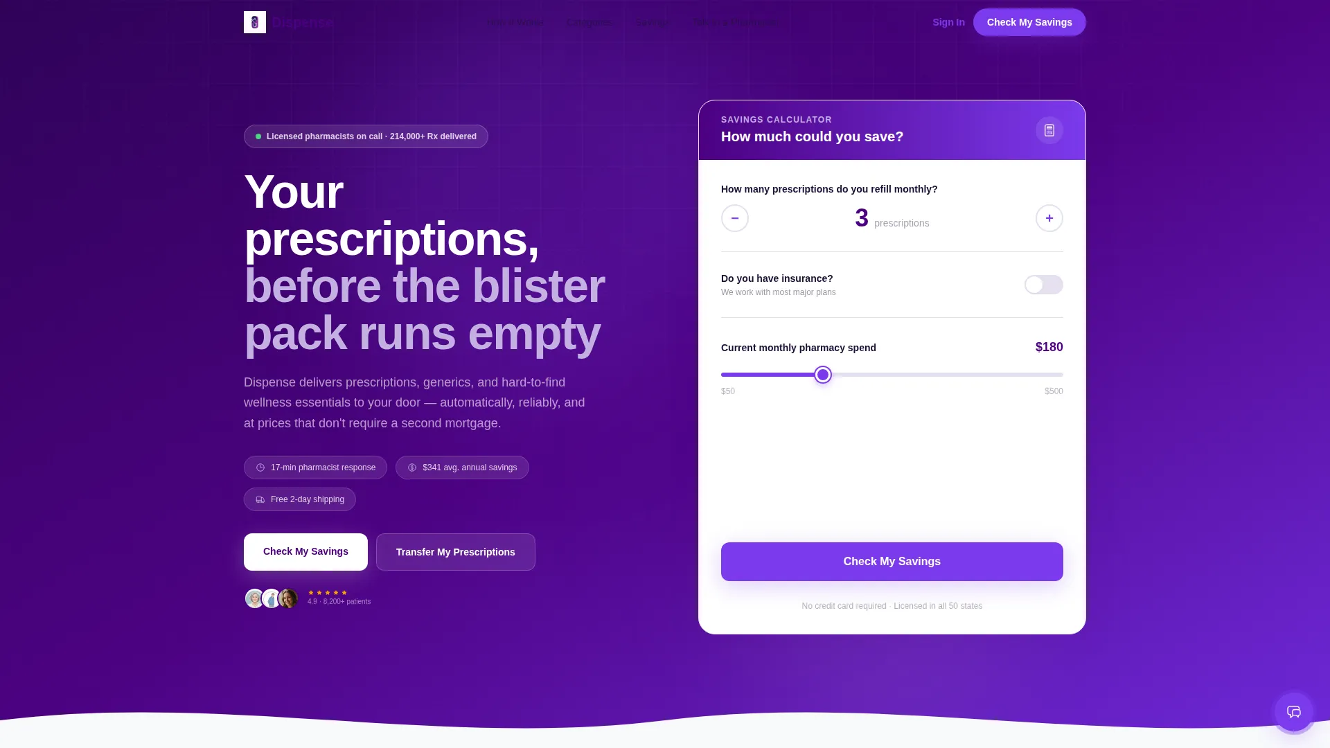
- An interactive savings estimator above the fold with a stepper, insurance toggle, and animated spend slider
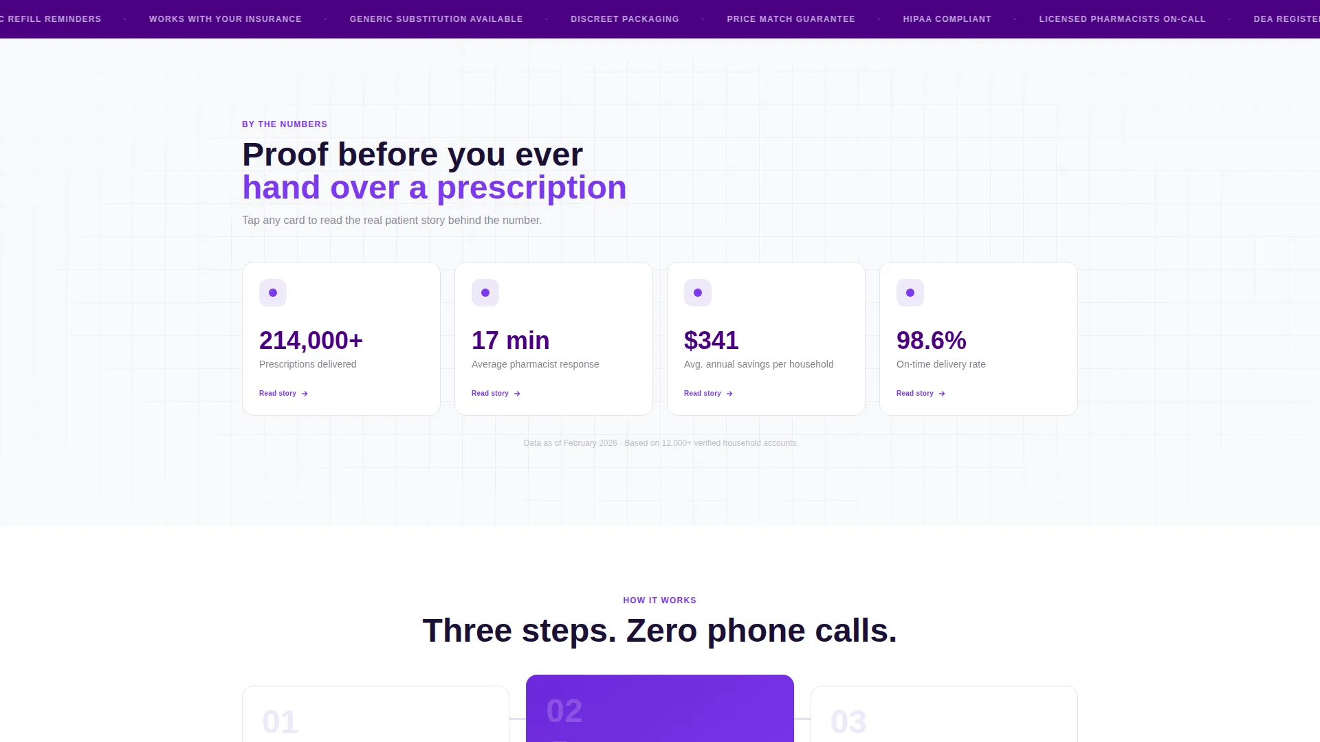
- Flip-card stat blocks showing delivery numbers, response times, and savings averages with customer stories on the reverse
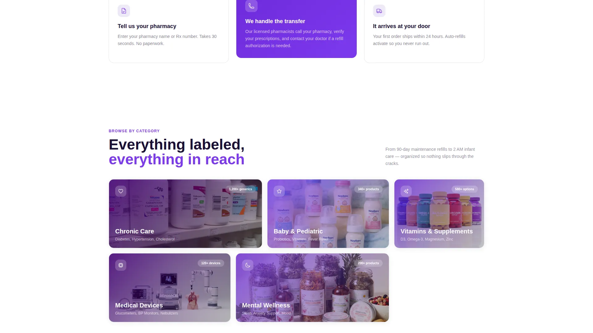
- A modular product category grid covering Chronic Care, Baby and Pediatric, Vitamins and Supplements, and Medical Devices
Feature list
This template ships with a tightly sequenced set of interactive and visual components. Each one is grounded in the specific needs of pharmacy visitors.
Interactive Savings Estimator
The header section asks three focused questions: monthly prescription count via a stepper, an insurance status toggle, and a monthly spend slider ranging from $50 to $500. The moment a visitor moves the slider, an animated number recalculates their estimated annual savings in real time. The result displays in electric violet type, counting down like a fare meter running in reverse, making the value feel immediate and personal.
Flip-Card Proof Stats
Three bold typographic stat cards appear immediately below the estimator. Each card displays a specific pharmacy metric: over 214,000 prescriptions delivered, a 17-minute average pharmacist response time, and $341 in average annual savings per household. On scroll, each card flips to reveal a single real customer story on its reverse, pairing hard numbers with human context.
Modular Product Category Grid
Below the proof section, browsable pill-shaped category cards organize the catalog into clear segments. Chronic Care, Baby and Pediatric, Vitamins and Supplements, and Medical Devices each get their own tappable thumbnail. The grid makes discovery feel intuitive rather than overwhelming for a visitor who arrives unsure of where to start.
Progressive Lead Capture Form
The lead form is sequenced for minimum friction. It asks for the pharmacy name or prescription number first, then email, then zip code for delivery radius confirmation. This order captures the highest-intent signal first and reduces drop-off at each subsequent step.
Sticky Mobile Bottom Bar
On mobile, the primary call-to-action locks to the bottom of the screen throughout the entire scroll. It reads "Check My Savings" at the estimator stage and switches to "Transfer My Prescriptions" once a result is shown. This keeps the conversion path visible at every point in the visitor journey.
Floating Pharmacist Chat Icon
A secondary conversion path sits as a floating chat icon in electric violet. It offers a "Talk to a Pharmacist" prompt for visitors who need reassurance before committing. This captures warm leads who are not yet ready for the main form but have genuine purchase intent.
Page sections overview
| Section | Purpose |
|---|---|
| Savings Estimator Header | Hooks visitors with personalized, real-time cost savings |
| Stat Flip Cards | Builds trust through specific delivery and savings proof points |
| Product Category Grid | Makes the catalog browsable and organized by condition or need |
| Lead Capture Form | Collects prescription transfer details with minimal friction |
| Sticky Mobile call to action | Keeps the primary action visible throughout the mobile scroll |
| Floating Chat Icon | Provides a warm secondary path for reassurance-seeking visitors |
Design & branding system
The Electric Indigo color system is designed to feel trustworthy and calm. It evokes the glow of a tablet screen in a dim bedroom: clear enough to read, quiet enough to make confident health decisions.
- Deep digital indigo (#4B0082) anchors the header and navigation for authority and structure
- Clinical white (#F8F9FC) fills card backgrounds to keep product information clean and easy to scan
- Soft lavender (#C3B1E1) appears on hover states and category dividers, while electric violet (#7C3AED) drives calls to action and active filter highlights
Mobile & speed optimization
The template is built with mobile pharmacy visitors in mind. A parent searching for infant probiotics at 2 a.m. or a caregiver checking drug interactions needs everything to load and respond without friction.
- The sticky bottom bar locks the primary call to action in place throughout the full mobile scroll
- Pill-shaped category cards are sized and spaced for comfortable thumb navigation on small screens
- The savings estimator stepper and slider are designed for single-hand touch interaction without requiring precise tapping
How this template helps you convert
The page is built around a Lead Generation goal. Every design and copy decision is sequenced to reduce hesitation and increase the likelihood that a visitor takes one clear action.
- The savings estimator above the fold gives visitors a personal reason to stay before they have read a single marketing claim, anchoring engagement through self-interest rather than brand promises.
- The alternating rhythm of stat proof cards and product category cards compounds trust with each scroll row, so by the time a visitor reaches the form, they have already seen evidence and explored the catalog.
- The progressive form structure and dual conversion paths (prescription transfer form plus floating pharmacist chat) ensure that both high-intent and reassurance-seeking visitors have a natural next step.
Other information about this template
Dispense is a Directory and Discovery themed template built on a Card Grid (Modular) layout. It follows a Stats-First Impact creative direction, meaning proof points appear before product promotion. The template is categorized under Technology, specifically the Pharmacy Digital Presence subcategory, making it relevant for pharmacy online store projects seeking a modern digital counter experience.
- The template style is Card Grid (Modular), allowing individual section blocks to be updated or reordered independently
- The landing page direction is Lead Generation, with every section sequenced to support prescription transfer sign-ups
- The Calculator/Estimator header concept is the primary engagement hook and is designed to be the first interactive experience a visitor encounters

Theme
Directory & Discovery
Creative direction
Stats-First Impact
Color system
Electric Indigo
Style
Card Grid (Modular)
Direction
Lead Generation
Page Sections
Interactive Savings Estimator
Flip-card Stat Proof Blocks
Modular Product Category Grid
Progressive Lead Capture Form
Sticky Mobile Bottom Bar
Floating Pharmacist Chat Prompt
Related questions
Who is this landing page template designed for?
Can I customize the product categories in the card grid?
How does the savings estimator engage visitors above the fold?
Does the template include a mobile-optimized layout?
What conversion paths does this template support?



