Specialist Pharmaceutical Software & SaaS Appointment Booking Website Template
Prescribe is a pharmaceutical CRM landing page template built for field sales teams, district managers, and commercial operations. It pairs a Feature Tab Switcher header with a 22-row comparison table, a two-step trial form, and a demo booking path. The Midnight Blue visual system gives every screen a focused, mission-control feel.
by Rocket studio
Quick summary
Prescribe is a single-page CRM landing page template designed for pharma sales tools. It opens with an interactive Feature Tab Switcher, drives scroll through a dense comparison table, and closes with a two-step pilot sign-up form. The Midnight Blue color system keeps the layout sharp, data-forward, and instantly credible.
Who this template is for
This template was built for teams selling or marketing pharmaceutical CRM software. The layout speaks directly to the people who evaluate, buy, and use these tools every day.
- Field sales representatives managing large physician territories who need to see call planning and sample compliance features at a glance
- District managers and commercial operations teams comparing legacy tools against a modern alternative before a buying decision
- SaaS founders and product marketers launching a pharma CRM and needing a landing page that earns trust before the first demo
What problem this template solves
Pharmaceutical software buyers are skeptical. They have lived through failed Salesforce customizations and consultant-heavy rollouts. A generic SaaS landing page does not answer their real questions fast enough.
- Visitors arrive wanting proof of depth, not a list of bullet promises, so the template leads with live-data product screens instead of hero copy
- Buyers need a side-by-side comparison to justify switching tools, and building that argument from scratch takes weeks
- Teams lose qualified leads when the path from interest to pilot sign-up has too many steps or asks for a credit card too early
What you get with this template
You get a fully structured, single-page layout with every major section pre-built and pre-sequenced. Nothing needs to be invented from scratch.
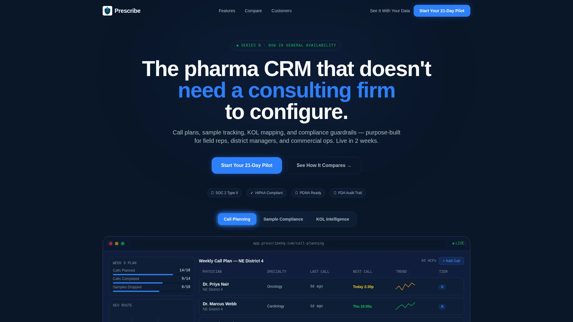
- A Feature Tab Switcher header with three product screens covering call planning, sample compliance, and key opinion leader intelligence
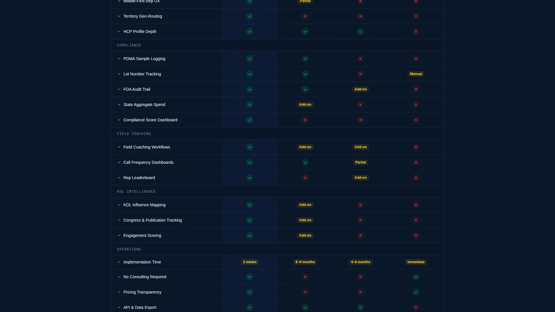
- A 22-row comparison table with expandable rows, micro-demo GIFs, and checkmark or dash scoring across four competitor columns
- A two-step freemium trial form, a secondary demo booking path with calendar embed, and a pinned primary call-to-action in the navigation
Feature list
This template includes components built specifically for the pharmaceutical CRM buying journey. Each piece earns its place in the page flow.
Interactive Feature Tab Switcher
Three tabs sit above a live product screen: Call Planning, Sample Compliance, and KOL Intelligence. Each tab reveals a different interface view packed with real data details, from physician tiles and call history sparklines to lot numbers and influence network graphs. Tab switching is instantaneous, so depth is proven before a visitor reads a single line of copy.
22-Row Comparison Table
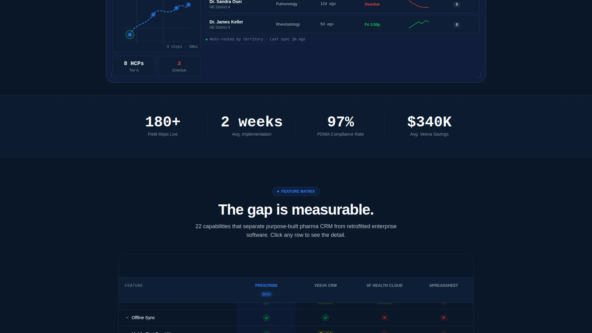
The table pins the product against three reference points across twenty-two feature rows. Green checkmarks and red dashes create an immediate visual verdict. Each row is expandable and opens a micro-demo GIF plus one sentence of context, turning a static matrix into an interactive argument.
Three-Column Testimonial Strip
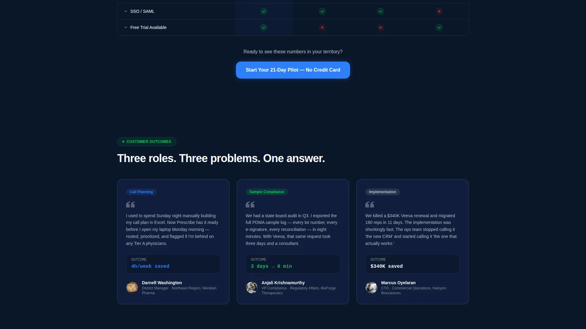
Three short customer quotes follow the comparison table, each attributed to a district manager, a compliance officer, and a chief technology officer. Each quote addresses a different row from the matrix, escalating the stakes from everyday convenience to compliance risk to total cost of ownership.
Two-Step Pilot Sign-Up Form
Step one collects work email and company name only. Step two asks for territory size and current CRM. No credit card is required. The low-friction entry path is designed to convert hesitant buyers who are not ready to commit to a full sales cycle.
Demo Booking Path with Calendar Embed
A secondary conversion path labeled "See It With Your Data" opens a guided demo booking flow with a calendar embed. This option gives high-intent prospects a direct human touchpoint without leaving the page.
Pinned Navigation Call-to-Action
The primary call-to-action, "Start Your 21-Day Pilot," is pinned inside the top navigation bar. It also repeats below the comparison table and after the testimonial strip, ensuring the conversion prompt stays visible at every scroll depth.
Page sections overview
| Section | Purpose |
|---|---|
| Feature Tab Switcher Header | Opens with three interactive product screens to prove depth immediately |
| Headline Above Tabs | Sets the product's core promise before the visitor explores tabs |
| 22-Row Comparison Table | Builds a structured visual argument against legacy and competing tools |
| Expandable Table Rows | Adds micro-demo GIFs and one-line context to each feature comparison |
| Testimonial Strip | Reinforces the table argument with three role-specific customer quotes |
| Primary call to action Block | Repeats the pilot sign-up prompt after the table and after testimonials |
| Two-Step Trial Form | Captures lead details across two low-friction steps with no credit card |
| Demo Booking Path | Offers a calendar-embedded guided demo for high-intent prospects |
| Pinned Navigation Bar | Keeps the primary call to action accessible at every scroll depth |
Design & branding system
The template uses a Midnight Blue color system that feels like a mission-control screen at night. Every color has an assigned role and nothing competes for attention without earning it.
- Deep terminal navy (#0A1628) dominates backgrounds and section dividers, electric blue (#2D7FF9) owns buttons and active toggle states, interface fog (#B0BEC5) handles secondary text and table borders, and clean-sheet white (#F8F9FB) breathes across card surfaces
- Signal green (#00C853) appears as an accent pulse on live data indicators and success states, making real-time information instantly identifiable
- The overall Startup Velocity theme gives the layout energy and intention, deliberately avoiding anything that reads as legacy enterprise software
Mobile & speed optimization
The layout is structured to remain readable and functional on smaller screens, where field reps are most likely to share or revisit a landing page link after a meeting.
- The comparison table is horizontally scrollable on mobile so no data is hidden or collapsed without user intent
- The two-step form and demo booking path are built as distinct steps rather than a long scrollable form, keeping the experience manageable on touch devices
- The pinned navigation bar stays accessible at all scroll depths on both desktop and mobile viewports
How this template helps you convert
The page is engineered around a single goal: move a skeptical pharmaceutical software buyer from first impression to pilot sign-up without requiring a sales call first.
- The Feature Tab Switcher leads with product proof before copy, so visitors assess real capability in the first ten seconds rather than reading marketing claims they have learned to distrust
- The comparison table gives buyers the side-by-side evidence they need to justify an internal switch from a legacy tool, removing a major pre-sale objection before it is ever voiced
- The no-credit-card two-step form and the calendar-embedded demo booking path serve two distinct buyer types in one page, capturing both the self-serve pilot starter and the enterprise prospect who needs a human conversation first
Other information about this template
This template is part of the Prescribe product family, a purpose-built pharmaceutical CRM concept designed around the real workflows of field medical sales teams. A few practical notes for teams evaluating this template:
- The comparison table structure supports twenty-two feature rows out of the box, covering areas such as call plan automation, PDMA compliance logging, field coaching workflows, and offline sync
- Implementation time is included as one of the comparison rows, directly addressing a concern that is common among teams who have experienced long rollouts with other platforms
- The template is built on the Startup Velocity theme, meaning the layout signals a modern, well-funded product rather than a legacy enterprise tool
- The overall page direction is Freemium and Trial conversion, so the copy hierarchy and call to action placement are intentionally calibrated for self-serve pilot starts rather than quote-request flows
Theme
Startup Velocity
Creative direction
Feature Matrix
Color system
Midnight Blue
Style
Comparison Table
Direction
Freemium/Trial
Page Sections
Interactive Feature Tab Switcher
Row Feature Comparison Table
Role-specific Testimonial Strip
Two-step No-card Pilot Form
Calendar-embedded Demo Booking
Pinned Navigation Call to Action Bar
Related questions
What type of page is this template?
Does the comparison table work on mobile devices?
What conversion paths does this template include?
Can I relabel the competitor columns in the comparison table?
Is this template suitable for an early-access or beta pharma CRM launch?



