Intelligent Scheduling Software Landing Page Template
The Nudge smart appointment reminder nonprofit landing page template is built for nonprofits that rely on appointment attendance to deliver impact. It showcases an automated, multi-channel reminder engine covering appointment reminder text message, appointment reminder email, and voice nudges. The design is dark, iridescent, and conversion-focused, guiding program directors toward a demo request or a gated PDF download.
by Rocket studio
Quick summary
The Nudge landing page template gives nonprofits a high-impact, single-page showcase for an automated appointment reminder platform. It pairs a glowing notification-screen aesthetic with a structured Feature Matrix comparison table and two lead-generation conversion paths. The page is built for program directors who need to reduce no shows and turn missed appointment slots into kept promises.
Who this template is for
This template is designed for nonprofit operations and program leadership who manage high volumes of scheduled services. If your team is drowning in manual follow up and watching grant-funded hours vanish, this page speaks your language.
- Program Directors at community health centers who send appointment reminders manually and lose hours to phone tag
- Executive Directors at legal aid societies where every missed appointment means lost income and wasted grant capacity
- Operations leads at food banks and social service agencies where distribution slots go unclaimed while waitlists grow
What problem this template solves
Most nonprofits cobble together a reminder workflow from manual calls, basic email reminders, and a shared spreadsheet or a generic booking system like Google Calendar. That patchwork fails clients and burns out staff. This template makes a clear, visual case for why a purpose-built reminder engine outperforms anything duct-taped together.
- No-shows drain budgets: a single missed appointment ripples into lost income, empty chairs, and underreported grant outcomes
- Manual reminder processes leave clients uninformed and case managers overwhelmed with last minute cancellations and reschedule requests
- Generic tools do not offer multi-channel appointment reminder text message delivery, multilingual messaging, or no-show prediction built for nonprofit workflows
What you get with this template
This is a fully designed, single-page lead generation landing page. Every section has a defined job: prove the problem, show the solution, and earn the click. The layout gives your business name a credible digital presence from the first scroll.
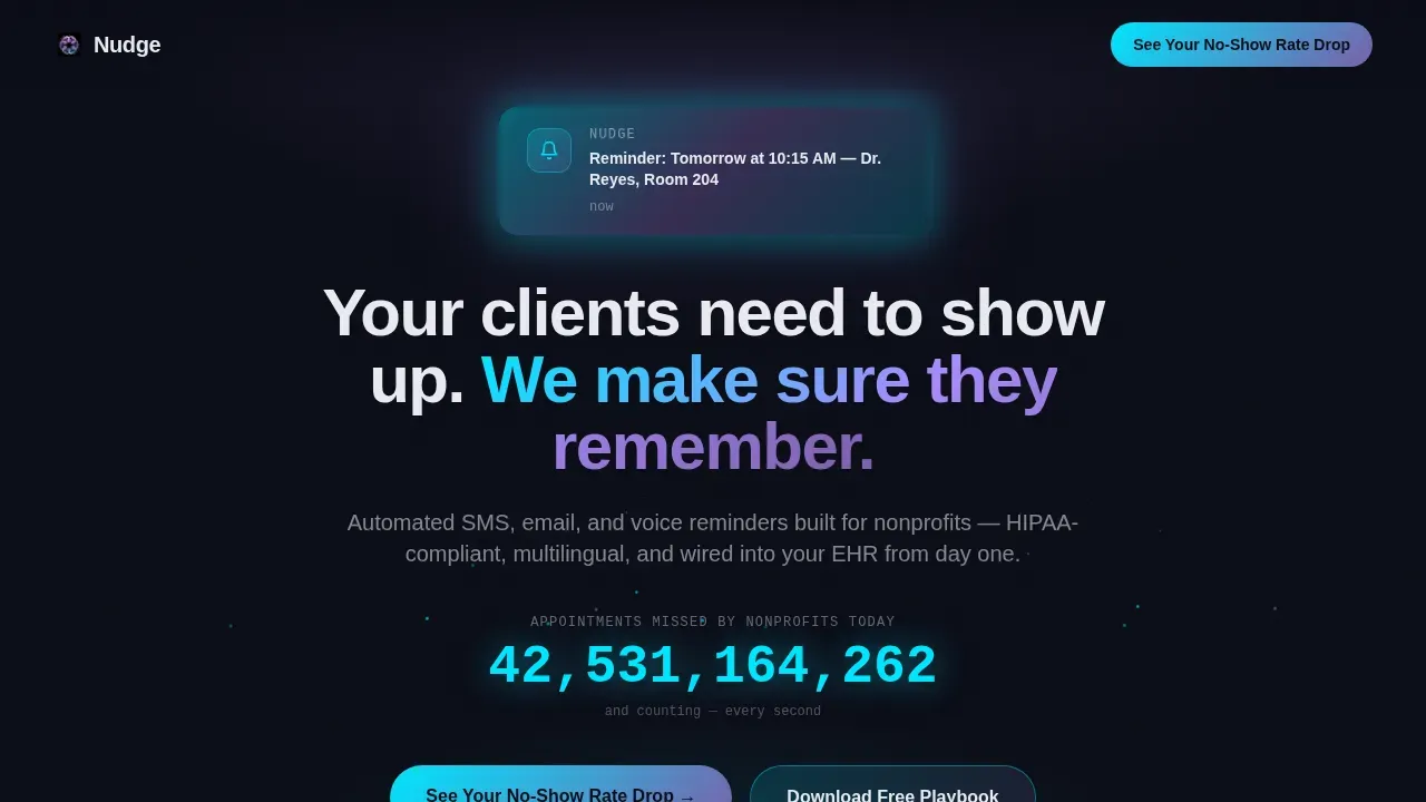
- A dark full-bleed hero with a glowing animated notification card, a live missed-appointment counter, and a delayed headline reveal
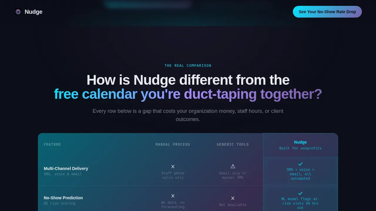
- A three-column Feature Matrix comparison table that puts your appointment reminder workflow side by side against manual processes and generic tools
- Expandable feature deep-dive cards, director-level social proof blocks with specific outcome metrics, and a dual-conversion lead generation section with a qualification form and a gated PDF download path
Feature list
This template includes a carefully sequenced set of sections and interactive components, all grounded in the source brief. Each feature below reflects what the template actually delivers.
Glowing Hero with Live Counter
The header opens on a void black full-bleed canvas. A single notification card floats center-frame, softly pulsing with a cyan-to-violet gradient halo. The card reads a reminder message: "Reminder: Tomorrow at 10:15 AM, Dr. Reyes, Room 204" in clean pearl type, giving visitors the feeling of an appointment reminder text message lighting up a dark screen. A live counter ticks upward above the fold, showing appointments missed by nonprofits today. This makes the cost of inaction visceral before a form ever appears.
Three-Column Comparison Table
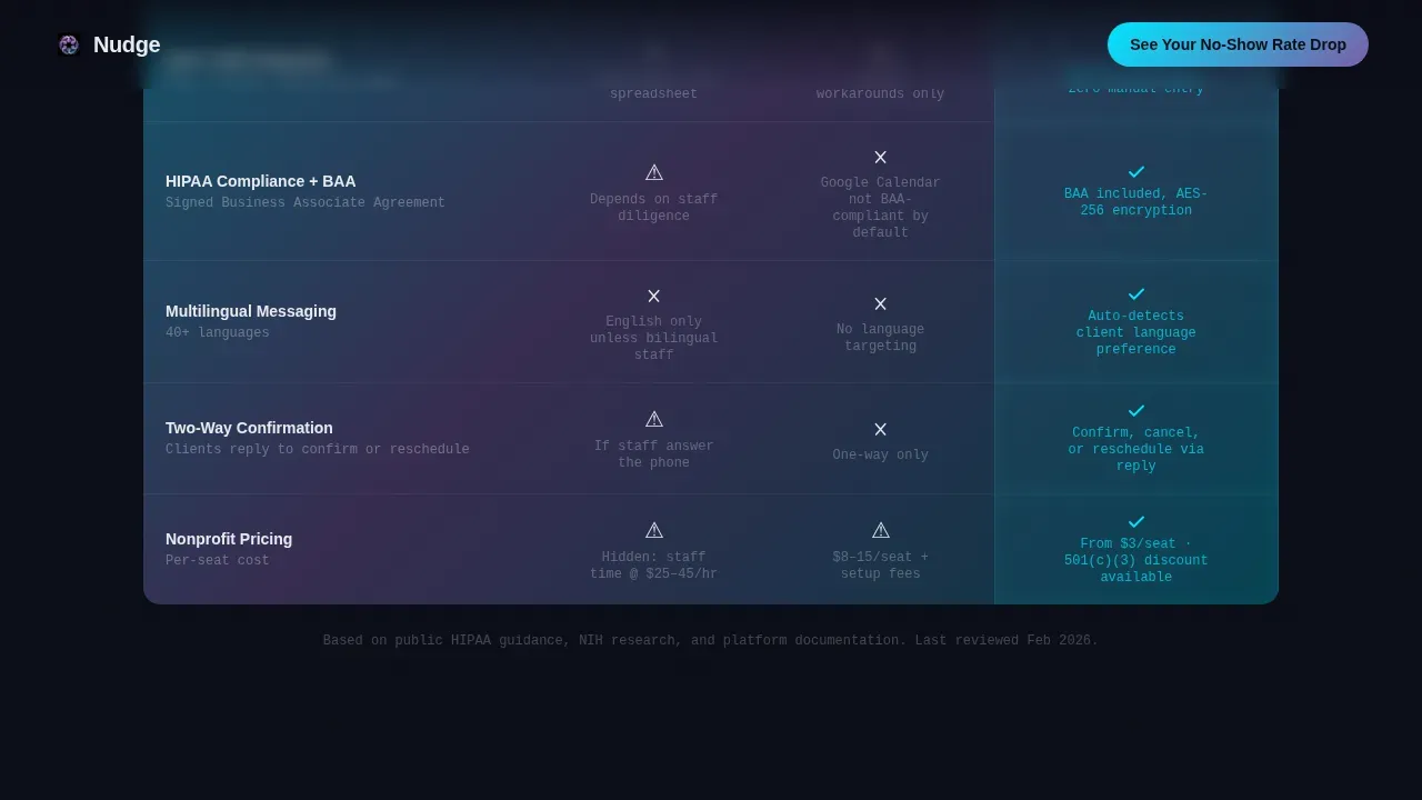
The Feature Matrix is the heart of the page. It answers the question every nonprofit ops lead asks: how is this different from what we are already doing? Three columns compare Manual Process, Generic Tools, and the Nudge platform across rows including multi-channel delivery, no-show prediction, cancellation policy handling, multilingual messaging, HIPAA compliance, and per-seat cost. Nudge cells glow faintly on scroll-enter, drawing the eye to the differentiators. The table keeps all parties on the same page without unnecessary details.
Expandable Feature Deep-Dive Cards
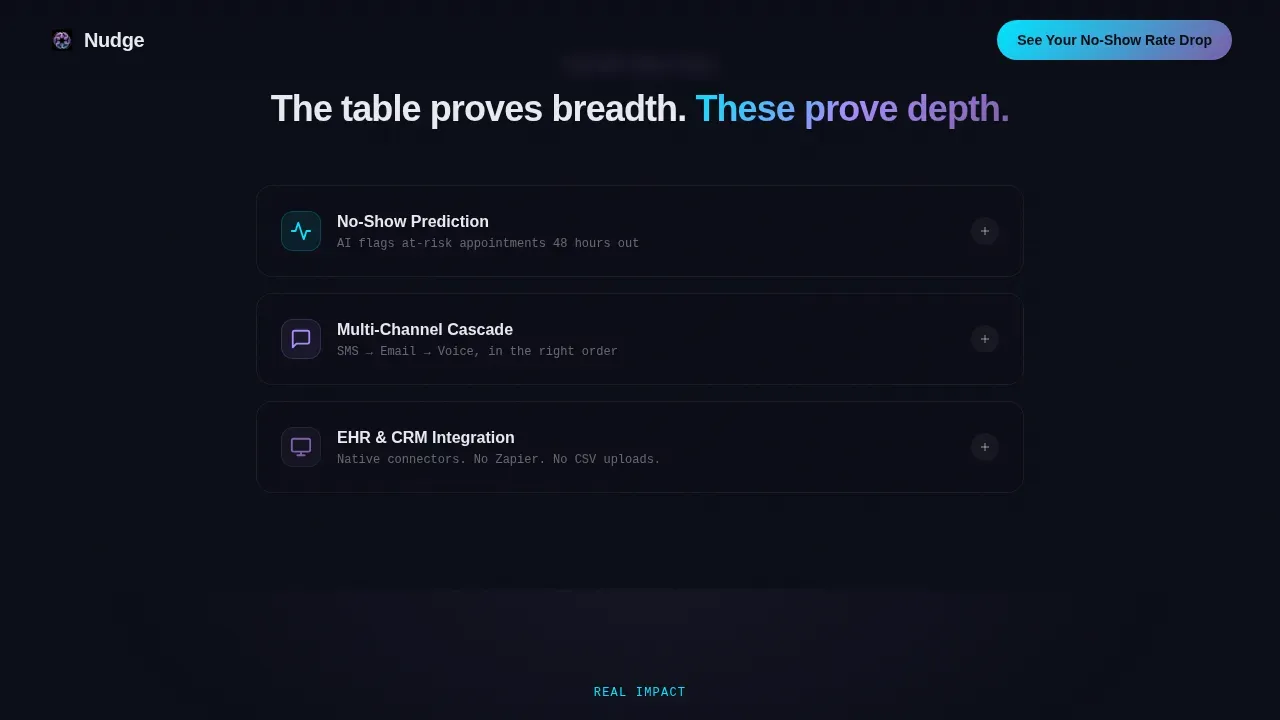
Below the comparison table, individual features unfold as expandable cards. Each card carries key details about a specific capability. Click the No-Show Prediction card and a mini-animation shows an AI confidence score climbing as the appointment date approaches. This rhythm proves breadth at the table level and depth at the card level, giving readers the heads up they need before they commit to a demo.
Director-Level Social Proof Blocks
Testimonial blocks from real program directors appear after the feature cards. Each block includes a specific before-and-after no-show metric, an org name, and a headshot. Real numbers, like a no-show rate dropping from 34 percent to 11 percent in one quarter, create trust that generic claims cannot.
Dual-Path Lead Generation Section
The primary conversion path anchors to a short qualification form asking for organization name, monthly appointment volume, current reminder method, and work email. The form sits on a glowing card that mirrors the header aesthetic. A secondary path offers a gated PDF download, capturing email and org size from visitors not yet ready to talk. Both paths share a clear call to action that makes next steps obvious.
Page sections overview
| Section | Purpose |
|---|---|
| Hero Notification Card | Anchor attention with pulsing glow, reminder card, and live missed-appointment counter |
| Comparison Table | Contrast manual, generic, and Nudge reminder workflows across six feature rows |
| Feature Deep-Dives | Expand individual capabilities with animated cards and key details |
| Social Proof Blocks | Build trust with director-level outcome metrics and org names |
| Lead Gen Form | Qualify and convert visitors via short form or PDF download path |
| Footer | Linear single-row footer closing the page cleanly |
Design & branding system
The visual identity follows a Startup Velocity theme using an AI Iridescent color system. The palette feels like a phone screen glowing face-up on a desk in a dark office, the light synthetic but warm, shifting between violet and cyan like quiet intelligence.
- Colors: void black (#0B0D17) as the primary background, holographic violet (#7B5EA7) for section accents and gradient anchors, electric cyan (#00E5FF) on interactive elements and data highlights, soft pearl (#E8EAF0) for body text against dark fields
- Typography: Plus Jakarta Sans for headings and JetBrains Mono for data labels and reminder text fields, creating a clear contrast between editorial and technical content
- Animation: high-intensity pulsing glow on the hero card, particle trails drifting upward, scroll-triggered cell highlights in the comparison table, an AI confidence score animation in the expandable cards, and a live counter ticker above the fold
Mobile & speed optimization
The template is designed desktop-first, reflecting how operations leads and program directors typically work at their desks. Full mobile support is included so the page remains usable across all screen sizes.
- Static sections use server-rendered components for fast initial load, while interactive elements like the live counter, expandable cards, and comparison table hover states are handled as client components
- The comparison table is structured to remain readable on smaller screens, keeping essential details visible without horizontal scrolling
How this template helps you convert
The page is engineered around a single behavioral insight: show the cost of doing nothing before you ask for anything. Every section earns the next click.
- The live missed-appointment counter above the fold makes lost income tangible before the visitor reads a single feature claim, creating urgency that a static headline cannot
- The Feature Matrix gives skeptical ops leads a direct, side-by-side answer to why automated appointment reminders outperform manual processes and generic scheduling tools, removing the biggest objection before the form
- The dual conversion path captures both high-intent visitors through the qualification form and lower-intent visitors through the PDF download, so no lead leaves without giving an email
Other information about this template
This template is built for the nonprofit technology niche but the underlying reminder architecture it showcases applies to any service business that relies on scheduled appointments. The appointment reminder strategies, templates, and messaging formats demonstrated throughout the page reflect real best practices.
- The nudge smart appointment reminder nonprofit landing page template is the full product identifier for this design and can be used when referencing it in your asset library or sharing it with your team
- Appointment reminder text templates and appointment reminder email templates shown in the comparison table illustrate how a well-built reminder message covers the appointment date, appointment time, location, and a reply prompt such as "reply C to confirm" without including unnecessary details
- A few templates in this collection use similar dark iridescent palettes; this one is specifically tuned for nonprofit lead generation with its Feature Matrix layout and dual-path conversion structure
- Google Calendar and similar generic scheduling tools appear in the comparison table as the baseline, helping visitors immediately understand the gap between a basic booking system and a purpose-built reminder engine
- Appointment reminder messages in this template follow best practices: they are short, carry essential details only, include specific instructions when needed such as preparation instructions before a health visit, and give clients a clear way to cancel or reschedule
- SMS reminders and appointment reminder email delivery are both represented in the Feature Matrix, reflecting the reality that nonprofit clients may not have consistent email access, making multi-channel delivery a key differentiator
- Discreet messaging is an important consideration shown in the template context: keeping text messages free of sensitive details protects clients in shared-phone situations or unsafe environments
- The booking page and qualification form use user-friendly forms to keep friction low, helping keep clients happy and the pipeline moving
- Appointment confirmations, cancellation policy display, and follow up messaging are all represented as feature rows in the comparison table
- For a service based business or service business outside the nonprofit sector, the core reminder architecture this template showcases can support similar lead generation goals with adjusted copy
Theme
Startup Velocity
Creative direction
Feature Matrix
Color system
AI Iridescent
Style
Comparison Table
Direction
Lead Generation
Page Sections
Animated Hero with Missed-appointment Counter
Three-column Feature Matrix Table
Expandable Feature Deep-dive Cards
Director-level Social Proof Blocks
Dual-path Lead Generation Section
Iridescent AI Color System and Motion Design
Related questions
Can this template support both appointment reminder text and appointment reminder email delivery in the same workflow?
How does the template handle the comparison between manual reminders and automated appointment reminders?
Does the template include ready-to-use appointment reminder templates for the cards and forms?
Can a visitor cancel or reschedule directly from the landing page?
Is this template suitable for a service business outside the nonprofit sector?



