Remind - Powerful Education Landing Page Template
Remind is a dashboard-style education appointment reminder landing page built for scheduling teams that cannot afford no-shows. It features a live cost estimator, layered spec-sheet comparison grids, and a two-step conversion form. The Void and Violet color system makes every data point stand out, and the layout guides visitors from curiosity to confident action.
by Rocket studio
Quick summary
Remind is a data-grid landing page for an education appointment reminder service. It opens with a live calculator that quantifies hours recovered and no-shows reduced. Scrolling deeper reveals spec-sheet comparison tables, uptime stats, pricing breakdowns, and two conversion paths. The dark Void and Violet visual identity keeps every number readable and every call to action impossible to miss.
Who this template is for
This template is built for education operations teams who need to demonstrate value quickly and capture qualified leads. It works equally well as a sales tool and a product showcase.
- K-12 front-office coordinators managing hundreds of family appointments each week
- University admissions teams running high-volume campus tours and interviews
- Private tutoring centers where a single missed appointment represents real revenue loss
What problem this template solves
Scheduling tools often struggle to communicate their impact to buyers who are comparing multiple options. Decision-makers need proof, not promises, before they commit to a demo or share their contact details.
- No clear way to show prospective clients how many hours and dollars they are losing without a dedicated reminder system
- Generic product pages that fail to answer the specific comparison questions that front-office coordinators actually ask
- Weak conversion paths that let research-ready visitors leave without capturing their contact information
What you get with this template
You get a single-page layout structured entirely around evidence and decision support. Every section is designed to remove doubt and move a visitor one logical step closer to booking a demo or downloading a comparison document.
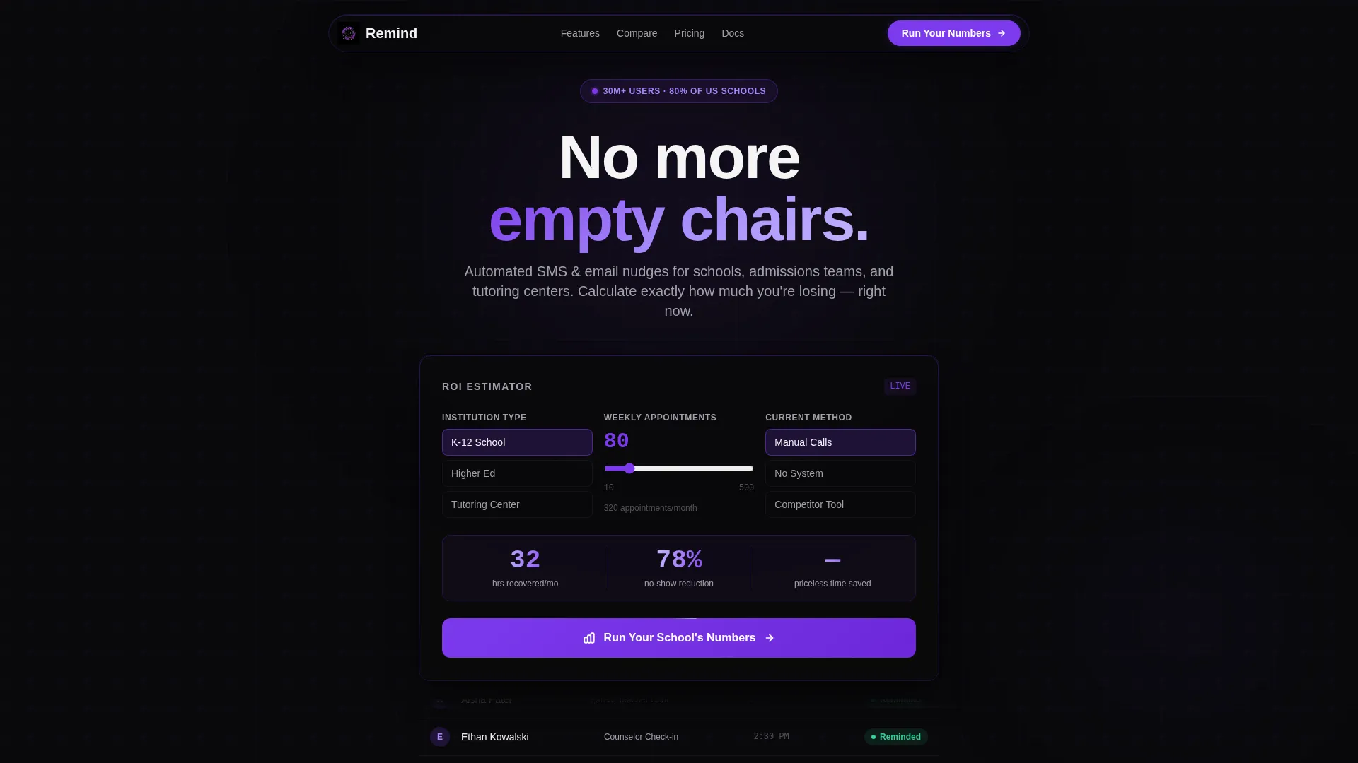
- A live calculator header that renders personalized ROI estimates in real time using visitor inputs
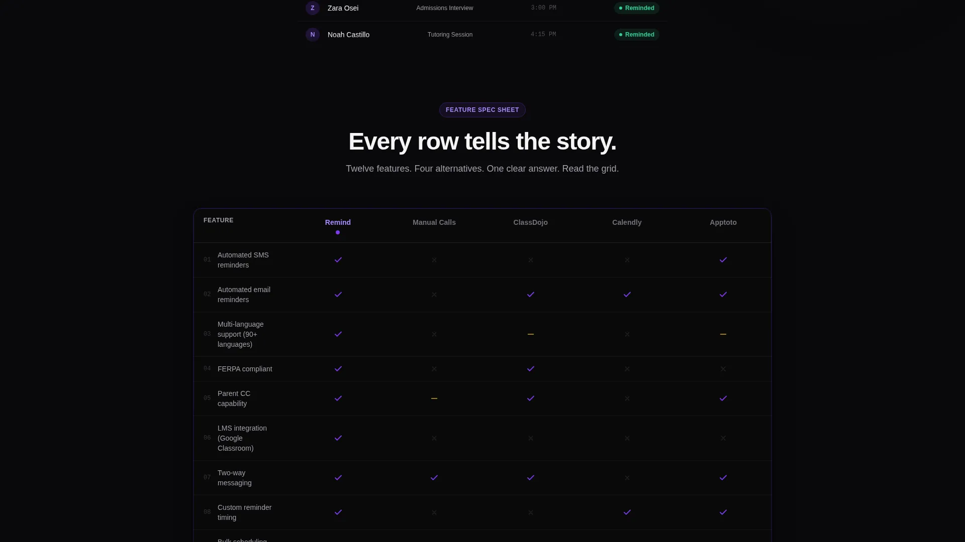
- A full spec-sheet comparison grid covering twelve feature rows across multiple reminder methods and competitor categories
- Two distinct conversion paths: a two-step demo request form and an email-gated PDF download for visitors who are not yet ready to talk
Feature list
This template packages six purpose-built components that work together to convert skeptical buyers into qualified leads.
Live ROI Calculator Header
Visitors select their institution type, enter their weekly appointment volume, and toggle their current reminder method. The estimator instantly renders two animated outputs: hours recovered per month on the left and projected no-show reduction on the right, both counting upward in electric violet.
Ghost-Grid Appointment Preview
Below the calculator, a slow-scrolling ghost grid displays sample appointment rows. Each row shows a student name, appointment type, and a green "Reminded" badge, giving visitors an immediate sense of how the product feels in daily use.
Twelve-Row Feature Comparison Table
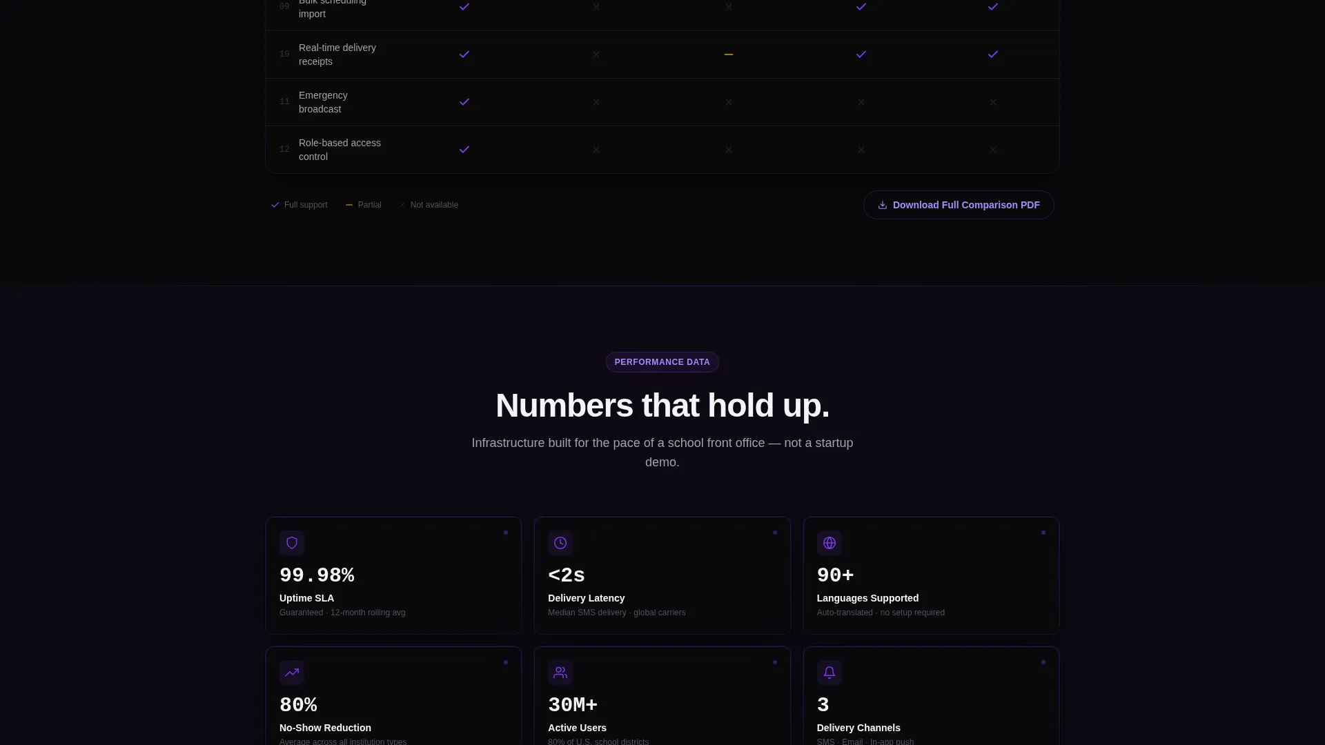
A structured spec table compares the reminder service against manual calls, generic calendar tools, and two leading competitor categories. Rows cover multi-channel delivery, language support, LMS integration, Family Educational Rights and Privacy Act (FERPA) compliance, and parent copy-in capability, using violet checkmarks and void-black crosses.
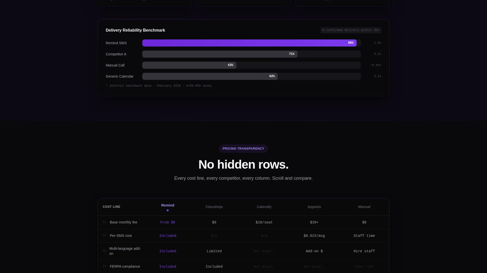
Pricing Transparency Grid
A dedicated pricing table places every competitor in its own column and maps each cost line as a row. Visitors can scan the full cost picture in seconds without leaving the page or reading a wall of text.
Two-Step Demo Request Form
The primary call to action opens a focused two-step form. Step one captures institution name, role, and monthly appointment volume. Step two asks which tool or method the visitor is replacing and their preferred demo format, either a live walkthrough or a recorded session.
Email-Gated PDF Download
A secondary conversion path offers the full comparison document gated behind a single email field. This captures visitors who are still in research mode and keeps them inside the nurture funnel without requiring a full form submission.
Page sections overview
| Section | Purpose |
|---|---|
| Calculator estimator header | Personalize value with live ROI output |
| Ghost-grid preview | Show the product in realistic daily context |
| Feature comparison grid | Compare twelve rows against competitors |
| Uptime and latency stats | Back claims with concrete performance data |
| Pricing transparency table | Map every cost line across all options |
| Sticky call to action bar | Keep the primary action visible while scrolling |
| Two-step demo form | Qualify and capture high-intent leads |
| PDF download gate | Capture research-stage visitors via email |
Design & branding system
The visual identity follows a Directory and Discovery theme expressed through the Void and Violet color system. The palette feels like a planetarium control room: dark backgrounds make every lit element demand attention, while violet accents pulse like signal lights across a quiet console.
- Absolute void black (#09090B) and deep interstellar purple (#1E1035) form the page background and card surfaces
- Electric violet (#7C3AED) drives all active states, interactive highlights, animated number outputs, and checkmark icons
- Chalk-white (#F4F4F5) handles data text and card surfaces, keeping figures legible against the dark base
Mobile & speed optimization
The template is designed so that data-heavy grids remain readable on smaller screens. Comparison tables reflow cleanly and the sticky call-to-action bar is sized for thumb reach on mobile devices.
- Comparison grids adapt their column layout for narrow viewports without hiding critical feature rows
- The sticky bottom bar appears after the first spec grid on all screen sizes, keeping the primary action reachable at every scroll depth
How this template helps you convert
The Comparison and Versus conversion strategy works by making visitors feel they have already done the research before they reach the call to action.
- The calculator header personalizes the pitch immediately, giving each visitor a number that feels specific to their institution rather than a generic claim.
- The layered spec-sheet structure builds cumulative evidence across every scroll increment, so by the time a visitor reaches the call to action they are confirming a decision already forming, not starting one.
- The dual conversion paths ensure that both high-intent visitors ready for a demo and lower-intent visitors still comparing options leave something behind, maximizing lead capture across the full buyer spectrum.
Other information about this template
This template sits at the intersection of the Technology category and the Education Appointment Reminder niche, making it a strong fit for edtech product teams and scheduling software vendors targeting school and university buyers.
- The Spec Sheet creative direction means the page persuades through structured data rather than narrative copy, which suits technical buyers and procurement reviewers
- The Dashboard and Data Grid template style gives the layout credibility with operations-focused audiences who work in grid-based tools every day
- The template is built as a single landing page, making it straightforward to deploy as a standalone campaign page or embed within a larger marketing site
- The Calculator and Estimator header concept is the centerpiece interaction; it is designed to reduce bounce by giving visitors a reason to engage before they have read a single paragraph of body copy
Theme
Directory & Discovery
Creative direction
Spec Sheet
Color system
Void & Violet
Style
Dashboard/Data Grid
Direction
Comparison/Versus
Page Sections
Live ROI Calculator Header
Ghost-grid Appointment Preview
Twelve-row Feature Comparison Table
Pricing Transparency Grid
Two-step Demo Request Form
Email-gated PDF Download
Related questions
Who is this landing page template designed for?
What does the ROI calculator show visitors?
How does the two-step demo request form work?
Can visitors access the comparison data without booking a demo?
What makes the spec-sheet layout effective for education buyers?



