Fitness & Gym Software Complete Cost Calculator Website Template
Rep is a bold brutalist landing page template built for fitness payment processing platforms. It combines frosted glass comparison tables, a dark full-bleed header with ultraviolet glow, and a dual conversion path driving app downloads and a savings calculator. Designed for gym software products targeting independent gym owners, boutique studio founders, and fitness franchise operators.
by Rocket studio
Quick summary
Rep is a single-page landing page template for gym and fitness payment processing platforms. It uses a bold brutalist design system with glassmorphic panels, ultraviolet glow accents, and frosted comparison tables. The page leads visitors through proof-driven scroll sections and closes with two conversion paths: app download and a savings calculator with email capture.
Who this template is for
This template is built for fitness technology founders and payment software teams who need to sell a specialized processor to gym operators. It speaks the language of the weight room without losing clarity.
- Independent gym owners running multiple locations who need recurring billing and chargeback management
- Boutique studio founders who require class-pack billing and flexible membership logic
- Fitness franchise operators reconciling multi-unit revenue and needing a single payment command center
What problem this template solves
Generic payment processor landing pages fail fitness businesses because they look and sound like every other fintech product. Gym software buyers need specific proof before they switch processors.
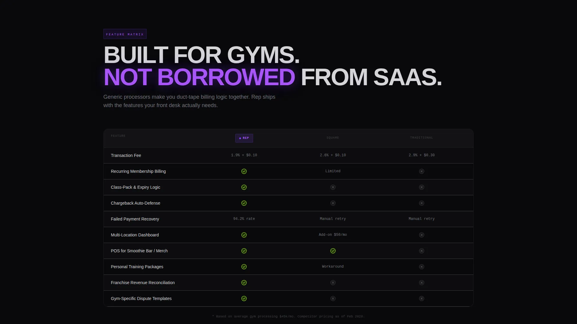
- Visitors need side-by-side comparisons of transaction fees, chargeback handling, and gym-specific billing features before committing
- Studio and gym operators need to see that class-pack billing logic and recurring membership charges are handled natively
- Franchise operators need evidence that multi-location revenue reconciliation is a core capability, not an afterthought
What you get with this template
You get a complete, conversion-focused single-page layout that walks gym software buyers from skepticism to download. Every section is designed to add one more layer of proof.
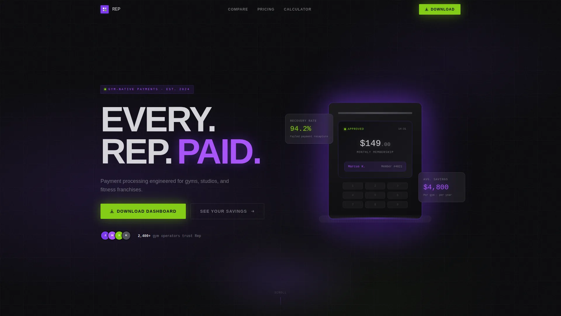
- A dark full-bleed header with an ultraviolet-lit card terminal visual, a word-by-word animated headline, and a chrome gray subtitle
- Two frosted glass comparison tables and a plan-tier feature matrix with viewport-triggered checkmark animations
- Three brutalist stat blocks, a two-field savings calculator with email-gated report, and dual call to action paths for app store downloads
Feature list
This template delivers a focused set of designed components, each grounded in what fitness payment software buyers actually need to see before converting.
Dark Full-Bleed Header with Glow
The header fills the full viewport with a void black background. A card terminal sits on a rubber-matted desk, lit from beneath by a diffused ultraviolet glow. The terminal screen shows a live membership charge. The headline animates one word at a time: EVERY. REP. PAID.
Frosted Glass Comparison Tables
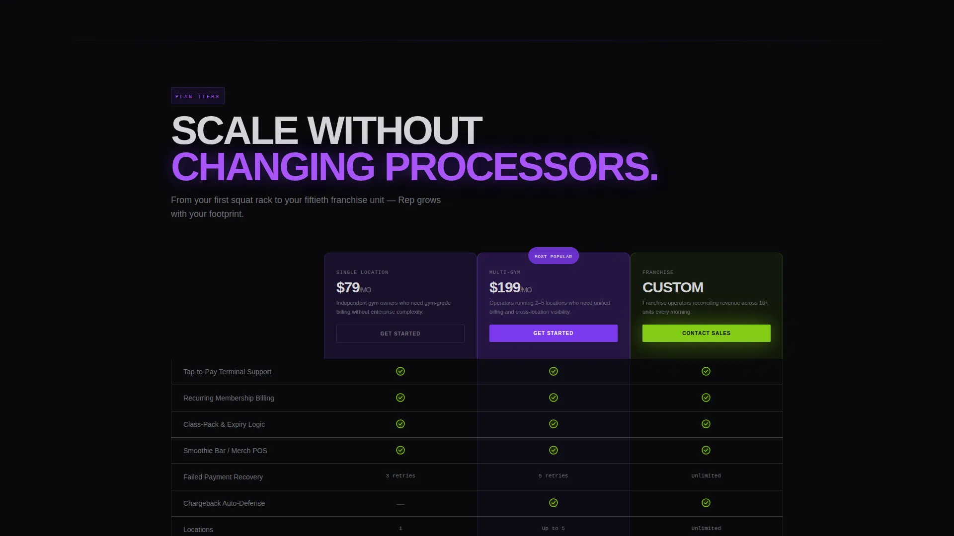
Two distinct comparison tables sit inside glassmorphic panels at 12% white opacity. The first compares transaction fees, chargeback handling, and class-pack logic across processor types. The second displays plan tiers with animated checkmarks that trigger as each row enters the viewport.
Brutalist Stat Blocks
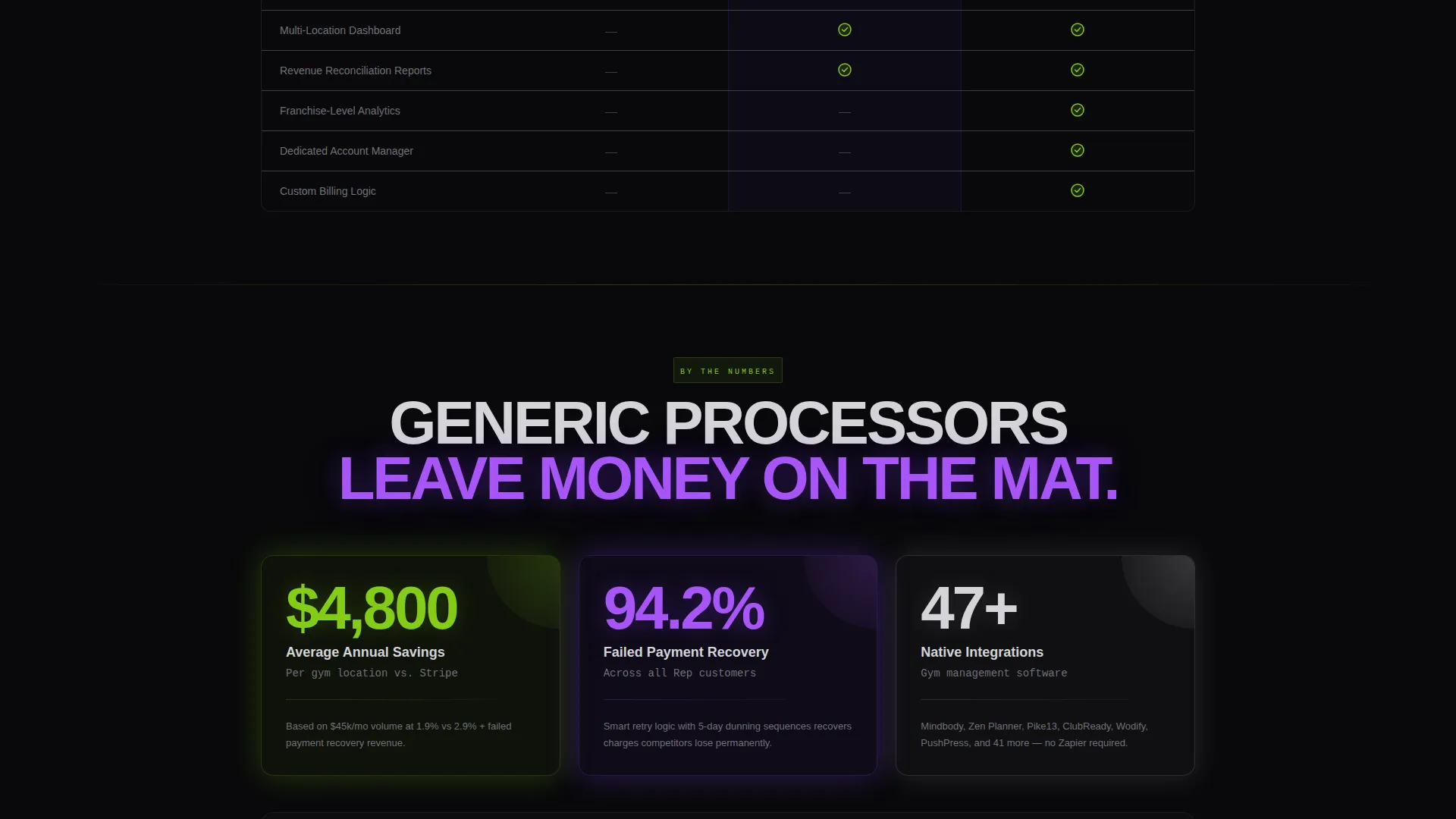
Three oversized stat blocks break the table format mid-page. They display average annual savings per gym, failed-payment recovery rate, and integration count. The typography is tight-tracked and all-caps, designed to punch through the frosted panels like stamped steel.
Savings Calculator with Email Capture
A two-field inline calculator accepts current monthly volume and current processor. It instantly displays estimated annual savings. The full savings report is gated behind an email capture field, creating a lightweight but effective lead generation step.
App Download call to action Section
The primary call to action reads "Download the Dashboard" and pairs App Store and Google Play badges. Both badges glow ultraviolet on hover. The app is positioned as a real-time command center for revenue per location, failed-payment alerts, and member billing management.
Dual Conversion Path Layout
The page supports two conversion flows simultaneously. The primary path drives app downloads. The secondary path leads to the savings calculator. Both paths are visible without competing, so visitors self-select based on where they are in the buying decision.
Page sections overview
| Section | Purpose |
|---|---|
| Full-Bleed Header | Establish brand identity and hook attention with animated headline and terminal visual |
| Processor Comparison Table | Prove fee and feature advantages over generic payment processors |
| Plan Tier Matrix | Show feature availability across Single Location, Multi-Gym, and Franchise plans |
| Brutalist Stat Blocks | Reinforce value with bold, scannable proof points on savings and recovery |
| Savings Calculator | Let visitors calculate personal ROI with two fields before email capture |
| App Download call to action | Drive primary conversion with dual app store badges and ultraviolet hover states |
Design & branding system
The visual identity is bold brutalist layered over a glassmorphic color system. The result feels like a gym at midnight: industrial, focused, and lit by neon rather than daylight.
- Color palette: void black (#09090B) background, frosted glass panels at 12% white opacity, electric ultraviolet (#7C3AED) as the primary glow accent, cold chrome (#D4D4D8) for body text, and searing lime (#84CC16) reserved for active states and call-to-action pulses
- Typography: oversized, tight-tracked, all-caps section headers in a brutalist style that reads like stamped steel through frosted glass
- Depth and texture: gradient mesh backgrounds sit behind glass panels, creating layered depth without decorative clutter; ultraviolet glow halos appear on key hardware visuals and interactive hover states
Mobile & speed optimization
The template is structured for clean rendering on smaller screens while keeping the brutalist visual weight intact. Heavy visual sections are built to scale without losing the depth effect.
- Glassmorphic panels and gradient meshes are designed to maintain their layered look on mobile viewports
- Viewport-triggered animations, including the comparison table checkmarks and the word-by-word headline, are scoped to trigger correctly at standard mobile breakpoints
- The savings calculator and app download call to action section are stacked for single-column mobile layouts without losing conversion clarity
How this template helps you convert
Every design and content decision in this template is built to reduce hesitation and build confidence before asking for the tap. The scroll path is a proof ladder.
- The comparison tables arrive before any call to action, so visitors see fee and feature evidence first. Trust is earned before action is requested.
- The savings calculator creates a personal, immediate ROI moment. A visitor who sees their own estimated annual savings is far more likely to engage with the email capture and move toward the app download.
- The dual conversion path allows buyers at different decision stages to self-select. Early-stage visitors use the calculator. Ready-to-commit visitors tap the download call to action.
Other information about this template
This template is built to slot into a broader fitness and gym software marketing stack. It is designed as a standalone landing page but carries enough structural depth to anchor a product launch or a paid acquisition campaign.
- The template style is a comparison table layout, making it well-suited for competitive positioning in the fitness payment processing space
- The creative direction is feature matrix, meaning the page is structured to educate and compare before converting
- The header concept is a dark full-bleed with glow, a format that works particularly well in performance marketing contexts where first-impression retention matters
- The landing page direction targets app download as the primary conversion goal, with a secondary lead generation path through the savings calculator
Theme
Bold Brutalist
Creative direction
Feature Matrix
Color system
Glassmorphic
Style
Comparison Table
Direction
App Download
Page Sections
Animated Dark Full-bleed Header
Frosted Glass Comparison Tables
Brutalist Stat Blocks
Savings Calculator with Email Gate
Dual App Download Call to Action
Dual Conversion Path Structure
Related questions
Who is this template designed for?
What conversion goals does this template support?
How does the savings calculator work?
What makes the comparison table section effective?
Is this template suitable for a product launch or paid advertising campaign?



