Personal Training App Landing Page Template
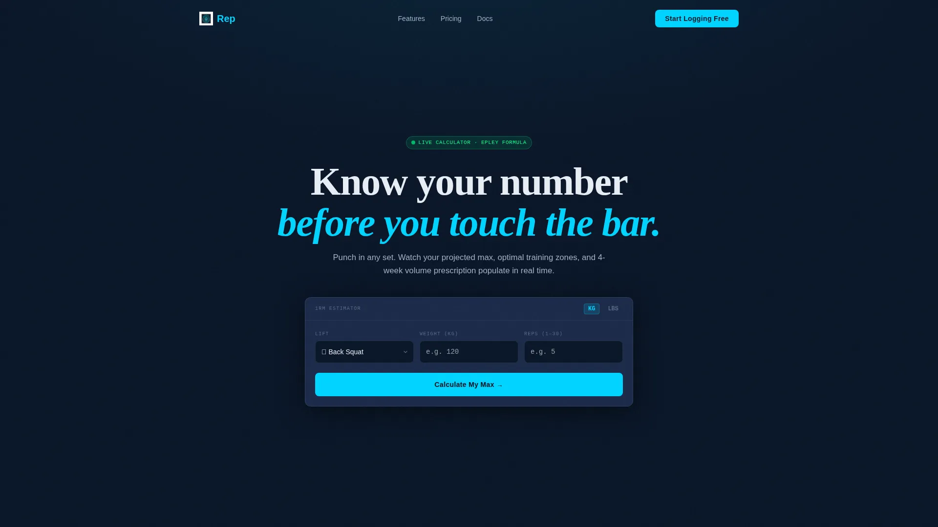
Rep is a dashboard-style personal training app landing page built for strength-focused users who want data, not decoration. The hero embeds a live one-rep-max and volume estimator. Scroll further and each section presents a labeled capability card with micro-animations. The freemium sign-up flow asks only for email and training goal, two fields, instant access.
by Rocket studio
Quick summary
Rep is a single-page landing page template for a personal training app. It opens with a functional calculator that delivers real training estimates before asking for anything. The design runs on a dark cockpit palette and presents every feature as a clean data card. The conversion model is freemium, with a two-field sign-up and a sticky trial bar.
Who this template is for
This template is built for founders, developers, and product teams launching a strength or performance tracking app. It speaks directly to users who want proof of value before they commit to signing up.
- Intermediate lifters who have moved past basic beginner programs
- Shift workers who need flexible, adaptive session scheduling
- Competitive amateur athletes looking for periodization without a personal coach
What problem this template solves
Generic app landing pages lead with headlines and stock photography. They describe features without demonstrating them. This template flips that dynamic by leading with a working tool, so visitors experience the product before reading a single marketing line.
- Visitors leave when there is no immediate reason to stay or trust the offer
- Long sign-up forms create friction and reduce conversion on freemium apps
- Static feature lists fail to communicate how adaptive training logic actually feels
What you get with this template
You get a complete, section-led landing page structured around one core idea: earn the click by delivering value first. Every section is purposeful and self-contained.
- A hero section with a functional one-rep-max and weekly volume estimator
- Spec Sheet-style capability cards with micro-animations for each core feature
- A sticky secondary call-to-action bar and a two-field freemium sign-up form
Feature list
This template is built around interactive and data-driven components that reflect the product itself.
Live One-Rep-Max Calculator
Visitors select a lift, enter weight and reps, and watch projected maxes and training ranges populate in real time across a compact data grid. Numbers animate in like a live scoreboard, making the tool feel immediate and credible.
Weekly Volume Estimator
Alongside the one-rep-max output, the calculator generates weekly set recommendations tailored to the lift and input values. This gives visitors a concrete, personalized output before they see a single call to action.
Contextual Freemium call to action
The primary "Start Logging Free" button appears inside the calculator results panel, triggered after the visitor receives their estimates. The placement makes the ask feel natural rather than intrusive.
Spec Sheet Capability Cards
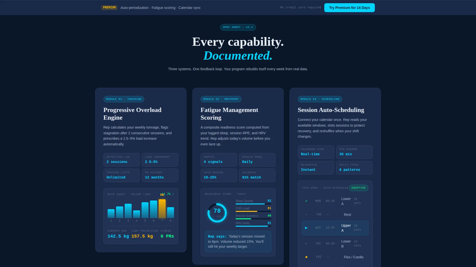
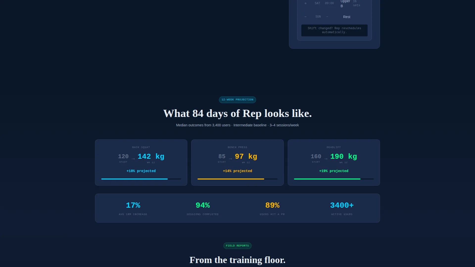
Each scroll section isolates one app capability, such as progressive overload tracking, fatigue management scoring, or session auto-scheduling. Each card uses a labeled data layout and a micro-animation showing the feature in motion.
Sticky Trial Bar
A persistent secondary bar offers "Try Premium for 14 Days" with no credit card required. It stays visible during scroll without interrupting the reading experience.
Two-Field Sign-Up Form
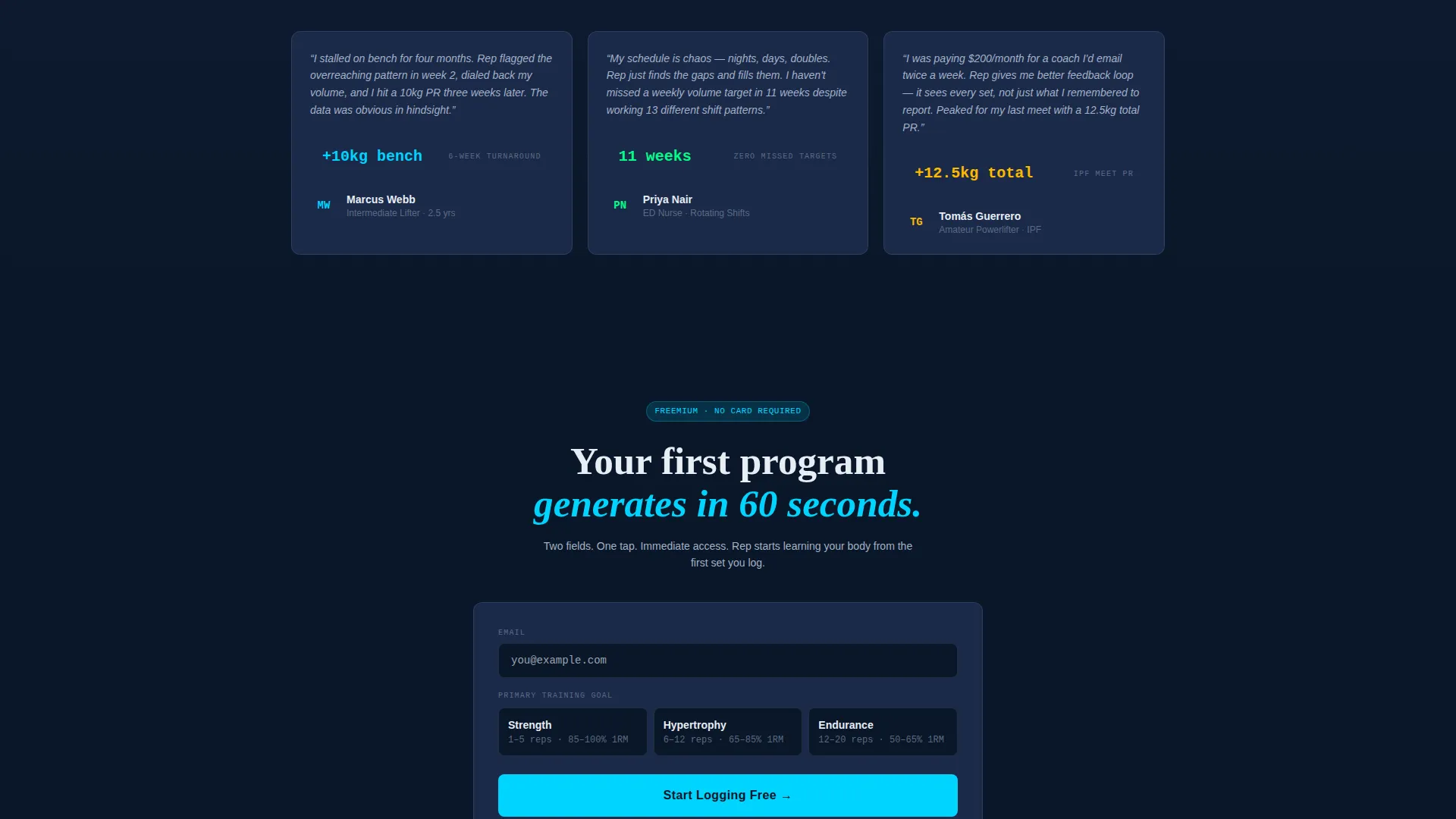
The sign-up form captures only email and primary training goal, with goal options of strength, hypertrophy, or endurance. One tap grants immediate access, keeping drop-off low at the moment of intent.
Page sections overview
| Section | Purpose |
|---|---|
| Hero Calculator | Deliver live one-rep-max and volume estimates as the first impression |
| Calculator Results Panel | Surface the primary "Start Logging Free" call to action after estimates generate |
| Progressive Overload Card | Show how the app tracks set-by-set progression over time |
| Fatigue Management Card | Present the fatigue scoring system as a labeled data card |
| Auto-Scheduling Card | Demonstrate session scheduling logic with a micro-animation |
| Sign-Up Form | Capture email and training goal with a two-field, one-tap form |
| Sticky Trial Bar | Maintain "Try Premium for 14 Days" visibility throughout scroll |
Design & branding system
The visual identity uses a Dashboard Pro theme built entirely on the Midnight Blue color system. The palette reads like a cockpit display: dark, calm, and precise.
- Deep terminal navy (#0A1628) as the base background, panel-surface slate (#1B2A4A) for card surfaces, and cool interface gray (#A3B1C6) for secondary text
- Electric accent cyan (#00D4FF) reserved for live data points, toggle states, and primary buttons to draw the eye exactly where action is needed
- No stock photography or lifestyle imagery; the calculator and data cards are the visual anchors throughout the page
Mobile & speed optimization
The layout is designed to stay functional and readable across screen sizes. The calculator and data grid components are compact by design, which supports a clean mobile experience.
- The hero estimator and results panel are structured to work on small screens without losing the live-data feel
- Capability cards are self-contained and stack cleanly on narrower viewports
- The sticky trial bar and sign-up form are kept minimal to load fast and tap easily on mobile
How this template helps you convert
The conversion strategy is built into the page structure. Value comes before the ask, and friction is removed at every sign-up touchpoint.
- The calculator delivers a personalized training estimate immediately, giving visitors a reason to trust the product before any call to action appears
- The contextual "Start Logging Free" button appears only after estimates are shown, making the sign-up feel like a natural next step
- The two-field form and no-credit-card trial bar reduce commitment anxiety and lower the barrier to first action
Other information about this template
This template is part of a broader set of industry-specific mobile app landing page designs within the Technology category. It is a strong fit for teams building in the personal training app space who want a polished, data-forward first impression.
- The template style is Dashboard and Data Grid, meaning the visual language mirrors the product it promotes
- The Spec Sheet creative direction makes it easy to adapt copy for different training focuses, such as powerlifting, bodybuilding, or endurance sport
- The freemium and trial conversion model is reflected in every structural decision, from the calculator placement to the sticky bar behavior
Theme
Dashboard Pro
Creative direction
Spec Sheet
Color system
Midnight Blue
Style
Dashboard/Data Grid
Direction
Freemium/Trial
Page Sections
Live One-rep-max Estimator
Weekly Volume Recommendations
Spec Sheet Capability Cards
Contextual Freemium Sign-up
Sticky Premium Trial Bar
Two-field Access Form
Related questions
Can I customize the calculator fields for different lifts or sports?
Does the sign-up form connect to any specific email or app platform?
Is this template suitable if my app targets beginners rather than intermediate lifters?
Can I add more capability cards beyond the three featured in the Spec Sheet sections?
What does the sticky trial bar say and can I change the offer text?



