CS Practice & Quiz App Landing Page Template
Repengine is a sidebar companion landing page template built for computer science practice and quiz apps. It pairs a dramatic half-page photo header with a Problem→Solution Arc layout that guides visitors from frustration to confidence. The Dopamine Pop color system and freemium-first conversion flow make it compelling for CS students, bootcamp graduates, and self-taught developers ready to start solving immediately.
by Rocket studio
Quick summary
Repengine is a focused sidebar companion landing page template for a computer science practice and quiz app. It opens on real developer pain, walks visitors through targeted feature solutions, and converts on a freemium model where the first problem is free with no form required. The design feels like a dark-mode IDE that celebrates every win.
Who this template is for
This template is built for teams launching or promoting a computer science practice platform. It speaks directly to technical learners who are tired of passive studying and ready for active, adaptive problem solving.
- Computer science students cramming data structures and algorithms before midterms
- Bootcamp graduates grinding interview-style problems before their first technical loop
- Self-taught developers who want to prove applied coding knowledge under real pressure
What problem this template solves
Most quiz and practice app pages bury the value proposition under marketing language that means nothing to someone who just got a "Time Limit Exceeded" error at midnight. This template leads with recognition, not persuasion.
- Visitors see their own frustration reflected immediately in the opening carousel of real error states
- Each section connects one specific failure mode to one specific platform feature
- The freemium flow removes commitment friction by letting visitors try one problem before signing up
What you get with this template
You get a fully structured, single-page layout that sequences a visitor's emotional journey from stuck to confident. Every section is designed with intent, from the cinematic header to the pinned sidebar call-to-action.
- A half-page photo and text header with a live community problem counter
- A Problem→Solution Arc content flow across spaced repetition, adaptive difficulty, and guided hints sections
- A persistent sidebar call-to-action rail with a freemium entry point and a paid-tier upgrade prompt
Feature list
This template is built around five deliberate design and layout decisions, each solving a real conversion or engagement challenge for a computer science practice app.
Half-Page Photo and Text Header
The left side displays a close-cropped over-the-shoulder laptop shot showing a partially solved binary tree traversal problem. The right side delivers the hero headline and a live counter showing problems solved across the platform today. This pairing makes the product feel active and immediate from the first second.
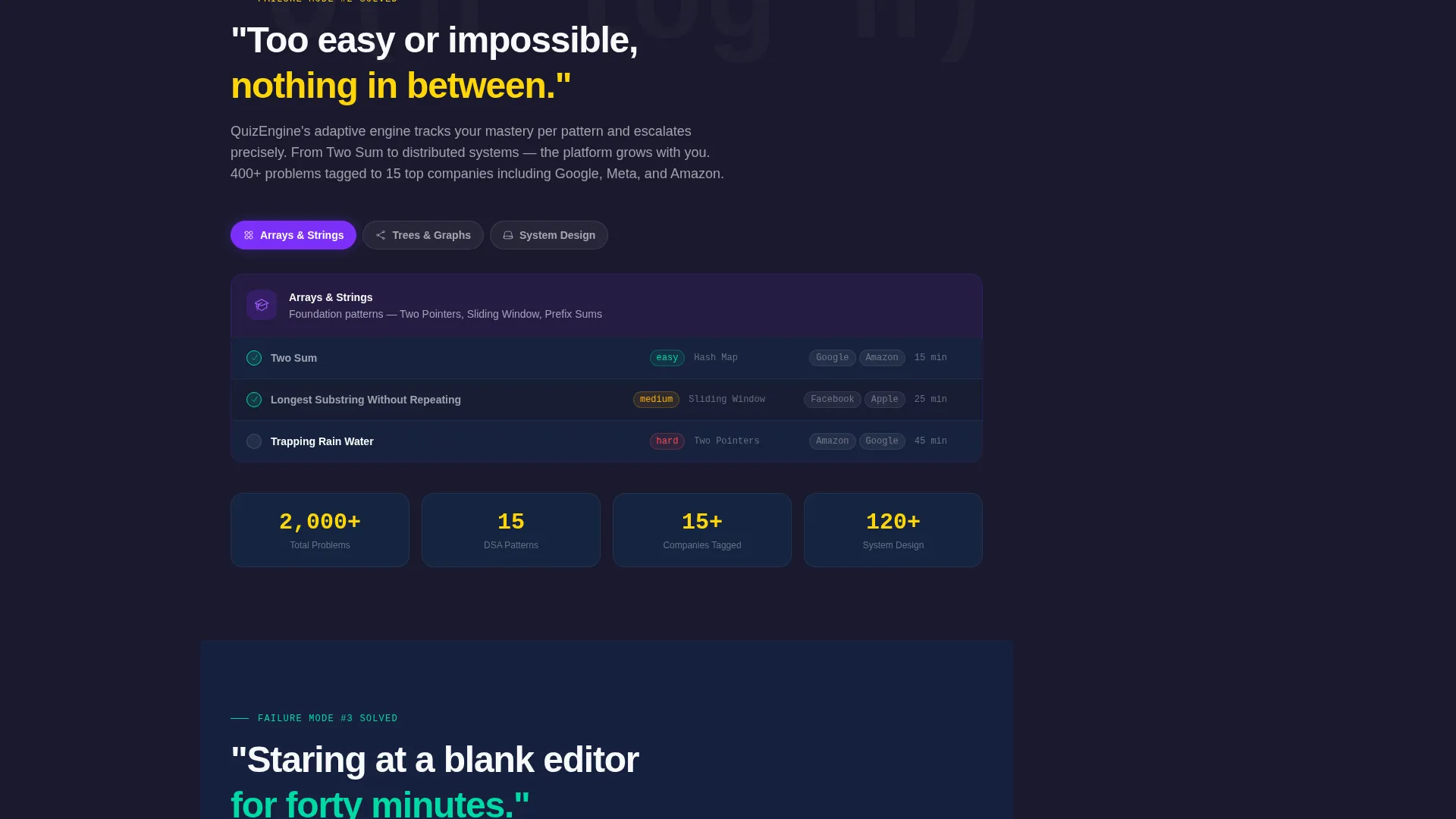
Problem→Solution Arc Layout
Every scroll beat opens on a pain point before presenting the feature antidote. Spaced repetition answers forgetting. Adaptive difficulty answers the gap between too easy and impossible. Guided hints answer the blank-editor paralysis. This structure gives each feature section a narrative reason to exist.
Dopamine Pop Color System
The palette uses deep terminal black for the background, electric violet for primary actions and progress indicators, reward-burst yellow for correct-answer states and achievement badges, and crisp chalk white for content surfaces. The result feels like a focused dark-mode workspace that visually celebrates success.
Persistent Sidebar Call-to-Action Rail
The primary call-to-action button stays pinned in the sidebar companion rail at all times. It remains visible throughout the scroll without obstructing the main content. Visitors always have a clear path to start solving without being interrupted.
Freemium Conversion Sequence
The primary entry button reads "Start Solving Free" and requires no form or account. After one completed problem, a subtle modal surfaces to offer sign-up for progress saving. The secondary upgrade prompt then introduces the paid tier with access to the full problem library.
Escalating Problem Showcase
The page walks visitors through problems in increasing complexity order, from arrays to graphs to system design. This progression demonstrates that the platform grows alongside the learner, which builds trust that the tool is useful beyond beginner-level practice.
Page sections overview
| Section | Purpose |
|---|---|
| Hero Header Split | Introduce the platform with a cinematic photo and live activity counter |
| Error State Carousel | Surface real failure screens to create immediate emotional recognition |
| Spaced Repetition Section | Present forgetting as a solved problem through adaptive scheduling |
| Adaptive Difficulty Section | Show how the platform matches problem complexity to current skill level |
| Guided Hints Section | Demonstrate how structured hints break blank-editor paralysis |
| Escalating Problem Showcase | Build confidence by showing coverage from arrays to system design |
| Pinned Sidebar Rail | Keep the primary call-to-action visible and accessible throughout |
| Freemium Modal Trigger | Convert first-time solvers into registered users after one free problem |
| Paid Tier Upgrade Prompt | Introduce the full problem library as the next logical step |
Design & branding system
The visual identity follows an Educational Guide theme expressed through the Dopamine Pop color system. The palette is designed to feel serious and focused during problem-solving, then burst into celebration when a correct answer lands.
- Deep terminal black (#1A1A2E) as the base, electric violet (#7B2FF7) for actions and progress, reward-burst yellow (#FFD60A) for achievement states, and chalk white (#F8F9FC) for content surfaces
- Dark-mode IDE aesthetic that carries visual weight without feeling heavy or distracting
- Yellow highlight moments reserved for correct-answer states and badges, so celebration feels earned rather than constant
Mobile & speed optimization
The sidebar companion layout is designed to translate cleanly across screen sizes. The persistent rail and content sections stack in a logical reading order on smaller viewports.
- Sidebar call-to-action collapses gracefully on mobile without losing visibility or tap accessibility
- Photo and text header adapts to a stacked layout on narrow screens, keeping the headline prominent
- Section-by-section scroll flow remains intact across device sizes, preserving the Problem→Solution Arc narrative
How this template helps you convert
The conversion strategy earns trust before asking for anything. The template is structured to move a skeptical technical visitor from recognition to action in a single scroll session.
- The live problem counter in the header creates immediate social proof by showing real platform activity without requiring the visitor to take any action first.
- The freemium entry button drops visitors into a live problem with no form, no account, and no friction, letting the product prove its value before the sign-up ask appears.
- The subtle post-problem modal and the paid-tier upgrade prompt appear only after the visitor has already experienced a win, making both conversion steps feel like natural next moves rather than interruptions.
Other information about this template
This template is purpose-built for the computer science education niche, where learners are technically savvy, skeptical of hype, and motivated by proof over promises. A few additional details worth knowing before you build with it.
- The template style is a Sidebar Companion layout, meaning the main content rail and the persistent action rail are designed to coexist without competing for attention
- The header concept is a Half-Page Photo and Text split, so high-quality photography of real coding environments is recommended for best visual impact
- The creative direction follows a Problem→Solution Arc, which means copy written for each section should lead with the specific pain before introducing the feature
- The landing page direction is Freemium and Trial, so the conversion copy and button labels are pre-structured for a no-commitment first step followed by a clear upgrade path


Theme
Educational Guide
Creative direction
Problem→Solution Arc
Color system
Dopamine Pop
Style
Sidebar Companion
Direction
Freemium/Trial
Page Sections
Half-page Photo and Text Header
Problem→solution Arc Scroll Flow
Dopamine Pop Color System
Persistent Sidebar Call-to-action Rail
Freemium and Upgrade Conversion Sequence
Escalating Problem Complexity Showcase
Related questions
Who is this landing page template designed for?
Does this template include a working quiz or problem engine?
How does the freemium conversion flow work in this template?
Can I change the color palette to match my own brand?
What kind of photography works best for the hero header?


